kage
kage
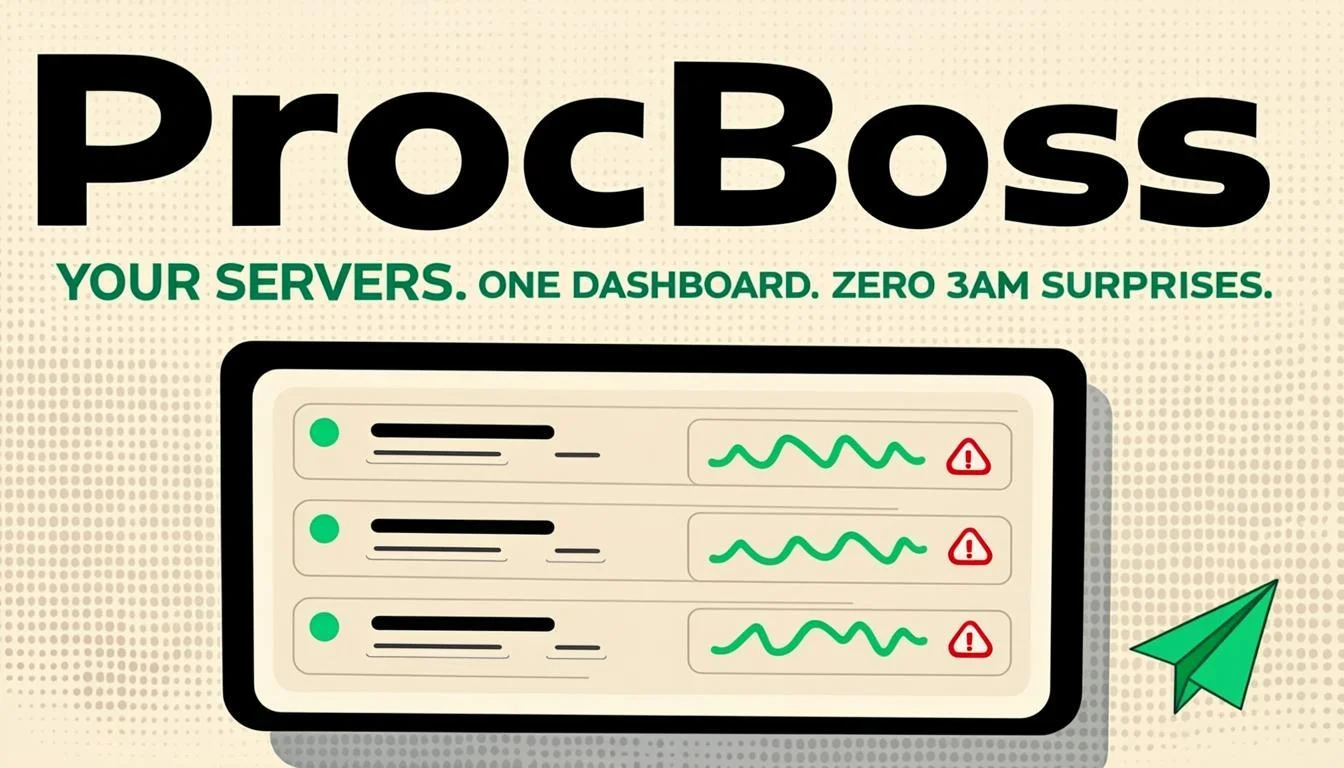
Design analysis
A 1200×630 social card on a near-black canvas with a retro-terminal personality. The focal hierarchy is wordmark first: a very large cream "ProcBoss" headline dominates the upper half, followed by a small green uppercase tagline split by periods ("YOUR SERVERS. ONE DASHBOARD. ZERO BAD SURPRISES."). The lower half carries a single illustration — a beige-bordered terminal/browser window with stacked status rows (green dots, red dot, squiggly green sparkline lines) — so the card reads as word, promise, proof in three tiers. Colour is strictly three-value: near-black ground, warm cream type, and saturated green for accents and status, which keeps the card legible at thumbnail size. A small green cursor arrow tucked at the right edge adds a playful pointer into the illustration.
Prompt preview
## Reference images

Study these alongside the description below: hierarchy, rhythm, spacing, colour. Build for the product you are asked about, using this design language.

- Screenshot: https://kage-design-assets.t3.tigrisfiles.io/screenshots/procboss/8349b9f5-856f-4c29-9658-94d10ba50888-1791525799985.webp
- Design on Kage: https://kage.design/designs/procboss-og-image

## Before you start
Ask the user what product or project the social card is for, who the audience is, and what brand assets they already have (name, logo, colours, tagline). Wait for their answers before building. Everything below is applied to *their* product — do not reproduce ProcBoss's name, copy, or branding.

## Page structure
Produce a single 1200×630 social card image (for example, an HTML/CSS page rendered to PNG, or a standalone SVG). Compose it in three vertical tiers:

1. **Wordmark tier (top ~45% of canvas)**: the product name set in a large bold display face, occupying roughly 70% of the canvas width, left-aligned with generous margin (~64px). This is the single dominant element; everything else is subordinate to it.
2. **Tagline tier (directly under the wordmark)**: one short line of uppercase micro-copy in the accent colour, letter-spaced, with sentence-length broken by periods or middle dots (e.g. three short claims separated by punctuation). Keep it to one line, small enough that it contrasts sharply in scale with the wordmark.
3. **Illustration tier (bottom ~35%)**: one framed "window" — a rounded rectangle with a visible 2px border and a thin title bar — containing 3–4 stacked status rows. Each row has a status dot (mostly green, one red for tension), a placeholder text bar, and a small inline sparkline or squiggly line. Add one small playful accent element (e.g. a cursor arrow) overlapping the window's right edge to pull the eye into the illustration.

Leave a safe margin on all sides; nothing critical within ~48px of the canvas edge.

## Design language
- **Canvas and ground**: 1200×630, solid near-black background (#0F0F0D or similar), no gradients, no photo texture — flat colour only so the card survives compression on Slack/X/iMessage.
- **Three-colour rule**: exactly three values — near-black ground, warm cream/off-white (#F2EFE6) for primary type, and one saturated accent (green #3FBF5A) for status, tagline and small accents. No fourth hue.
- **Type pairing and scale**: a chunky rounded slab or heavy grotesque for the wordmark at ~120–140px, tracked slightly tight; tagline at ~20–24px, uppercase, letter-spacing ~0.12em. The extreme scale contrast between the two is the whole hierarchy.
- **Illustration style**: schematic, line-and-dot UI mock rather than a real screenshot — dots, bars and squiggly lines on the dark ground inside a cream-bordered window. Keep stroke weights consistent (~2–3px).
- **Rhythm**: strict top-to-bottom reading order (word → claim → proof), with the illustration visually "grounding" the type block; asymmetric left alignment throughout, with the cursor accent as the only element breaking the left edge rhythm on the right.
- **Motion**: none — it's a static raster/SVG card, so all personality must come from type weight, colour and the illustration.

## Never
Never use the reference product's name, wordmark, tagline copy, or any text from the screenshot. Never copy its logo or icon set. Build the card with the user's own branding and placeholder copy; do not present the result as ProcBoss.