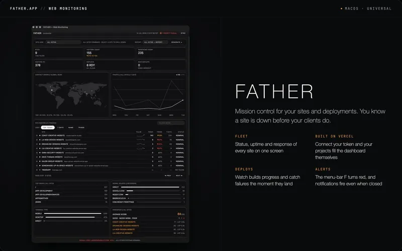
kage
kage
qagent.in
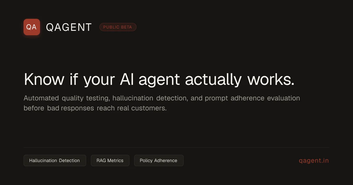
Design analysis
A 1200×630 social card built on a flat warm near-black field with a strict single left axis: a top brand lockup (terracotta rounded-square QA tile, letterspaced uppercase wordmark, dimmed-outline PUBLIC BETA pill), a dominant one-line white headline ending in a period, and a two-line muted-grey subhead. A full-width hairline divider introduces a utility footer — three bordered capability chips on the left, the domain repeated in the accent red on the right. The rust accent (~#c0432a) appears exactly three times (logo tile, beta pill, domain), which keeps the card monochrome apart from a disciplined brand signal, and the large empty band between headline and footer gives the composition its air.
Prompt preview
## Reference images

Study these alongside the description below: hierarchy, rhythm, spacing, colour. Build for the product you are asked about, using this design language.

- Screenshot: https://kage-design-assets.t3.tigrisfiles.io/screenshots/qagent/325a7122-f8f8-4cd1-861a-1f99d2183dff-1789711432120.webp
- Design on Kage: https://kage.design/designs/qagent-og-image

## Before you start
Ask the user what product or announcement this card is for, who the audience is, and what brand assets they already have (name or wordmark, logo mark, brand colours, domain, any status like beta/GA). Also ask for a one-sentence value proposition to use as the headline. Wait for the answers before generating anything. Everything below is applied to their product, not to the reference.

## Page structure
Produce a single social share card at exactly **1200×630** (as HTML/CSS sized to 1200×630 and rendered to PNG, or as a standalone SVG). All content hangs on one left axis with ~80px safe padding on all sides. Four zones, top to bottom:

1. **Header lockup (top-left):** a ~48px rounded-square logo tile in the accent colour with a short white monogram, the product wordmark beside it in uppercase letterspaced sans, and an optional outlined status pill (e.g. "PUBLIC BETA" style) immediately after the wordmark.
2. **Negative space:** a generous empty band separating the lockup from the message — roughly a quarter of the canvas height.
3. **Focal message block (left-aligned, vertically centred-ish):** one line of large white headline copy (~64px) that states what the product does and ends with a period; below it a two-line muted-grey subhead (~26px, max-width ~950px) expanding on how it works.
4. **Footer utility band:** a full-width 1px hairline divider, then a single row — three small bordered capability chips on the left naming key features, and the product domain right-aligned in the accent colour.

## Design language
- **Canvas:** flat, warm near-black background (#1a1a17). No gradients, no photography, no illustration — depth comes only from spacing and a hairline rule.
- **Colour discipline:** the entire card is greyscale except one accent (terracotta/rust ~#c0432a), used exactly three times: the logo tile fill, the status-pill text/border, and the domain text. Accent marks brand identity, never decoration.
- **Type:** one neutral grotesque sans family throughout (Helvetica Neue / Inter class). Hierarchy is built from size and weight, not from adding fonts: headline ~64px regular-to-medium white (#f4f4f1) in sentence case with a full stop for a confident, declarative tone; subhead ~26px muted grey (#8b8b86); wordmark ~30px uppercase with ~0.15em tracking; chips and footer text ~15–18px.
- **Components:** the status pill is a transparent fill with a 1px border in a dimmed version of the accent and small letterspaced text. Chips are transparent with a 1px #3a3934 border, ~8px radius, ~12px vertical padding, and never carry icons. The divider is a 1px #2e2e2a rule spanning the full content width.
- **Composition rhythm:** brand band → large quiet gap → dense text block → utility band. Except for the right-aligned domain, everything aligns to the left edge; asymmetry plus emptiness does the work that decoration would otherwise do.
- **Motion/interaction:** none — this is a static image asset. Keep all contrast ratios high enough that the headline stays legible at link-preview sizes.

## Never
Never reuse QAgent's name, "QA" logo tile, headline copy ("Know if your AI agent actually works."), subhead text, chip labels, or the qagent.in domain. Do not copy the reference's branding or present the output as that product — substitute the user's own brand, colours, and copy, or clearly generic placeholders if they have none yet.