 kage
kage
relic.space
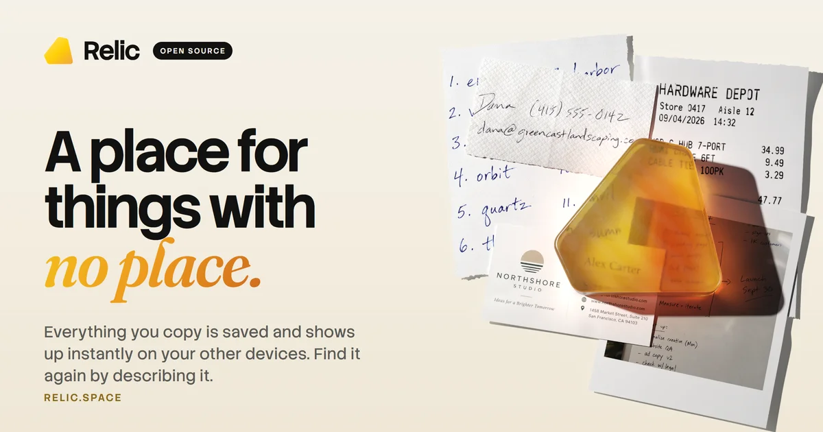
Design analysis
A 1200×630 social card split into a quiet typographic left column and a tactile paper collage on the right. The top-left locks up an amber rounded-triangle mark with the wordmark and a black OPEN SOURCE pill; the headline sets two lines in a heavy geometric sans before pivoting to a high-contrast italic serif for the final phrase in amber — the card's strongest colour moment. The right half layers stationery ephemera (handwritten list, napkin, receipt, business card, polaroid) with soft directional shadows, topped by a translucent amber version of the logo object acting as the brand anchor, while a small letterspaced amber domain line closes the bottom-left.
Prompt preview
## Reference images

Study these alongside the description below: hierarchy, rhythm, spacing, colour. Build for the product you are asked about, using this design language.

- Screenshot: https://kage-design-assets.t3.tigrisfiles.io/screenshots/relic/ccd4e5af-176c-45b9-a369-36c1e674eb1e-1789279303995.webp
- Design on Kage: https://kage.design/designs/relic-og-image

## Before you start
Ask the user what product or project this social card is for, who it is for, and what brand assets they already have (name, logo mark, colours, typefaces, domain). Wait for the answers before writing any code. Everything below is applied to *their* brand — use placeholder branding and copy if assets don't exist yet. The deliverable is a single 1200×630 image (build it as an HTML/CSS page and screenshot to PNG, or as an SVG).

## Page structure
A single fixed artboard, exactly 1200×630, composed as a split canvas:

1. **Header lockup (top-left, ~64px from edges):** a small brand mark (~44–48px) next to a bold wordmark, followed by an optional black pill badge with a short uppercase label. This row establishes the brand before the headline is read.
2. **Headline block (left column, upper-middle):** three lines. Lines one and two in a very heavy sans; line three is the payoff phrase set in an italic serif and coloured in the brand accent. This serif line is the focal point of the whole card.
3. **Supporting line (below headline):** two to three short lines of plain explanatory copy, much smaller, capped at ~460px width so it stays inside the left column.
4. **Domain line (bottom-left):** the site URL in small uppercase letterspaced type, tinted a darker shade of the accent colour. It anchors the corner and balances the badge at the top.
5. **Right collage (right ~45% of canvas, full height, bleeding off the top and right edges):** four to six overlapping paper items — a handwritten list, a napkin or paper-towel sheet, a printed monospace receipt, a business card, a polaroid-style photo — each rotated a few degrees with soft realistic shadows. On top of the stack, one large translucent object in the accent colour shaped like the brand mark, casting its own shadow: this is the visual hero and ties the collage to the brand.
6. **Lighting:** one warm directional light from the upper right; every collage element drops its shadow down-left onto the background.

## Design language
- **Background:** warm cream, approximately `#F2EDE3`. Keep the entire left half flat and quiet so type does all the work; texture and depth live only on the right half.
- **Palette discipline:** exactly three colours — cream background `#F2EDE3`, near-black ink `#111111`, and one amber accent `#E8940A` (darker gold `#B8790F` for the small domain line). The accent appears in only three places: the mark, the serif phrase, the domain.
- **Type pairing:** one heavy geometric sans for the main statement — ~88–96px, tracking about −2%, line-height ~0.95 — paired with one high-contrast italic serif for the final phrase at a similar optical size. Never more than two typefaces. Use a monospace face only inside receipt-like collage items for texture.
- **Supporting copy scale:** ~26–28px, ink at ~80% opacity, line-height ~1.35. Domain and badge labels: 12–14px uppercase, letter-spacing ~0.18em.
- **Badge:** solid black pill, generous horizontal padding, white uppercase text — the only pure-black fill on the card.
- **Collage realism:** paper items in white/off-white, rotations between −8° and +8°, generous overlap; shadows at blur 30–50px and 25–35% opacity. The translucent accent object should look like a physical material (subtle inner gradient, darker shadow beneath).
- **Hierarchy read order:** wordmark → headline serif phrase → amber object → subhead → domain. When previewed at ~300px wide, the serif phrase and the amber object must still be identifiable.
- **Safe areas:** keep all text ≥64px from every edge; only collage items may bleed off-canvas.

## Never
- Never reuse the reference product's name, wordmark, logo shape, tagline, headline copy, domain, or the specific collage contents (the handwritten list text, business card names, receipt line items).
- Never present the result as the reference product — it is the user's own brand in this composition.
- Never use photography or assets copied from the reference; recreate all collage elements as CSS/SVG placeholders with your own invented content.


