kage
kage
saliency.dev
Design analysis
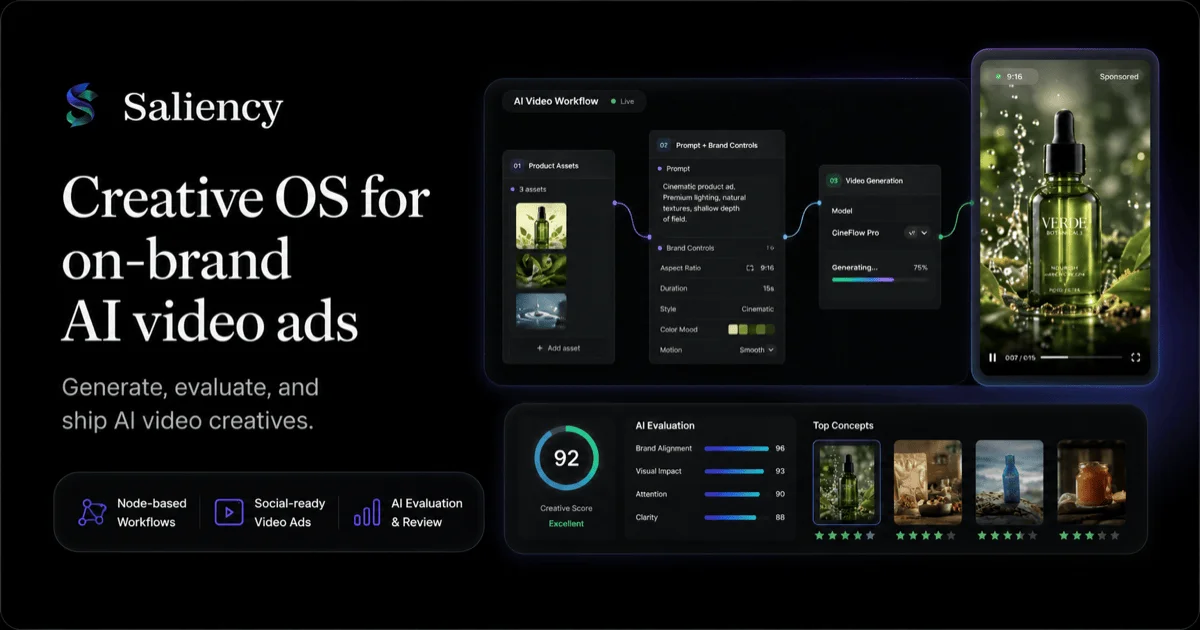
A 1200×630 dark social card that splits the canvas into an editorial left column and a dense product-collage right half. A small mark plus serif wordmark sits above a three-line white serif headline, a gray sans subhead, and a row of three icon pills, while the right two-thirds floats a layered mock of the product: a node-graph workflow panel, a phone mockup playing a vertical ad, and an evaluation panel with a 92-score gauge and blue metric bars. A violet gradient glow traces the rounded card edge, and colour is otherwise rationed — teal appears only in the score ring and product imagery, keeping the chrome monochrome so the headline dominates at preview size.
Prompt preview
## Reference images

Study these alongside the description below: hierarchy, rhythm, spacing, colour. Build for the product you are asked about, using this design language.

- Screenshot: https://kage-design-assets.t3.tigrisfiles.io/screenshots/s-roll/f4f9db66-bdf5-440a-9553-7176213653b6-1789711333206.webp
- Design on Kage: https://kage.design/designs/s-roll-og-image

## Before you start
Ask the user what product this social card is for, who will see it when the link is shared (X, Slack, LinkedIn, iMessage), and the single sentence the card must communicate. Ask for existing brand assets: name, logo mark, brand colours, fonts, and any product screenshot or media frame they want shown. Wait for the answers before building. Everything below is applied to their brand, not to the reference.

## Page structure
The deliverable is one static image at exactly 1200×630 — build it as a 1200×630 HTML/CSS page rendered to PNG (e.g. via a headless screenshot), or as an SVG exported to PNG. Compose it as:

1. **Canvas**: a full-canvas near-black rounded card (outer radius ~28px) with a subtle violet gradient glow tracing the top and right edges, sitting on pure black. Keep ~56–64px internal safe padding.
2. **Brand row** (top-left): a small logo mark (~40px) beside the wordmark in a serif face at ~30px, white.
3. **Headline block** (left column, ~40% width): a display-serif headline set in three short lines at ~56–64px, line-height ~1.05, white. Beneath it a two-line sans subhead at ~20px in mid-gray.
4. **Feature pill row** (bottom-left): three fully-rounded dark pills in a row, each with a small accent icon and a two-line label at ~12px.
5. **Product collage** (right ~58%): layered floating mock-UI panels — a workflow panel containing two or three connected mini-cards (assets, controls, generation state) joined by curved connector lines, a device mockup on the far right edge playing the product's media, and a metrics panel tucked beneath with a circular score gauge plus three or four labelled horizontal bars.
6. **Background detail**: a faint radial glow behind the collage so the dark panels separate from the black canvas.

## Design language
- **Hierarchy**: the serif headline is the largest element and owns the top-left; the mock-UI collage is the second focal point and owns the right; wordmark is small; pills are the smallest text. Nothing competes at the same scale.
- **Rhythm**: deliberately sparse, editorial left half against dense micro-UI right half. Vertical rhythm on the left runs brand → headline → subhead → pills, pinned to top and bottom edges so the column feels composed rather than stacked.
- **Layout**: two-zone grid with intentional overlaps in the collage — the device mockup overlaps the workflow panel's right edge, the metrics panel tucks under both. Gaps between panels are tight (12–20px) so the collage reads as one object.
- **Colour**: background #0A0A0C; panel fill #151519; panel strokes #2B2B33 at 1px; headline and wordmark #F4F4F5; subhead and mock-UI secondary text #8E8E98; violet-to-blue accent #7C5CFF→#3B82F6 for the edge glow, node connectors and progress bars; teal #2DD4A8 reserved for the score ring and success states. Bright colour appears only inside media thumbnails, never in the chrome.
- **Type pairing**: a high-contrast display serif for wordmark and headline against a compact UI sans (10–12px, medium weight) for every label inside the mock panels; the subhead uses the sans at regular weight. Only two families total.
- **Borders, radius, shadow**: outer card gets a 1px violet gradient ring plus a soft outer glow; inner panels get 14–18px radius, 1px light strokes and very soft black drop shadows for lift; pills are fully rounded with dark fills and no stroke or a hairline one.
- **Legibility at preview size**: render mock-UI text no smaller than ~9px effective and verify the card still reads at 600px wide — headline and score must survive shrinking, everything else may blur.
- **Motion**: none — it is a static image. Suggest product behaviour with static cues only: a progress bar mid-fill, a live dot, playback controls.

## Never
Do not reuse the reference product's name, wordmark, logo mark, headline or subhead copy, pill labels, icon set, or its product photography and imagery. Use placeholder branding and copy from the user's own product. Never present the result as the reference product.