kage
kage
tell-we.vercel.app
Design analysis
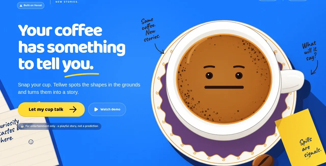
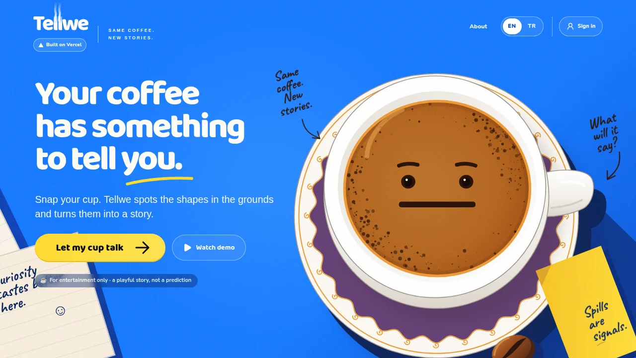
A deliberately single-viewport landing page that sits everything on one saturated cobalt field with no cards, sections or footer. Hierarchy is carried by a strict three-step type scale — an extra-bold rounded display headline with a hand-drawn yellow underline, one supporting paragraph, and 10px letterspaced uppercase micro-taglines. Rhythm below the hero comes not from new sections but from a narrative annotation layer: handwritten arrows, a "Spills are signals" sticky note and a notepad edge that overlap the oversized top-down coffee-cup illustration, while a lone yellow accent is rationed to the primary pill CTA and one illustration prop.
Prompt preview
## Reference images

Study these alongside the description below: hierarchy, rhythm, spacing, colour. Build for the product you are asked about, using this design language.

- Full page: https://kage-design-assets.t3.tigrisfiles.io/screenshots/tellwe/53391754-7b36-48bd-9a17-10851678d0af-1790488917784-full.webp
- Above the fold: https://kage-design-assets.t3.tigrisfiles.io/screenshots/tellwe/53391754-7b36-48bd-9a17-10851678d0af-1790488915147.webp
- Design on Kage: https://kage.design/designs/tellwe-landing-page

## Before you start
Ask the user what product they are building, who it is for, and what brand assets they already have (name, wordmark, colours, typeface, tone of voice). Wait for the answers before writing any code. Everything below is a design language to apply to *their* product — never rebuild the reference site itself.

## Page structure
Design the page as one full-viewport composition (100dvh, no scroll) unless the user explicitly asks for more sections:

1. **Top bar** — left: wordmark with a small logo glyph, a thin vertical divider, then a two-line uppercase micro-tagline in ~10px letterspaced type; below the wordmark, a small dark deployment badge. Right: one plain text link, a two-option language pill toggle (active option = solid white pill with the background colour as its text; inactive = thin white outline), and an outlined pill button with a small person icon.
2. **Hero left column (~45%)** — display headline in three stacked lines, white, extra-bold, rounded terminals, with a hand-drawn yellow underline under the last phrase. Under it a single supporting paragraph (~18px, white at ~90% opacity) explaining the product in two short sentences. Then a CTA row: primary solid pill with dark text and a trailing arrow, plus a secondary outlined pill with a play icon.
3. **Hero right/centre (~55%)** — one oversized flat vector illustration of the product's core object, drawn top-down, overlapping the headline column slightly and bleeding toward the bottom edge. The illustration should hide a small character face inside it (product-as-character).
4. **Annotation layer** — scatter 2–3 handwritten notes around the illustration: curved arrows pointing at details, short asides in casual script (white on the blue field, dark ink on paper props). One prop is a rotated yellow sticky note with a short punchline; one is a lined notepad peeking from the left viewport edge with a handwritten sentence and a tiny smiley.
5. **Disclaimer pill** — directly under the CTAs, a small translucent dark pill with ~12px white text stating the product is for entertainment/not a guarantee. This earns trust without breaking the playfulness.
6. **Bottom-edge props** — a couple of small physical objects (e.g. a bean/seed) sitting on the bottom edge to ground the illustration. No footer, no further sections.

## Design language
- **One colour carries the page:** a saturated cobalt background (~#2B5CF0) fills the entire viewport; everything sits directly on it — no cards, panels, dividers or section backgrounds. Depth comes from illustration, not containers.
- **Three-step type scale only:** display headline (rounded geometric sans — Nunito/Baloo/Quicksand feel — extra-bold, ~clamp(44px, 6vw, 76px), white, line-height ~1.05, tight 3-line stack), one supporting paragraph (~18px, white 90% opacity, max-width ~34ch), and microcopy (10–11px, uppercase, letter-spacing ~0.15em) for taglines and labels. Nothing in between.
- **Colour rationing:** white for all type and outlined controls; one accent yellow (~#FFD23F) used *only* for the primary CTA and one illustration prop (sticky note / underline). Inside the illustration, allow complementary hues — purple shadow (~#6D28D9), coffee brown (~#7A4A21) — but never let them appear in the UI chrome.
- **Buttons are pills:** fully rounded (border-radius 999px). Primary = solid yellow, dark text, arrow glyph, subtle hover lift + darken. Secondary = transparent with 1.5px white border, white text, leading icon. Toggle and sign-in controls use the same pill vocabulary at smaller sizes.
- **Illustration rules:** flat vector, no gradients, thick confident shapes; one oversized object scaled 2–3× larger than realistic proportions; cast its shadow in a saturated contrasting hue instead of grey; give the object a face built from product material so it becomes a character.
- **Handwritten layer:** pair the sans with a casual marker script (Caveat/Shadows Into Light feel). Notes are short asides (3–6 words), slightly rotated (-6° to 8°), connected by curved hand-drawn arrows. They add voice without adding UI.
- **Trust microcopy:** the disclaimer is a 1-line translucent dark pill (rgba(0,0,0,0.45), border-radius 999px, ~12px text) — visible but humble.
- **Density and rhythm:** sparse by design; the page's rhythm is nav → headline block → illustration margins. All narrative energy below the headline comes from annotation layering, not from stacking more sections.
- **Motion (subtle only):** gentle 3–4s float/bob on the central illustration; arrows do a small periodic wiggle; pill buttons scale to ~1.03 on hover; nothing slides in aggressively.
- **Localization affordance:** if the product is multilingual, use the two-pill toggle pattern in the nav rather than a dropdown.

## Never
Never reuse the Tellwe name, wordmark, cup logo, "Same coffee. New stories." copy, the coffee-cup-with-face illustration, the sticky-note or notepad drawings, or any of the page's actual sentences. Do not present the result as Tellwe or imply any affiliation with it. Apply the design language to the user's own product, object and voice.