kage
bonds.chat

Design analysis
A playful consumer landing page built as alternating full-width colour "panels" (electric blue, violet, peach-pink) floating as rounded cards on a near-black background, each panel an illustrated scene with a 3D furry mascot and oversized condensed display type. Product UI (chat bubbles, streak cards, phone mockups) is embedded directly into the panels as floating glass cards, so every claim is shown as an in-context artifact. Generous black spacing between panels creates a slow, theatrical scroll rhythm, and the page closes with a final blue CTA panel with QR code and store buttons.
Prompt preview
## Reference images

Study these alongside the description below: hierarchy, rhythm, spacing, colour. Build for the product you are asked about, using this design language.

- Full page: https://kage-design-assets.t3.tigrisfiles.io/screenshots/bonds/92b84629-52db-439e-9b50-1b68fbcd9bda-1792562529975-full.webp
- Above the fold: https://kage-design-assets.t3.tigrisfiles.io/screenshots/bonds/92b84629-52db-439e-9b50-1b68fbcd9bda-1792562527254.webp
- Design on Kage: https://kage.design/designs/bonds-landing-page

# Playful mascot-panel landing page

## Before you start
Ask the user: what product are you building, who is it for, and what brand assets exist (name, logo, colours, type, mascot/illustration style)? Wait for answers before writing code. Everything below is applied to *their* product.

## Page structure
Build a single scroll page with a near-black body; each section is a full-width rounded panel with its own vivid background colour, separated by generous bands of black so each scene reads like a slide.

1. **Sticky dark nav**: small left logo, right side two pill buttons ("open on web", "get the app" with app-store glyph). Very compact.
2. **Hero panel** (electric blue gradient, ~28px radius corners): oversized all-caps condensed display headline stacked in 3 centred lines, a big 3D mascot peeking below it, and 2–3 floating chat bubbles (avatar, name, one-liner) positioned at the panel edges like real messages. A small "scroll for more" hint at the bottom edge.
3. **Feature intro band**: black section with a two-line stacked headline — line 1 white, line 2 in the brand accent colour — acting as a chapter break.
4. **Named-chat panel**: two-column layout; left a rounded dark card showcasing a mascot for one group, right a headline plus a row of five colour-dot avatars and a vertical list of chat-row cards (group name, last message, coloured unread dot). Product UI is rendered directly, not screenshotted.
5. **Positioning panel** (blue gradient): a struck-through word above a big stacked headline ("not X — a Y with Z"), a two-line friendly subtitle, and 3D emoji-style objects (controller, clipboard, heart, trophy) floating at the panel corners. Mascot peeking from the bottom edge.
6. **Capabilities panel** (violet/lavender gradient): headline centred with explanatory paragraph, surrounded by floating tilted cards — a funding progress card, a streak card ("12 days, nobody skipped"), a book-club progress card, polaroid-style photo stickers. Cards overlap the panel edges slightly.
7. **Media panel** (peach-to-pink gradient): two columns — left dark all-caps headline plus short paragraph, right a phone mockup of the app running in the chat, mascot with a prop at the bottom.
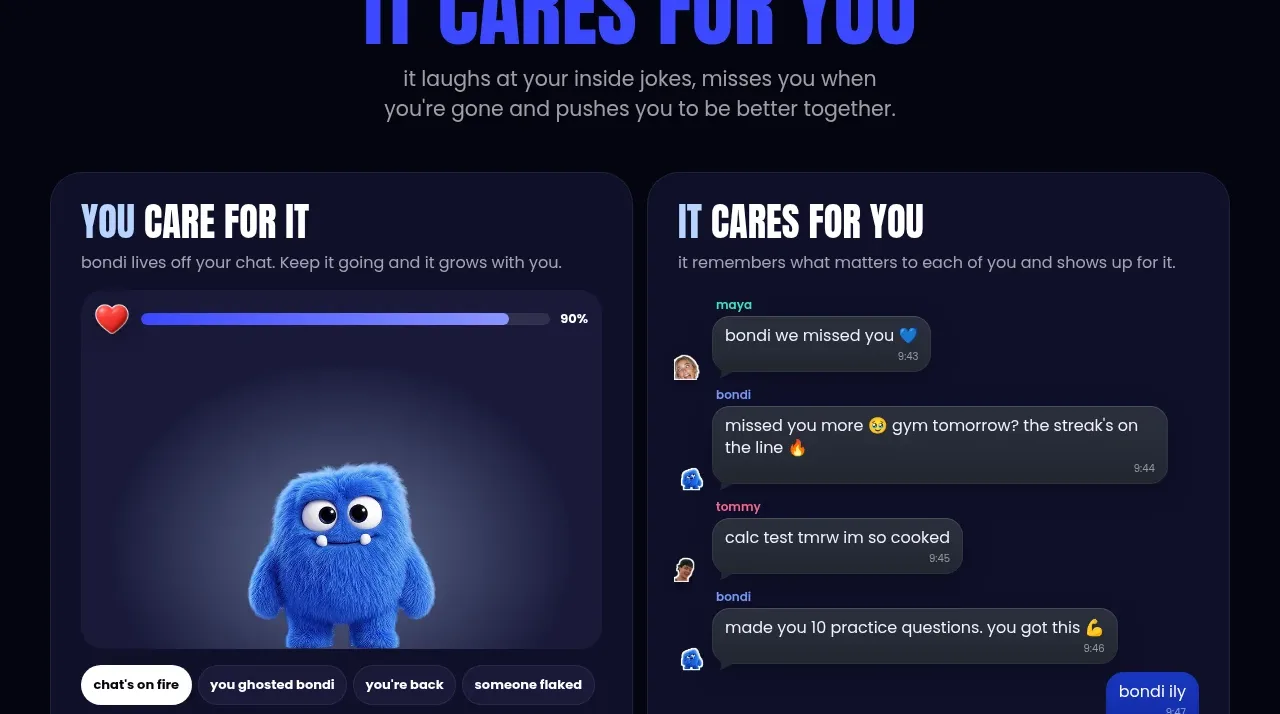
8. **Care/reciprocity band**: black section with two-tone stacked headline, then two equal dark cards side by side: left an interactive-feeling panel (progress bar, mascot, selectable pill chips like "chat's on fire", "you ghosted me") and right a chat transcript card showing the mascot replying to friends.
9. **Final CTA panel** (blue gradient): stacked all-caps headline, short invite paragraph, QR code, App Store pill button and a secondary "open on web" button, mascot and a photo sticker decorating the corners.
10. **Footer**: single dark row — tiny logo left, language switcher centre, copyright right.

## Design language
- Hierarchy: enormous condensed all-caps display type for headlines (three stacked lines, tight leading), small friendly rounded sans for body copy; nothing in between — size does all the work.
- Rhythm: alternating coloured panels and black breathing space; density inside panels is high (floating cards, bubbles, mascots) while transitions are empty — this contrast is the whole feel.
- Colour: near-black body `#0b0b12`; panel gradients from electric blue `#3b46f1` → violet `#7b6cf6`, lavender `#b9a8f5`, peach-pink `#f8c8b8` → `#f7a8c0`; accent text in `#4f5cff` on dark. Cards float in white or deep translucent dark `rgba(20,20,40,0.7)` with subtle borders.
- Type: pair an ultra-bold condensed display face (all caps, white) with a rounded geometric sans for body; use two-tone headlines (white line + accent-colour line) as a recurring motif.
- Shape & depth: all panels and cards use large radius (20–32px); depth comes from soft coloured shadows and slight tilt/overlap on floating cards, not hard borders. Glassy translucent surfaces inside dark cards.
- Motion: gentle float/bob on mascots and floating objects, subtle parallax on chat bubbles, hover lift on pill buttons; keep it playful and springy.
- UI-as-content: render product UI (chat rows, streaks, progress bars, phone frames) as crafted components inside the scenes rather than screenshots.

## Never
No copying of the reference's mascot, logo, "bondi" naming, headlines, emoji stickers, photos, or exact copy. Build the same visual system for the user's own product with their own assets, characters and wording; never present the result as the reference product.
Components from this page
All components
 Top navigation
bonds · Navigation
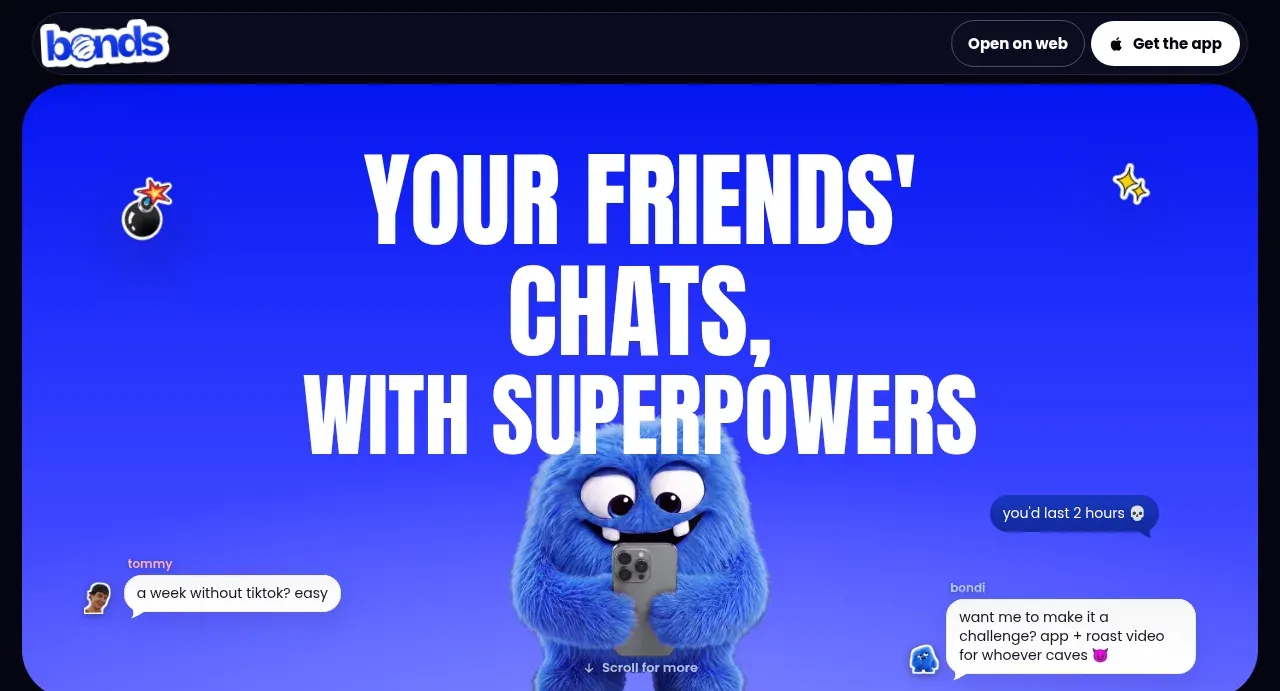 Chat superpowers hero
bonds · Hero
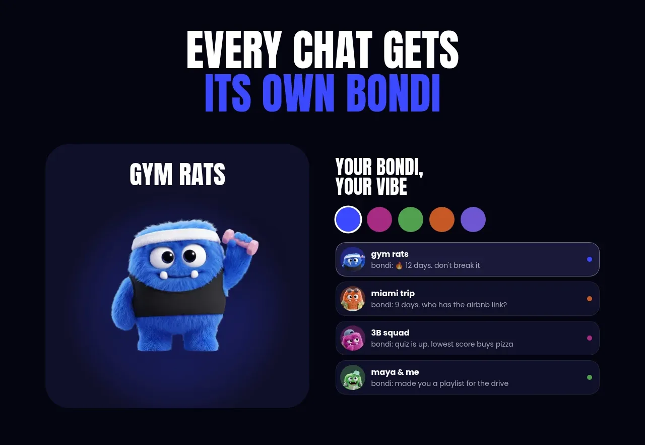 Personalized chat identity
bonds · Hero
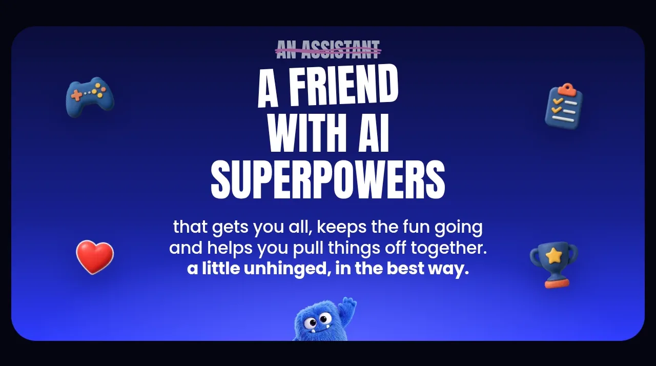 AI friend positioning
bonds · Hero
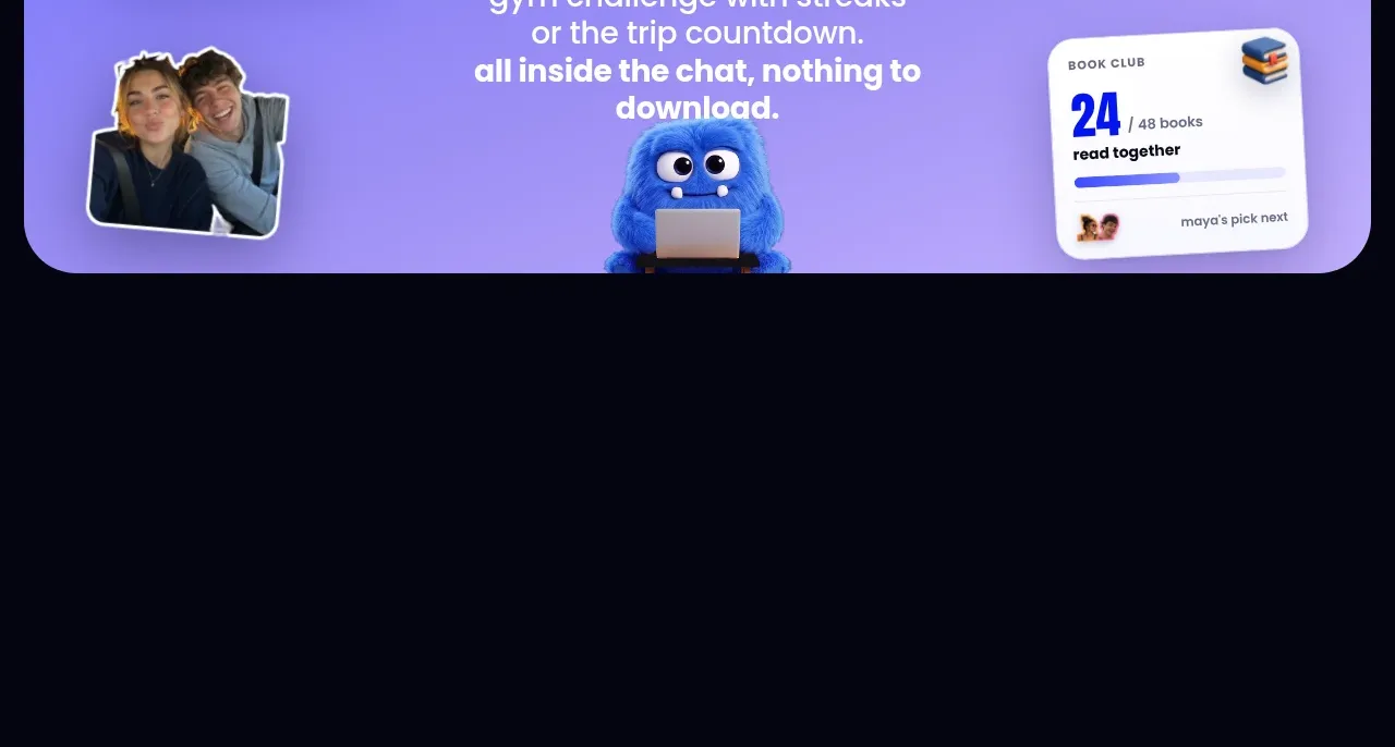 Built-in activities
bonds · Hero
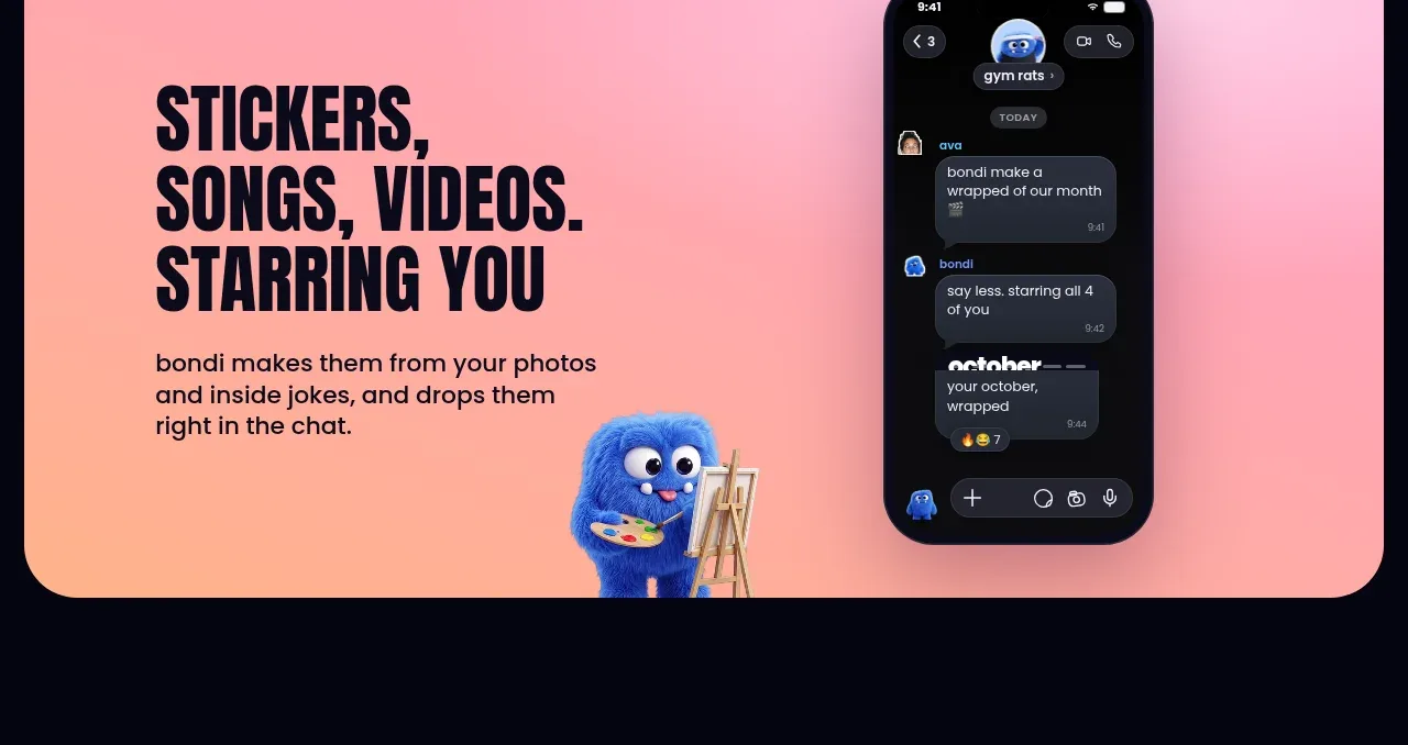 Creative chat media
bonds · Feature grid
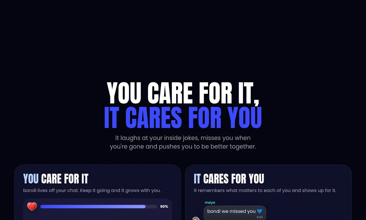 Care loop comparison
bonds · Feature grid
 Download and start CTA
bonds · Call to action
 Site footer
bonds · Footer