 kage
kage
tell-we.vercel.app
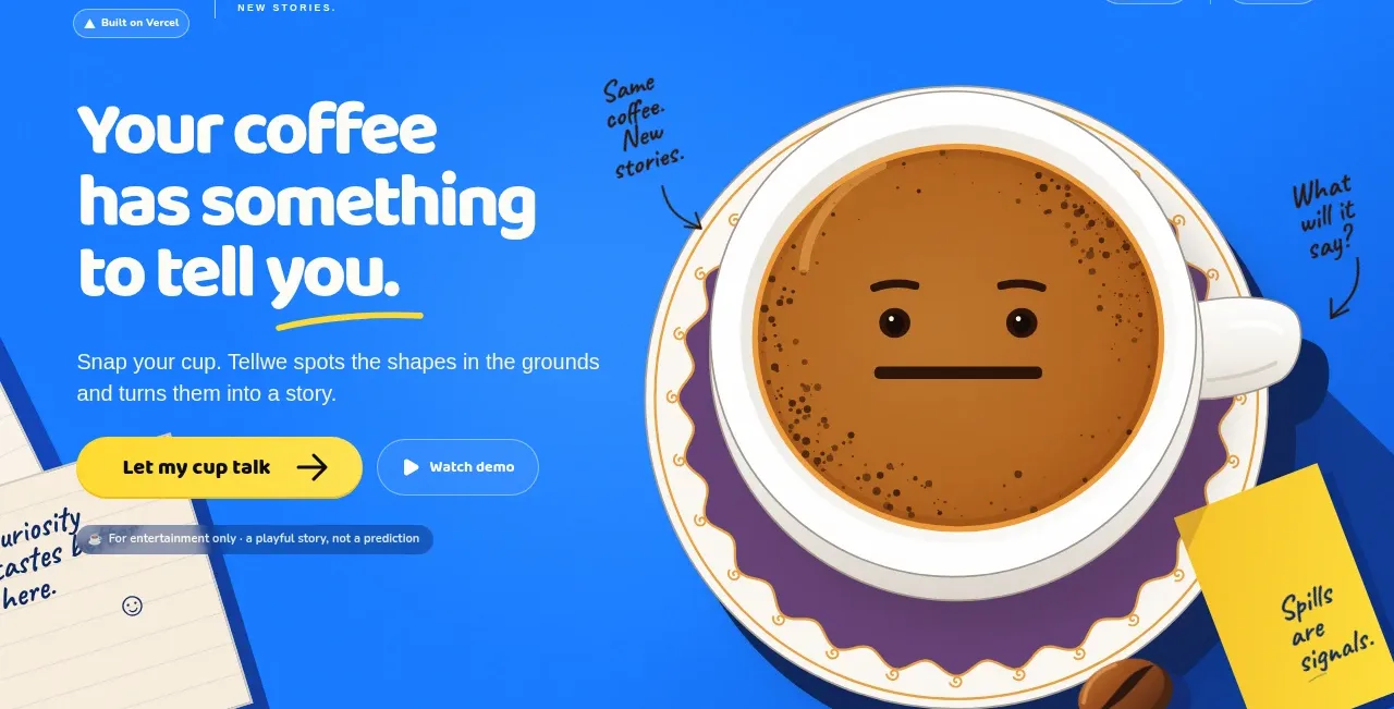
Design analysis
The hero pairs an oversized, highly legible left-aligned promise with a short explanation and two contrasting actions, while a large expressive product visual dominates the right side and overlaps the colorful background.
Prompt preview
## Reference images

Study these alongside the description below: hierarchy, rhythm, spacing, colour. Build for the product you are asked about, using this design language.

- Component: https://kage-design-assets.t3.tigrisfiles.io/components/tellwe/53391754-7b36-48bd-9a17-10851678d0af-1790488949-1.webp
- Full page it was cut from: https://kage-design-assets.t3.tigrisfiles.io/screenshots/tellwe/53391754-7b36-48bd-9a17-10851678d0af-1790488917784-full.webp
- Component on Kage: https://kage.design/component/tellwe-hero

## Before you start
Ask what the user's product is, who it serves, and what brand personality and visual system it should use. Apply the principles below to that product rather than reproducing the reference.

Build a full-width landing-page hero beneath the navigation. Use a two-column composition: a strong text block on the left and a large product-relevant visual on the right. Let the visual extend toward or beyond the hero edge, but preserve enough contrast and whitespace for the message to remain instantly readable.

Design language:
- Use a vivid blue background close to `#1678EE`, with optional abstract geometric accents in darker blue and warm yellow.
- Set the headline in a large rounded display face, approximately 56–72px desktop, bold, tight leading around 0.95–1.05, and white text. Use a short highlighted underline or accent stroke in yellow `#FFD52F`.
- Keep supporting copy beneath the headline at roughly 17–20px with a relaxed 1.45 line height and slightly softened white.
- Place a primary pill CTA in warm yellow `#FFD52F` with near-black text and a strong directional icon; add a secondary transparent or outlined pill CTA beside it.
- Use a large, expressive product visual or illustration on the right with an irregular, playful silhouette. It may overlap decorative cards, notes, or abstract shapes, but the visual hierarchy must remain clear.
- Add small handwritten-style annotations only when they reinforce the story; keep them secondary and ensure accessible text alternatives.
- Use a generous desktop hero height, around 420–560px, and stack the columns on small screens with the visual below the actions.
- Provide hover, focus, and pressed states for both CTAs; preserve keyboard visibility and sufficient color contrast.

Never:
- Never use the reference's logos, product names, copy, illustrations, or imagery.
- Never copy the coffee cup, handwritten annotations, exact composition, or decorative notes.
- Never sacrifice headline readability for decorative artwork.
More components
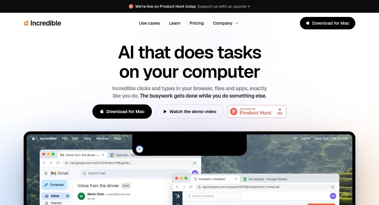
 AI workflow hero
Incredible · Hero
AI workflow hero
Incredible · Hero
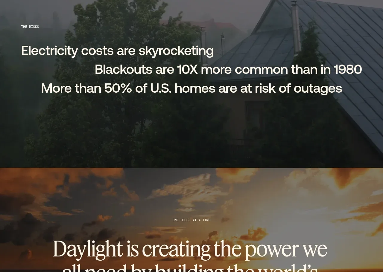
 Decentralized energy statement
godaylight.com · Hero
Decentralized energy statement
godaylight.com · Hero
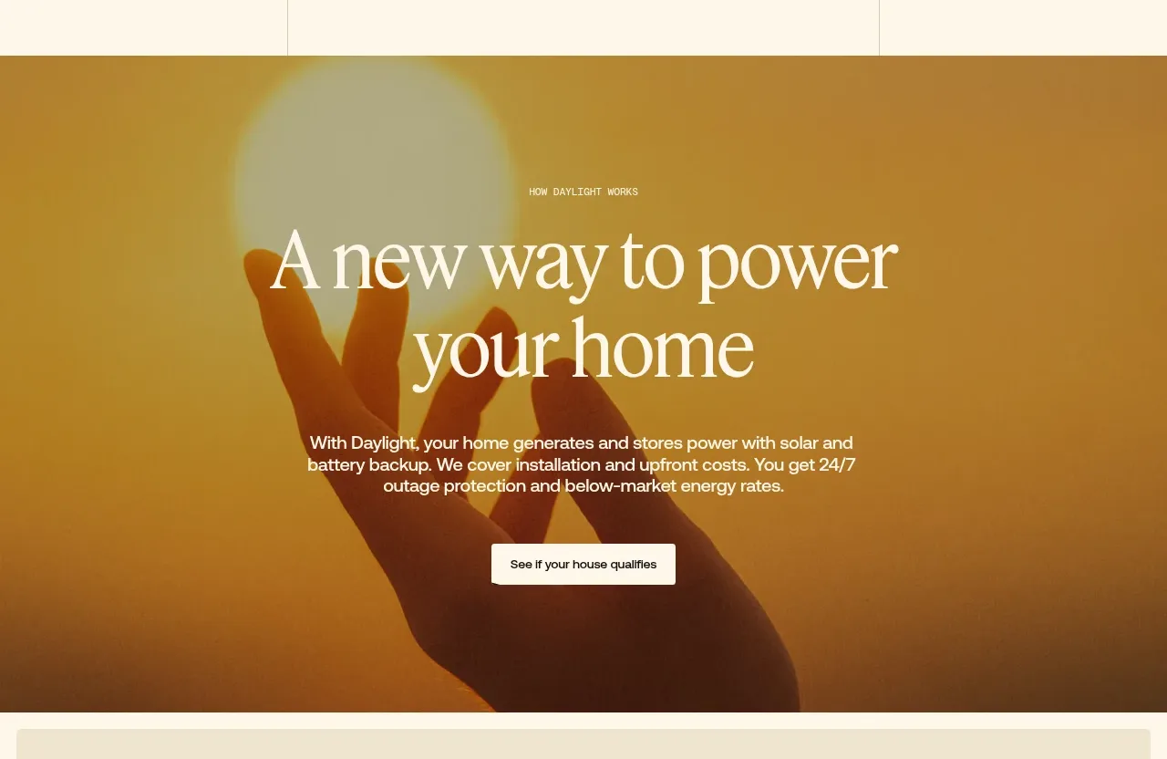 Warm mission statement panel
godaylight.com · Hero
Warm mission statement panel
godaylight.com · Hero
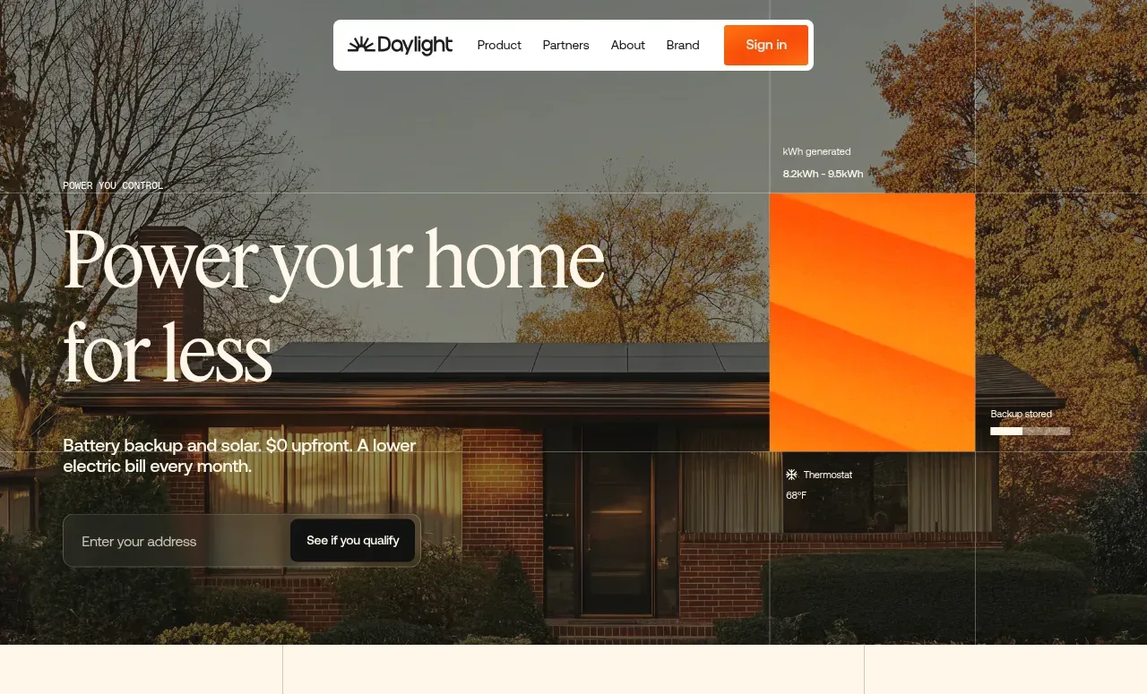 Photographic power-home hero
godaylight.com · Hero
Photographic power-home hero
godaylight.com · Hero
 Grid problem statement
godaylight.com · Hero
Grid problem statement
godaylight.com · Hero
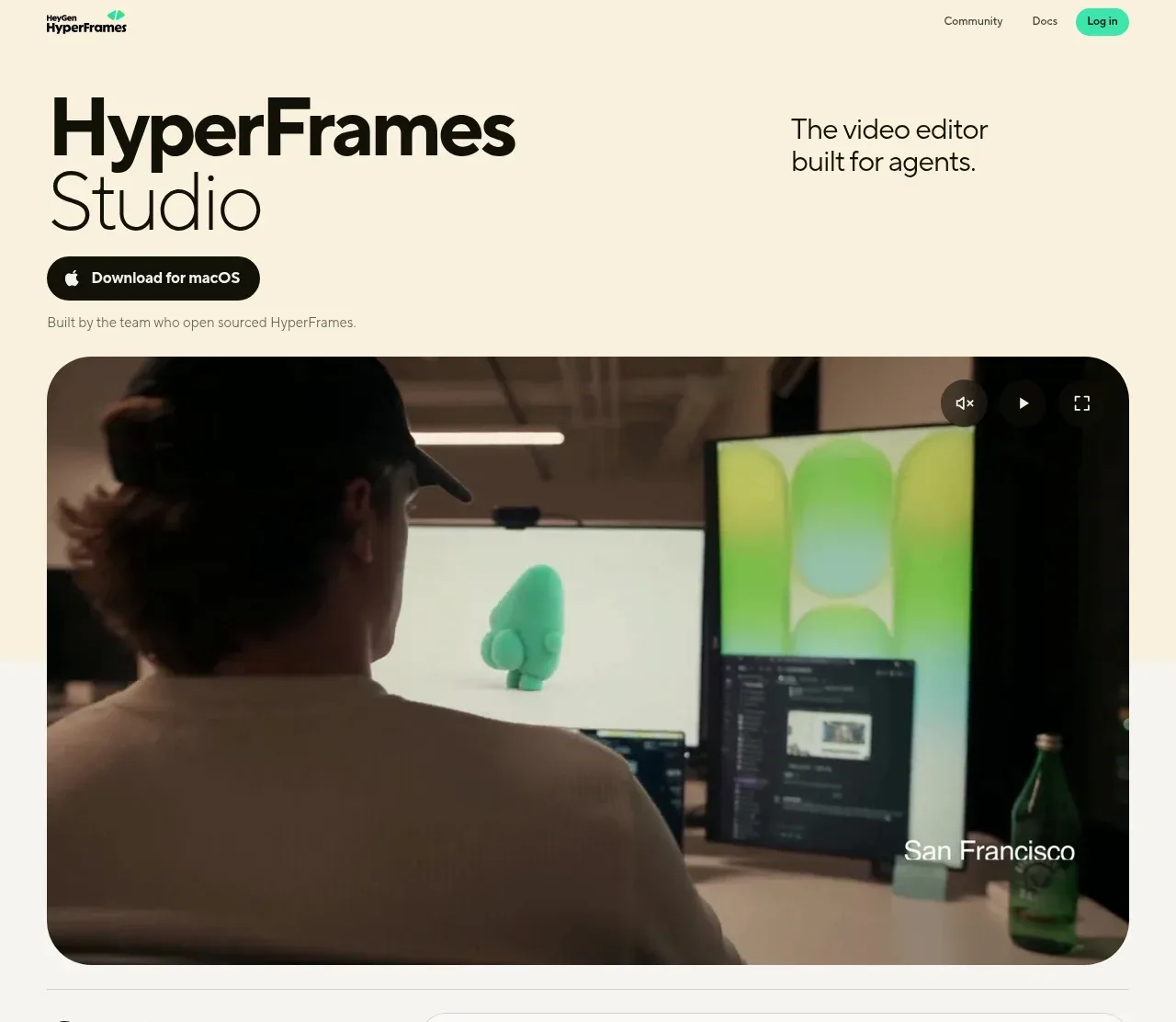
 Product hero with download action and video
HyperFrames Studio (Desktop) · Hero
Product hero with download action and video
HyperFrames Studio (Desktop) · Hero