kage
kage
callfifi.app
Design analysis
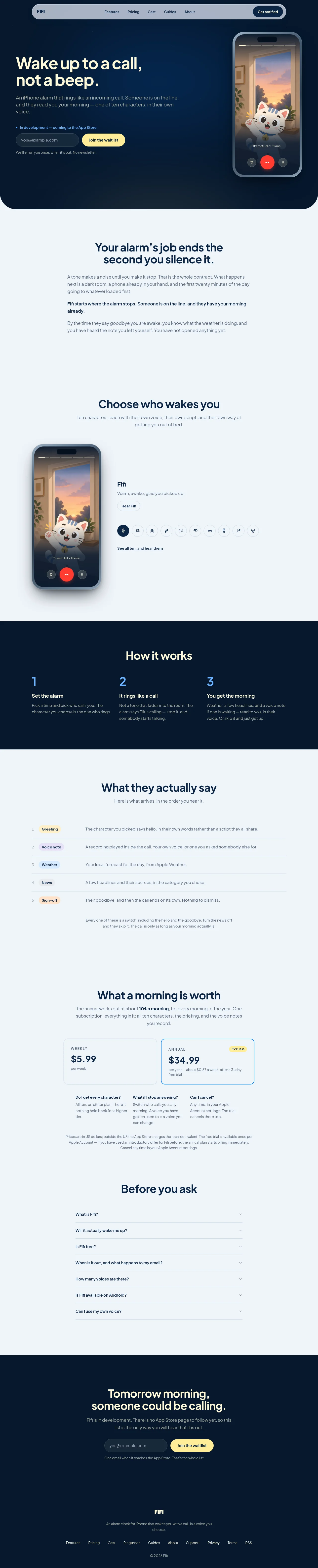
A long-form consumer landing page pairs a deep navy hero and footer with a cool near-white content field, using pale blue-gray surfaces and lemon-yellow accents for calls to action. The page moves from a spacious, image-led hero into centered narrative copy, a character selector with a phone mockup, a dark three-step explainer, a dense tabular content sequence, pricing cards, FAQ rows, and a final waitlist conversion block; restrained borders, soft shadows, and large rounded containers keep the product approachable without becoming playful-heavy.
Prompt preview
## Reference images

Study these alongside the description below: hierarchy, rhythm, spacing, colour. Build for the product you are asked about, using this design language.

- Full page: https://kage-design-assets.t3.tigrisfiles.io/screenshots/fifi/65f510a7-1d11-431a-a427-6e570df25f2f-1789538432367-full.webp
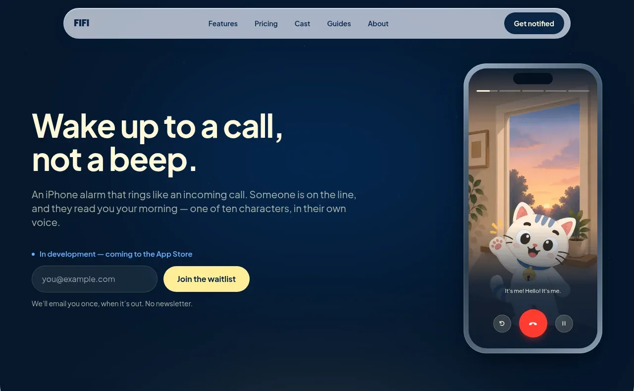
- Above the fold: https://kage-design-assets.t3.tigrisfiles.io/screenshots/fifi/65f510a7-1d11-431a-a427-6e570df25f2f-1789538429129.webp
- Design on Kage: https://kage.design/designs/fifi-landing-page

## Before you start
Ask the user what they are building, who it is for, and what brand assets they already have, including the product name, colours, typefaces, imagery, and any existing logo or illustration system. Wait for their answers before designing. Apply the system below to their product, not to the reference product.

## Page structure
1. **Pill navigation:** Place a wide rounded navigation bar near the top of the page, with a compact brand label at left, a small set of centered text links, and a dark rounded action button at right.
2. **Hero:** Use a deep navy rounded-bottom hero panel. Put a large two-line headline and short explanatory paragraph on the left, followed by a small status line, email waitlist form, and quiet supporting note; place a tall phone/product mockup on the right.
3. **Problem framing:** Transition to a cool near-white background and a narrow centered text column. Use a large centered heading, two explanatory paragraphs, and one bold emphasis paragraph with generous vertical breathing room.
4. **Character or option selector:** Introduce the product’s selectable options with a centered heading and subtitle. Below it, use a horizontal composition with a large product/device visual on the left and selected-option title, description, small secondary button, circular option controls, and an underlined browse link on the right.
5. **How-it-works band:** Add a full-width navy section with a centered light heading and three evenly spaced columns. Number each step in bright blue, then provide a compact title and short supporting copy.
6. **Content sequence section:** Return to the pale background with a centered heading and subtitle. Present the product output as a five-row numbered list or table, using small pastel category pills, thin horizontal separators, and descriptions aligned in a second column; finish with a short centered note.
7. **Pricing section:** Add a centered pricing heading and explanatory paragraph, then two side-by-side plan cards. Give the recommended plan a crisp blue outline and a small yellow savings badge; follow with three compact FAQ-style reassurance columns and a centered legal/pricing note.
8. **FAQ:** Use a centered heading and a single narrow accordion list. Each question occupies a spacious row with a subtle bottom border and a small chevron aligned to the right.
9. **Final conversion panel:** Close the light content area with a dark navy full-width CTA section. Center a pale-yellow two-line heading, short muted paragraph, email field and yellow submit button, plus a small reassurance line.
10. **Footer:** Keep the footer in the same navy field. Center the brand label, one-sentence description, a single horizontal row of utility links, and a small copyright line.

## Design language
- Build hierarchy through a restrained type scale: oversized bold display headings around 48–64px on desktop, section headings around 32–40px, body copy around 14–17px, and compact utility text around 11–13px.
- Use a friendly, modern sans-serif with heavy, slightly tight headings and calm regular-weight body text. Keep headings dark navy on light surfaces and pale cream on dark surfaces.
- Establish the palette with deep navy around `#061A30` or `#071B31`, cool blue-gray background around `#EEF4F8`, white around `#F8FBFC`, muted slate text around `#71808F`, bright blue around `#5C9CF0`, and lemon yellow around `#FFF080` for primary actions and small highlights.
- Let rhythm change down the page: the hero and narrative sections are spacious and editorial, the selector and three-step band become more structured, the output list and pricing area are denser, and the FAQ/footer simplify the layout again.
- Use a centered max-width content container, generally 680–900px for copy and about 1100–1200px for multi-column sections. Keep text measure narrow enough for comfortable reading.
- Treat controls and cards as soft, tactile objects: use 18–28px corner radii on major panels and cards, pill shapes for buttons, tags, inputs, and the top navigation, and only very soft diffuse shadows under device imagery and selected cards.
- Prefer 1px low-contrast blue-gray borders over heavy outlines. Use a brighter blue border only to indicate the selected or recommended pricing state; avoid gradients and excessive shadowing.
- Use imagery as a focal accent rather than filling every section: a tall rounded device mockup should carry the hero and selector visuals, with a soft halo/shadow to separate it from the pale background.
- Make primary actions yellow with dark text, secondary actions dark navy or lightly outlined, and status/category pills use small pastel fills such as pale yellow, lavender, blue, and peach.
- Keep interaction understated: rounded buttons should have clear hover contrast, selector controls should visibly indicate the active option, accordion rows should reveal content with a subtle height transition, and the pricing selection should remain visually obvious without animation-heavy effects.
- Preserve generous vertical gaps between major sections, but use thin rules and compact row spacing in list, pricing reassurance, and FAQ areas to create a clear information-density shift.

## Never
- Do not copy the reference product’s logos, wordmarks, product name, written copy, character names, phone artwork, illustrations, photography, or icon set.
- Do not reproduce the reference brand or present the result as that product.
- Create original content, imagery, and visual assets for the user’s product while retaining only the reusable layout principles and design language above.
Components from this page
All components
 Floating pill navigation
Fifi · Navigation
Floating pill navigation
Fifi · Navigation
 Call-like alarm hero
Fifi · Hero
Call-like alarm hero
Fifi · Hero
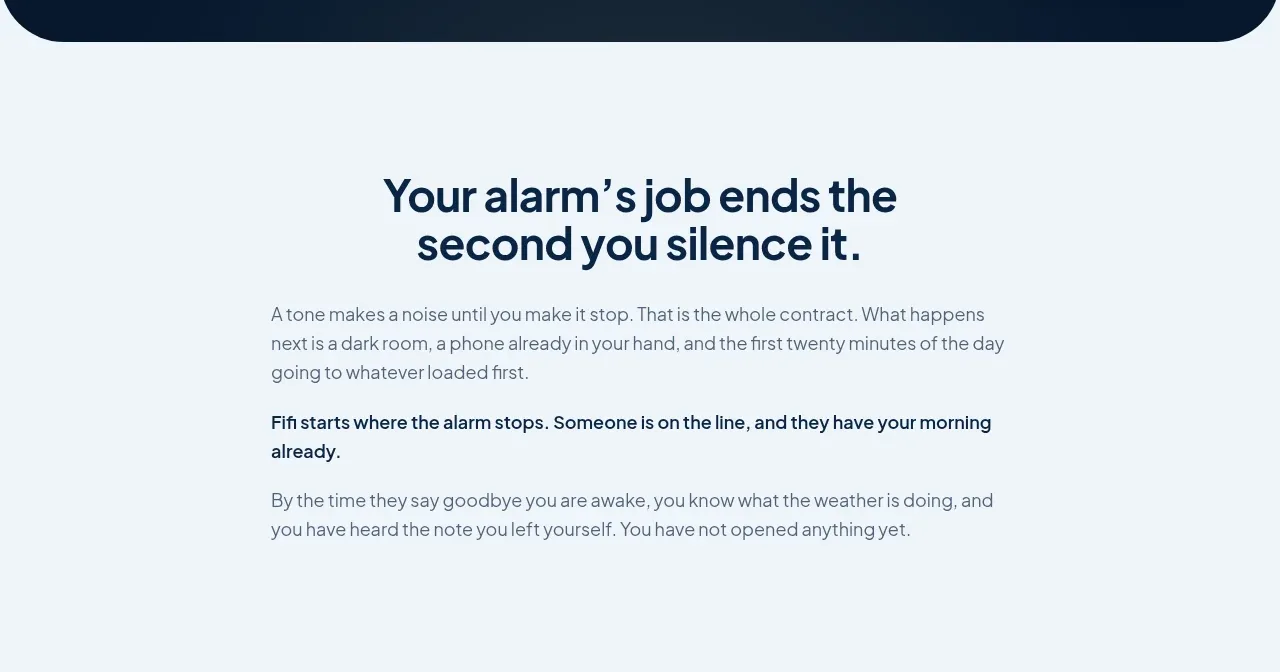 Problem framing statement
Fifi · Card
Problem framing statement
Fifi · Card
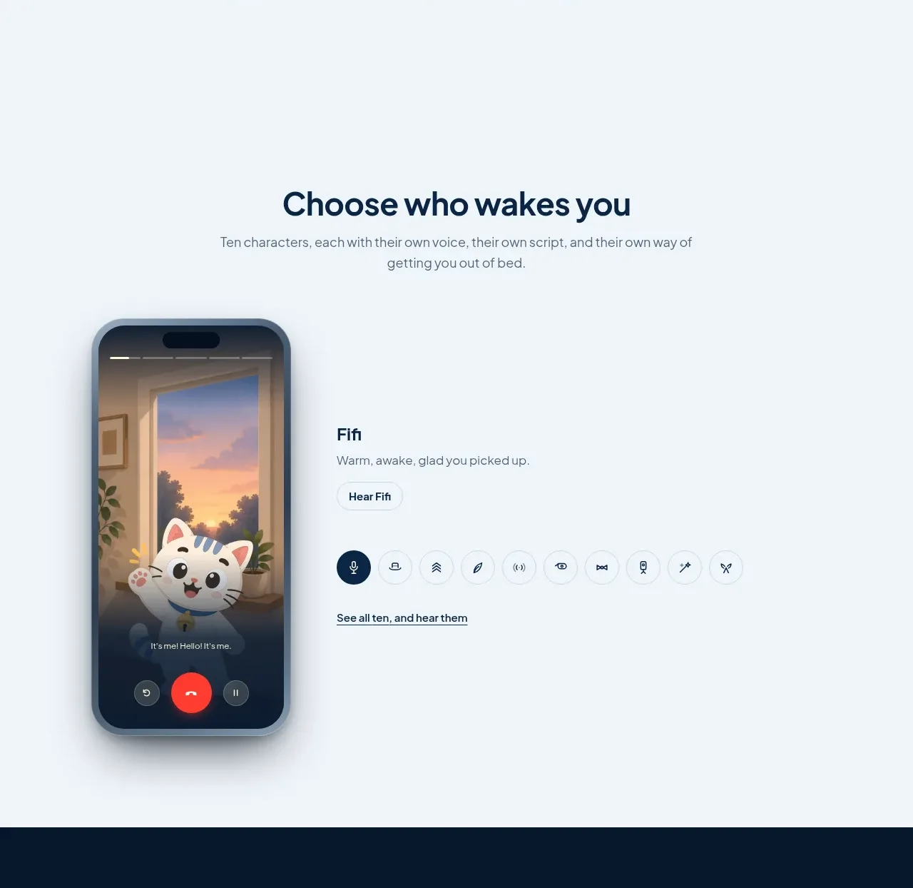 Character chooser showcase
Fifi · Feature grid
Character chooser showcase
Fifi · Feature grid
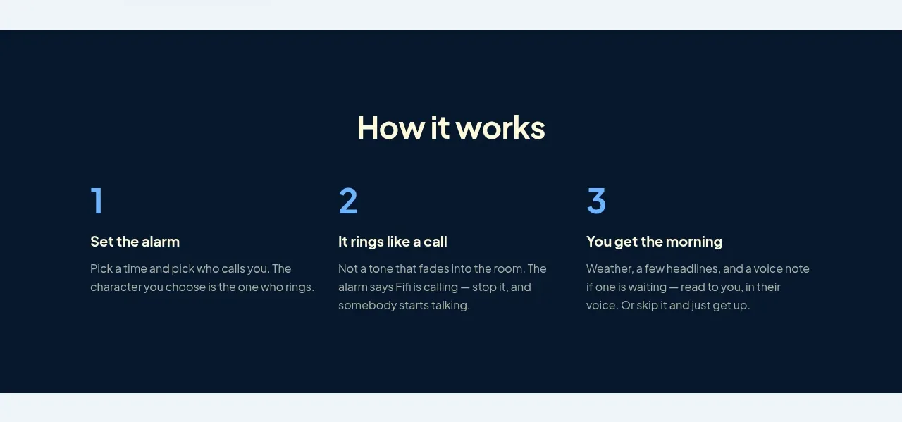 Three-step how-it-works
Fifi · Feature grid
Three-step how-it-works
Fifi · Feature grid
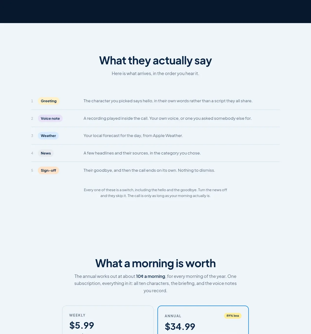 Ordered experience sequence
Fifi · Table
Ordered experience sequence
Fifi · Table
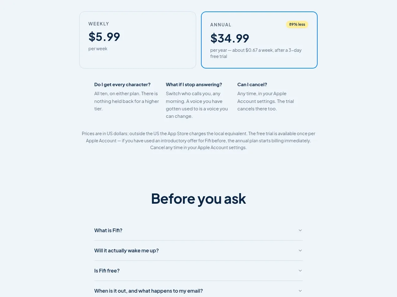 Simple subscription pricing
Fifi · Pricing table
Simple subscription pricing
Fifi · Pricing table
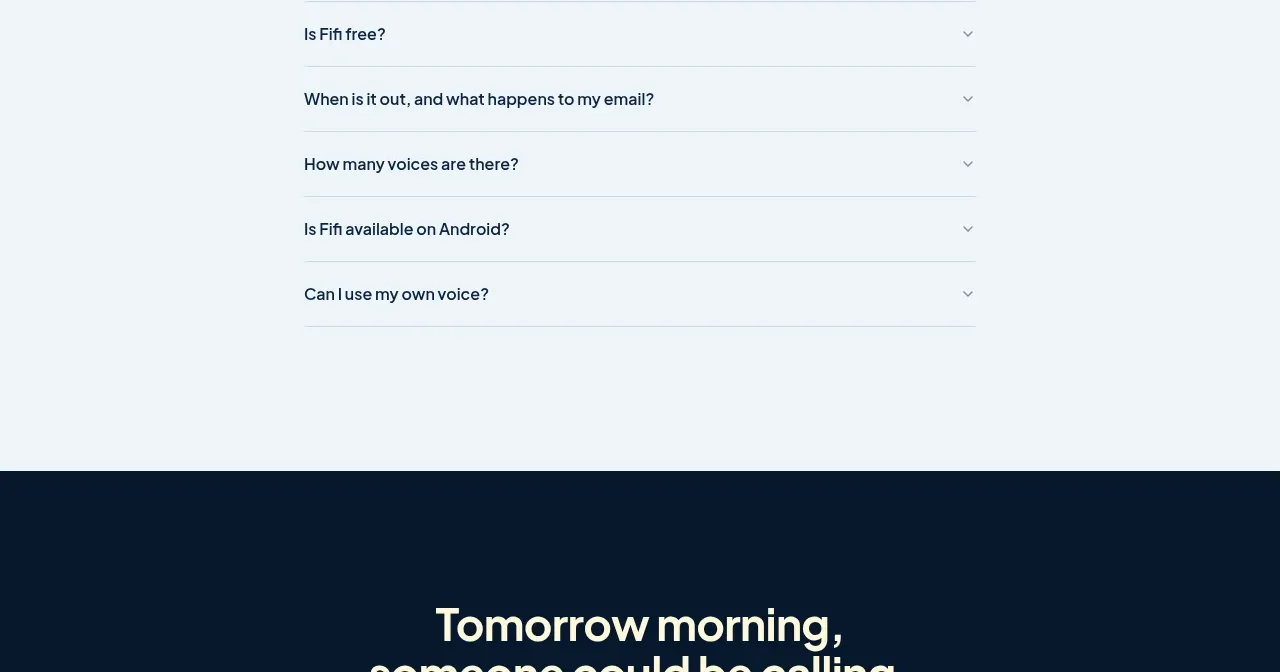 Expandable questions
Fifi · FAQ
Expandable questions
Fifi · FAQ
 Dark waitlist call to action
Fifi · Call to action
Dark waitlist call to action
Fifi · Call to action
 Minimal dark footer
Fifi · Footer
Minimal dark footer
Fifi · Footer