kage
bonds.chat
Design analysis
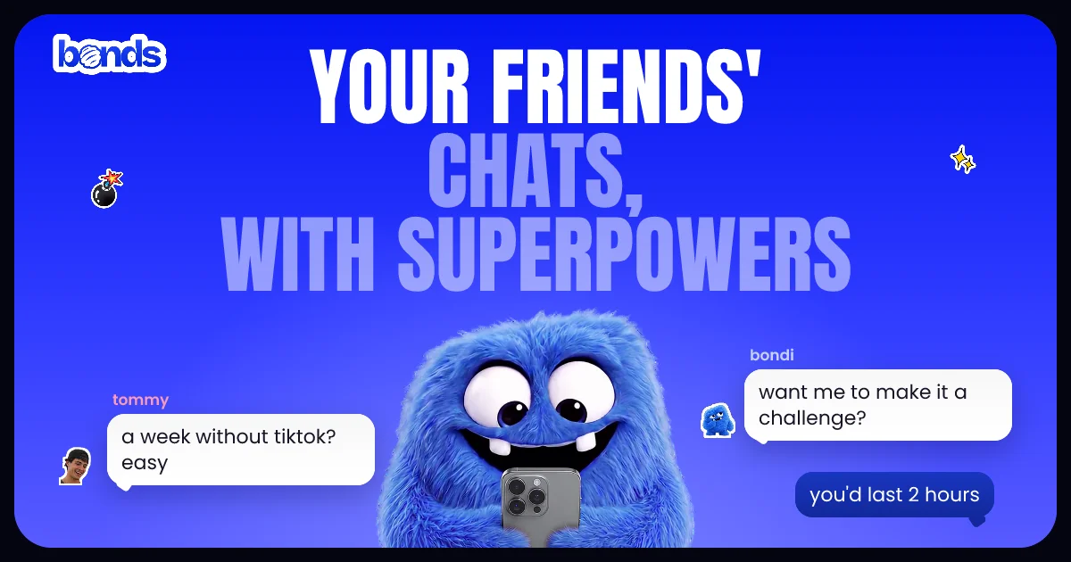
A playful 1200×630 social card on a saturated blue gradient with rounded black corners. A huge white/pale-lavender condensed sans headline dominates the top half, a fuzzy blue mascot holding a phone anchors the centre, and two chat bubbles with sender names and small avatar stickers flank it left and right, telling the product story at a glance. Sticker-like accents (bomb, sparkles) scattered in the margins keep it feeling like a group chat, and a white bubbly wordmark sits top-left.
Prompt preview
## Reference images

Study these alongside the description below: hierarchy, rhythm, spacing, colour. Build for the product you are asked about, using this design language.

- Screenshot: https://kage-design-assets.t3.tigrisfiles.io/screenshots/bonds/5b30ee29-e659-487a-80f5-f13192c3de4d-1792562528898.webp
- Design on Kage: https://kage.design/designs/bonds-og-image

## Before you start
Ask the user what product the card is for, who it is for, and what brand assets they have (name, logo, colours, mascot/imagery, tagline). Wait for the answers. Everything below is applied to their product, not the reference.

## Task
Produce a single **1200×630 social share card** (Open Graph image), built as HTML/CSS and rendered to PNG, or as SVG. Use placeholder branding and copy throughout.

## Page structure (canvas composition)
- **Canvas**: 1200×630 with a solid dark (near-black) background and a large rounded-rectangle (~24–28px radius) inset card filled with a vertical brand-colour gradient (saturated hue at top, slightly darker/deeper at bottom), leaving a visible dark frame around all edges.
- **Top-left**: small wordmark lockup in a rounded, sticker-style treatment (white letters with soft outline/shadow).
- **Top-centre (primary focal layer)**: three-line stacked headline in an ultra-bold condensed uppercase display face, very large (~120–150px equivalent), centred. Two-tone treatment: first line in white, following lines in a light tint of the brand colour (~20–30% lighter/desaturated) so the eye reads line one first.
- **Centre (secondary focal layer)**: a character/mascot or product hero image breaking the baseline of the headline, occupying the middle third, overlapping the headline's bottom slightly to unify the layers.
- **Left and right flanks (tertiary layer)**: two chat-message groups at different heights — a sender name in small lowercase brand-coloured text, a white rounded speech bubble (~20px radius, small tail) with 1–2 lines of casual dark text, plus a tiny circular avatar sticker. One bubble lower-right inverts to a dark bubble with light text for reply rhythm.
- **Margins**: 2–4 small playful sticker accents (sparkles, doodads) scattered asymmetrically to fill negative space without crowding.

## Design language
- One dominant brand hue carried by a full-canvas gradient; white and one dark neutral for text; a single accent tint for the headline's secondary lines.
- Hierarchy by size and contrast: display headline → hero image → chat bubbles → wordmark/stickers.
- Two-tone headline (white + tinted) creates depth without extra colour.
- Bubble UI idiom (rounded rects, tails, sender labels, avatars) instantly signals a chat product — keep bubbles realistic and legible at thumbnail size (~16–20px bubble text).
- Rounded everything: card corners, bubbles, avatars, wordmark treatment; no hard edges.
- Slight scattered/asymmetric sticker placement gives casual energy; core content stays centre-aligned and symmetric.
- Keep total text under ~25 words; largest text must remain readable at 300px-wide preview.

## Never
No logos, wordmarks, character designs, copy, illustration style or sticker icons copied from the reference. Create placeholder brand name, mascot-free imagery (or the user's own assets) and original copy. Never present the result as the reference product.