kage
kage
thinkingorbs.com
Design analysis
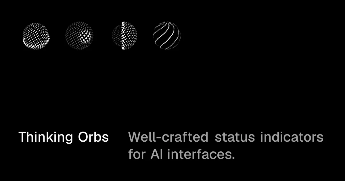
A near-black 1200×630 social card that spends its whole budget on two moves: a row of four halftone dot-spheres in the upper-left that read as sequential frames of one animation, and a two-column, baseline-aligned text lockup pinned to the bottom edge — bold white wordmark beside a gray two-line tagline. Luminance does all the hierarchy work (white → gray → black), roughly 60% of the canvas is left empty, and the flat, borderless, shadowless rendering keeps every bit of attention on the dotted texture of the specimens.
Prompt preview
## Reference images

Study these alongside the description below: hierarchy, rhythm, spacing, colour. Build for the product you are asked about, using this design language.

- Screenshot: https://kage-design-assets.t3.tigrisfiles.io/screenshots/thinking-orbs/4711b2f7-f691-46ba-ac72-13ab79af49e5-1791180213966.webp
- Design on Kage: https://kage.design/designs/thinking-orbs-og-image

## Before you start
Ask the user what product this social card is for, who it is aimed at, what name and tagline should appear, and what brand assets (colours, typeface, an existing logo or component to feature) they already have. Wait for the answers — everything below is applied to *their* product, not to the reference.

## Page structure
A single static frame, exactly **1200×630**, exported as a PNG (e.g. build it as HTML/CSS and screenshot it with Playwright, or write an SVG and convert with resvg/sharp). It has three zones:

1. **Background** — full-bleed near-black canvas (#050505), completely flat: no texture, no border, no vignette.
2. **Specimen strip (upper-left)** — one horizontal row of four renderings of the product's key visual artifact, sized so it reads like keyframes of an animation or a variant sheet. Each specimen ≈110–130px, evenly spaced (~40px gaps), aligned to a shared baseline, starting at the left margin (~72px) and top margin (~64px). The right two-thirds and the middle of the canvas stay empty.
3. **Text lockup (bottom-left)** — a two-column lockup pinned ~64px from the bottom and ~72px from the left. Column 1: the product wordmark in bold white. Column 2: the tagline, one or two lines, in gray, wrapping inside roughly 55% of the canvas width. Both columns share a common first-line baseline; the tagline may run a second line below it.

## Design language
- **Monochrome only.** Near-black #050505 field, pure #ffffff for the wordmark and the brightest parts of the imagery, mid-gray #8a8a8a for the tagline, darker grays #3a3a3a–#6a6a6a for shading inside the imagery. No accent colours, no gradients, no glows, no shadows, no borders, no rounded containers.
- **Hierarchy through luminance, not hue.** White elements read first, gray second, black space last — that is the entire hierarchy system.
- **The imagery is the product.** Render four states or variants of the user's own component side by side so the strip implies motion (a loading sequence, animation frames, or variant matrix). All specimens identical in size and on one baseline. For a look like the reference, build each sphere from small white dots whose size and density vary to fake spherical shading, then vary the pattern per specimen (solid dot sphere, halftone-lit sphere, half-shaded sphere, dotted spiral lines) — but substitute the user's actual artifact in the same monochrome technique.
- **Negative space is the composition.** At least ~55% of the canvas is empty; content hugs the top-left and bottom-left corners, leaving the centre and right open. Never centre-align the lockup or fill the middle.
- **Type.** One neo-grotesque sans (Inter/Helvetica-like). Wordmark: bold weight, ~56–64px, white, slightly tight tracking, sentence/title case. Tagline: regular weight, same optical size (~48–56px), gray #8a8a8a, normal tracking, sentence case. Two-column baseline-aligned lockup; no heading/body contrast in size — contrast comes from colour and weight only.
- **Motion.** None — it is a static card, but the specimen row should visually imply animation by showing sequential states.

## Never
- Do not reuse the name "Thinking Orbs", its tagline copy, or recreate its orb artwork exactly; use placeholder branding and the user's own product artifact.
- Do not add logos, URLs, social handles, buttons, badges or extra copy beyond the name and tagline.
- Never present the result as the reference product.