kage
kage
trycase.dev

Design analysis
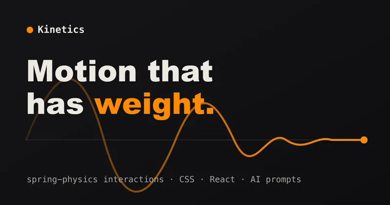
A typography-only social card on a near-black canvas, left-aligned with generous negative space on the right. Hierarchy is built entirely through a two-tone headline: the value proposition line sits in near-white while the qualifier falls to mid-gray, with a small lowercase wordmark lockup anchored top-left and a one-line subhead underneath. The scale jump between the ~90px headline and the ~24px subline, plus the single squircle logo mark, does all the visual work — no imagery, gradients or decoration anywhere.
Prompt preview
## Reference images

Study these alongside the description below: hierarchy, rhythm, spacing, colour. Build for the product you are asked about, using this design language.

- Screenshot: https://kage-design-assets.t3.tigrisfiles.io/screenshots/trycase/d0bb4d20-36d5-4a5d-8113-46aded204de3-1789452103816.webp
- Design on Kage: https://kage.design/designs/trycase-og-image

## Before you start
Ask the user what product or page this social card is for, who the audience is, and what brand assets they already have (name, wordmark, logo shape, brand colours, typeface). Wait for the answers before designing. Everything below is applied to *their* product with placeholder branding and copy, not to the reference product.

## Page structure
Produce a single 1200×630 social card image (render an HTML/CSS file to PNG via a headless browser or screenshot tool, or emit an SVG). Layout top to bottom:

1. **Canvas**: 1200×630 flat near-black field (approx `#1B1B1B`), no texture, no gradient, no border. Content sits in a left column with roughly 90px outer padding; the right half of the canvas stays intentionally empty.
2. **Wordmark lockup (top-left, ~y=150)**: a small white rounded-square mark (~36×36px, fully rounded corners, no icon inside) followed by the product name in lowercase, ~28px, near-white, medium weight, with comfortable letter spacing between mark and text.
3. **Headline block (vertically centred-ish, ~y=290–450)**: two lines, one sentence split across them, ~88–96px in a tight grotesque sans with slightly negative tracking. Line 1 in near-white (`#FAFAFA`), line 2 in mid-gray (`#8A8A8A`) so the first line reads as the claim and the second as the qualifier. Both lines end with a period.
4. **Subline (~y=505)**: one short sentence, ~24px, in the same mid-gray (`#8A8A8A`), normal weight, listing three terse claims separated by periods. It is the smallest text on the card and should still be legible at feed size.
5. **Nothing else**: no CTA button, no URL, no screenshot mockup, no decoration filling the empty right side.

## Design language
- The card is typography-led: hierarchy comes from a single large type block plus one small support line, nothing else. If the user's card needs a product visual, keep it small and secondary or omit it.
- Build the focal point with a **two-tone headline**: claim line in the lightest colour, qualifier line one or two steps darker. This is the signature move — repeat it with the user's own copy.
- Colour palette is three greys on dark: background `#1B1B1B`, primary text `#FAFAFA`, secondary text `#8A8A8A`. If the user has a brand accent, use it at most once (e.g. the logo mark), never in the headline.
- Type: one grotesque/neo-grotesque sans throughout (e.g. Inter, Neue Haas Grotesk or similar), tight tracking (-1% to -2%) on the headline, normal tracking below. Scale ratio is extreme: ~90px headline, ~28px wordmark, ~24px subline — no middle sizes.
- Alignment: everything left-aligned to a single edge; do not centre. Reserve the right ~40% of the canvas as empty space so the card crops well in small previews.
- Corner and shape language: the only rounded element is the squircle logo mark (~30% radius). No cards, borders, shadows or radii elsewhere — the flat canvas is the frame.
- No motion; this is a static image. Keep total copy under ~20 words so nothing gets clipped on X/Slack/LinkedIn previews.

## Never
Never copy the reference product's name, wordmark, logo shape, headline copy, subline copy or domain. Do not present the output as that product — use the user's own branding, or clearly placeholder branding and copy if none exists yet.