kage
kage
cdn.prod.website-files.com
Design analysis
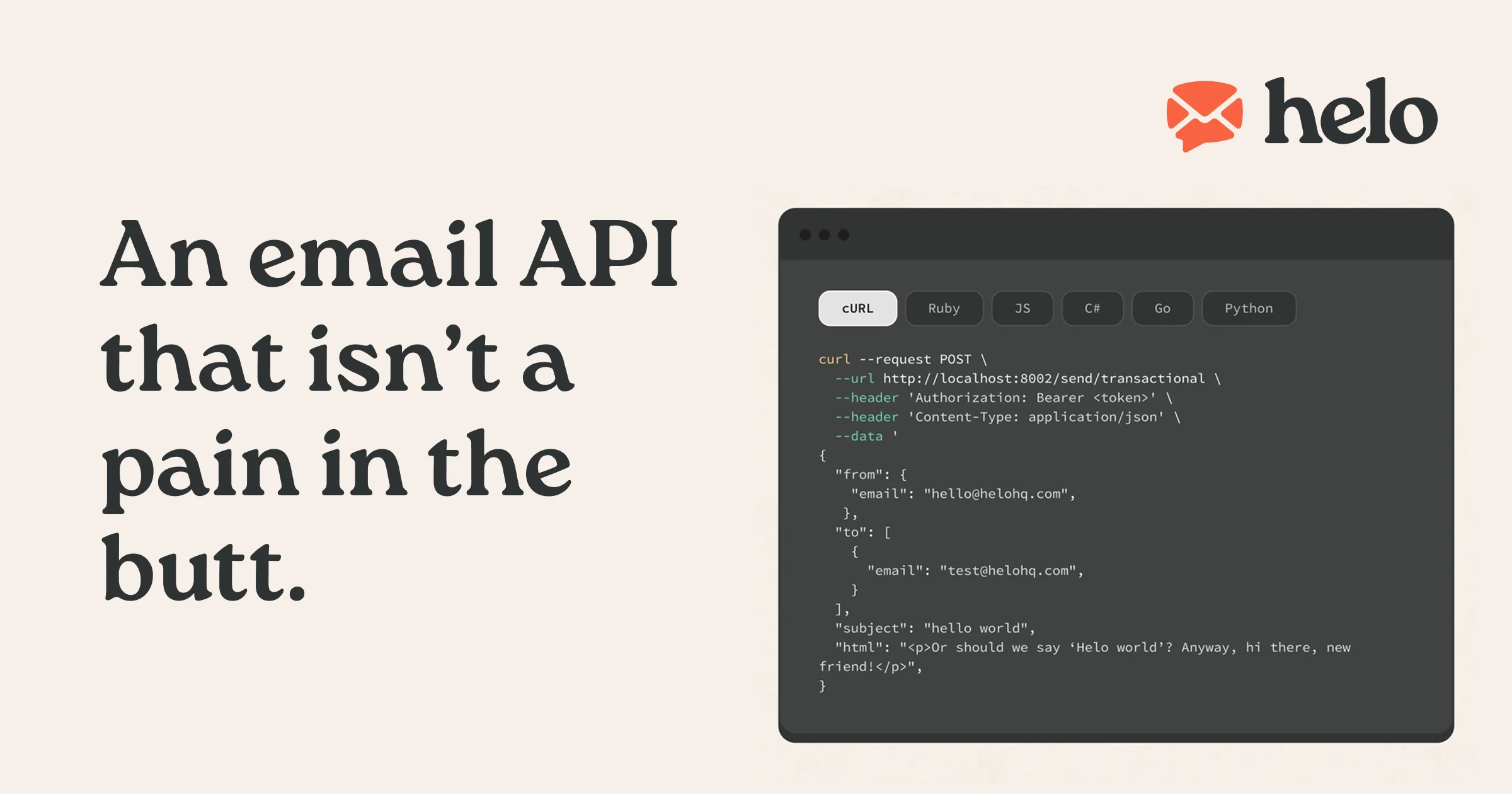
A 1200×630 social card built as a two-zone composition: a warm cream field carries a four-line headline in a chunky dark serif on the left, while a rounded charcoal code window with language tabs and syntax-highlighted cURL proves the product on the right. Colour is rationed to cream, near-black and one coral-orange, spent on the bubble glyph, the active tab pill and a single syntax token. The serif/monospace pairing and conversational copy give it personality without any illustration or photography.
Prompt preview
## Reference images

Study these alongside the description below: hierarchy, rhythm, spacing, colour. Build for the product you are asked about, using this design language.

- Screenshot: https://kage-design-assets.t3.tigrisfiles.io/screenshots/helo/dfbdac36-26f9-4217-891e-68dae9ab5fa3-1790920903121.webp
- Design on Kage: https://kage.design/designs/helo-og-image

## Before you start
Ask the user what product they are building, who it is for, and what brand assets they already have (name, wordmark, colours, typefaces). Wait for the answers. Everything below is applied to *their* product with placeholder branding and copy — never the reference product. Then produce a single **1200×630 social card (Open Graph image)**, ideally as one standalone HTML file sized exactly 1200×630px (easy to screenshot/export to PNG) or as an SVG.

## Page structure
- **Canvas**: fixed 1200×630, flat warm cream background (≈#F3ECE2), generous ~80px safe margins, no gradients, no texture.
- **Top-right lockup**: small brand mark (a simple rounded glyph, ~70px) beside a bold serif wordmark (~48px), anchored to the corner with a tight baseline relationship between glyph and word.
- **Left column (~45% width)**: the headline, broken into four short lines, set in a very heavy editorial serif at ~90px with generous line-height. It is the largest object on the card and the only text element there.
- **Right column**: a dark code-window card (~560px wide, vertically centred) with 14–16px rounded corners. Inside, top to bottom: a slim title bar with three small window dots; a row of six language tab pills where the active one is cream-on-dark and the rest are dark-on-dark; then a syntax-highlighted code snippet (a request line plus a JSON body) at ~15px monospace, cropped slightly at the bottom edge as if it continues.

## Design language
- **Focal hierarchy**: headline → code window → wordmark. Exactly one oversized typographic element, one supporting proof element, one small brand mark; nothing else competes.
- **Colour**: three colours only — cream field ≈#F3ECE2, charcoal ink ≈#262523, coral-orange accent ≈#F0512B. Spend the accent on the glyph, the active tab pill and at most one syntax token; everything else stays two-tone.
- **Type pairing**: a chunky editorial serif (e.g. a fat display serif) for headline and wordmark; monospace for all code and tab labels. No third typeface, no sans-serif.
- **Shape language**: 14–16px radius on the window card and pills; the window dots echo the round glyph so the card feels like one system.
- **Syntax palette on dark**: keyword/command in the orange accent, strings and flags in a mint/teal, body text in cream at ~80% opacity — keep tokens to three colours.
- **Density and rhythm**: the canvas is sparse; whitespace does the framing, copy is short and conversational (one plain-spoken sentence about the product), and the code window is the only dense area.
- **No motion**: it's a static export — bake all states (active tab, highlight colours) into the image.

## Never
Never use the reference product's name, wordmark, bubble-envelope glyph, headline copy or the exact code snippet; never reproduce its logo or favicon; never present the result as that product. Use placeholder brand name, original headline copy and a generic code example in the same visual language.