kage
kage
cdn.prod.website-files.com
Design analysis
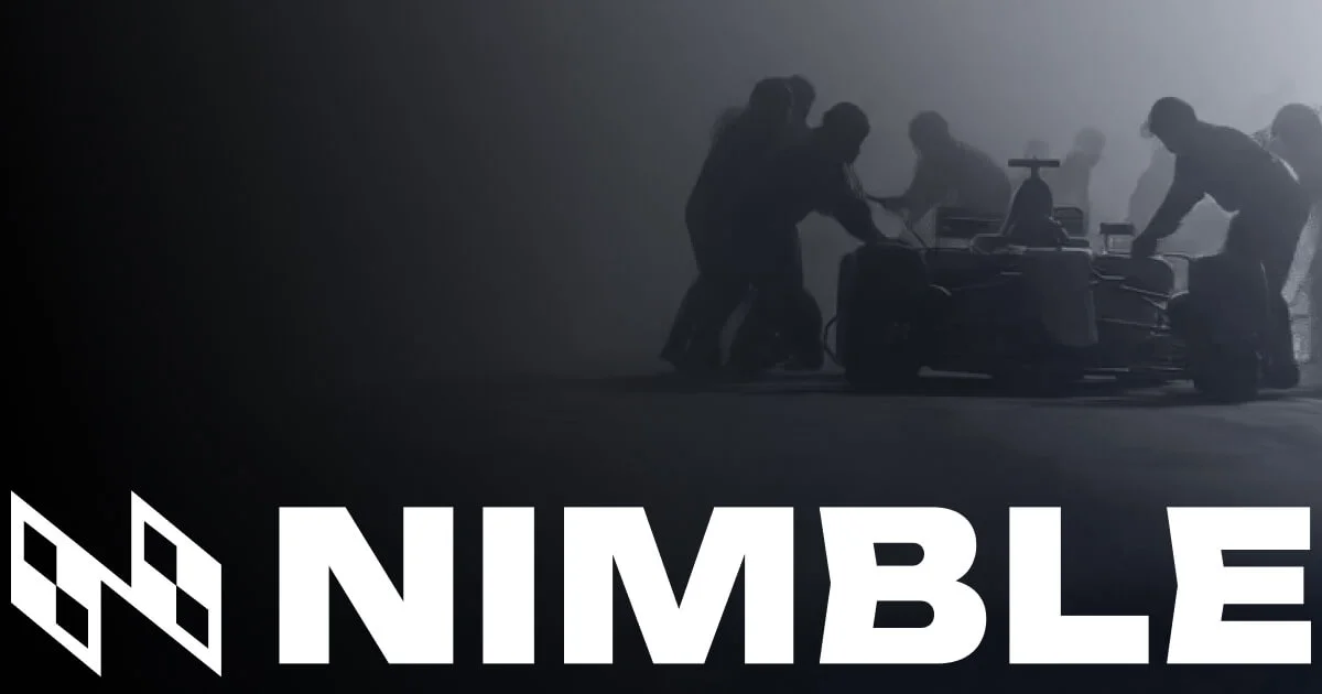
A brand-only 1200×630 card with no product copy: the top three-quarters is a cinematic, desaturated photograph of a silhouetted pit crew pushing a race car through fog, placed right-of-centre so the left third stays dark and quiet. The bottom quarter is a full-width band carrying the white wordmark at near-bleed width, with the checkered-flag N mark set to its left at matching cap height. The only other element is a small white glyph top-left, balancing the diagonal weight; everything relies on extreme monochrome contrast and the speed/precision metaphor rather than a headline.
Prompt preview
## Reference images

Study these alongside the description below: hierarchy, rhythm, spacing, colour. Build for the product you are asked about, using this design language.

- Screenshot: https://kage-design-assets.t3.tigrisfiles.io/screenshots/web-search-agents-by-nimble/91f941c2-53d9-43aa-b3f6-f3562a3ac2ba-1789452076153.webp
- Design on Kage: https://kage.design/designs/web-search-agents-by-nimble-og-image

## Before you start
Ask the user what product the card is for, who will be sharing it and where (X, LinkedIn, Slack, iMessage), and what brand assets they already have: brand name, logo mark (SVG preferred), brand colours, typeface, and whether they have licensed photography or need an abstract/CSS-built visual. Wait for the answers. Everything below is applied to their product and brand — the reference is only a composition template.

## Page structure
This is a single static image, not a scrollable page. Build it as a 1200×630 HTML/CSS document (or SVG) and render to PNG with a headless browser, or hand off the SVG.

1. **Canvas**: one fixed 1200×630 frame, `overflow: hidden`, filled edge-to-edge with a near-black background. No browser chrome, no safe-zone guides in the export.
2. **Imagery zone (top ~72% of canvas height)**: a single full-width visual — a photograph or abstract scene — treated in monochrome. Its focal subject sits right-of-centre; the left third is intentionally low-detail and dark so the wordmark below has contrast headroom.
3. **Corner glyph (top-left)**: a small white brand glyph or mark (~36–44px) set at the same margin as everything else. It is the only element in the upper-left quadrant and balances the heavy subject on the right.
4. **Wordmark band (bottom ~28%)**: the logo mark and the brand name set in one line, spanning nearly the full canvas width, white, vertically centred in its band, sitting close to the bottom and side edges (24–40px margin) so platform corner-rounding never clips it.
5. **Nothing else**: no headline, no tagline, no URL, no CTA. The image carries the metaphor; the wordmark carries identity.

## Design language
- **Palette**: near-black canvas (#0A0A0C), neutral grays inside the imagery (#2E3136 to #6B6F75), pure white (#FFFFFF) for every mark and letter. No accent colour anywhere — the card is strictly monochrome.
- **Imagery treatment**: desaturate any photo completely (`filter: grayscale(1)`, plus contrast/brightness tuning so blacks crush toward the canvas colour). Prefer silhouettes, haze, smoke, low light — atmosphere over detail. If the user has no photography, build an abstract monochrome scene with layered gradients and grain in the same tonal range.
- **Composition rule**: roughly a 70/30 vertical split between visual and wordmark band. Focal subject right-of-centre, quiet zone left-of-centre, single small glyph top-left at the shared margin. One focal point per zone; no competing elements.
- **Type**: one ultra-bold, extended, all-caps sans for the wordmark. Scale it so the full brand name spans the canvas width minus the 24–40px margins — for a short name that means ~160–220px with tight tracking. If the brand voice calls for it, use angular or sheared cuts on letterforms for a sense of speed, but only if the user's typeface supports it.
- **Mark pairing**: set the logo mark at cap-height next to the wordmark, aligned to the same optical baseline, together forming one lockup that reads as a single white band.
- **Borders, radius, shadow**: none. No cards, no strokes, no glow. Depth comes only from the photograph's tonal range.
- **Motion**: none — the deliverable is one flat PNG/SVG.

## Never
- Never use the Nimble wordmark, the checkered-flag "N" mark, pit-crew or racing photography, or any copy about agents, speed or data retrieval from the reference.
- Never present the finished card as Nimble's or include their name, logo or imagery in any form.
- Never add marketing copy, taglines or URLs to the card — this composition works precisely because it carries almost no text.