 kage
kage
adant.ai
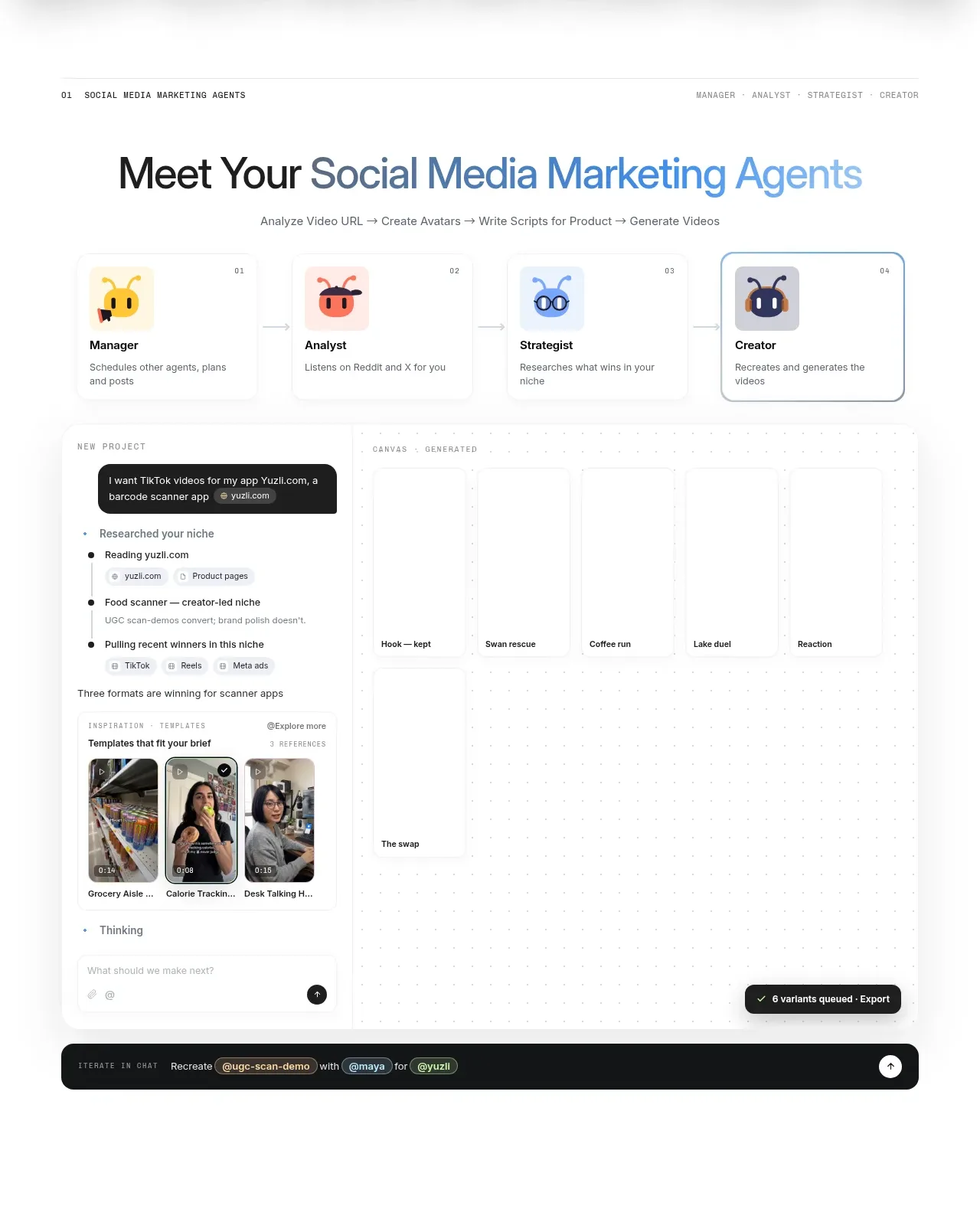
Design analysis
A section introduces a coordinated set of specialist agents and then demonstrates them in a research-to-creation workspace with a persistent prompt composer.
Prompt preview
## Reference images

Study these alongside the description below: hierarchy, rhythm, spacing, colour. Build for the product you are asked about, using this design language.

- Component: https://kage-design-assets.t3.tigrisfiles.io/components/adant-2-0/1b13b0a2-e64e-418d-a933-0f40a66c40ee-1792044357-2.webp
- Full page it was cut from: https://kage-design-assets.t3.tigrisfiles.io/screenshots/adant-2-0/1b13b0a2-e64e-418d-a933-0f40a66c40ee-1792044250464-full.webp
- Component on Kage: https://kage.design/component/adant-2-0-feature-grid

## Before you start
Ask what specialist roles or workflow stages exist in the user's product and what task the interface should help users complete. Build an original team/workspace section around those answers.

Create a feature section with a small overline, a centered benefit headline, and one concise explanatory line. Show four or more role cards in a horizontal grid, each with a distinct icon treatment, role label, and one-line responsibility; highlight the currently selected role with a thin accent border. Beneath that, show a large lightweight workspace mockup: a left research/prompt panel, a spacious board or result area, and a dark bottom command/status bar. Use a white canvas, faint #E7EBF0 dividers, pale #F7F9FC panels, ink #16181D, and blue/green status accents. Use 28–44px section headings, 10–11px uppercase overlines with letter spacing, 16–24px card padding, 12–18px radii, and very subtle shadows. Make role cards selectable and let the composer/status bar communicate progress without overwhelming the content.

### Never
- Never use logos, product names, copy, illustrations, or imagery from the reference.
- Never reproduce the exact agent names, avatar designs, or workspace text.
- Never create a decorative dashboard that has no obvious task flow.
More components
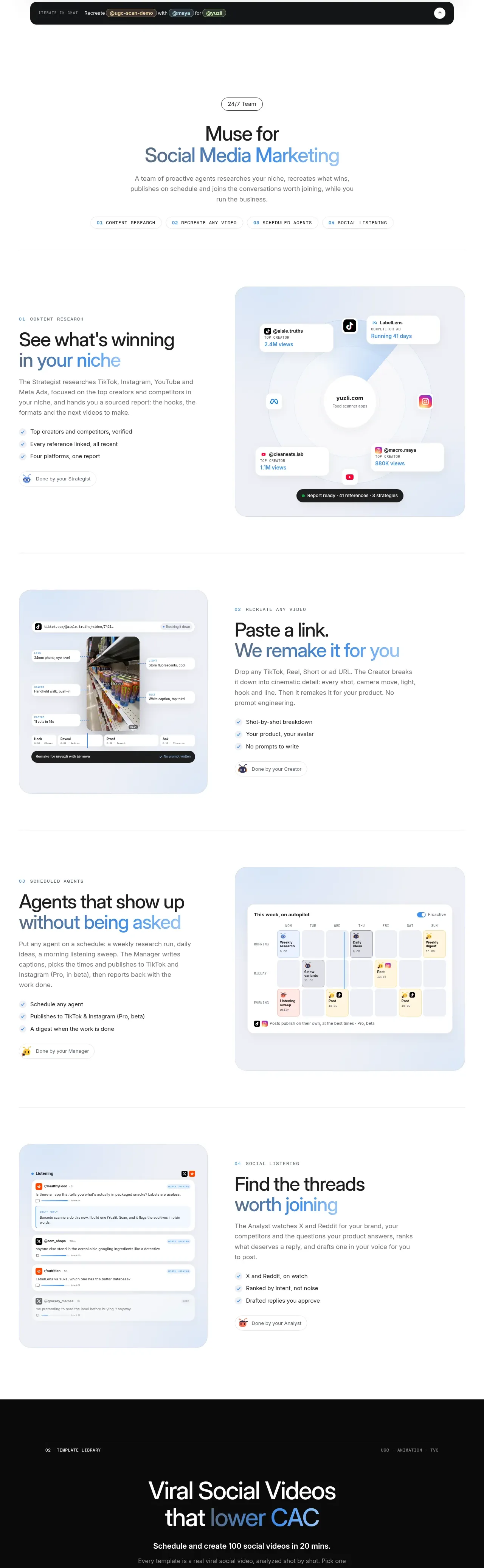
 Research and automation capabilities
AdAnt 2.0 · Feature grid
Research and automation capabilities
AdAnt 2.0 · Feature grid
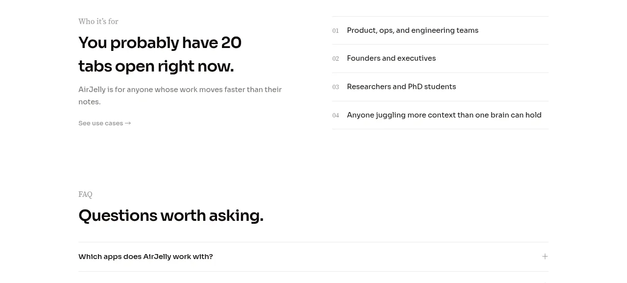
 Audience and use cases
AirJelly · Feature grid
Audience and use cases
AirJelly · Feature grid
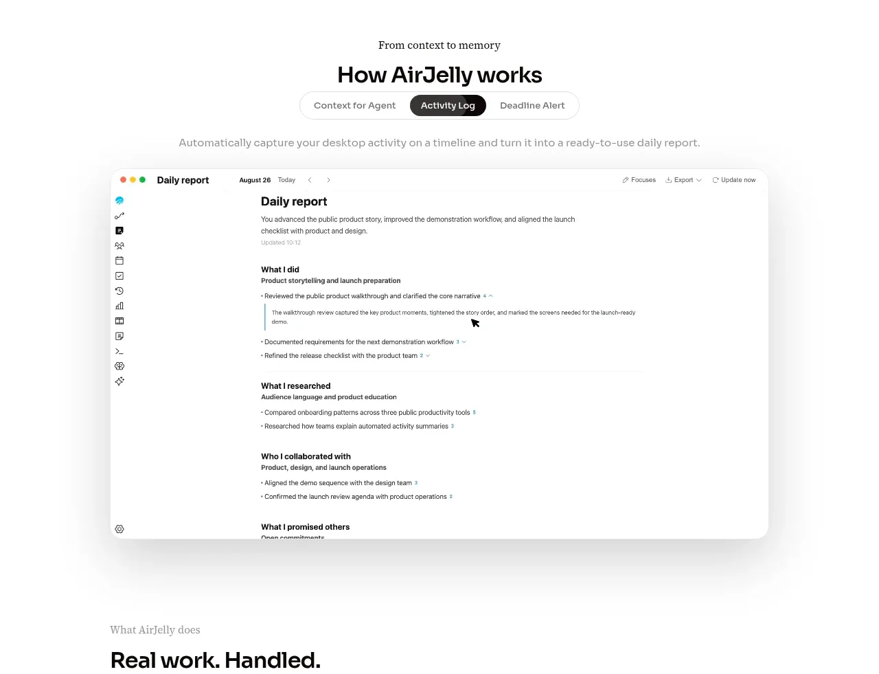 How the product works demo
AirJelly · Feature grid
How the product works demo
AirJelly · Feature grid
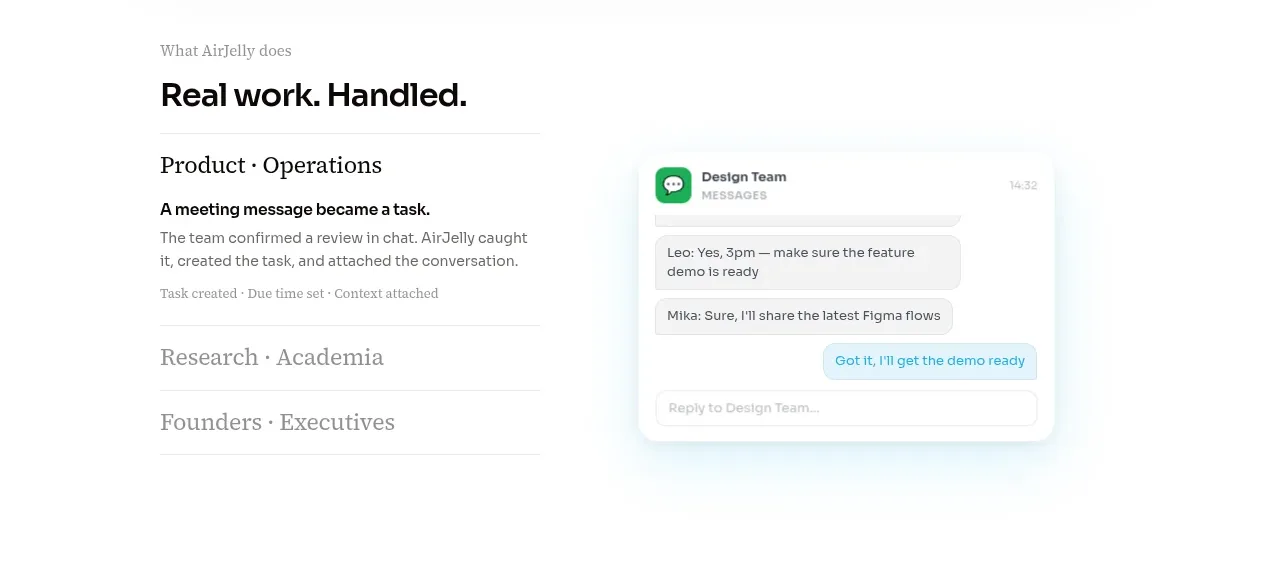 Real work handled showcase
AirJelly · Feature grid
Real work handled showcase
AirJelly · Feature grid
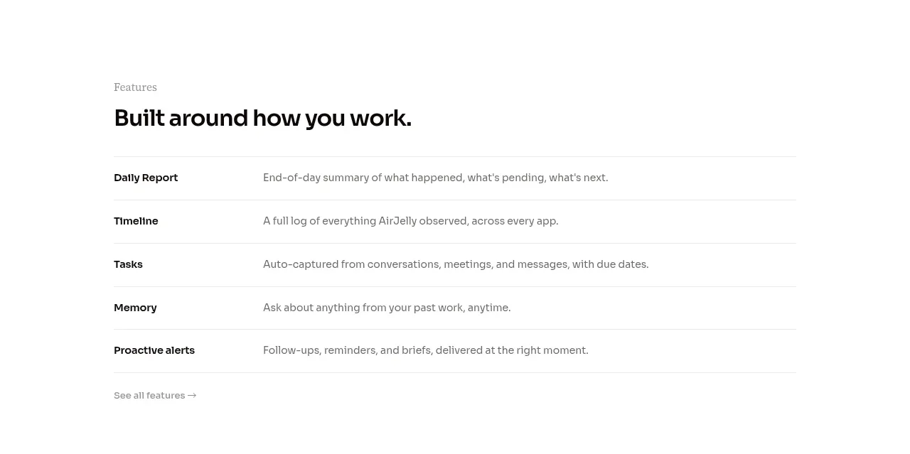 Feature capabilities list
AirJelly · Feature grid
Feature capabilities list
AirJelly · Feature grid
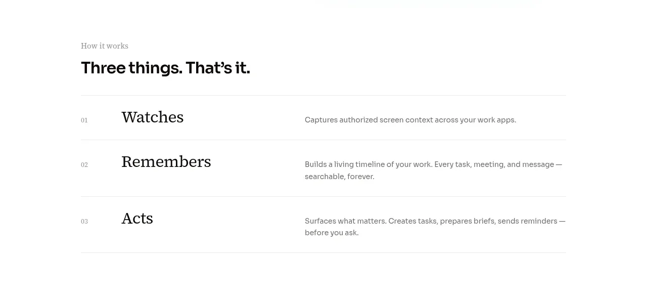 Three-step operating model
AirJelly · Feature grid
Three-step operating model
AirJelly · Feature grid