 kage
kage
airjelly.ai
Design analysis
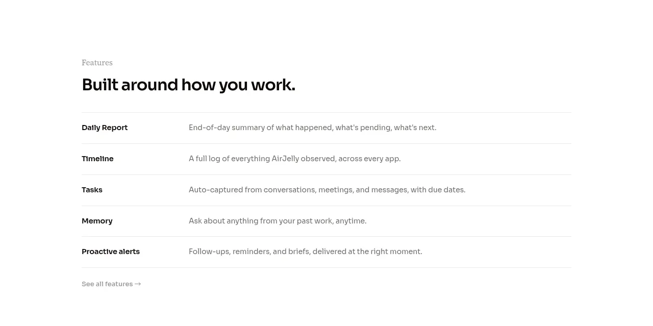
A practical feature list gives each capability equal treatment with a bold label and a plain-language explanation. The structure is dense enough to scan but remains airy through consistent row rules and generous margins.
Prompt preview
## Reference images

Study these alongside the description below: hierarchy, rhythm, spacing, colour. Build for the product you are asked about, using this design language.

- Component: https://kage-design-assets.t3.tigrisfiles.io/components/airjelly/990a635f-6745-4f3e-9b4f-9fb8b62b8b48-1792044310-5.webp
- Full page it was cut from: https://kage-design-assets.t3.tigrisfiles.io/screenshots/airjelly/990a635f-6745-4f3e-9b4f-9fb8b62b8b48-1792044207019-full.webp
- Component on Kage: https://kage.design/component/airjelly-feature-grid-4

## Before you start
Ask which capabilities are most important for the user's product and how they should be prioritized, then create an original list using those principles.

Create a feature-list section with a small eyebrow and a strong heading, followed by five or fewer horizontal capability rows. Each row should use a fixed narrow label column and a flexible description column, aligned to a shared grid. Use thin #E8E8E8 separators, 16–20px row padding, 13–15px text, and a small understated text link beneath the list. Keep the section white and editorial, with black labels and medium-gray descriptions. Add hover emphasis to the active row or link, but avoid decorative cards. Make the grid become one column on small screens while retaining clear label/description distinction.

Never: use logos, product names, copy, illustrations, or imagery from the reference.
More components

 Agent team workspace
AdAnt 2.0 · Feature grid
Agent team workspace
AdAnt 2.0 · Feature grid
 Research and automation capabilities
AdAnt 2.0 · Feature grid
Research and automation capabilities
AdAnt 2.0 · Feature grid

 Audience and use cases
AirJelly · Feature grid
Audience and use cases
AirJelly · Feature grid
 Real work handled showcase
AirJelly · Feature grid
Real work handled showcase
AirJelly · Feature grid
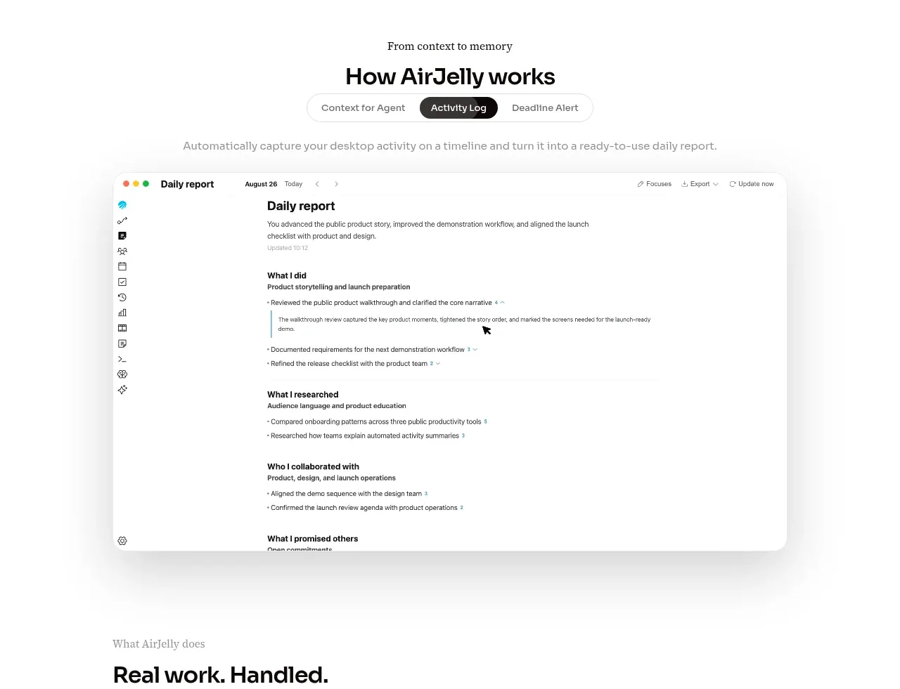 How the product works demo
AirJelly · Feature grid
How the product works demo
AirJelly · Feature grid
 Three-step operating model
AirJelly · Feature grid
Three-step operating model
AirJelly · Feature grid