 kage
kage
airjelly.ai
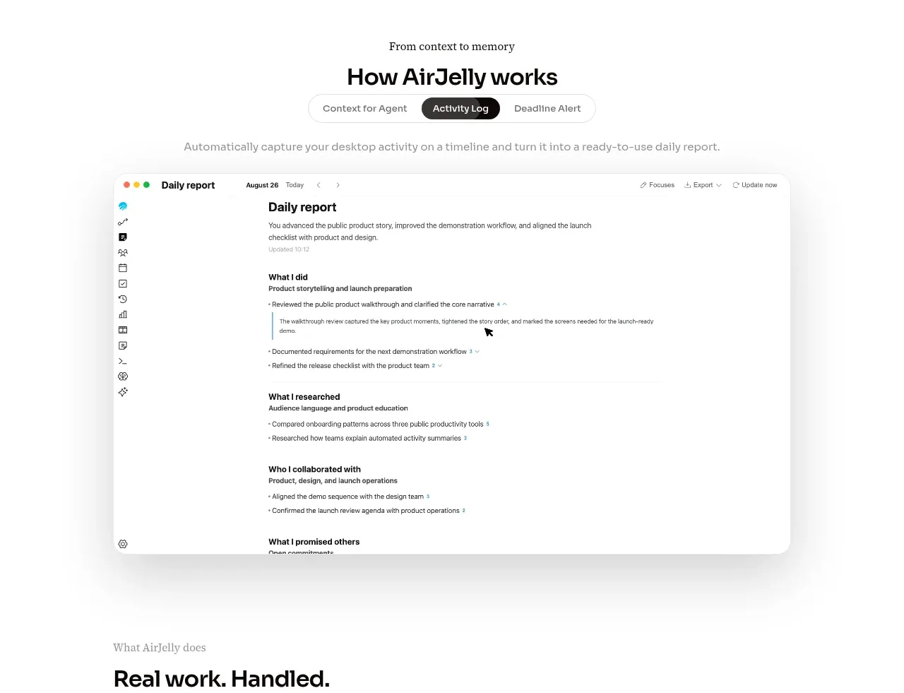
Design analysis
The section explains the product with a small eyebrow, a strong title, segmented tabs, and a large centered application screenshot. The oversized visual is given room to breathe and acts as proof rather than decoration.
Prompt preview
## Reference images

Study these alongside the description below: hierarchy, rhythm, spacing, colour. Build for the product you are asked about, using this design language.

- Component: https://kage-design-assets.t3.tigrisfiles.io/components/airjelly/990a635f-6745-4f3e-9b4f-9fb8b62b8b48-1792044310-2.webp
- Full page it was cut from: https://kage-design-assets.t3.tigrisfiles.io/screenshots/airjelly/990a635f-6745-4f3e-9b4f-9fb8b62b8b48-1792044207019-full.webp
- Component on Kage: https://kage.design/component/airjelly-feature-grid

## Before you start
Ask what the user's product does, what workflow it demonstrates, and which proof point matters most, then build an original version around those answers.

Build a product-explanation section with a centered eyebrow, headline, and a compact segmented control. Use a max-width around 680px for the text and control, then a wider framed product-preview area below. The tab control should look like a soft white capsule with a thin #E7E7E7 border, small 12px labels, and a dark filled active tab. Below it, add a muted one-line description and a large rounded application mockup or abstract UI preview with a very soft shadow. Keep the overall palette white, #777777 secondary text, #111111 headings, and a subtle cyan accent. Use approximately 56px section padding, 12–16px control spacing, and 28–36px radius on the preview. Tabs should be keyboard accessible and visibly switch the preview content.

Never: use logos, product names, copy, illustrations, or imagery from the reference.
More components
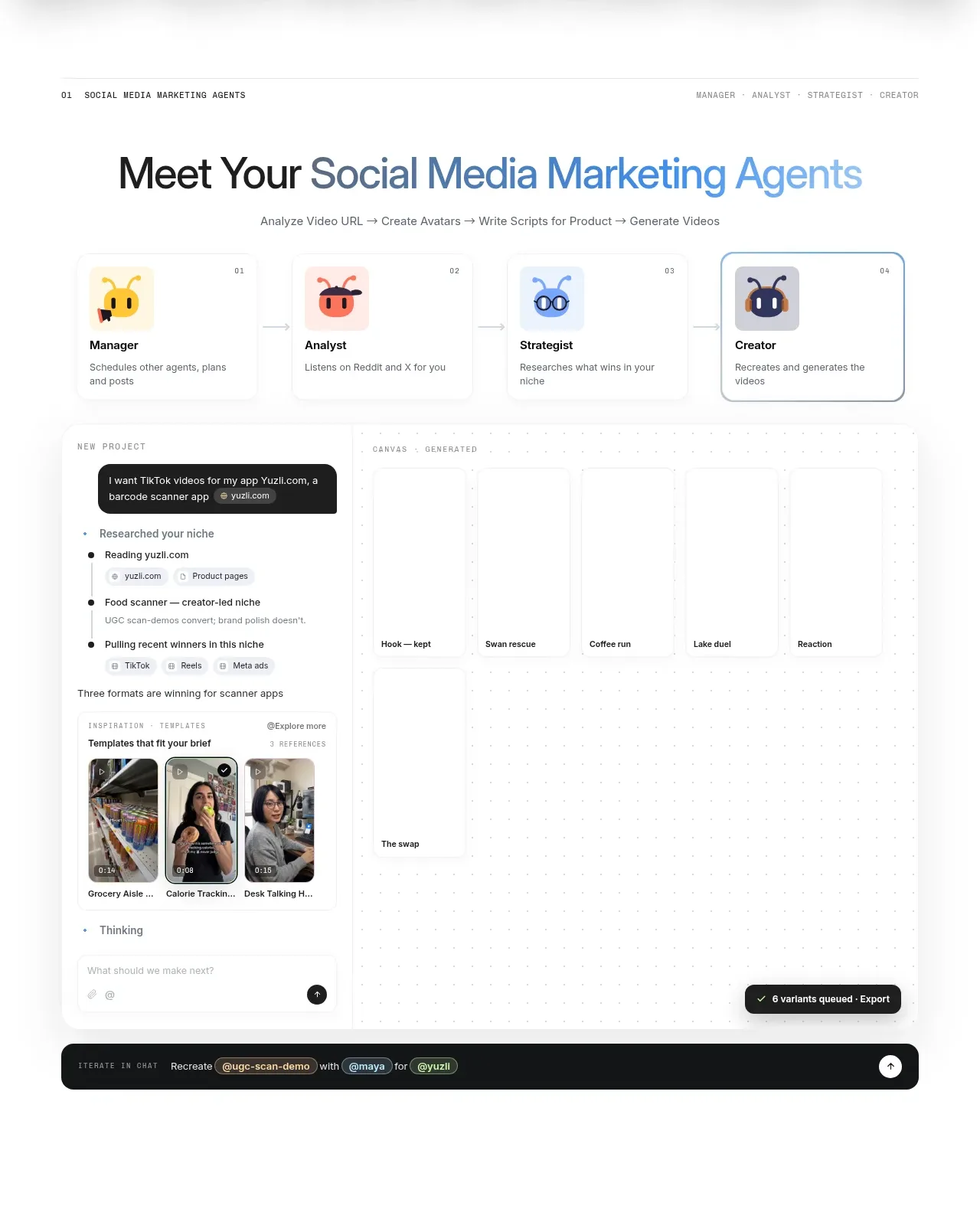
 Agent team workspace
AdAnt 2.0 · Feature grid
Agent team workspace
AdAnt 2.0 · Feature grid
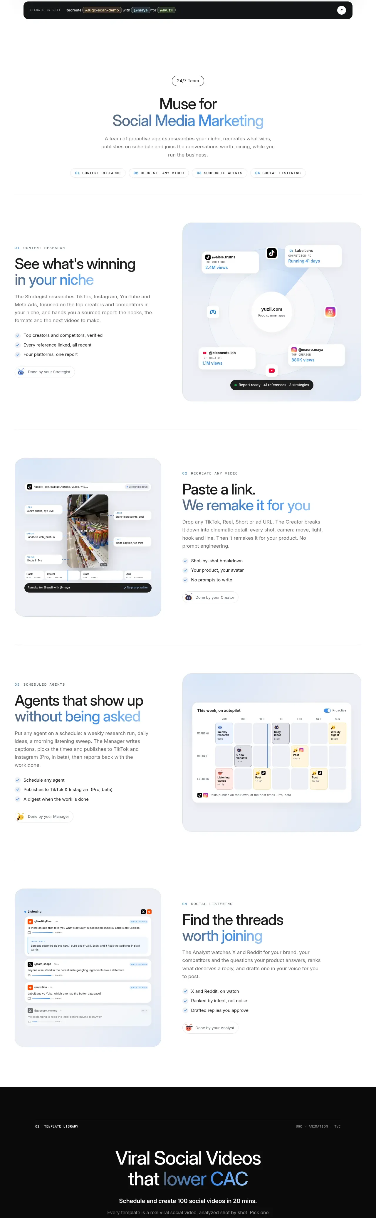 Research and automation capabilities
AdAnt 2.0 · Feature grid
Research and automation capabilities
AdAnt 2.0 · Feature grid
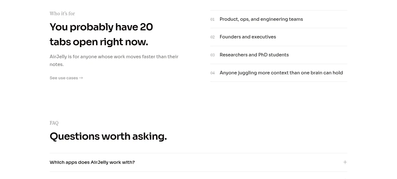
 Audience and use cases
AirJelly · Feature grid
Audience and use cases
AirJelly · Feature grid
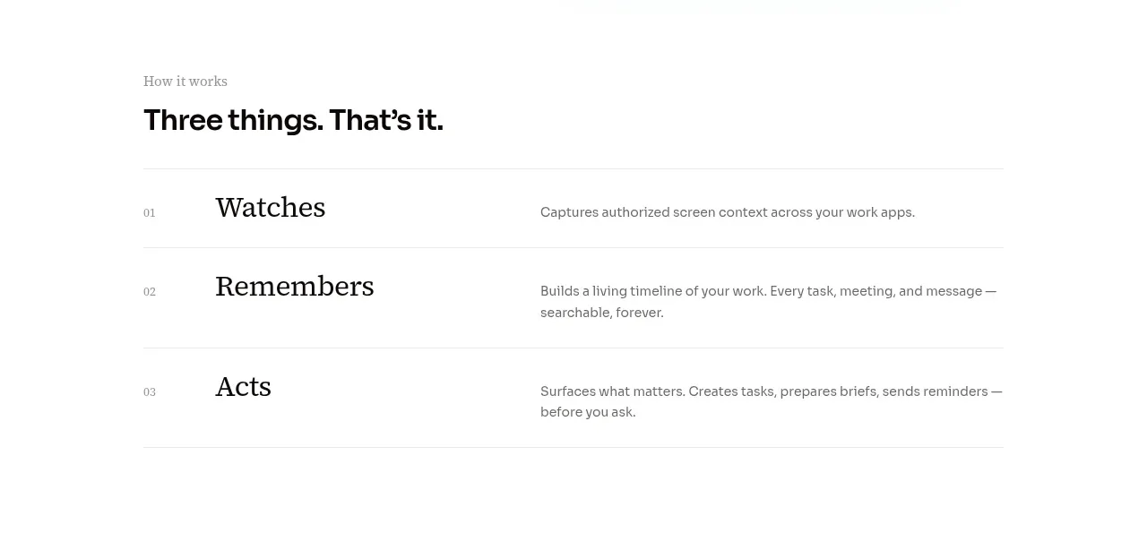 Three-step operating model
AirJelly · Feature grid
Three-step operating model
AirJelly · Feature grid
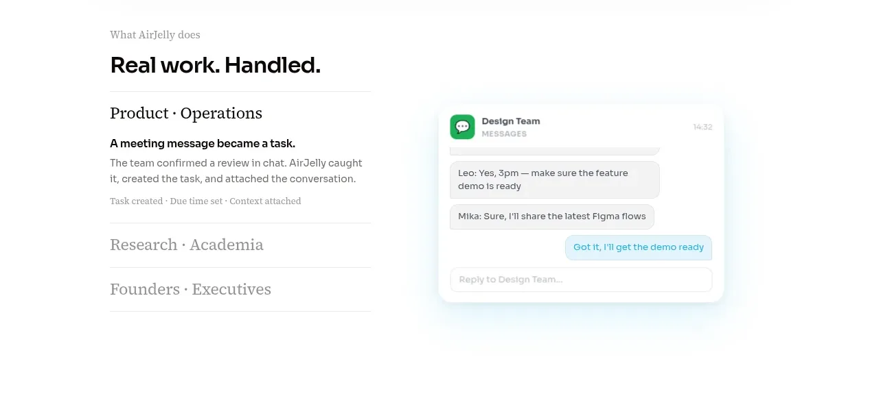 Real work handled showcase
AirJelly · Feature grid
Real work handled showcase
AirJelly · Feature grid
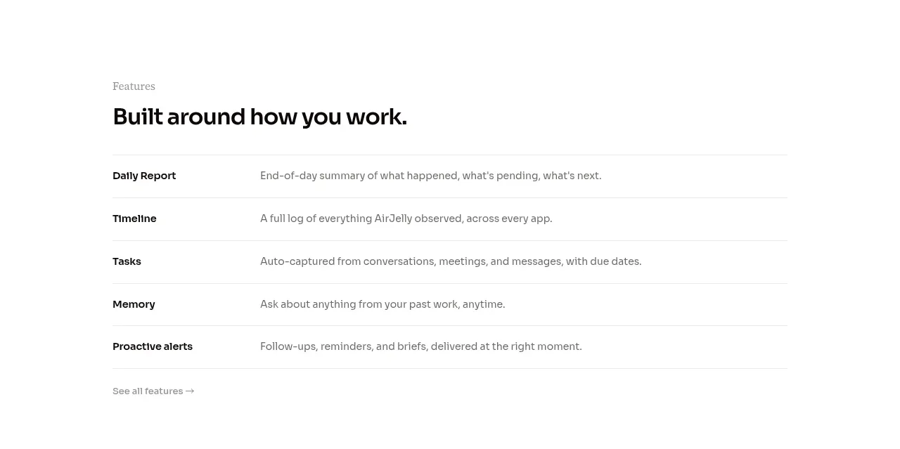 Feature capabilities list
AirJelly · Feature grid
Feature capabilities list
AirJelly · Feature grid