 kage
kage
airjelly.ai

Design analysis
A split layout introduces a practical outcome on the left and a lightweight message/task visual on the right. Thin separators and restrained typography make the feature feel like an editorial case study rather than a generic card grid.
Prompt preview
## Reference images

Study these alongside the description below: hierarchy, rhythm, spacing, colour. Build for the product you are asked about, using this design language.

- Component: https://kage-design-assets.t3.tigrisfiles.io/components/airjelly/990a635f-6745-4f3e-9b4f-9fb8b62b8b48-1792044310-3.webp
- Full page it was cut from: https://kage-design-assets.t3.tigrisfiles.io/screenshots/airjelly/990a635f-6745-4f3e-9b4f-9fb8b62b8b48-1792044207019-full.webp
- Component on Kage: https://kage.design/component/airjelly-feature-grid-2

## Before you start
Ask what real job your user's product handles, who benefits, and what interface proof supports it, then translate those answers into this layout.

Create a split feature showcase inside a centered max-width container. On the left, place a muted eyebrow, bold section heading, one highlighted workflow item with a short explanation, and two quieter related items separated by thin rules. On the right, show an original lightweight UI card representing the workflow outcome, such as a conversation becoming a task. Use a 46/54 or 44/56 column split, generous vertical padding, #111111 headings, #777777 body copy, #EEEEEE rules, and a very pale cyan glow behind the visual. Keep cards softly rounded around 16–20px with minimal shadow. On mobile, stack text above visual and preserve the hierarchy.

Never: use logos, product names, copy, illustrations, or imagery from the reference.
More components

 Agent team workspace
AdAnt 2.0 · Feature grid
Agent team workspace
AdAnt 2.0 · Feature grid
 Research and automation capabilities
AdAnt 2.0 · Feature grid
Research and automation capabilities
AdAnt 2.0 · Feature grid

 Audience and use cases
AirJelly · Feature grid
Audience and use cases
AirJelly · Feature grid
 Three-step operating model
AirJelly · Feature grid
Three-step operating model
AirJelly · Feature grid
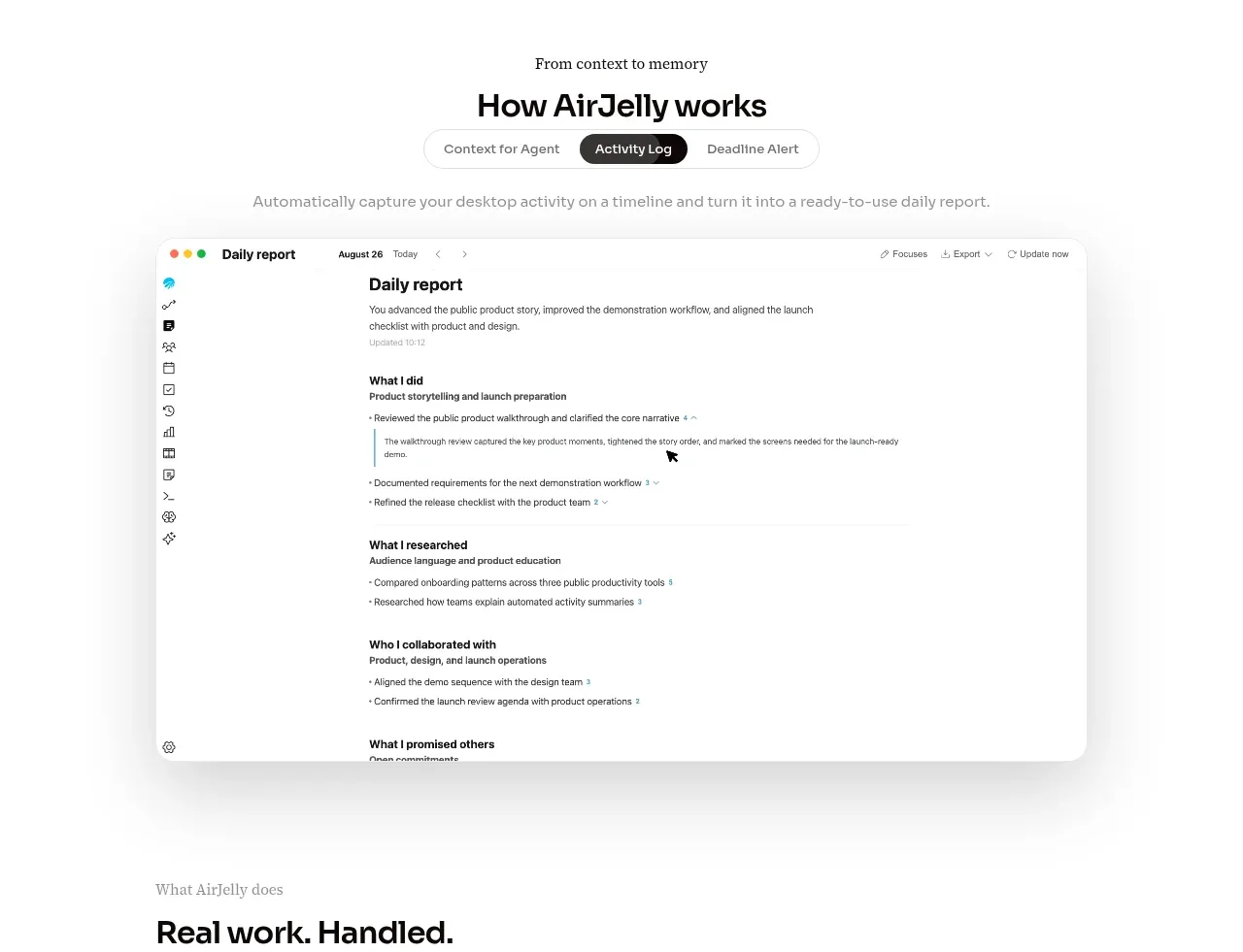 How the product works demo
AirJelly · Feature grid
How the product works demo
AirJelly · Feature grid
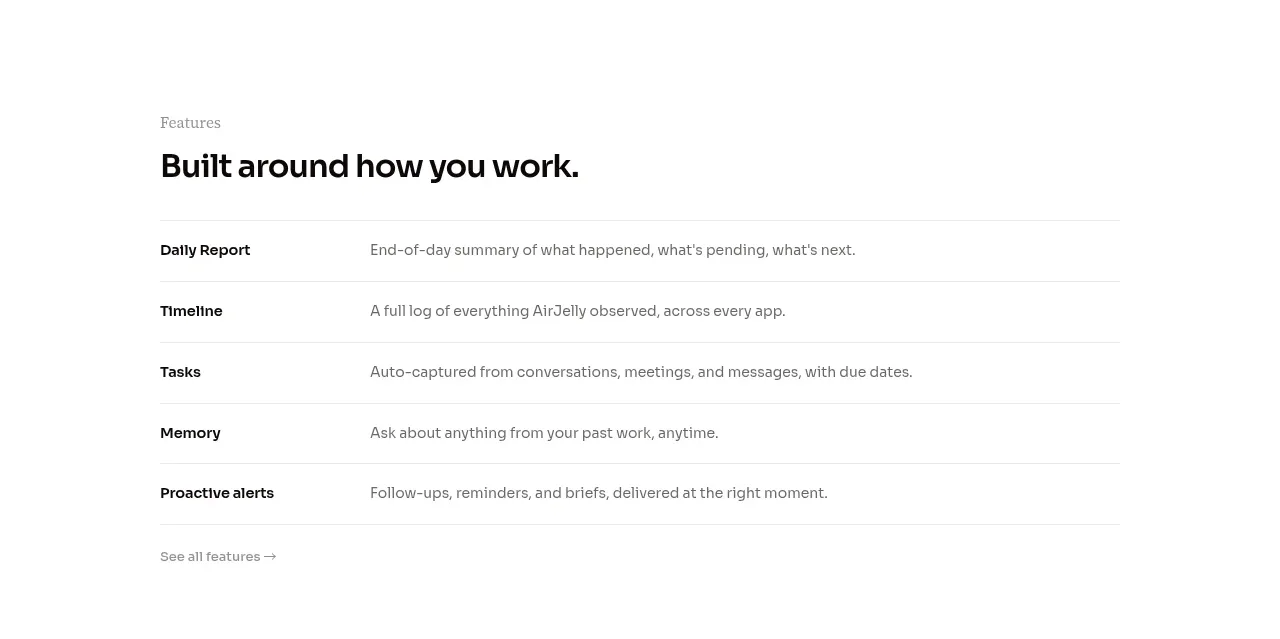 Feature capabilities list
AirJelly · Feature grid
Feature capabilities list
AirJelly · Feature grid