 kage
kage
airjelly.ai

Design analysis
The section answers who the product is for using a two-column editorial layout: a strong left-side positioning statement and a numbered list of audiences on the right. It is highly scannable and avoids overexplaining.
Prompt preview
## Reference images

Study these alongside the description below: hierarchy, rhythm, spacing, colour. Build for the product you are asked about, using this design language.

- Component: https://kage-design-assets.t3.tigrisfiles.io/components/airjelly/990a635f-6745-4f3e-9b4f-9fb8b62b8b48-1792044311-7.webp
- Full page it was cut from: https://kage-design-assets.t3.tigrisfiles.io/screenshots/airjelly/990a635f-6745-4f3e-9b4f-9fb8b62b8b48-1792044207019-full.webp
- Component on Kage: https://kage.design/component/airjelly-feature-grid-5

## Before you start
Ask who the user's product serves, what shared problem unites those people, and which audiences deserve priority, then adapt this layout accordingly.

Create a two-column audience/use-case section in a max-width container. The left column contains a muted eyebrow, a large bold positioning statement, a short supporting paragraph, and a small text link. The right column contains four numbered audience rows, each separated by thin horizontal rules and using compact 01–04 markers. Use a 44/56 split, 48–72px vertical spacing, #111111 headings, #777777 supporting text, and #E8E8E8 rules. On mobile stack the columns, preserving the numbered list as the second block. Let links and rows gain a subtle accent colour on hover.

Never: use logos, product names, copy, illustrations, or imagery from the reference.
More components
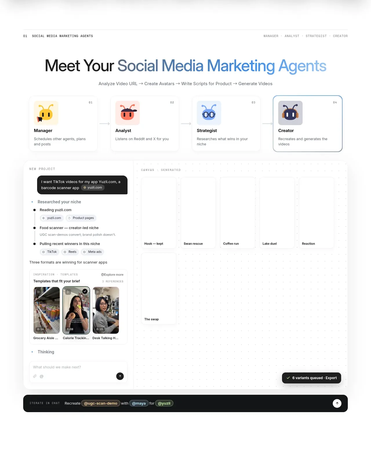
 Agent team workspace
AdAnt 2.0 · Feature grid
Agent team workspace
AdAnt 2.0 · Feature grid
 Research and automation capabilities
AdAnt 2.0 · Feature grid
Research and automation capabilities
AdAnt 2.0 · Feature grid
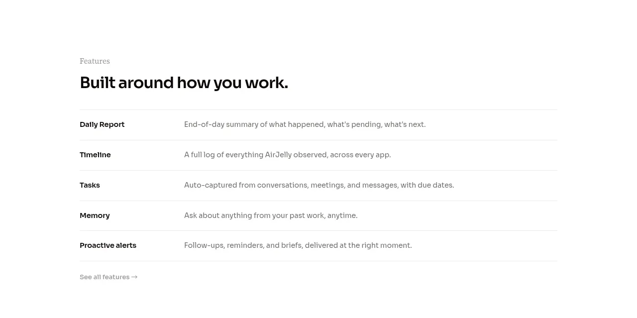
 Feature capabilities list
AirJelly · Feature grid
Feature capabilities list
AirJelly · Feature grid
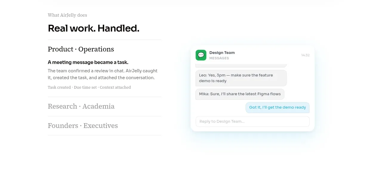 Real work handled showcase
AirJelly · Feature grid
Real work handled showcase
AirJelly · Feature grid
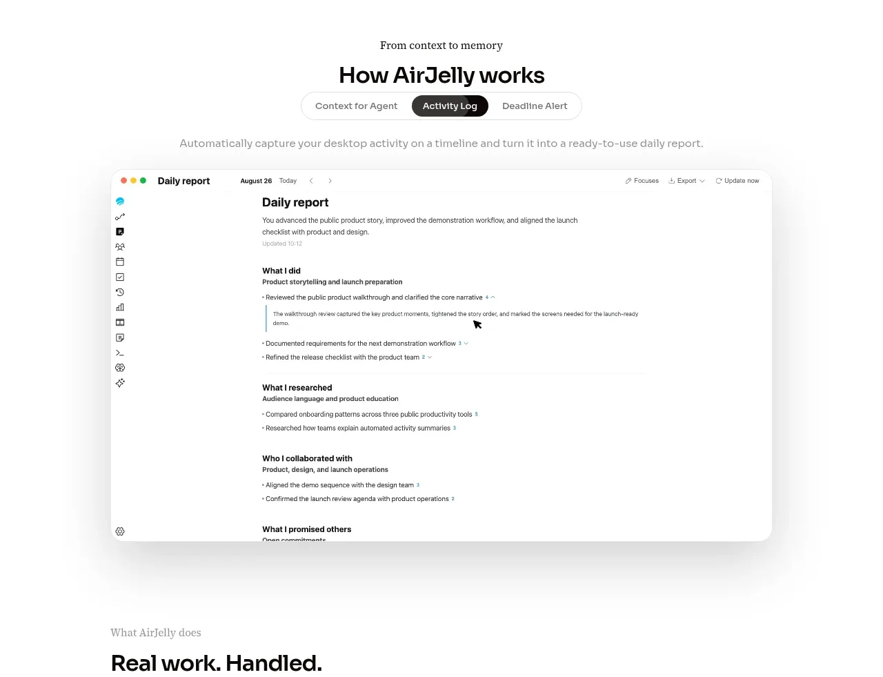 How the product works demo
AirJelly · Feature grid
How the product works demo
AirJelly · Feature grid
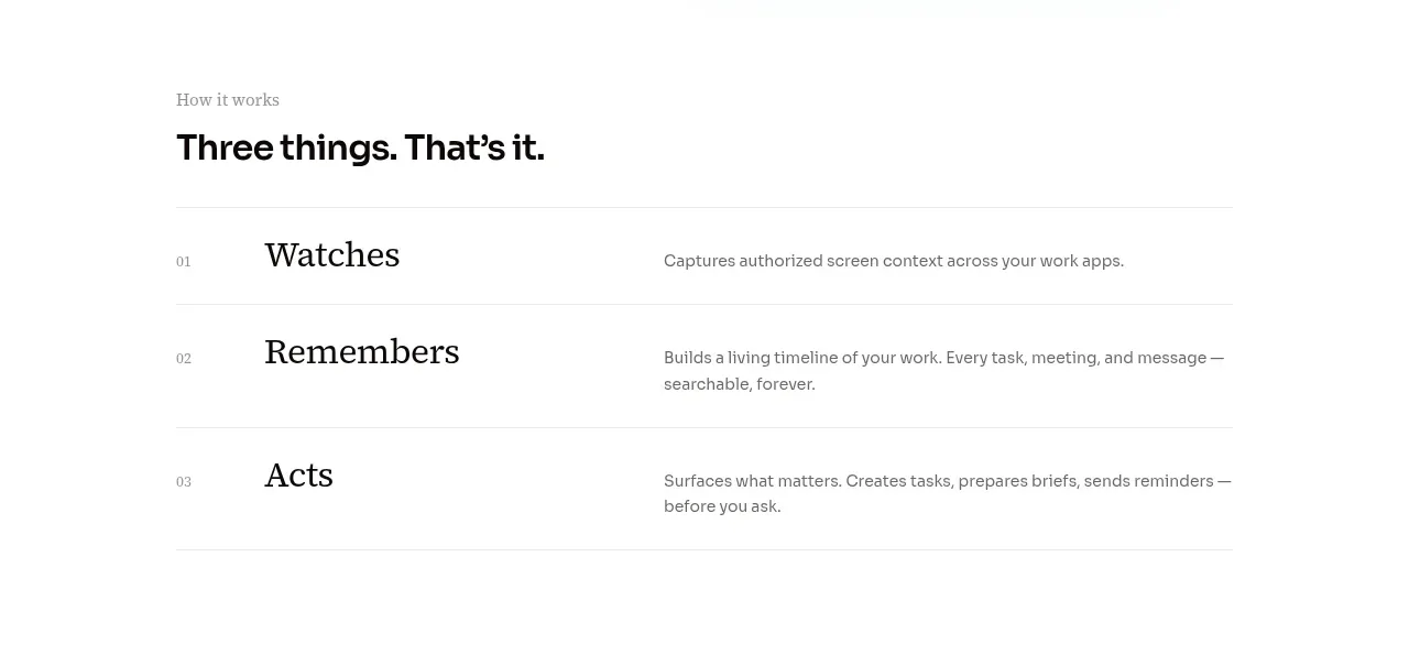 Three-step operating model
AirJelly · Feature grid
Three-step operating model
AirJelly · Feature grid