kage
kage
agentcraft.ai
Design analysis
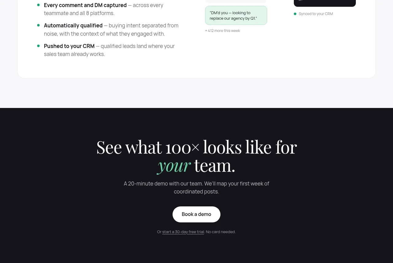
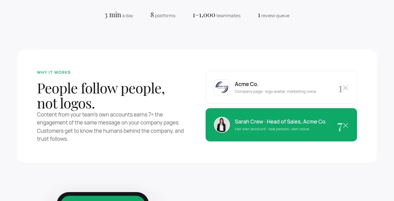
A large rounded white panel contrasts a written brand principle on the left with a simple account-versus-person visual on the right.
Prompt preview
## Reference images

Study these alongside the description below: hierarchy, rhythm, spacing, colour. Build for the product you are asked about, using this design language.

- Component: https://kage-design-assets.t3.tigrisfiles.io/components/agent-craft/d8105fc6-c65e-46ba-b702-5f209216873d-1791957789-4.webp
- Full page it was cut from: https://kage-design-assets.t3.tigrisfiles.io/screenshots/agent-craft/d8105fc6-c65e-46ba-b702-5f209216873d-1791957724400-full.webp
- Component on Kage: https://kage.design/component/agent-craft-card

## Before you start
Ask what the user's product and brand are, then apply these principles to that product rather than copying the reference.

Build a wide, rounded explanatory panel with a two-column layout. Put a green uppercase eyebrow, a 38–48px serif statement, and a short paragraph on the left. On the right, show a simple stacked comparison UI: a subdued neutral row for an impersonal entity and a vivid green highlighted row for a human or preferred outcome, each with an avatar placeholder, label, and small status text. Use a white panel (#ffffff) over a very light gray page (#f7f7f9), 20px radius, 40–48px padding, thin #eeeeef borders, and green #0da56f for the selected state. On small screens, stack the copy above the visual.

### Never
- Never reuse logos, product names, copy, illustrations, or imagery from the reference.
- Never turn the principle into a dense dashboard or use real people without permission.