kage
kage
hypervibe.so
Design analysis
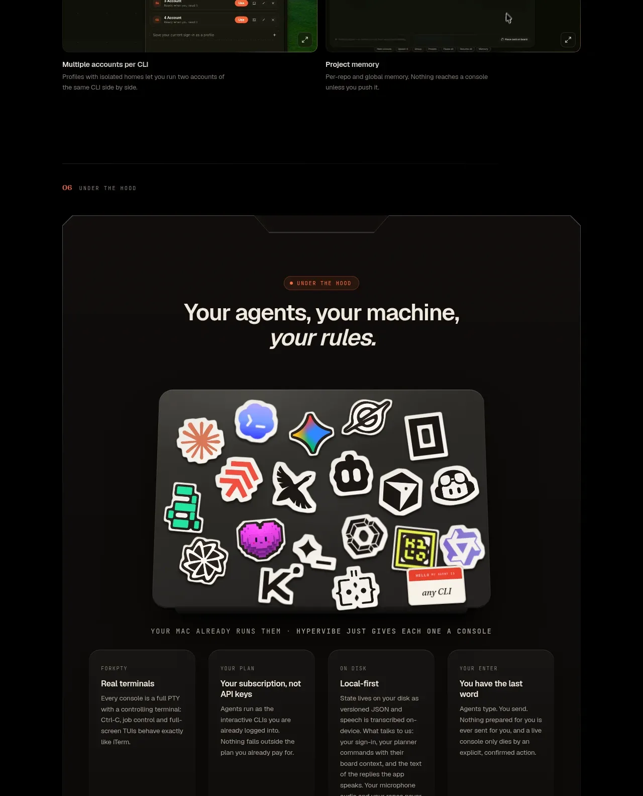
A large framed card presents the product philosophy, a collage-like visual, four principles, and three first-run steps in a contained narrative.
Prompt preview
## Reference images

Study these alongside the description below: hierarchy, rhythm, spacing, colour. Build for the product you are asked about, using this design language.

- Component: https://kage-design-assets.t3.tigrisfiles.io/components/hypervibe/0f025394-2dff-4c9b-be5f-8e394ec4a30f-1791699116-8.webp
- Full page it was cut from: https://kage-design-assets.t3.tigrisfiles.io/screenshots/hypervibe/0f025394-2dff-4c9b-be5f-8e394ec4a30f-1791699070438-full.webp
- Component on Kage: https://kage.design/component/hypervibe-card

## Before you start
Ask what the user's product requires users to configure, what principles should reassure them, and what the first three setup steps are. Then create a custom onboarding/principles card.

Build a large inset panel on a black page, with a near-black brown surface (#100f0d), subtle 1px border, clipped or chamfered decorative corners only if they improve the brand, and a 16–24px radius. Center a small eyebrow and a two-line heading near the top. Add a contained visual or abstract product collage using only the user's own assets. Beneath it, arrange four compact principle columns with tiny labels and short descriptions, then a lower row of three numbered setup cards. Keep typography compact and editorial, use off-white headings, #89867e body text, and one warm accent. The section should feel like a self-contained product manifesto followed by actionable setup.

### Never
- Never use logos, product names, copy, illustrations, or imagery from the reference.
- Never reproduce the reference icon collage or exact principle wording.
- Never make the panel so dense that the setup steps become hard to scan.