kage
kage
ancher.ai
Design analysis
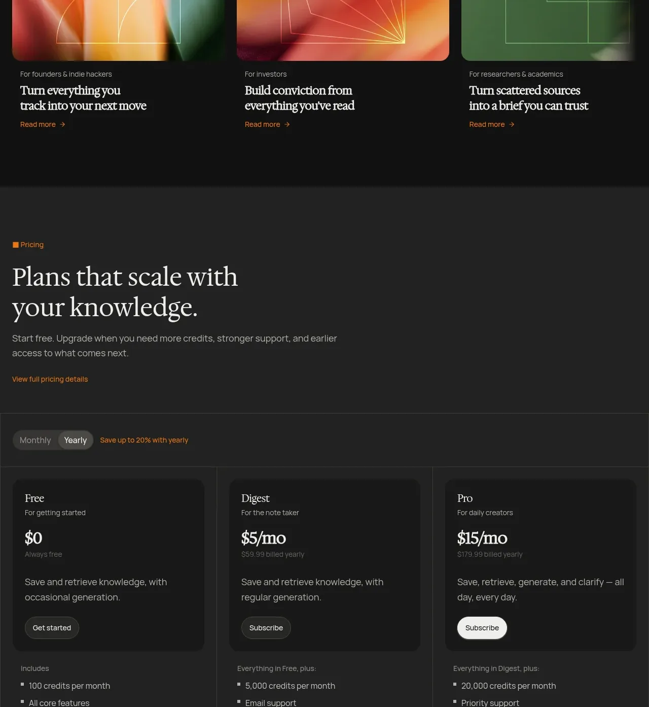
A broad audience-oriented heading is followed by three visual cards, each mapping a distinct user group to a concise outcome.
Prompt preview
## Reference images

Study these alongside the description below: hierarchy, rhythm, spacing, colour. Build for the product you are asked about, using this design language.

- Component: https://kage-design-assets.t3.tigrisfiles.io/components/ancher-2-0/49a60068-1f5d-45e9-9623-df337c2895cf-1791871461-7.webp
- Full page it was cut from: https://kage-design-assets.t3.tigrisfiles.io/screenshots/ancher-2-0/49a60068-1f5d-45e9-9623-df337c2895cf-1791871353691-full.webp
- Component on Kage: https://kage.design/component/ancher-2-0-card

## Before you start
Ask which user segments matter most for the user's product and what outcome each segment wants. Turn those answers into three original use cases.

Create a dark use-case section with a left-aligned serif heading and a short contextual paragraph. Under it, display three equal cards with large abstract visual thumbnails, a small audience label, a two-line serif outcome statement, and a compact text link. Use consistent 16:9 media areas, 10px radii, 16px gaps, and enough whitespace for the cards to feel premium. Use #111111, warm ivory #eee9df, muted #99928a, a restrained orange accent #de7d1b, and soft multicolor gradients tailored to the product brand. Add a subtle hover lift and thumbnail scale, but preserve accessible focus states. Stack cards vertically on narrow screens.

Never: use logos, product names, copy, illustrations, or imagery from the reference.