kage
kage
base44.com
Design analysis
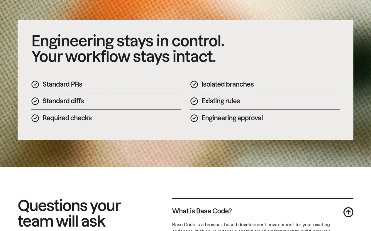
A photographic or textured backdrop supports a centered light panel whose headline and two-column checklist reassure engineering teams that existing controls remain intact.
Prompt preview
## Reference images

Study these alongside the description below: hierarchy, rhythm, spacing, colour. Build for the product you are asked about, using this design language.

- Component: https://kage-design-assets.t3.tigrisfiles.io/components/base-code/bec5af88-964e-4f0a-90b9-76aa2444b6f5-1791871472-6.webp
- Full page it was cut from: https://kage-design-assets.t3.tigrisfiles.io/screenshots/base-code/bec5af88-964e-4f0a-90b9-76aa2444b6f5-1791871315791-full.webp
- Component on Kage: https://kage.design/component/base-code-card

## Before you start
Ask what trust, governance, or compatibility concerns users have about the product, and ask for the brand's palette. Then make an original reassurance panel.

Build a full-width reassurance section over a softly blurred or abstract textured background. Place a large light panel inset from the edges, with a two-line headline and a two-column list of operational assurances. Each list row should use a small circular check icon, bold concise label, and thin divider line. Use a warm white panel around `#f2f1ee`, near-black text, understated dark rules, moderate panel padding, and a background gradient or texture that remains subordinate to the content. On mobile turn the checklist into one column. The panel should feel like a calm, concrete proof point rather than a marketing card.

Never use logos, product names, copy, illustrations, or imagery from the reference.