 kage
kage
latitude.so
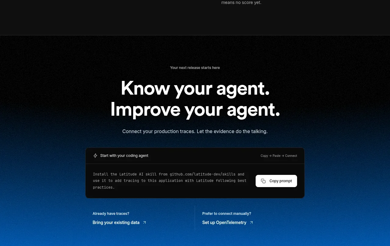
Design analysis
The closing CTA returns to a blue atmospheric gradient, uses a large two-line invitation, and offers a copyable setup snippet plus alternate connection paths.
Prompt preview
## Reference images

Study these alongside the description below: hierarchy, rhythm, spacing, colour. Build for the product you are asked about, using this design language.

- Component: https://kage-design-assets.t3.tigrisfiles.io/components/agentscore/bf3a39fb-f256-40cb-bcdd-3b9ee37cde16-1790229737-6.webp
- Full page it was cut from: https://kage-design-assets.t3.tigrisfiles.io/screenshots/agentscore/bf3a39fb-f256-40cb-bcdd-3b9ee37cde16-1790229689528-full.webp
- Component on Kage: https://kage.design/component/agentscore-cta

## Before you start
Ask what the user's desired conversion action is, how users connect the product, and whether setup should begin with a command, form, or integration. Apply the principles below to that product.

Build a centered closing CTA on a dark-to-blue gradient background. Use a small eyebrow, a large two-line headline, one supporting sentence, and a dark rounded code/setup panel with a top bar, short placeholder command, and prominent copy button. Beneath it, provide two compact alternative setup links in columns. Keep the content within about 600px for the heading and 500px for the code panel, with 50px side gutters. Use #050505 at the top blending into #0875d0 below, white #f5f5f5 headings, #c3d1df supporting text, a black translucent code panel (#101010cc), and a white copy button. Use 42–48px headline type, 14px body text, 12px code text, 12px panel radius, and 24–32px spacing. Make copy provide confirmation feedback, keep the code selectable, and stack the alternate links on mobile.

Never: use logos, product names, copy, illustrations, or imagery from the reference.
More components
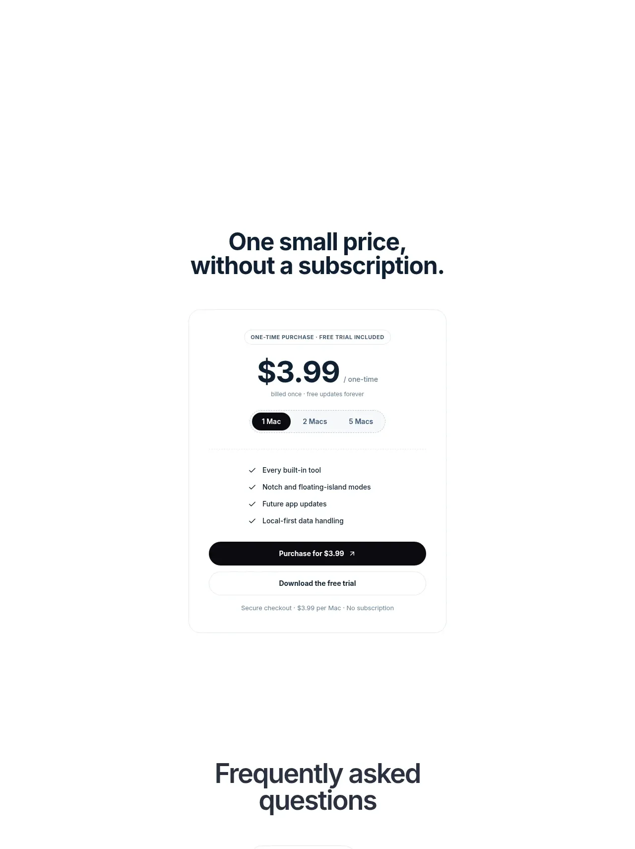
 Visual closing product statement
NotchPop · Call to action
Visual closing product statement
NotchPop · Call to action

 System positioning statement
IntellAgents.io · Call to action
System positioning statement
IntellAgents.io · Call to action
 Final conversion banner
IntellAgents.io · Call to action
Final conversion banner
IntellAgents.io · Call to action
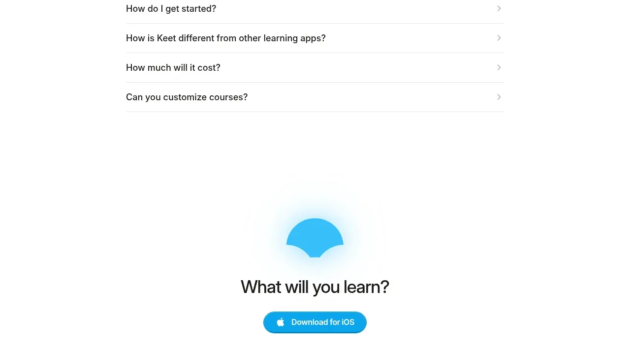
 Final app-download call to action
Keet · Call to action
Final app-download call to action
Keet · Call to action
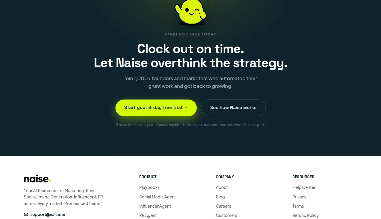
 Dark conversion call to action
Naise AI · Call to action
Dark conversion call to action
Naise AI · Call to action
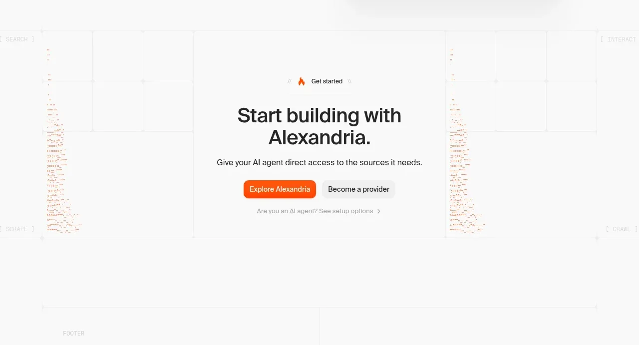
 Final build CTA
Alexandria by Firecrawl · Call to action
Final build CTA
Alexandria by Firecrawl · Call to action