kage
kage
latitude.so
Design analysis
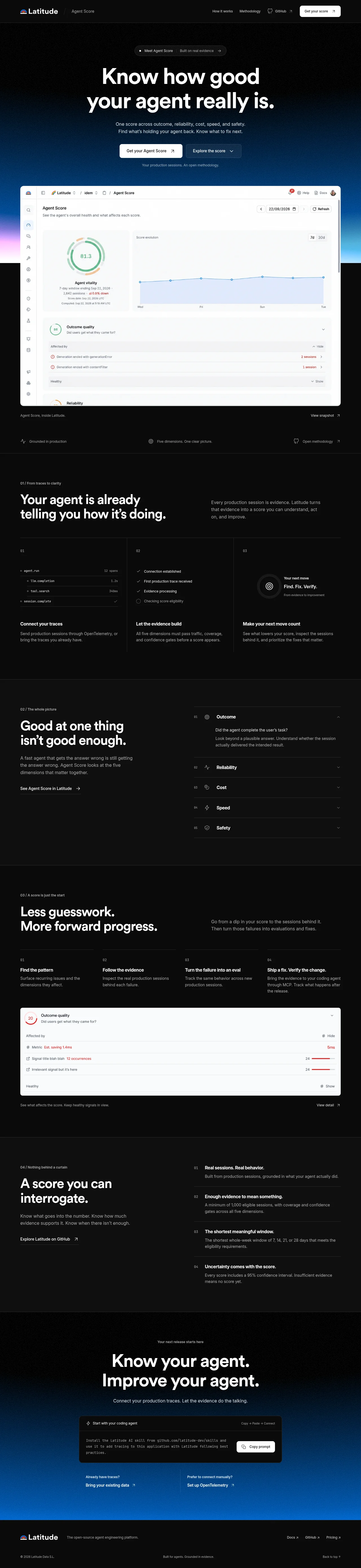
A long-form dark landing page uses a restrained black canvas, thin gray dividers, compact metadata labels, and oversized white headings to create a technical editorial rhythm. The hero and closing CTA use a vivid blue atmospheric gradient behind product screenshots and a code block, while the middle sections shift into dense two-column explanations, numbered cards, an accordion, and evidence panels that progressively explain the scoring model.
Prompt preview
## Reference images

Study these alongside the description below: hierarchy, rhythm, spacing, colour. Build for the product you are asked about, using this design language.

- Full page: https://kage-design-assets.t3.tigrisfiles.io/screenshots/agentscore/bf3a39fb-f256-40cb-bcdd-3b9ee37cde16-1790229689528-full.webp
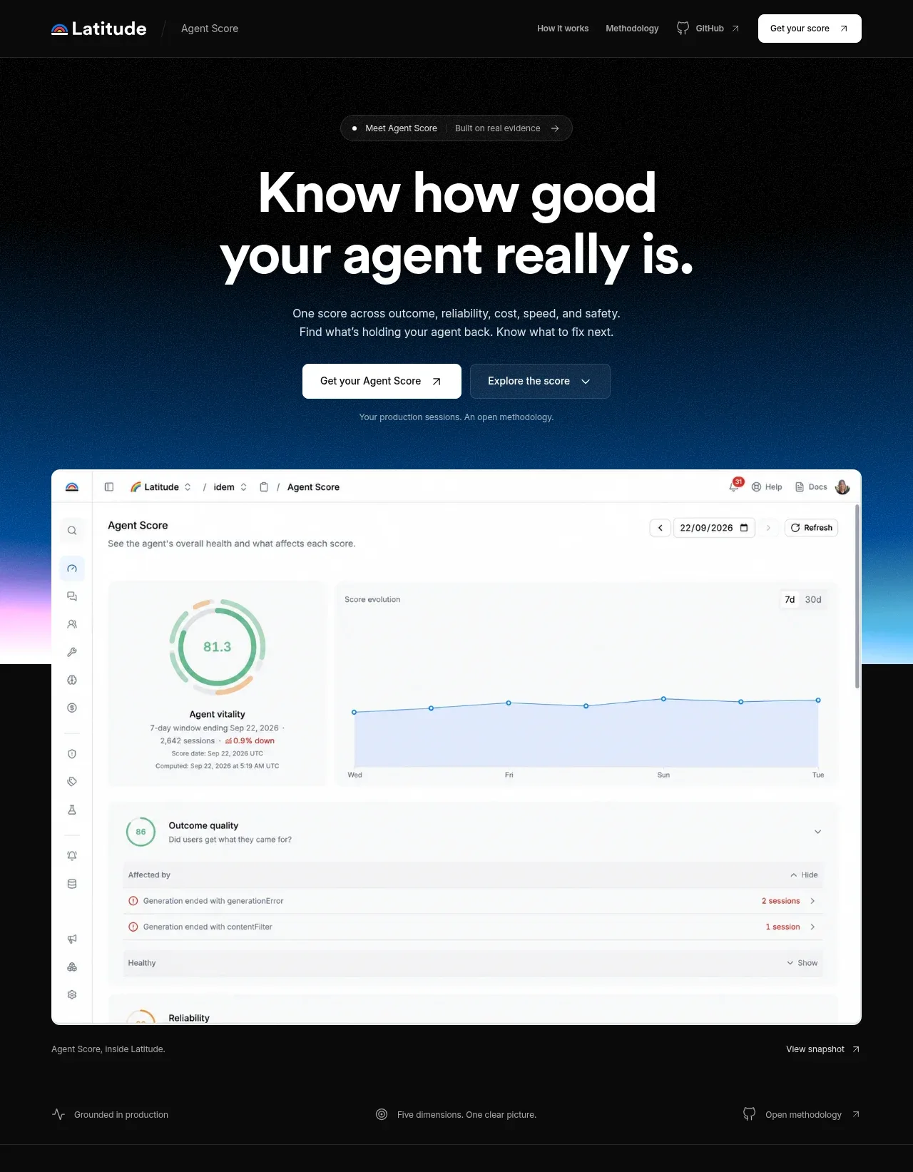
- Above the fold: https://kage-design-assets.t3.tigrisfiles.io/screenshots/agentscore/bf3a39fb-f256-40cb-bcdd-3b9ee37cde16-1790229687488.webp
- Design on Kage: https://kage.design/designs/agentscore-landing-page

## Before you start
Ask the user what they are building, who it is for, and what brand assets they already have, including a product name, colours, type choices, logos, and any existing UI screenshots. Wait for their answers before designing. Apply everything below to their product, not to the reference.

## Page structure
1. **Persistent top navigation** — Use a slim dark header with a product mark/name at left, a small contextual label beside it, text links for the explanatory sections and an external-resource link, plus a high-contrast rounded CTA at right.
2. **Hero announcement pill** — Center a small dark pill with a status dot, a short proposition, and a subtle arrow before the main headline.
3. **Hero introduction** — Center a large two-line white headline, a concise supporting paragraph, two side-by-side CTAs, and a muted line of auxiliary context.
4. **Primary product showcase** — Place a large light product dashboard screenshot in a rounded frame over a black-to-electric-blue glow that fades into pink near the lower edge. Add a tiny caption and a right-aligned snapshot link beneath it.
5. **Hero proof strip** — Add three evenly spaced, low-contrast proof points below the showcase, separated by generous horizontal space and small line icons.
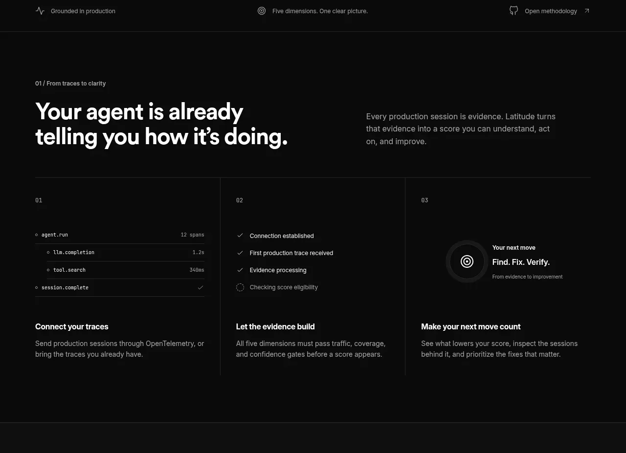
6. **Section 01: traces to clarity** — Introduce the first idea with a small numbered eyebrow, a large left-aligned heading, and a short explanatory paragraph aligned on the right. Follow with three equal-width cards separated by vertical rules: trace connection, evidence processing, and the next action. Each card combines a small visual/status treatment, a bold title, and muted body copy.
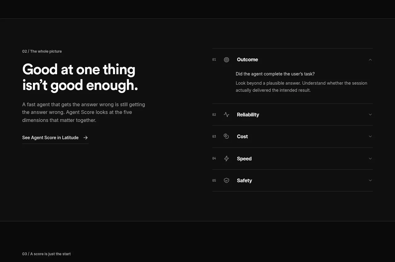
7. **Section 02: the whole picture** — Use a two-column layout with a large statement and supporting copy/link on the left, and a vertically stacked accordion/list of five scored dimensions on the right. Keep the first item expanded with an explanation and the others collapsed; use numbers, small line icons, separators, and chevrons.
8. **Section 03: score to progress** — Repeat the eyebrow-plus-heading and right-side explanatory copy pattern, then show four compact numbered steps in a horizontal row. Below, place a wide light evidence/detail panel with rows, red warning values, small progress bars, and an external detail link.
9. **Section 04: interrogable score** — Present another two-column explanatory section: a large headline and GitHub/resource link on the left, and four numbered evidence principles on the right. Use horizontal rules and concise bold lead-ins followed by muted descriptions.
10. **Closing CTA band** — Transition back to a black hero-like field with a blue glow rising from the bottom. Center a small preheading, a large two-line headline, supporting text, and a dark terminal/code card with a copy button. Add two small follow-up links below for importing existing data or connecting manually.
11. **Footer** — Finish with a compact dark footer: product identity and descriptor on the left, resource links on the right, then a lower legal/status row with copyright, a short grounding statement, and a back-to-top link.

## Design language
- Build hierarchy through scale and whitespace: use tiny uppercase or compact metadata labels, 13–16px muted body text, bold 42–64px section headlines, and a 64–82px hero headline with tight line height.
- Keep the page mostly monochrome: use near-black backgrounds around #080808–#101010, white text around #F5F5F5, secondary text around #8B8B8B, and dividers around #292929.
- Reserve colour for emphasis and atmosphere. Use a saturated blue glow around #0068D9–#087CFF, a restrained pink/lilac transition around #D98DFF, pale product surfaces around #F7F8F8, and occasional red warning accents around #D85C63.
- Use a strong editorial rhythm that changes down the page: an expansive, visually rich hero; sparse proof points; dense instructional card grids and accordions; a compact evidence panel; then a spacious technical CTA and quiet footer.
- Use a centered max-width container with generous horizontal margins. Align most explanatory content to a consistent left grid, while allowing hero headings and CTA content to remain centered.
- Treat product screenshots as high-value proof: place them in large rounded rectangles with subtle borders, clipped overflow, and enough surrounding dark space for the blue glow to read as depth.
- Keep cards and panels restrained: 1px borders, little or no shadow, small 4–8px radii for dark utility surfaces, and larger 8–12px radii for light dashboard screenshots and CTA controls.
- Pair a neutral modern sans-serif for all UI and headings. Use tight tracking and heavy weight for headlines, regular weight for explanatory copy, and monospace or technical microcopy only inside terminal/code treatments.
- Use thin rules and numbering as structural devices. Let vertical separators divide cards and horizontal rules organize accordions, evidence lists, and footer metadata instead of relying on heavy containers.
- Make controls understated but clear: white filled primary buttons, translucent or blue-tinted secondary buttons, short arrow labels, compact chevrons, and subtle hover changes in border, brightness, or text colour.
- Animate only where useful: allow the atmospheric gradient to remain static or drift very subtly, reveal evidence panels and accordion content with short easing, and keep interactions quiet and fast rather than decorative.

## Never
- Do not copy logos, wordmarks, product names, copy, illustrations, photography, icons, screenshots, or code from the reference.
- Do not present the result as Latitude, AgentScore, or as an imitation of that product.
- Create new brand assets, original interface examples, and product-specific copy for the user's product while preserving the reusable layout and design principles above.
Components from this page
All components
 Minimal product navigation
AgentScore · Navigation
Minimal product navigation
AgentScore · Navigation
 Evidence-led agent benchmark hero
AgentScore · Hero
Evidence-led agent benchmark hero
AgentScore · Hero
 Three-step evidence workflow
AgentScore · Feature grid
Three-step evidence workflow
AgentScore · Feature grid
 Five-dimension score breakdown
AgentScore · Tabs & steps
Five-dimension score breakdown
AgentScore · Tabs & steps
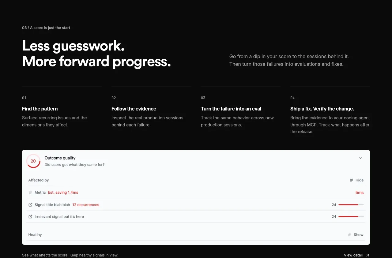 From signal to improvement loop
AgentScore · Feature grid
From signal to improvement loop
AgentScore · Feature grid
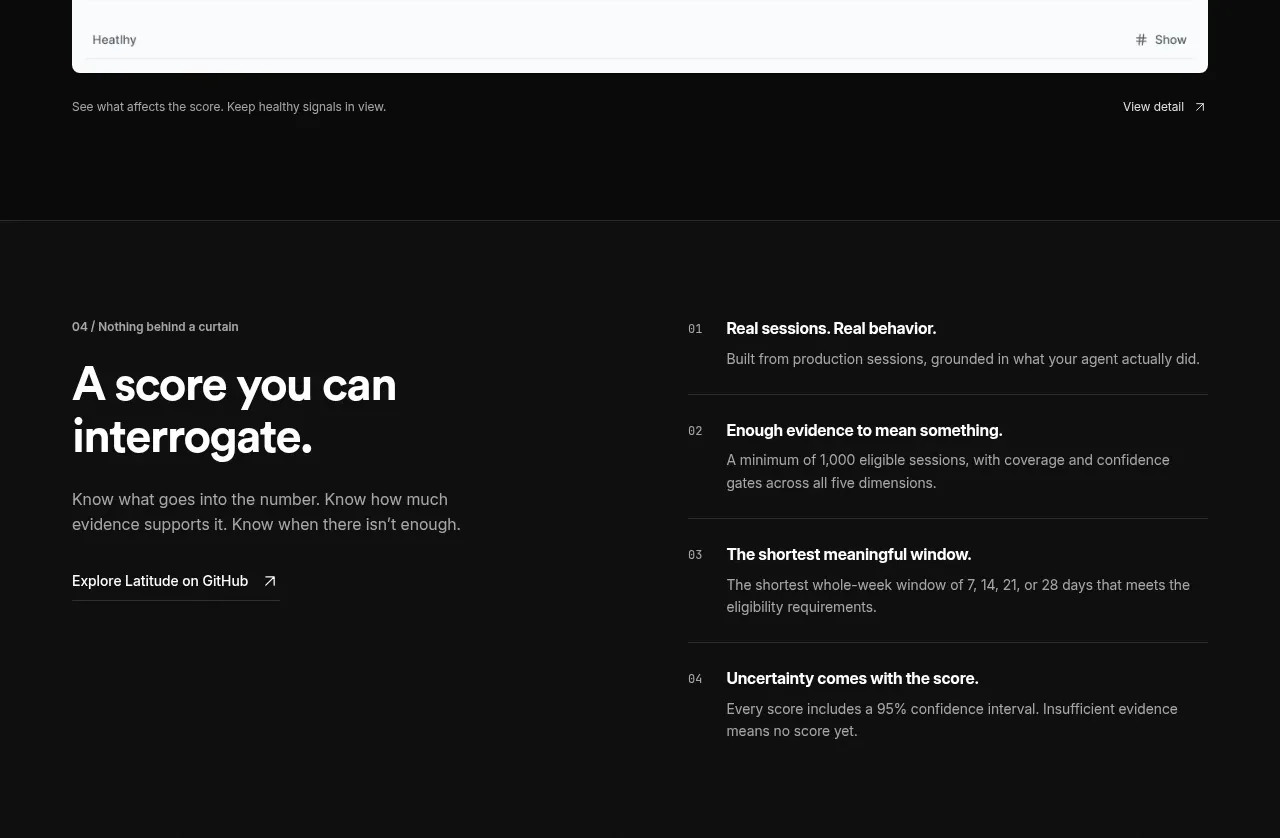 Transparent scoring principles
AgentScore · Feature grid
Transparent scoring principles
AgentScore · Feature grid
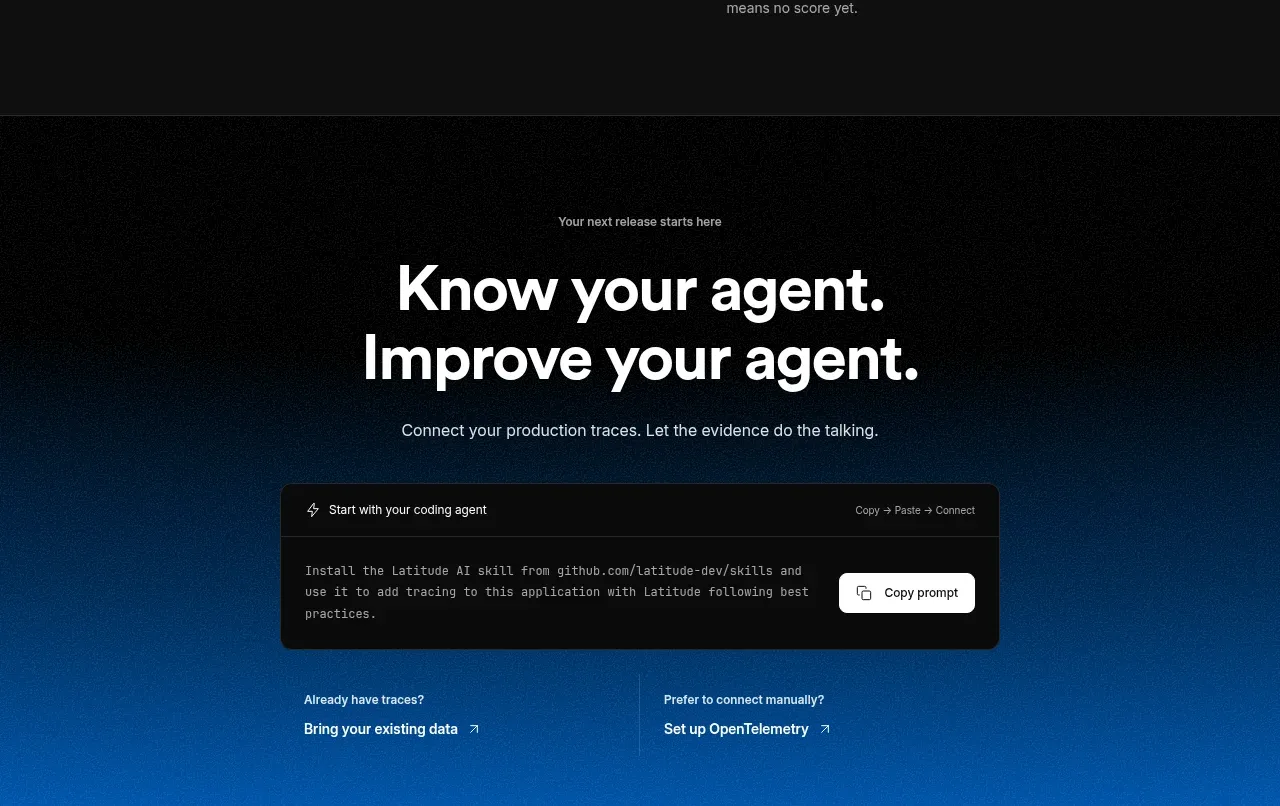 Connect data and start improving
AgentScore · Call to action
Connect data and start improving
AgentScore · Call to action
 Utility footer
AgentScore · Footer
Utility footer
AgentScore · Footer