kage
kage
latitude.so

Design analysis
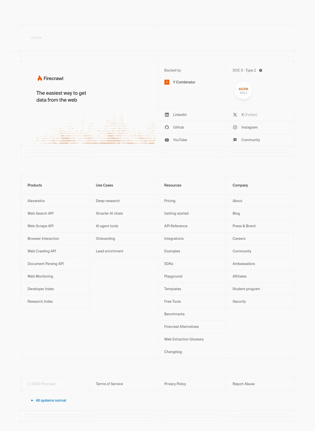
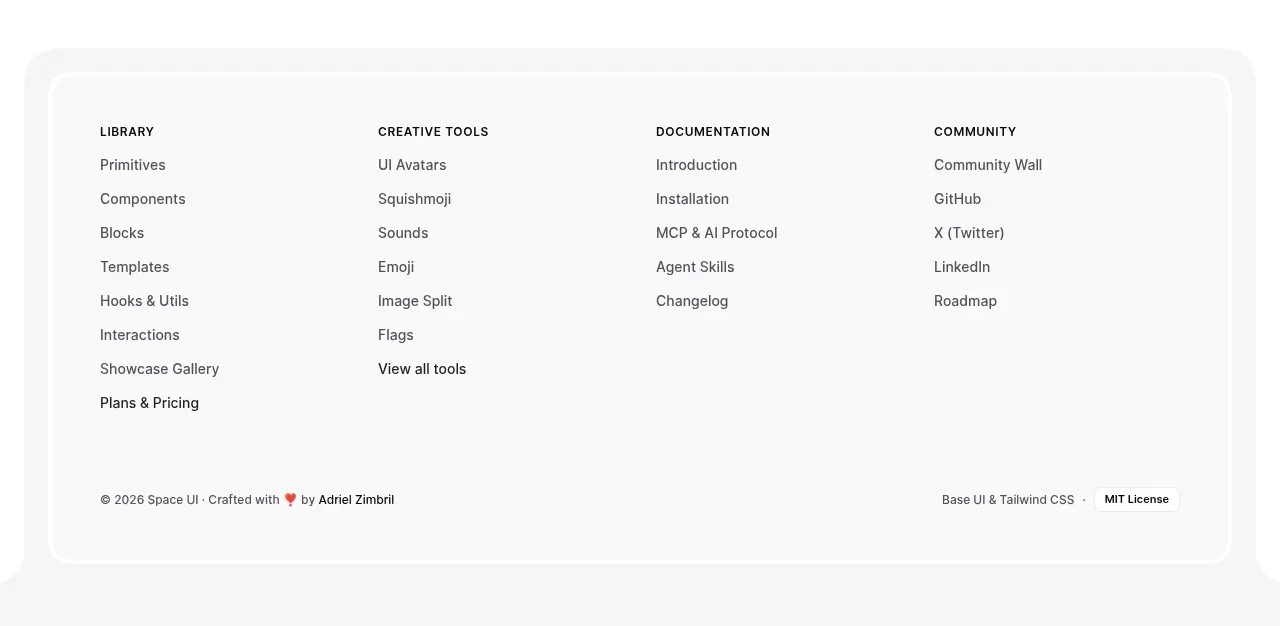
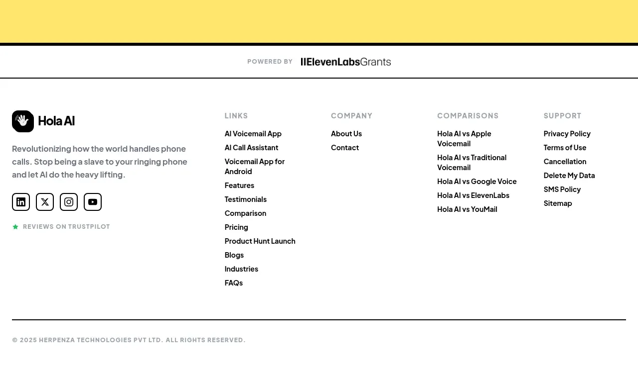
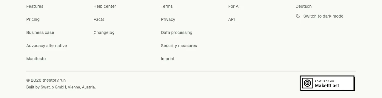
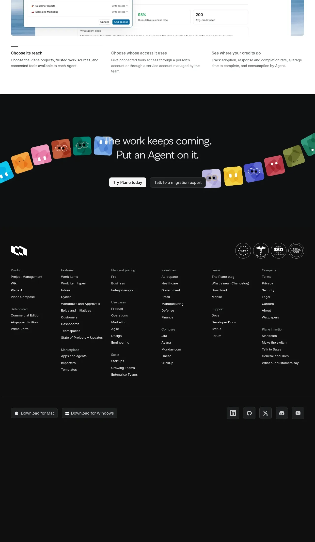
A restrained footer repeats the brand area, exposes a few utility destinations, and closes with copyright and a back-to-top affordance.
Prompt preview
## Reference images

Study these alongside the description below: hierarchy, rhythm, spacing, colour. Build for the product you are asked about, using this design language.

- Component: https://kage-design-assets.t3.tigrisfiles.io/components/agentscore/bf3a39fb-f256-40cb-bcdd-3b9ee37cde16-1790229738-7.webp
- Full page it was cut from: https://kage-design-assets.t3.tigrisfiles.io/screenshots/agentscore/bf3a39fb-f256-40cb-bcdd-3b9ee37cde16-1790229689528-full.webp
- Component on Kage: https://kage.design/component/agentscore-footer

## Before you start
Ask what links, legal details, and brand expression the user's product needs at the bottom of the page. Apply the principles below to that product.

Create a compact full-width dark footer with a thin top border. Use a centered container with a top row: a text-based brand placeholder and short descriptor on the left, and a small set of utility links on the right. Add a lower row with copyright or legal text, a quiet product statement, and a back-to-top link. Use #080808 background, #e8e8e8 for the brand, #858585 for supporting text, and #272727 for borders. Keep the footer around 170–200px tall on desktop, with 50px horizontal padding, 12–14px text, 28–36px row separation, and subtle hover transitions. Stack the rows and align links left on mobile. Keep it functional and visually quiet.

Never: use logos, product names, copy, illustrations, or imagery from the reference.