 kage
parthjadhav.com
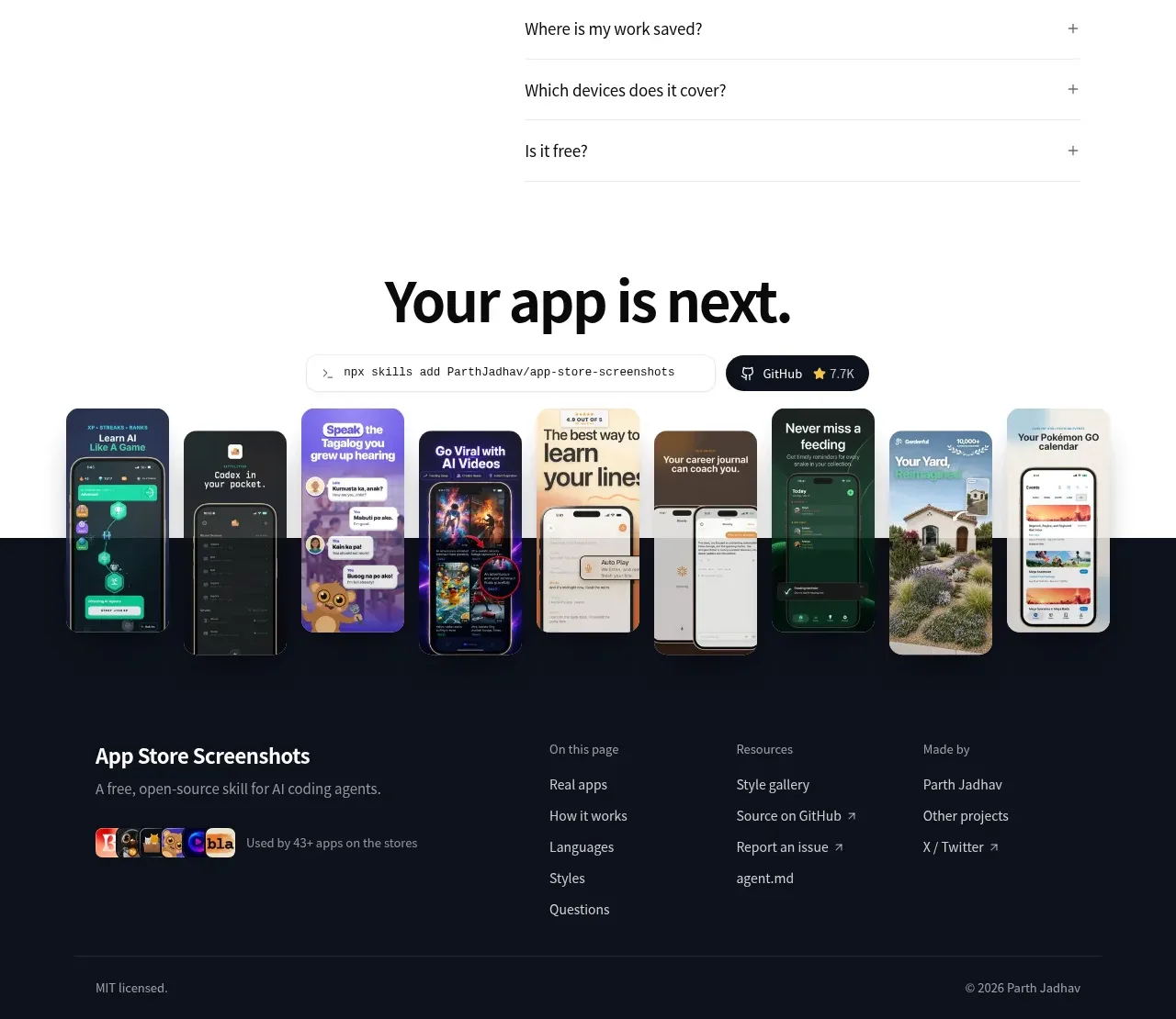
Design analysis
The footer continues the dark visual language with product context, grouped navigation links, social/resource destinations, and a quiet legal baseline.
Prompt preview
## Reference images

Study these alongside the description below: hierarchy, rhythm, spacing, colour. Build for the product you are asked about, using this design language.

- Component: https://kage-design-assets.t3.tigrisfiles.io/components/app-store-screenshots/ebba8a13-8dd3-48a7-9b23-a1c0db4171af-1793253673-8.webp
- Full page it was cut from: https://kage-design-assets.t3.tigrisfiles.io/screenshots/app-store-screenshots/ebba8a13-8dd3-48a7-9b23-a1c0db4171af-1793253637144-full.webp
- Component on Kage: https://kage.design/component/app-store-screenshots-footer

## Before you start
Ask what the user's product, brand, destination links, legal requirements, and social channels are, then apply these principles to that product.

Build a spacious dark footer matching the closing CTA, using a background near #0d121e and a restrained top boundary. Start with a product description and small usage/proof row on the left, then organize links into three or four compact columns such as page navigation, resources, and company/social. Use 12–14px muted gray text, white or near-white section labels, 8–12px vertical gaps, and subtle hover transitions. Finish with a thin divider and a bottom row for license/copyright information. Keep the footer responsive: collapse link groups into stacked sections or accordions on mobile while preserving clear keyboard access.

Never:
- use logos, product names, copy, illustrations, or imagery from the reference
- omit required legal or accessibility links
- overload the footer with every possible destination
More components

 Multi-column site footer
Basedash View-only members · Footer
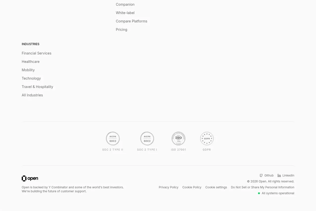
 Site navigation and trust footer
Open For sales · Footer
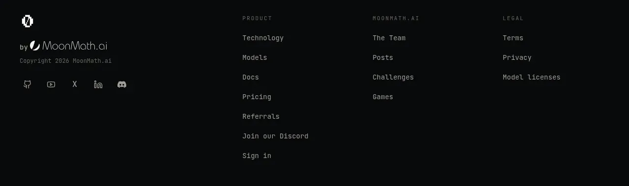
 Multi-column site footer
Zro: Uncensored Security Models · Footer

 Quiet utility footer
Dotverse · Footer

 Utility footer
AI Bridge · Footer

V
Multi-column company footer
VibeiDE · Footer