 kage
kage
buddy.works
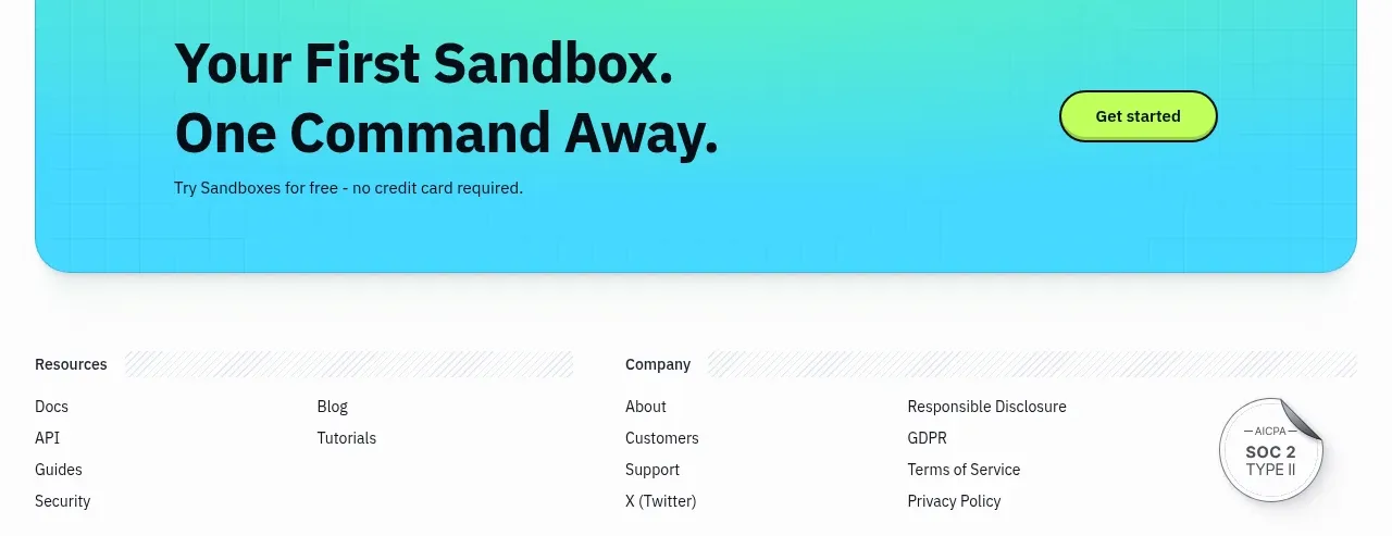
Design analysis
A rounded, saturated gradient panel closes the content with a memorable two-line invitation, supporting reassurance, and one clear action.
Prompt preview
## Reference images

Study these alongside the description below: hierarchy, rhythm, spacing, colour. Build for the product you are asked about, using this design language.

- Component: https://kage-design-assets.t3.tigrisfiles.io/components/ai-sandboxes-by-buddy/f0e6e8b3-2b0a-4e1e-b3c7-06d5e5447056-1792130831-10.webp
- Full page it was cut from: https://kage-design-assets.t3.tigrisfiles.io/screenshots/ai-sandboxes-by-buddy/f0e6e8b3-2b0a-4e1e-b3c7-06d5e5447056-1792130620611-full.webp
- Component on Kage: https://kage.design/component/ai-sandboxes-by-buddy-cta

## Before you start
Ask what first action the user's product wants visitors to take, what reassurance removes friction, and which brand colors should define the conversion moment. Then design an original CTA.

Create a wide, inset CTA panel with a generous 28–32px corner radius, bold two-line headline, short reassurance line, and one bright action button aligned to the right on desktop. Use a vivid but tasteful cyan-to-mint gradient, approximately #36C8EF to #55E5A5, with near-black #0E1117 text. Keep the panel around 170–220px tall, add ample internal padding, and use a soft shadow or subtle border to separate it from the page. The button should use lime #B9FF4A, black border, bold text, and a pill radius. Stack the content and button vertically on mobile while retaining strong contrast.

Never: use the reference's product name, exact copy, logo, illustrations, or imagery.
More components

 Final conversion banner
CrewTower Mod for Claude Code · Call to action
Final conversion banner
CrewTower Mod for Claude Code · Call to action
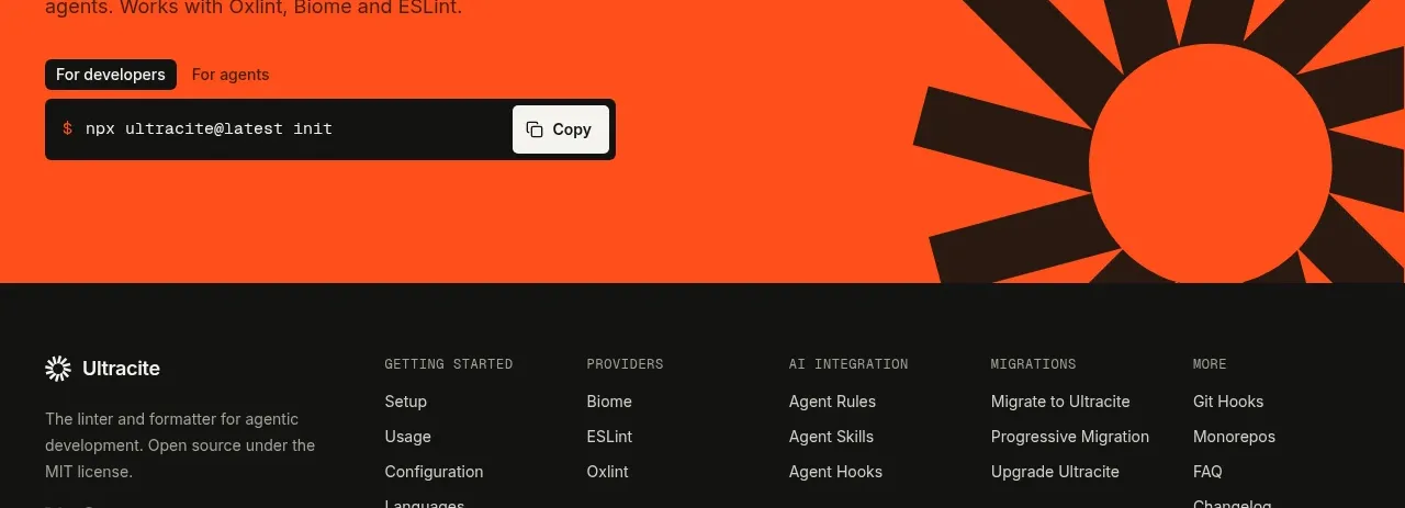
 Bright installation call to action
Ultracite v8 · Call to action
Bright installation call to action
Ultracite v8 · Call to action
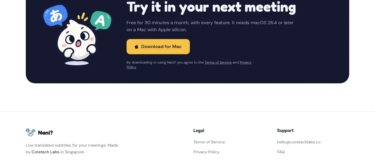
 Download call to action
NANI??? · Call to action
Download call to action
NANI??? · Call to action
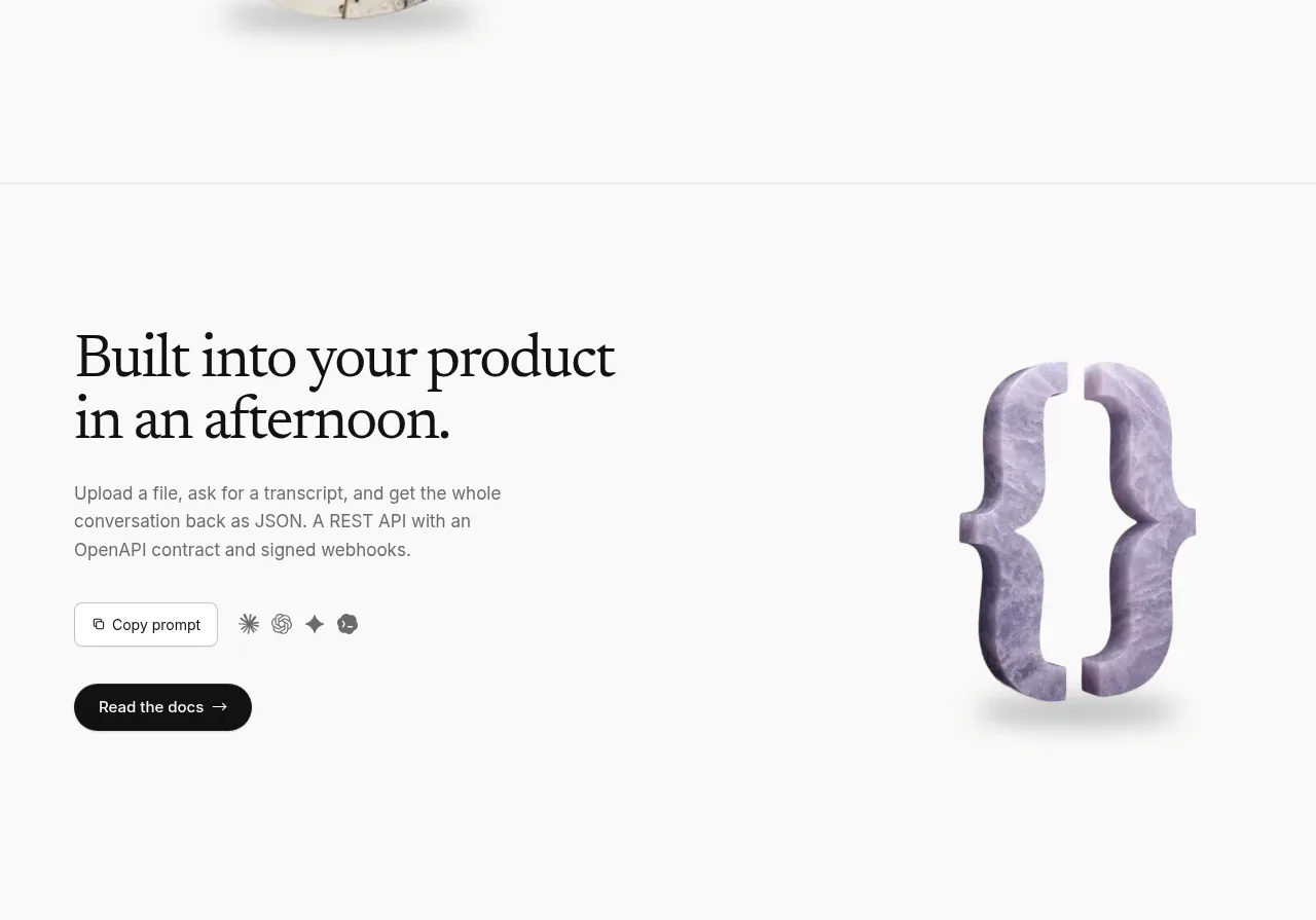
 Developer integration CTA
Maybloc · Call to action
Developer integration CTA
Maybloc · Call to action
 Marble-backed final CTA
Maybloc · Call to action
Marble-backed final CTA
Maybloc · Call to action
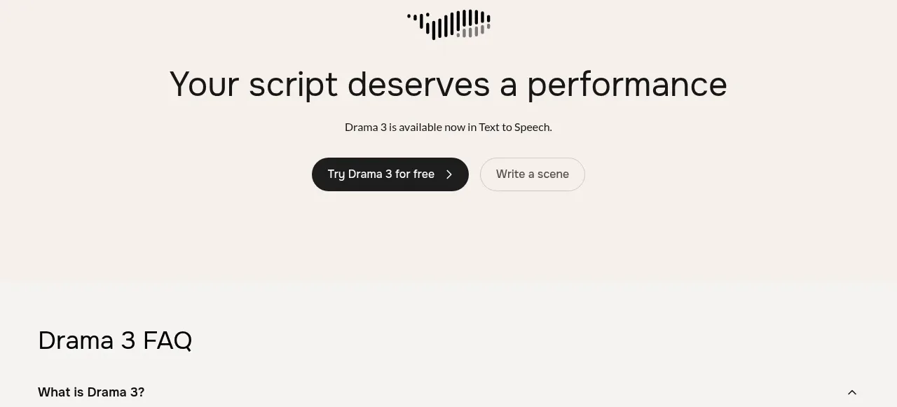
 Centered conversion call to action
Fish Audio Drama 3 · Call to action
Centered conversion call to action
Fish Audio Drama 3 · Call to action