kage
kage
buddy.works

Design analysis
A long-form infrastructure landing page uses a white technical grid as its recurring surface, heavy black sans-serif headlines, thin rules, and restrained rounded panels. The hero pairs a large two-line headline and compact CTA group with a terminal demo, then the rhythm moves through trust logos, three numeric metrics, dense capability grids, agent workflow steps, code/API examples, an interactive-looking pricing comparison, FAQ rows, and a bright cyan-to-teal closing CTA. Neon lime and cyan appear as small functional accents on controls, illustrations, terminal corner marks, and the final conversion block rather than as a broad colour system.
Prompt preview
## Reference images

Study these alongside the description below: hierarchy, rhythm, spacing, colour. Build for the product you are asked about, using this design language.

- Full page: https://kage-design-assets.t3.tigrisfiles.io/screenshots/ai-sandboxes-by-buddy/f0e6e8b3-2b0a-4e1e-b3c7-06d5e5447056-1792130620611-full.webp
- Above the fold: https://kage-design-assets.t3.tigrisfiles.io/screenshots/ai-sandboxes-by-buddy/f0e6e8b3-2b0a-4e1e-b3c7-06d5e5447056-1792130618779.webp
- Design on Kage: https://kage.design/designs/ai-sandboxes-by-buddy-landing-page

## Before you start
Ask the user what they are building, who it is for, and what brand assets they already have (name, colours, type choices, logo, and illustration or icon direction). Wait for their answers before designing. Apply the reference's structural and visual principles to their product, not to the reference product.

## Page structure
1. **Sticky top navigation** — Use a short horizontal header with a small product mark at left, a few centered anchor links, and one high-contrast rounded action button at right.
2. **Hero** — Place a large two-line headline and concise explanatory paragraph on the left with two pill-shaped CTAs; place a bordered terminal or code-output panel on the right. Put the hero over a very subtle full-width engineering grid and add small lime/cyan corner accents to the demo panel.
3. **Trust strip** — Follow the hero with a compact, centered “trusted by” label and a single horizontal row of monochrome customer wordmarks or neutral proof items.
4. **Metrics section** — Introduce a small uppercase eyebrow and three equal-width metric columns. Each column gets a thin technical illustration, a very large numeric value, and a short explanatory caption, separated by faint vertical rules.
5. **Stateful capability section** — Switch to a two-column introduction: a large left headline and a right paragraph explaining the product distinction. Below it, show a three-column by two-row feature grid with bold labels and short descriptions; keep the grid airy but use faint vertical and horizontal rules.
6. **Agent-focused integrations section** — Use another two-column layout with a large headline and explanatory copy on the left, and four compact integration/link items on the right arranged as a 2×2 grid. Include small line icons, short labels, and arrow affordances.
7. **Workflow/test section** — Present a large headline and short description, then a two-column, two-row sequence of four numbered steps. Each step combines a small outlined isometric-style number tile, a bold step title, body copy, and a narrow rounded command snippet where relevant.
8. **Commands and operations section** — Use the grid background more visibly here. Put a large headline and short technical description across the top, followed by a small SDK/CLI selector. Below, pair a bordered code editor or terminal panel on the left with a vertical list of operation categories on the right. Add a bright cyan or lime corner accent to the code panel.
9. **Pricing calculator/comparison section** — Keep the technical grid and introduce a large pricing interaction card. Show an hours label, a long horizontal slider with endpoint ticks, a comparison explanation, compact pill controls for resources, and stacked competitor bars with prices aligned to the right. Make the current product bar noticeably shorter/darker to show the comparison.
10. **FAQ section** — Use a two-column layout with a large left heading and a right accordion list. Number each question with small two-digit labels, separate rows with thin rules, and place a minimal chevron at the far right.
11. **Closing CTA** — Add a large rounded rectangular banner with a cyan-to-teal gradient, dark two-line headline, supporting sentence, and a lime rounded action button. Keep this as the strongest colour moment on the page.
12. **Footer** — Finish with several compact link columns for resources and company information, a compliance/security badge, a copyright/status row, and a very large faint outlined brand-neutral typographic treatment at the bottom.

## Design language
- Build hierarchy with an unusually bold black sans-serif display face for section headings, generally 44–64px on desktop, while body copy stays compact at roughly 14–16px with generous line-height.
- Let sections alternate between sparse editorial two-column compositions and denser technical grids. Use generous vertical spacing between sections, then increase information density in feature, workflow, pricing, and FAQ areas.
- Use a near-white base such as `#ffffff` or `#fbfbfa`, near-black text such as `#090b10`, and a very faint blue-gray grid such as `#e9eef0`. Make the grid a repeating 24–28px square background with low opacity, not a dominant texture.
- Reserve neon lime around `#c7ff45` for primary buttons and small technical highlights. Use cyan/teal around `#28d5ec` and `#45e3bd` for code-panel accents and the final CTA gradient; keep these colours concentrated so the page remains mostly monochrome.
- Pair heavy geometric headings with a neutral grotesk body face. Use uppercase, widely tracked micro-labels for eyebrows and utility metadata, and monospace type for commands, API snippets, terminal output, and small technical annotations.
- Treat borders as 1px pale gray rules. Use minimal shadow, mostly a very soft shadow beneath raised code panels and the CTA banner. Buttons and major panels can use 14–24px rounding, while content grids and dividers remain square and precise.
- Use thin line drawings and restrained isometric technical diagrams for metrics; avoid decorative illustration. Keep terminal panels white, bordered, and readable, with tabs or small selectors across the top.
- Make interactions feel operational: rounded lime buttons darken slightly on hover, code tabs switch content, pricing controls update values and bars, and FAQ rows expand in place. Keep motion short and functional, using subtle panel lifts or accent-line transitions rather than theatrical animation.
- Maintain a consistent wide content container, roughly 1200–1280px, with strong left alignment. Use full-width grid surfaces for technical sections and clean white breaks to control rhythm.

## Never
- Do not copy any reference logos, wordmarks, product names, slogans, customer logos, exact copy, illustrations, icon sets, terminal commands, pricing values, or brand-specific content.
- Do not present the result as Buddy Works or as the same sandbox product.
- Do not reproduce the reference's exact layout proportions or text; translate the system to the user's own product, audience, content, and brand assets.
- Do not add gradients everywhere, excessive shadows, noisy decoration, stock photography, or generic dashboard chrome.
Components from this page
All components
 Minimal product navigation
AI Sandboxes by Buddy · Navigation
Minimal product navigation
AI Sandboxes by Buddy · Navigation
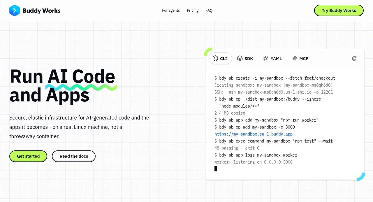 AI sandbox hero
AI Sandboxes by Buddy · Hero
AI sandbox hero
AI Sandboxes by Buddy · Hero
 Trusted by teams strip
AI Sandboxes by Buddy · Logo cloud
Trusted by teams strip
AI Sandboxes by Buddy · Logo cloud
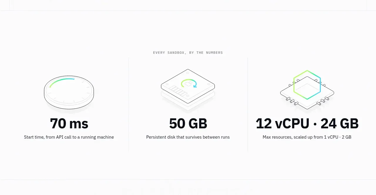 Sandbox performance stats
AI Sandboxes by Buddy · Stats
Sandbox performance stats
AI Sandboxes by Buddy · Stats
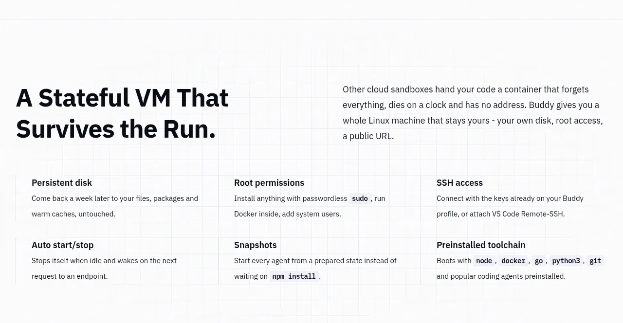 Stateful VM benefits
AI Sandboxes by Buddy · Feature grid
Stateful VM benefits
AI Sandboxes by Buddy · Feature grid
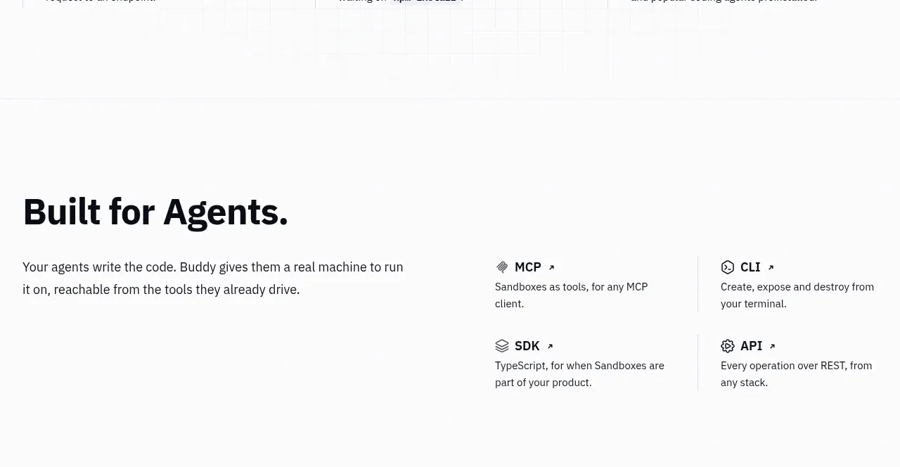 Agent integrations
AI Sandboxes by Buddy · Feature grid
Agent integrations
AI Sandboxes by Buddy · Feature grid
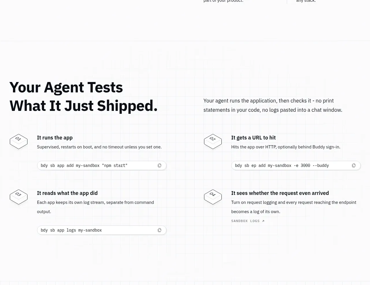 Agent test workflow
AI Sandboxes by Buddy · Feature grid
Agent test workflow
AI Sandboxes by Buddy · Feature grid
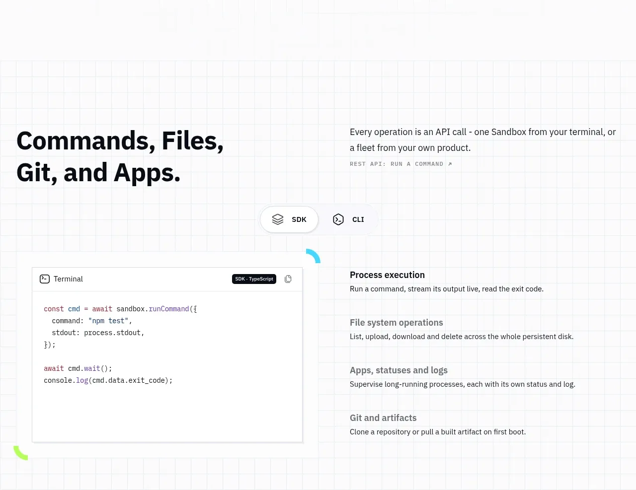 Commands and API surface
AI Sandboxes by Buddy · Code block
Commands and API surface
AI Sandboxes by Buddy · Code block
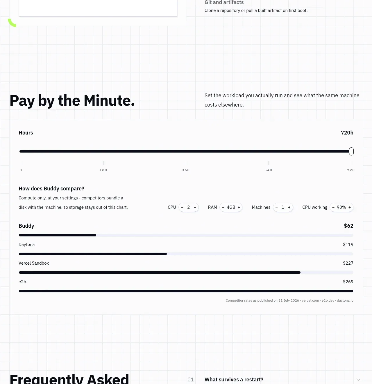 Usage and cost comparison
AI Sandboxes by Buddy · Chart
Usage and cost comparison
AI Sandboxes by Buddy · Chart
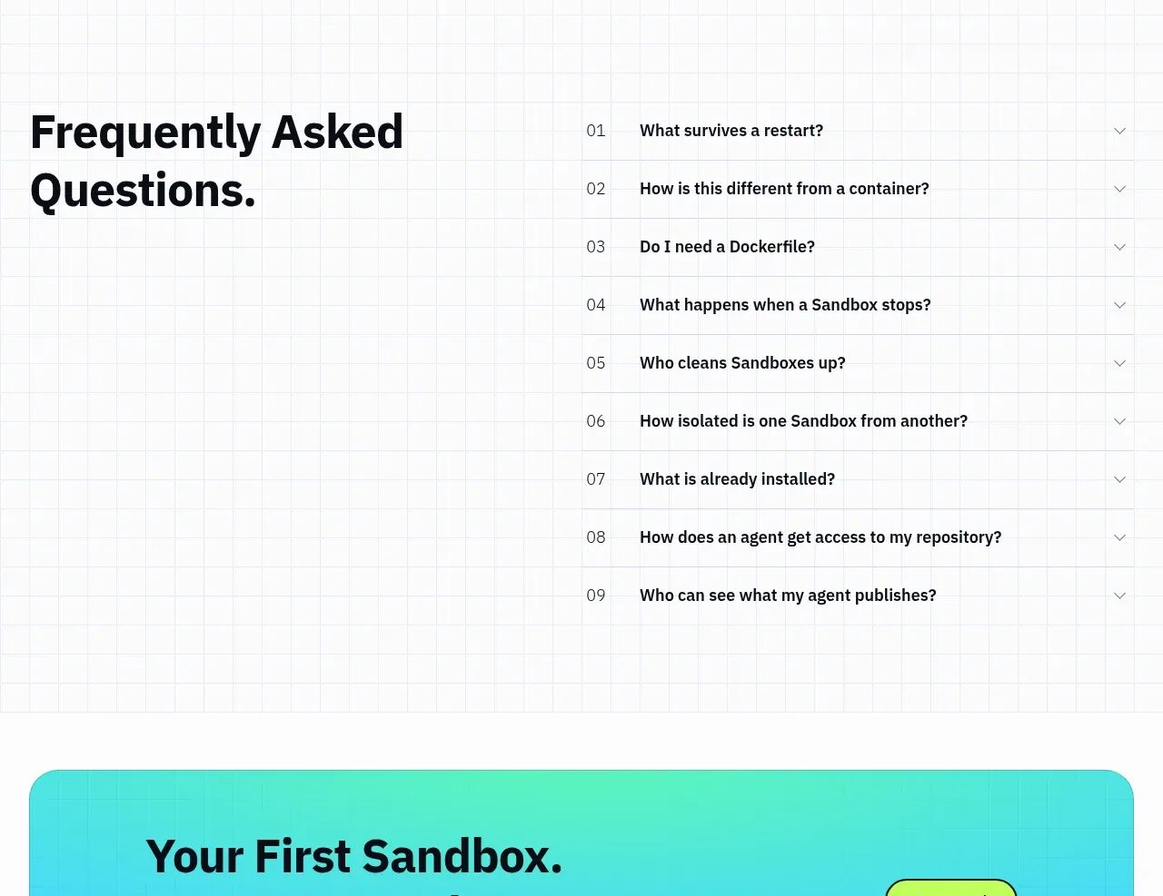 Frequently asked questions
AI Sandboxes by Buddy · FAQ
Frequently asked questions
AI Sandboxes by Buddy · FAQ
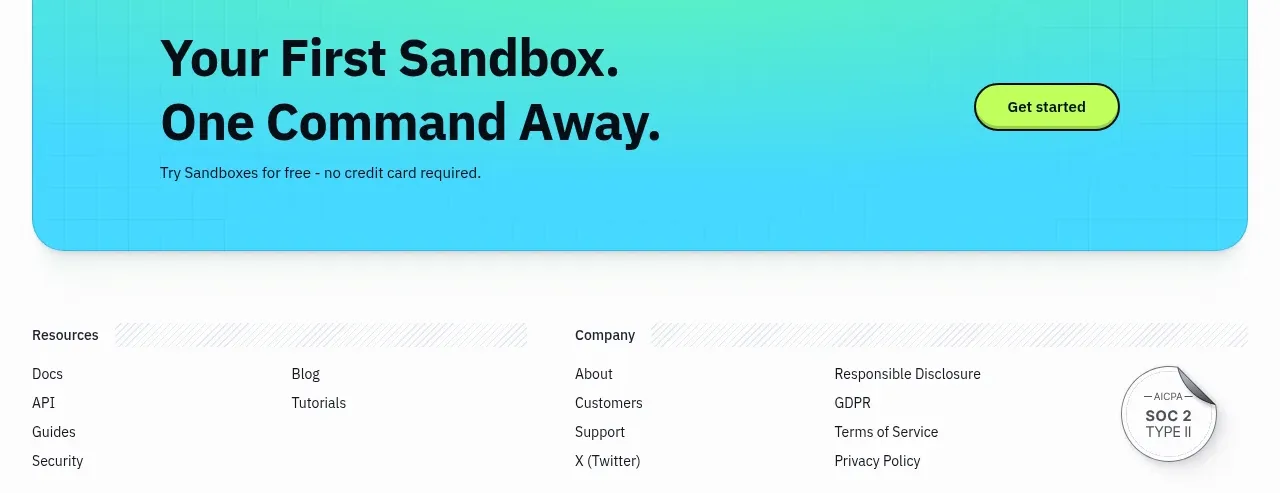 First-use conversion banner
AI Sandboxes by Buddy · Call to action
First-use conversion banner
AI Sandboxes by Buddy · Call to action
 Resource and legal footer
AI Sandboxes by Buddy · Footer
Resource and legal footer
AI Sandboxes by Buddy · Footer