 kage
kage
buddy.works
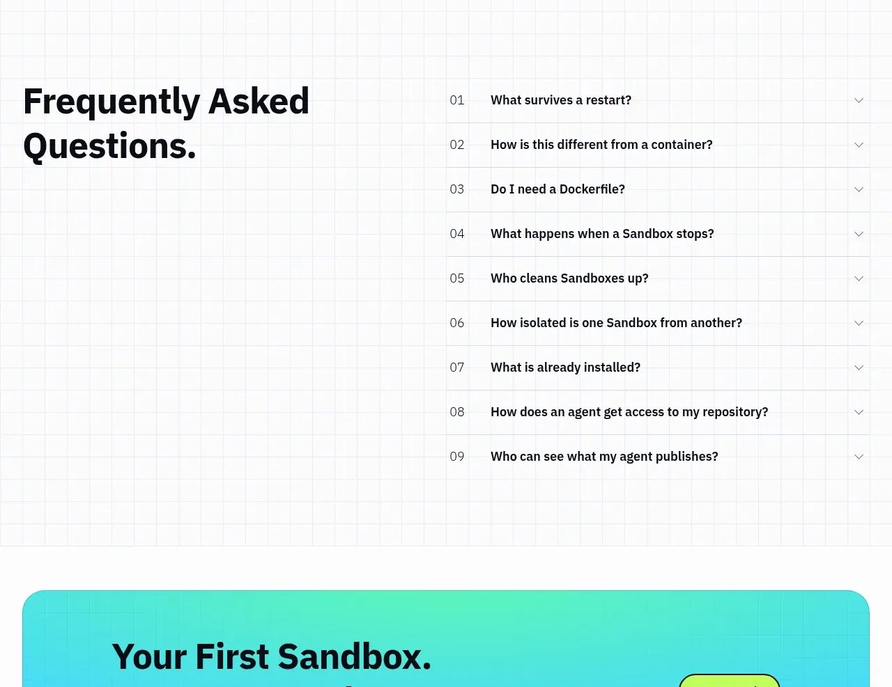
Design analysis
A large FAQ heading anchors the left column while numbered accordion rows on the right provide concise answers and a clear disclosure pattern.
Prompt preview
## Reference images

Study these alongside the description below: hierarchy, rhythm, spacing, colour. Build for the product you are asked about, using this design language.

- Component: https://kage-design-assets.t3.tigrisfiles.io/components/ai-sandboxes-by-buddy/f0e6e8b3-2b0a-4e1e-b3c7-06d5e5447056-1792130831-9.webp
- Full page it was cut from: https://kage-design-assets.t3.tigrisfiles.io/screenshots/ai-sandboxes-by-buddy/f0e6e8b3-2b0a-4e1e-b3c7-06d5e5447056-1792130620611-full.webp
- Component on Kage: https://kage.design/component/ai-sandboxes-by-buddy-faq

## Before you start
Ask what questions users repeatedly ask about the user's product, policy, setup, and limitations. Then create an accessible FAQ using those real concerns.

Build a two-column FAQ section on a very subtle grid background. Keep a large two-line heading on the left and a vertical accordion list on the right. Each row should have a small two-digit index, a bold question, and a chevron at the far edge; use 1px horizontal separators and generous 20–28px row padding. Closed rows show only the question; opened rows reveal a concise answer with a smooth but restrained height transition. Use #11131A for headings, #424850 for body copy, and #C9D0D5 for rules. Make every row a real button with keyboard support, aria-expanded, and a visible focus state. Stack heading above the accordion on mobile.

Never: use the reference's product name, exact questions, exact answers, illustrations, or imagery.
More components
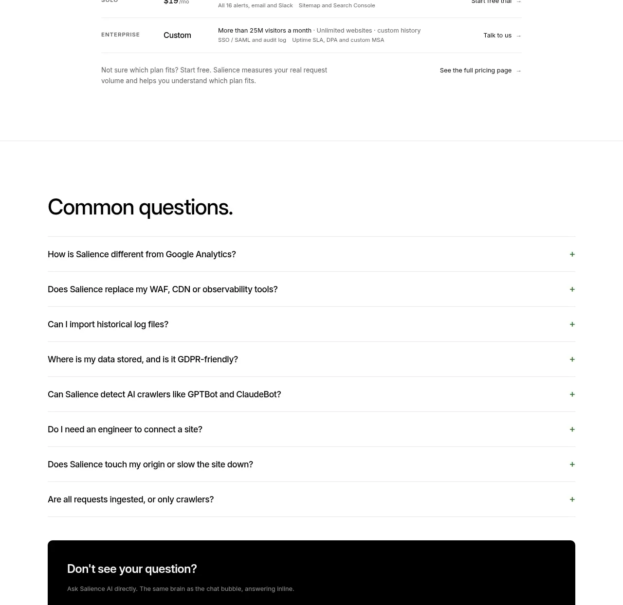
 Common questions accordion
Salience · FAQ
Common questions accordion
Salience · FAQ
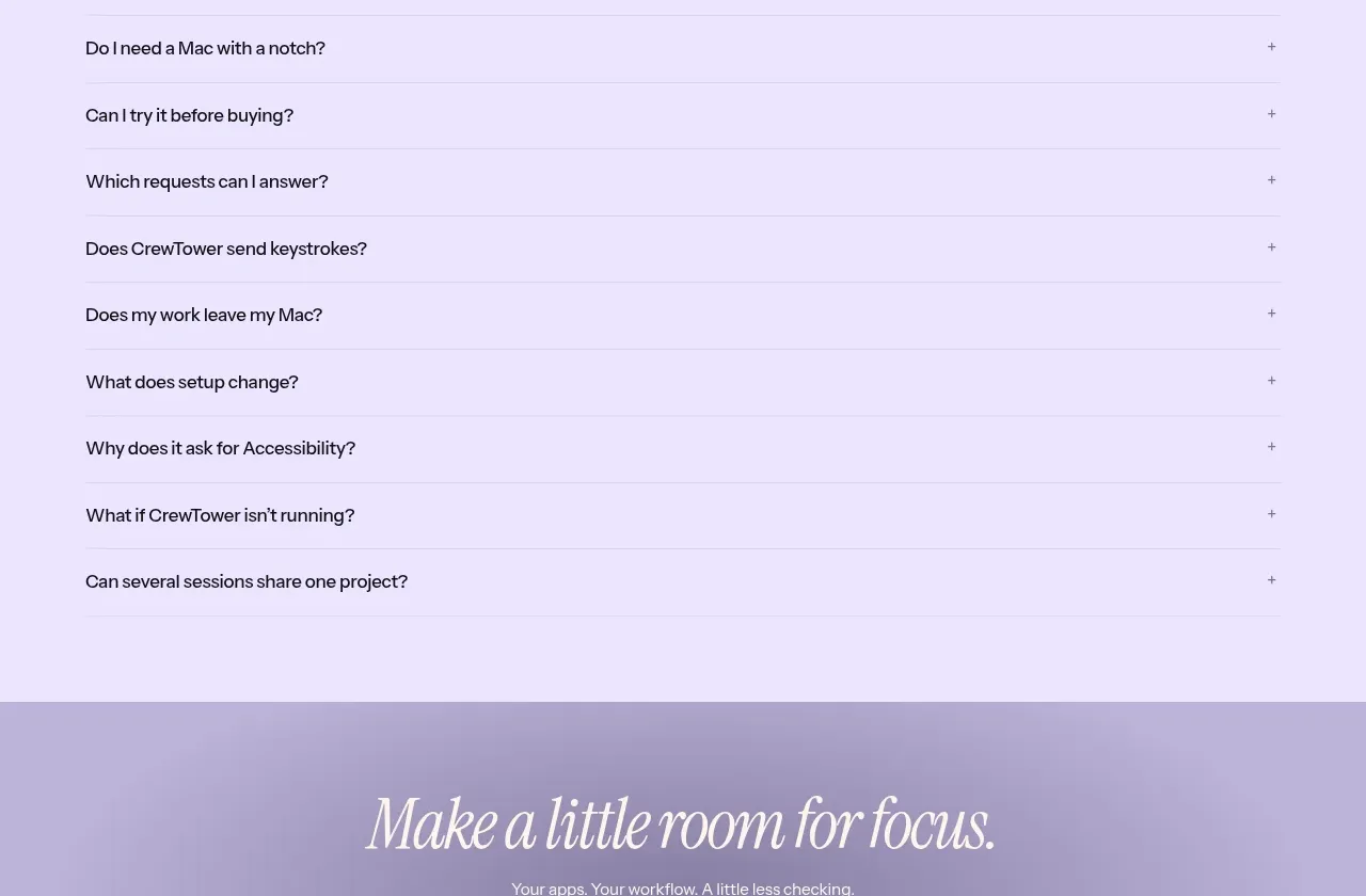
 Frequently asked questions
CrewTower Mod for Claude Code · FAQ
Frequently asked questions
CrewTower Mod for Claude Code · FAQ
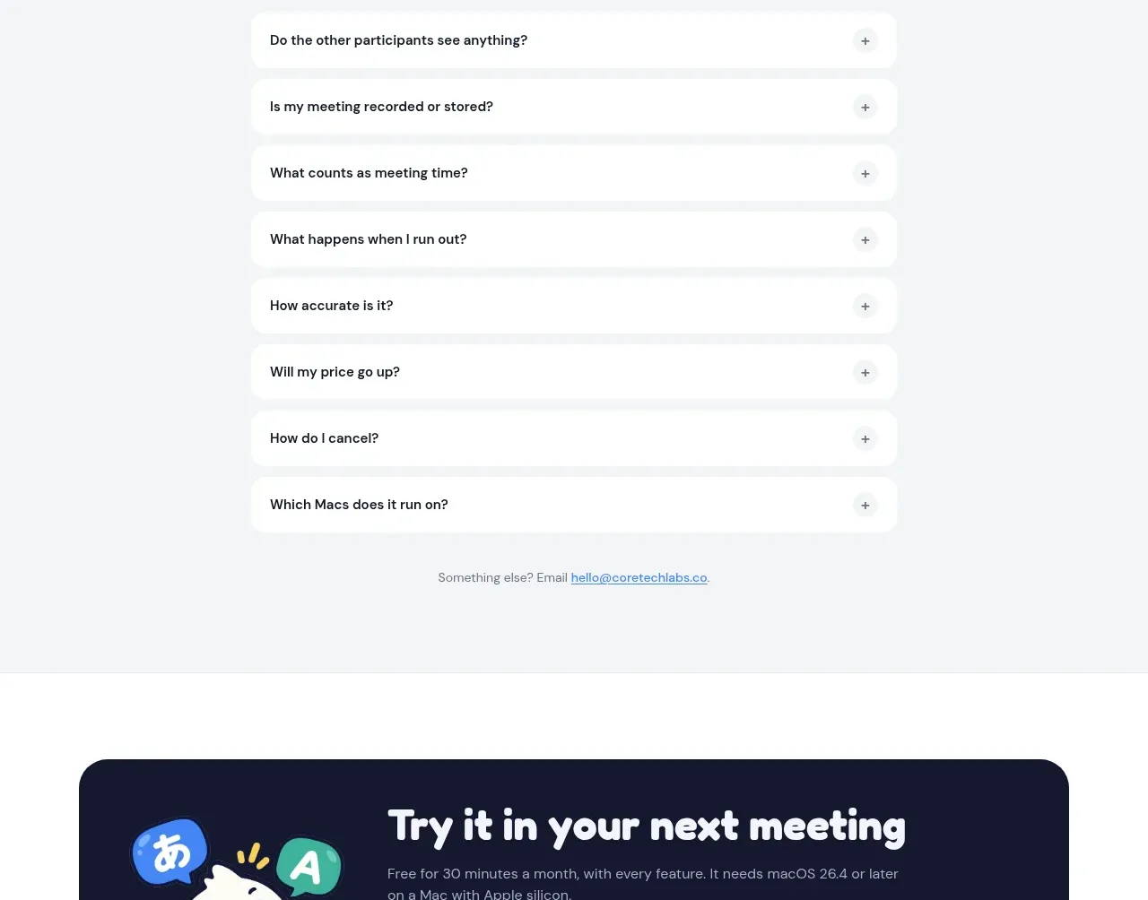
 Frequently asked questions
NANI??? · FAQ
Frequently asked questions
NANI??? · FAQ
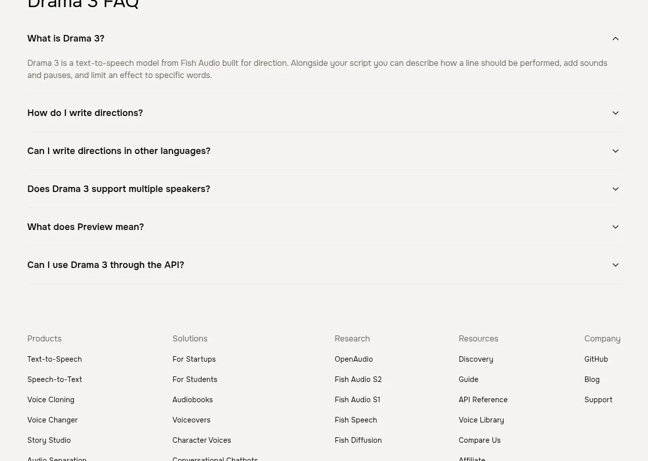
 Frequently asked questions
Fish Audio Drama 3 · FAQ
Frequently asked questions
Fish Audio Drama 3 · FAQ
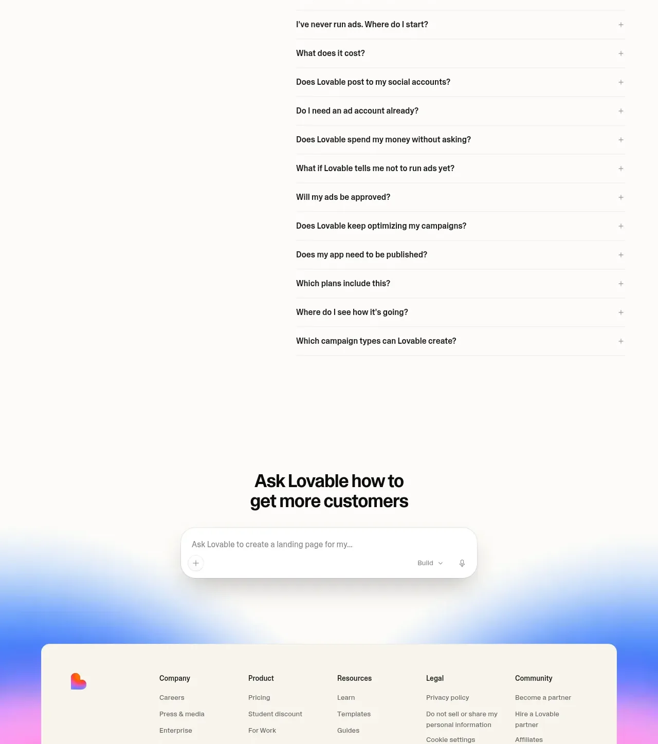
 Frequently asked questions
Lovable Growth Tools · FAQ
Frequently asked questions
Lovable Growth Tools · FAQ
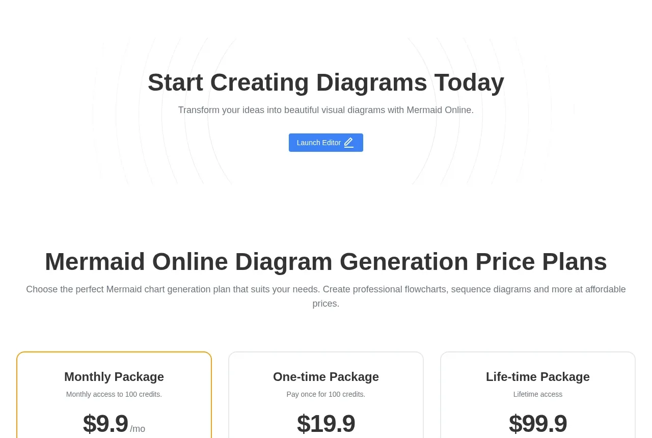
 Frequently asked questions
mermaidonline.live · FAQ
Frequently asked questions
mermaidonline.live · FAQ