 kage
kage
coretechlabs.co
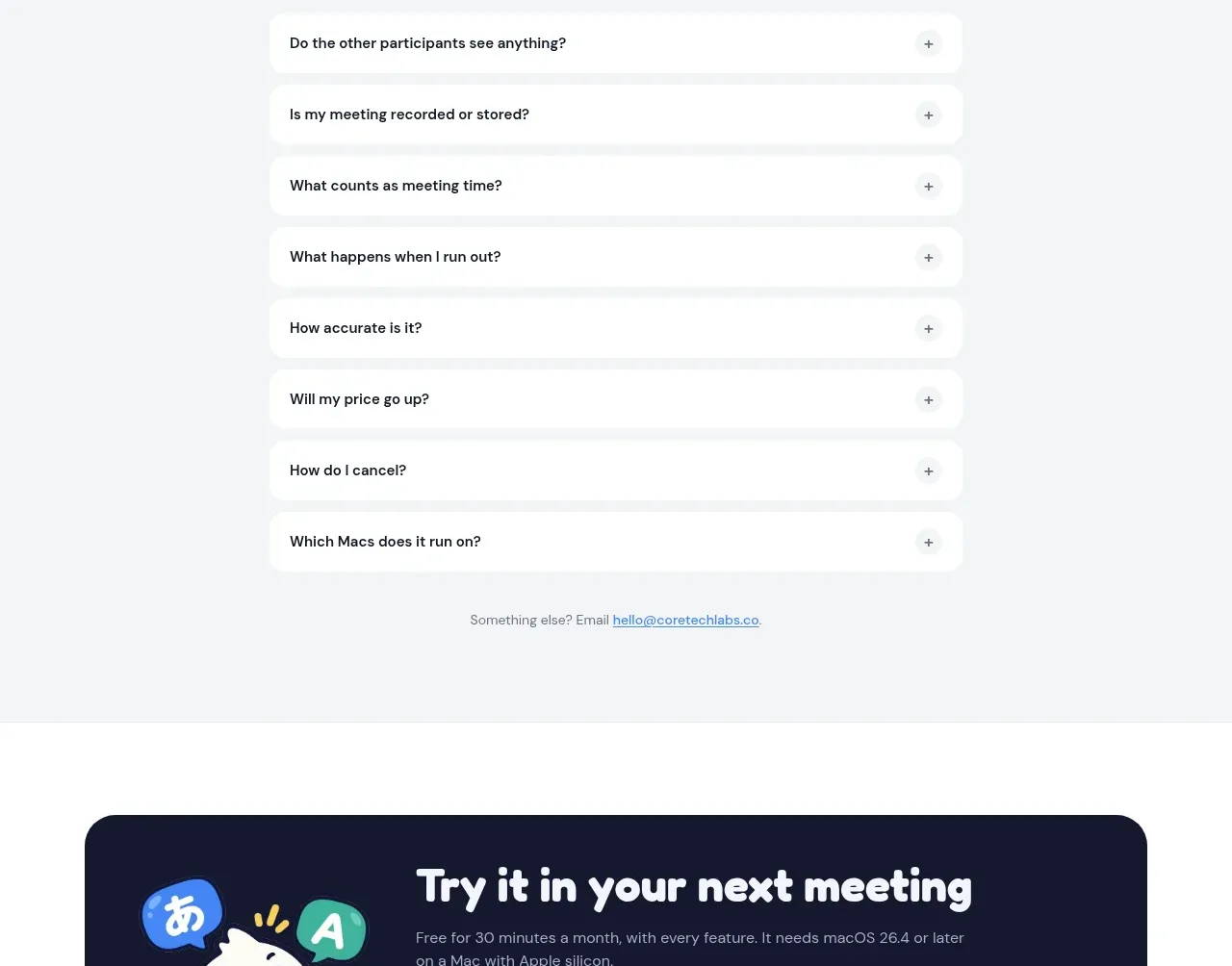
Design analysis
A centered FAQ block uses generous spacing and simple expandable rows to address the main objections without visual clutter.
Prompt preview
## Reference images

Study these alongside the description below: hierarchy, rhythm, spacing, colour. Build for the product you are asked about, using this design language.

- Component: https://kage-design-assets.t3.tigrisfiles.io/components/nani/f548445b-7dd2-48a7-847f-0684381711f2-1792217070-6.webp
- Full page it was cut from: https://kage-design-assets.t3.tigrisfiles.io/screenshots/nani/f548445b-7dd2-48a7-847f-0684381711f2-1792217012251-full.webp
- Component on Kage: https://kage.design/component/nani-faq

## Before you start
Ask what questions users typically have before adopting the product and what tone the brand should use. Then apply the following FAQ pattern.

Create a pale-gray FAQ section with a small eyebrow, a centered large rounded heading, and a narrow stack of white accordion rows. Each row should contain one concise question, a plus icon aligned to the right, generous horizontal padding, and a soft shadow or border. Keep row heights consistent when closed; animate height and rotate the plus icon when opened. Use deep navy #17192f for questions, muted gray for supporting contact text, white row surfaces, #e7e9ed borders, and 14–16px corner radii. Include a small centered “still have questions?” contact line below the accordion. Ensure the entire row is clickable, keyboard accessible, and has a visible focus ring.

Never: reuse logos, product names, copy, illustrations, or imagery from the reference.
More components
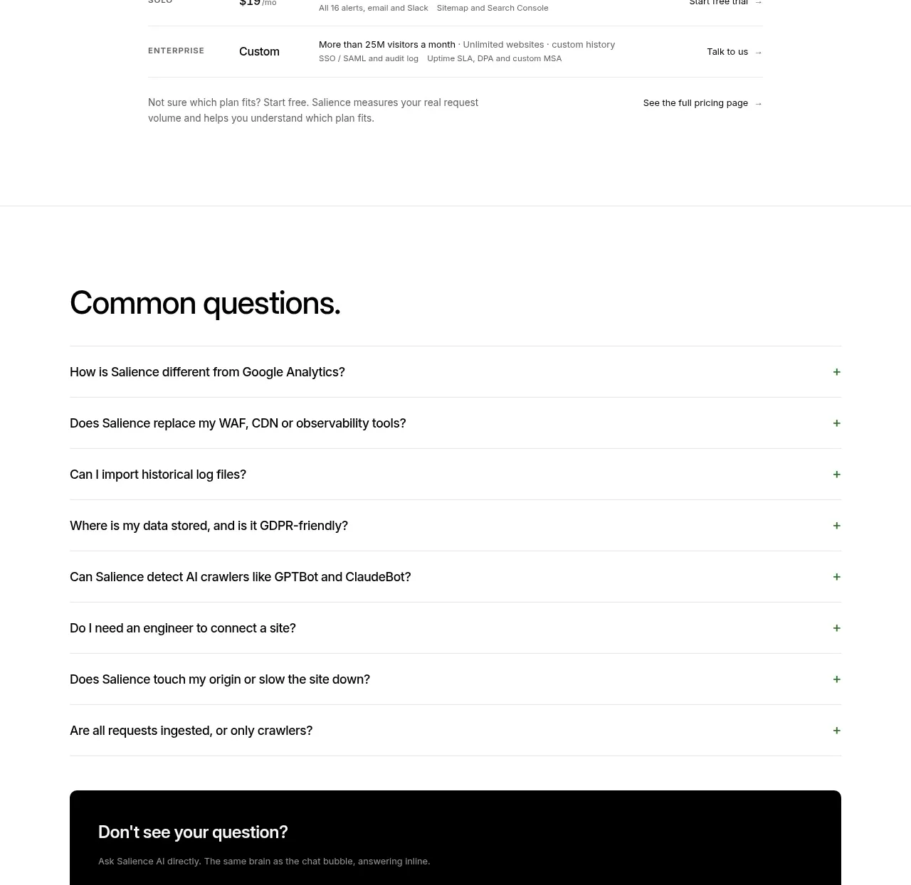
 Common questions accordion
Salience · FAQ
Common questions accordion
Salience · FAQ
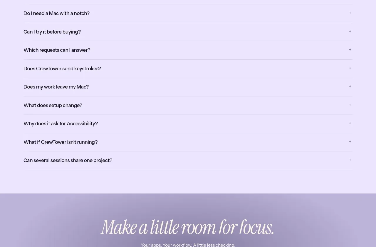
 Frequently asked questions
CrewTower Mod for Claude Code · FAQ
Frequently asked questions
CrewTower Mod for Claude Code · FAQ
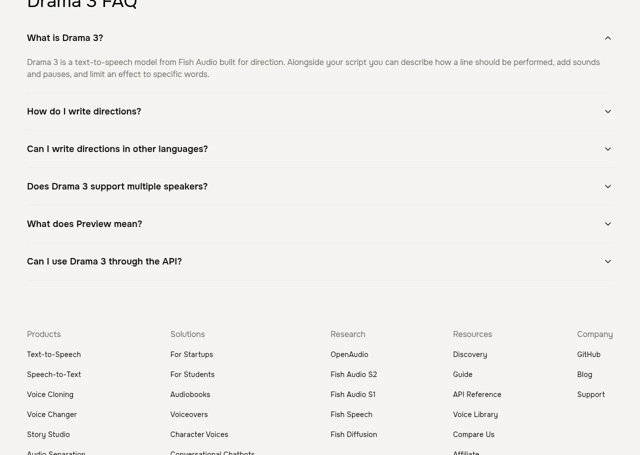
 Frequently asked questions
Fish Audio Drama 3 · FAQ
Frequently asked questions
Fish Audio Drama 3 · FAQ
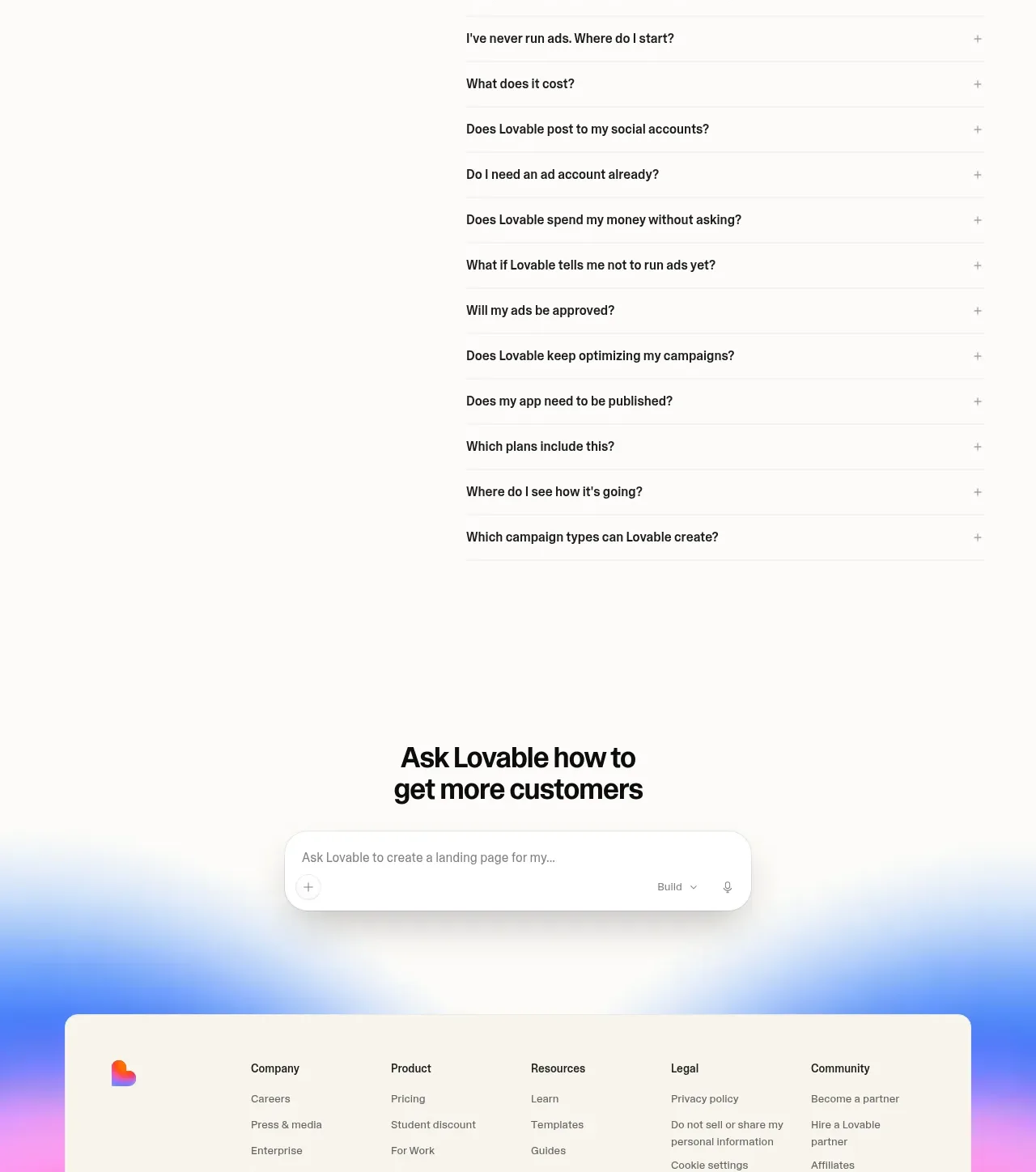
 Frequently asked questions
Lovable Growth Tools · FAQ
Frequently asked questions
Lovable Growth Tools · FAQ
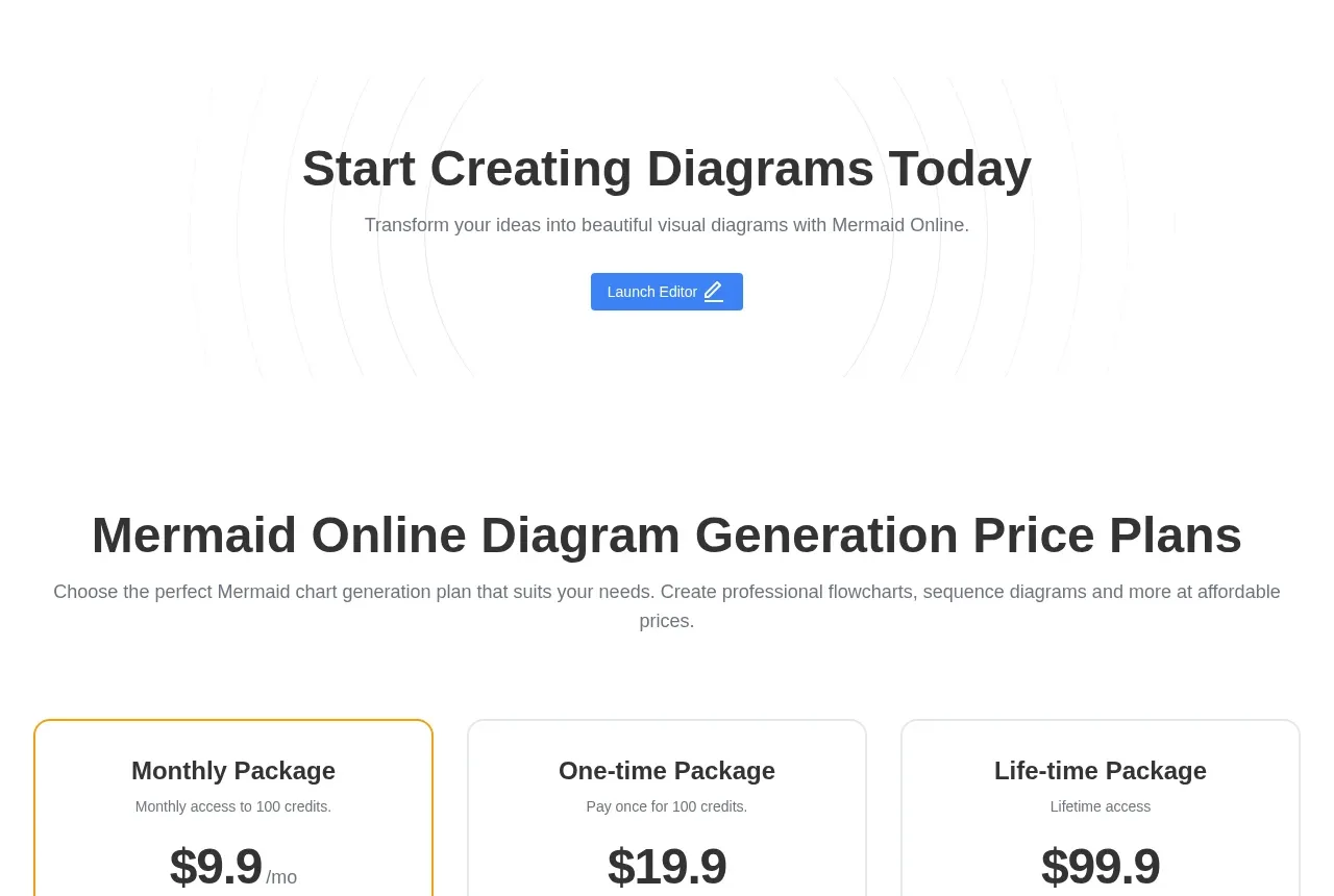
 Frequently asked questions
mermaidonline.live · FAQ
Frequently asked questions
mermaidonline.live · FAQ
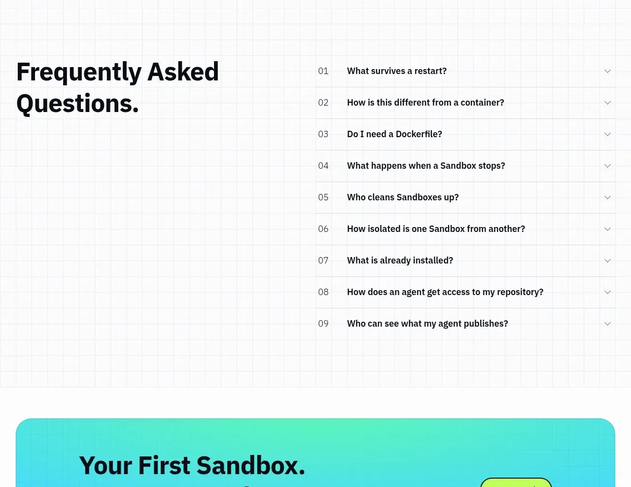
 Frequently asked questions
AI Sandboxes by Buddy · FAQ
Frequently asked questions
AI Sandboxes by Buddy · FAQ