 kage
kage
salience.com
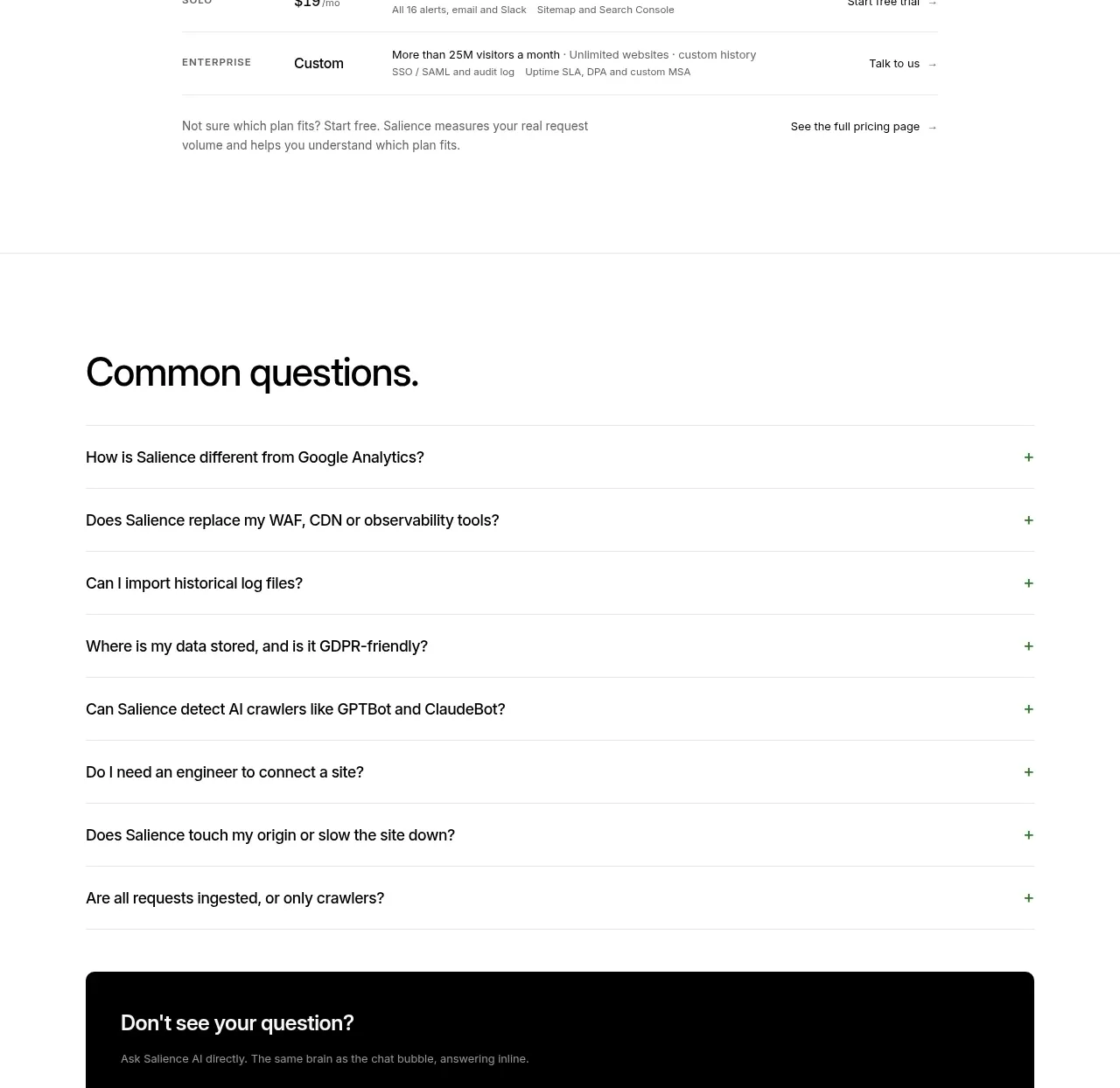
Design analysis
A spacious FAQ uses full-width ruled rows with clear plus controls, then ends with a dark question form that offers conversational fallback support.
Prompt preview
## Reference images

Study these alongside the description below: hierarchy, rhythm, spacing, colour. Build for the product you are asked about, using this design language.

- Component: https://kage-design-assets.t3.tigrisfiles.io/components/salience/db9244f7-ec48-4516-9a93-11a957a9eab9-1792303423-10.webp
- Full page it was cut from: https://kage-design-assets.t3.tigrisfiles.io/screenshots/salience/db9244f7-ec48-4516-9a93-11a957a9eab9-1792303314589-full.webp
- Component on Kage: https://kage.design/component/salience-faq

## Before you start
Ask what objections and pre-purchase questions users have, and whether the product offers an assistant or contact path. Use those answers to write an original FAQ structure.

Build a light FAQ section with a large heading and 7–9 accordion rows. Each row should have a 15–17px question, generous 20–24px vertical padding, a subtle 1px divider (#e7ebe5), and a right-aligned plus button that rotates to a close icon when open. Keep answers hidden until activated, animate height accessibly, and support keyboard and screen-reader semantics. At the bottom add a dark rounded fallback panel (#050605) with a short heading, muted helper copy, several suggested-question chips, and a white text input with a bright green submit button. Use a max-width of about 660px and generous section padding. Preserve high contrast and visible focus rings.

Never use logos, product names, copy, illustrations, or imagery from the reference.
More components
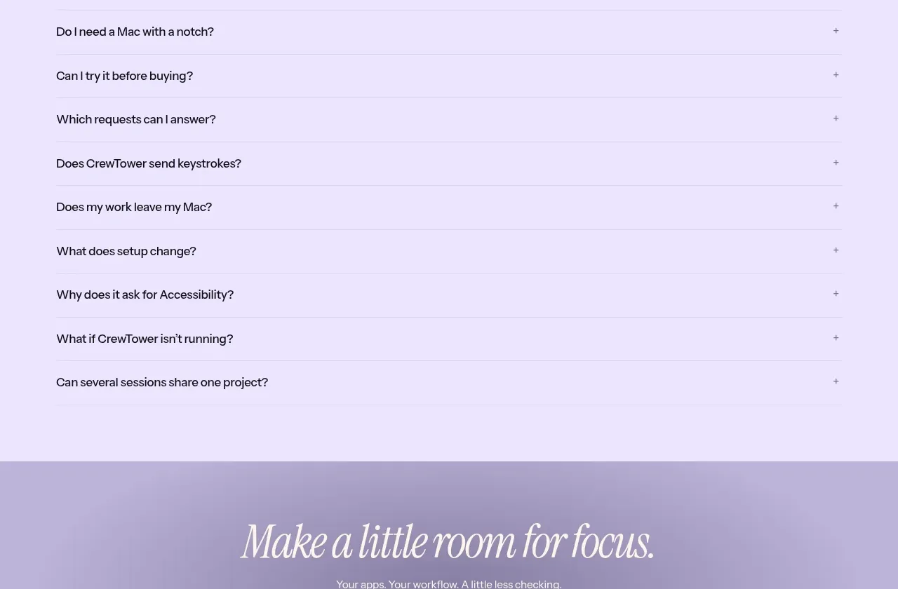
 Frequently asked questions
CrewTower Mod for Claude Code · FAQ
Frequently asked questions
CrewTower Mod for Claude Code · FAQ
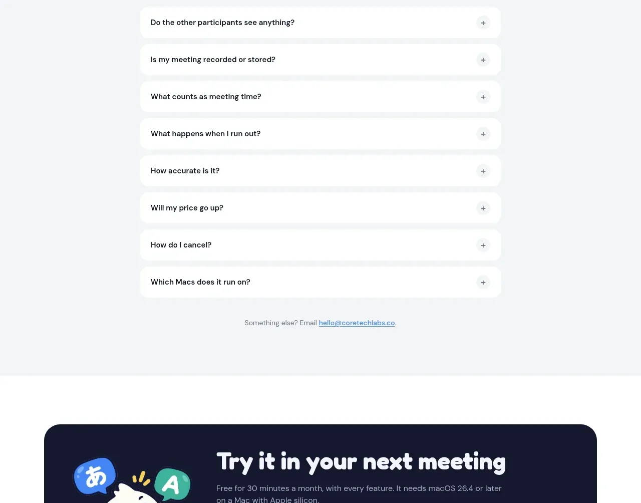
 Frequently asked questions
NANI??? · FAQ
Frequently asked questions
NANI??? · FAQ
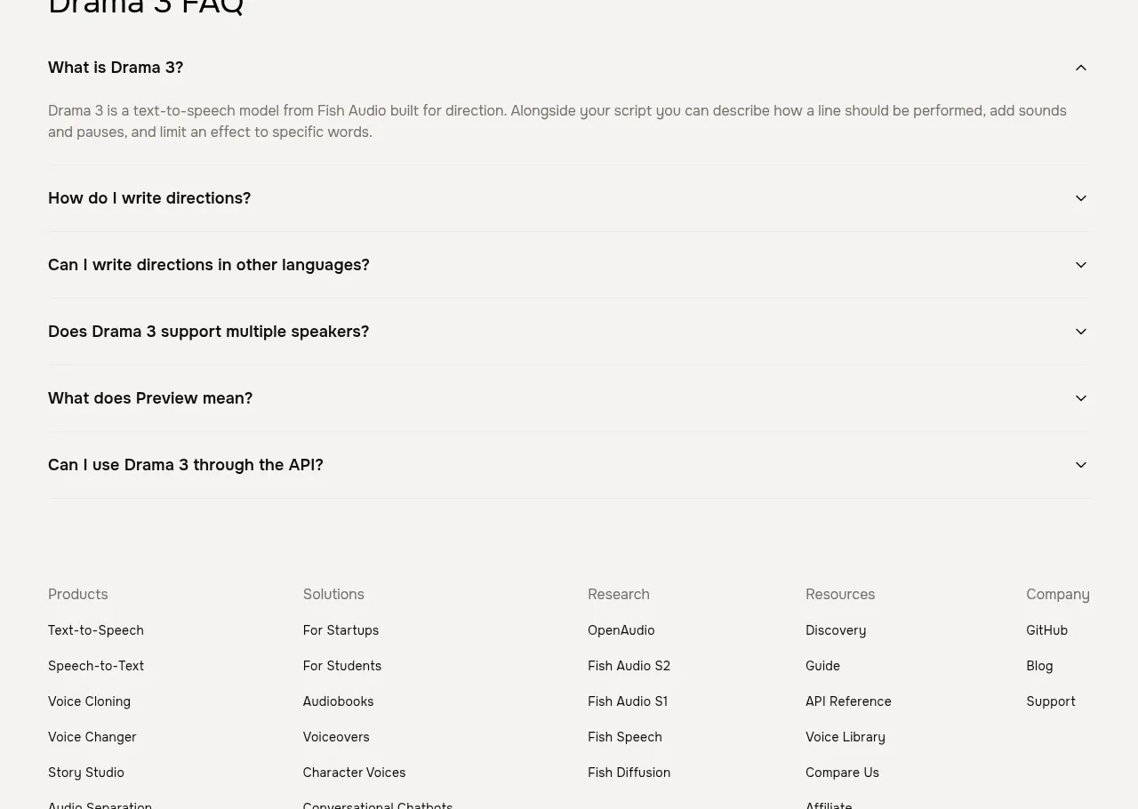
 Frequently asked questions
Fish Audio Drama 3 · FAQ
Frequently asked questions
Fish Audio Drama 3 · FAQ
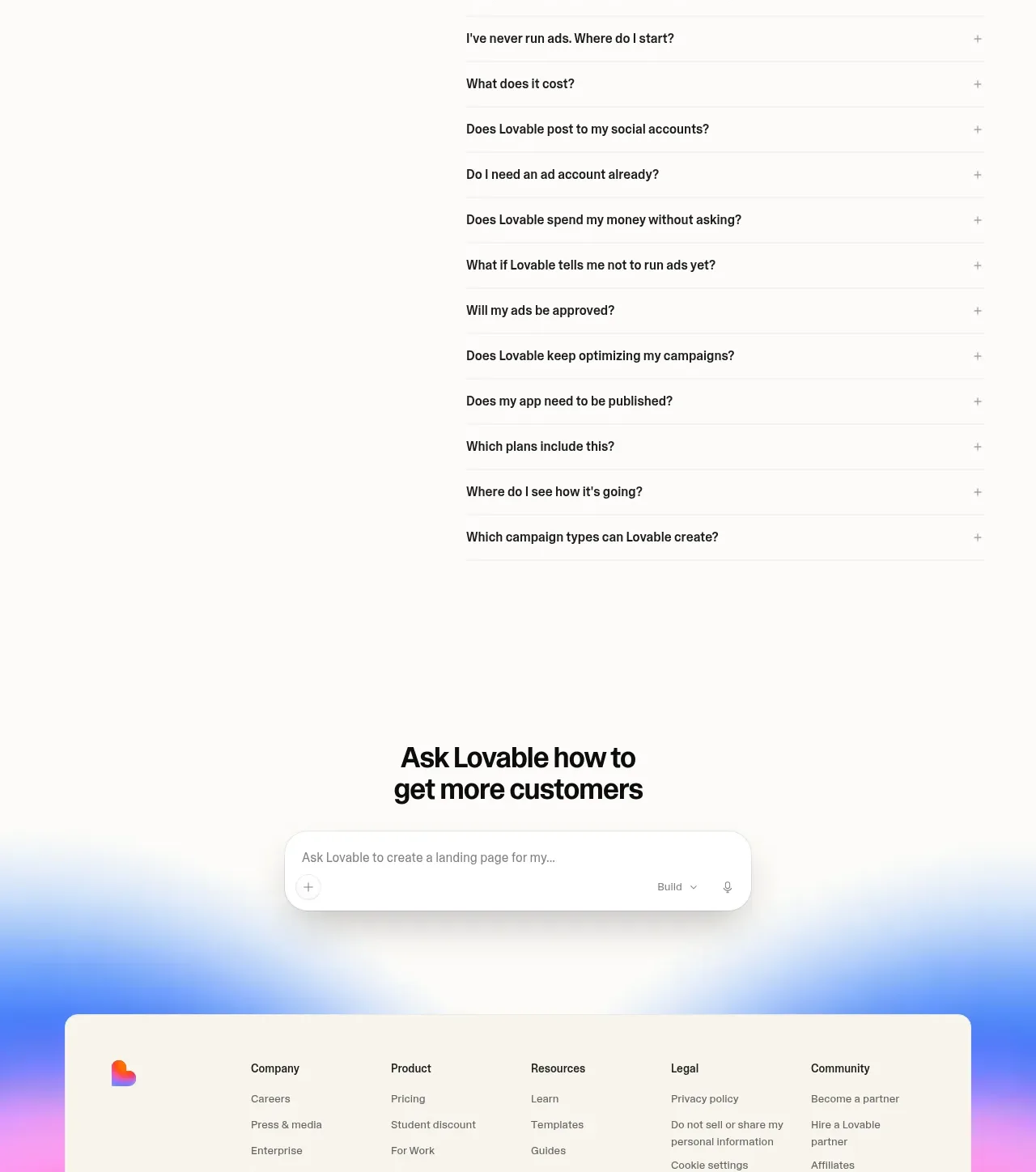
 Frequently asked questions
Lovable Growth Tools · FAQ
Frequently asked questions
Lovable Growth Tools · FAQ
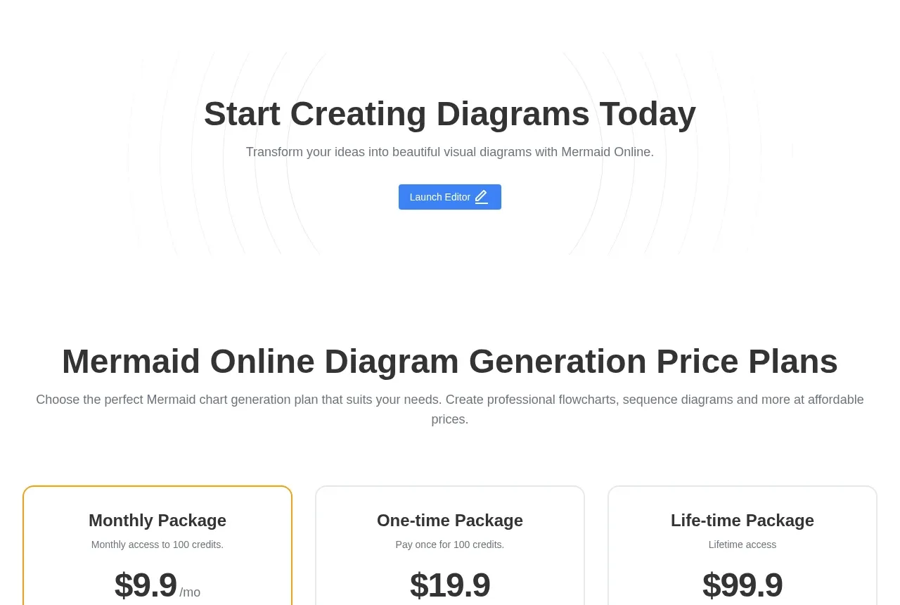
 Frequently asked questions
mermaidonline.live · FAQ
Frequently asked questions
mermaidonline.live · FAQ
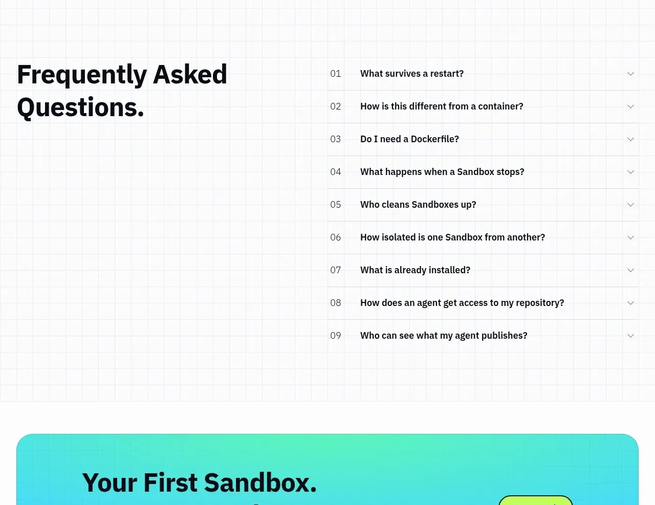
 Frequently asked questions
AI Sandboxes by Buddy · FAQ
Frequently asked questions
AI Sandboxes by Buddy · FAQ