 kage
kage
buddy.works
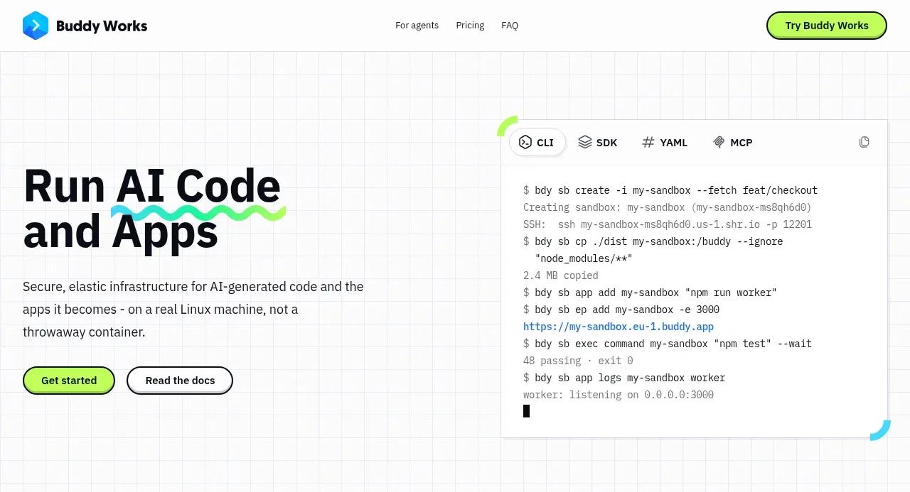
Design analysis
The hero pairs a forceful two-line headline and concise explanation with two CTAs and a large terminal-like product visual, all over a faint technical grid.
Prompt preview
## Reference images

Study these alongside the description below: hierarchy, rhythm, spacing, colour. Build for the product you are asked about, using this design language.

- Component: https://kage-design-assets.t3.tigrisfiles.io/components/ai-sandboxes-by-buddy/f0e6e8b3-2b0a-4e1e-b3c7-06d5e5447056-1792130828-1.webp
- Full page it was cut from: https://kage-design-assets.t3.tigrisfiles.io/screenshots/ai-sandboxes-by-buddy/f0e6e8b3-2b0a-4e1e-b3c7-06d5e5447056-1792130620611-full.webp
- Component on Kage: https://kage.design/component/ai-sandboxes-by-buddy-hero

## Before you start
Ask what the user's product does, its audience, and its brand direction. Then create a product-specific hero using these principles, not a visual or verbal copy of the reference.

Create a split hero below the navigation, approximately 720–850px tall on desktop. Align a large headline and supporting paragraph on the left with two actions beneath it; place a bordered terminal or interactive product preview on the right. Use a faint engineering grid across the background, built from very subtle #E9EDF0 lines over #FFFFFF. Headline typography should be bold and compact, around 46–58px with tight line-height and near-black #0E1016; body copy should be 15–17px, max-width 430px, and #30343B. Use a lime primary button around #B9FF4A and an outlined secondary button with black border. The preview should feel like a real tool: white or very pale panel, 1px #D8DDE2 border, 12–16px radius, tab labels, monospace output, and small cyan/lime accent arcs. Maintain a strong desktop two-column rhythm, then stack the preview under the copy on mobile.

Never: use the reference's logo, product name, exact copy, terminal text, illustrations, or imagery.
More components
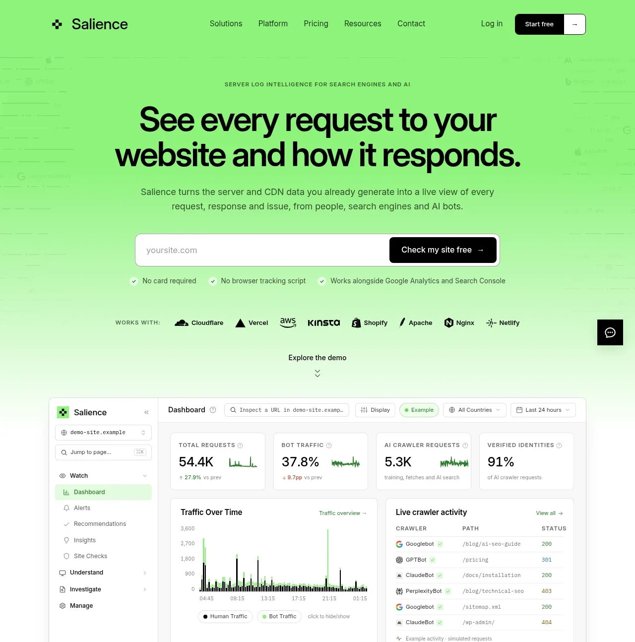
 Product promise and site checker hero
Salience · Hero
Product promise and site checker hero
Salience · Hero
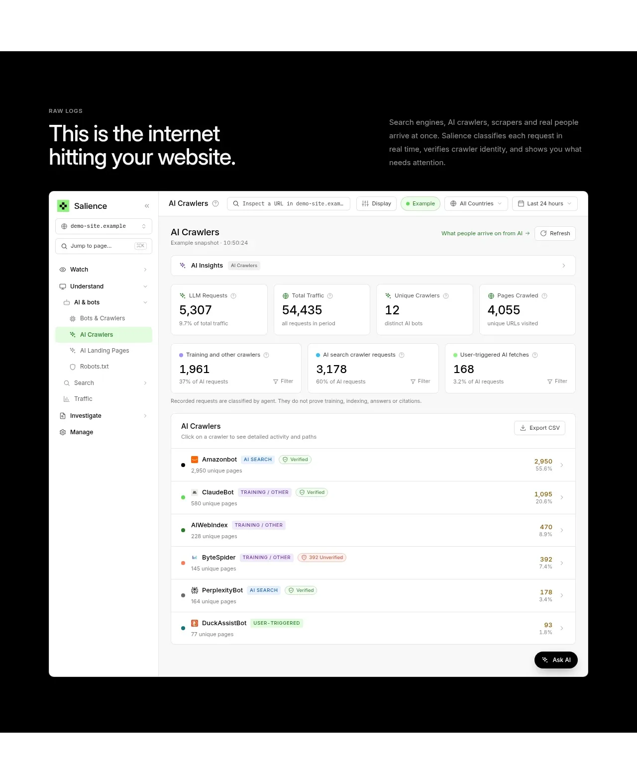 Raw activity dashboard showcase
Salience · Hero
Raw activity dashboard showcase
Salience · Hero
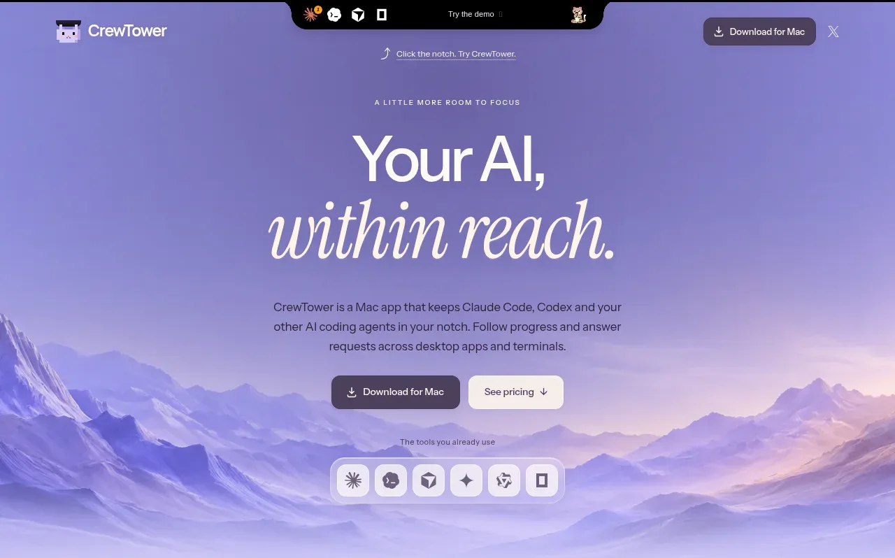
 Focus-oriented hero
CrewTower Mod for Claude Code · Hero
Focus-oriented hero
CrewTower Mod for Claude Code · Hero
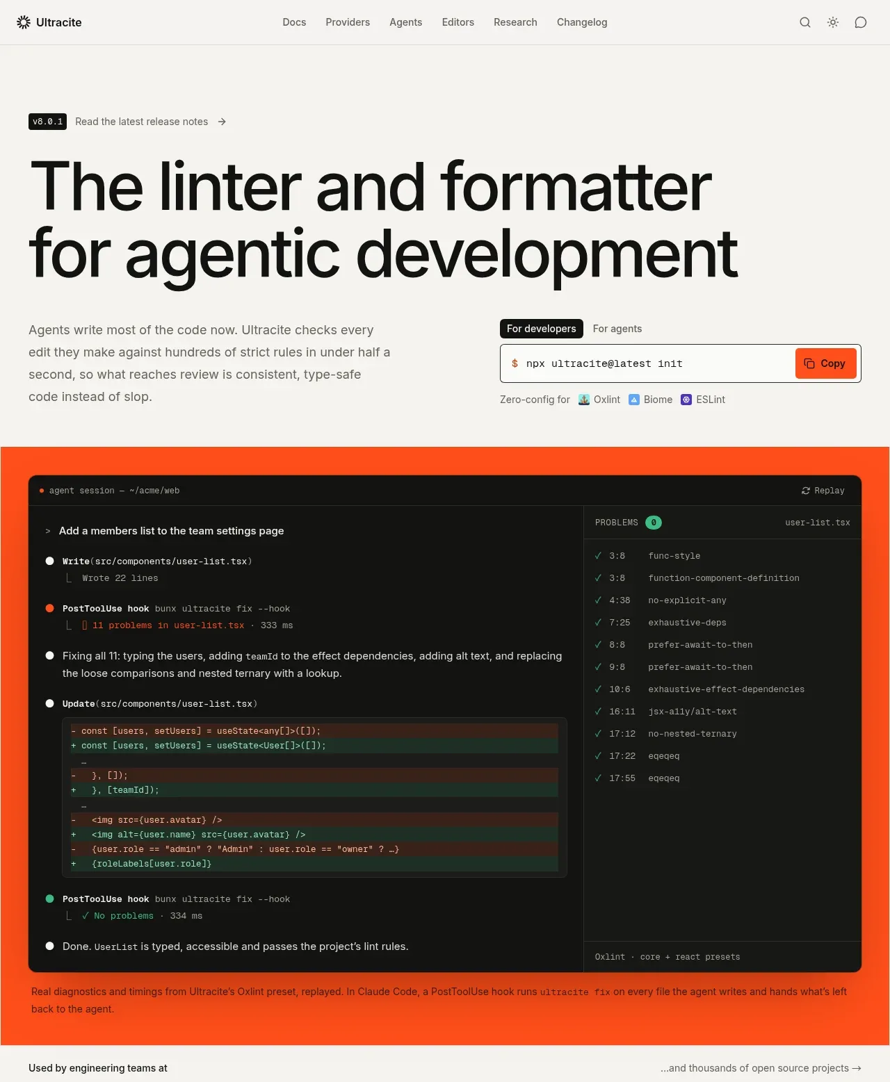
 Agentic development hero with live terminal preview
Ultracite v8 · Hero
Agentic development hero with live terminal preview
Ultracite v8 · Hero
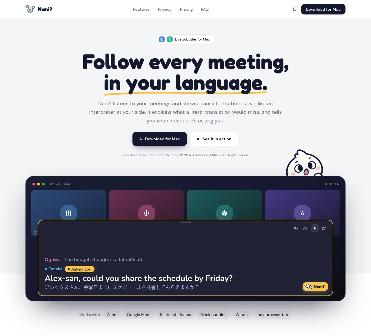
 Translation meeting hero
NANI??? · Hero
Translation meeting hero
NANI??? · Hero
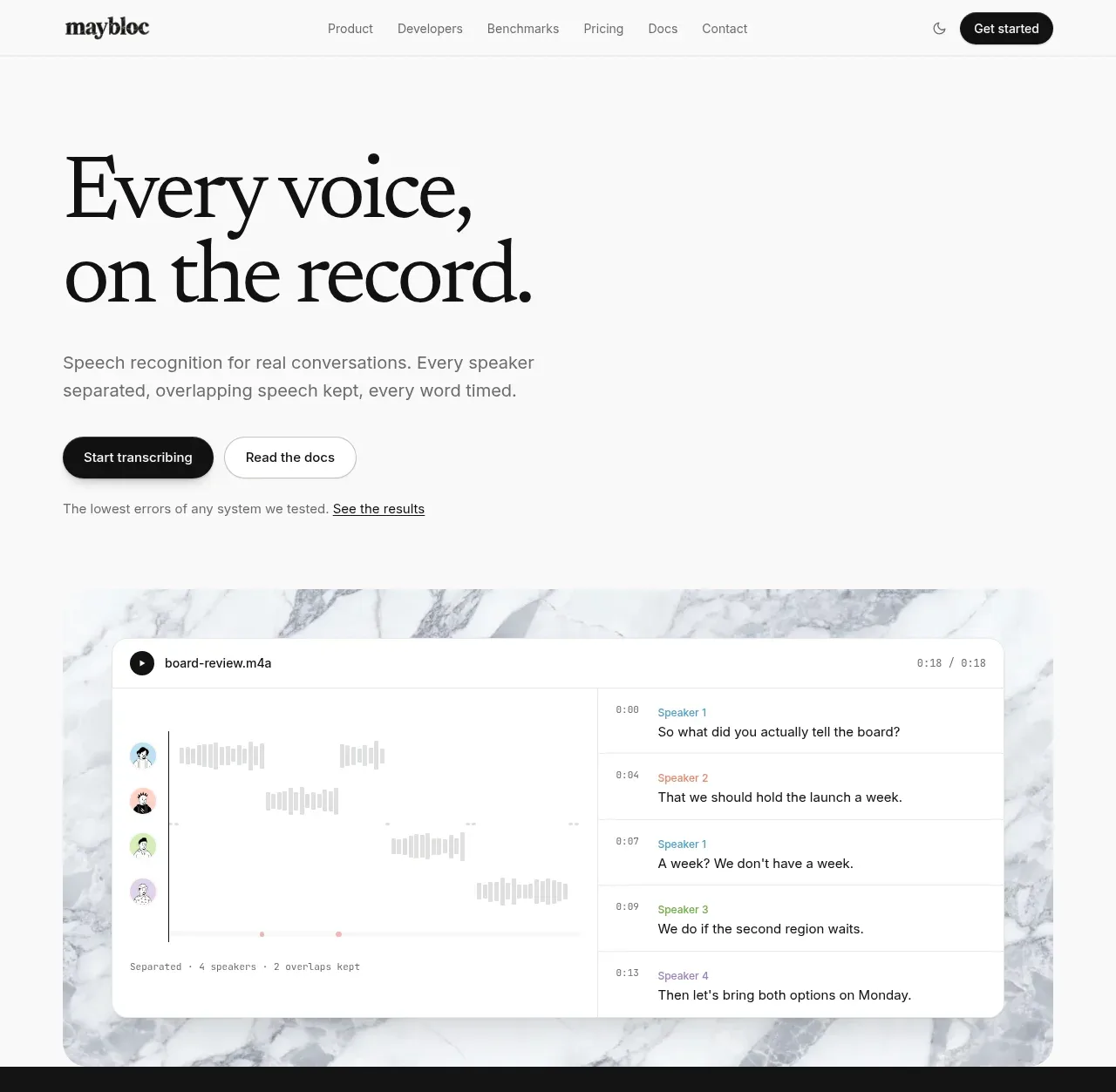
 Editorial speech transcription hero
Maybloc · Hero
Editorial speech transcription hero
Maybloc · Hero