 kage
kage
albie.school
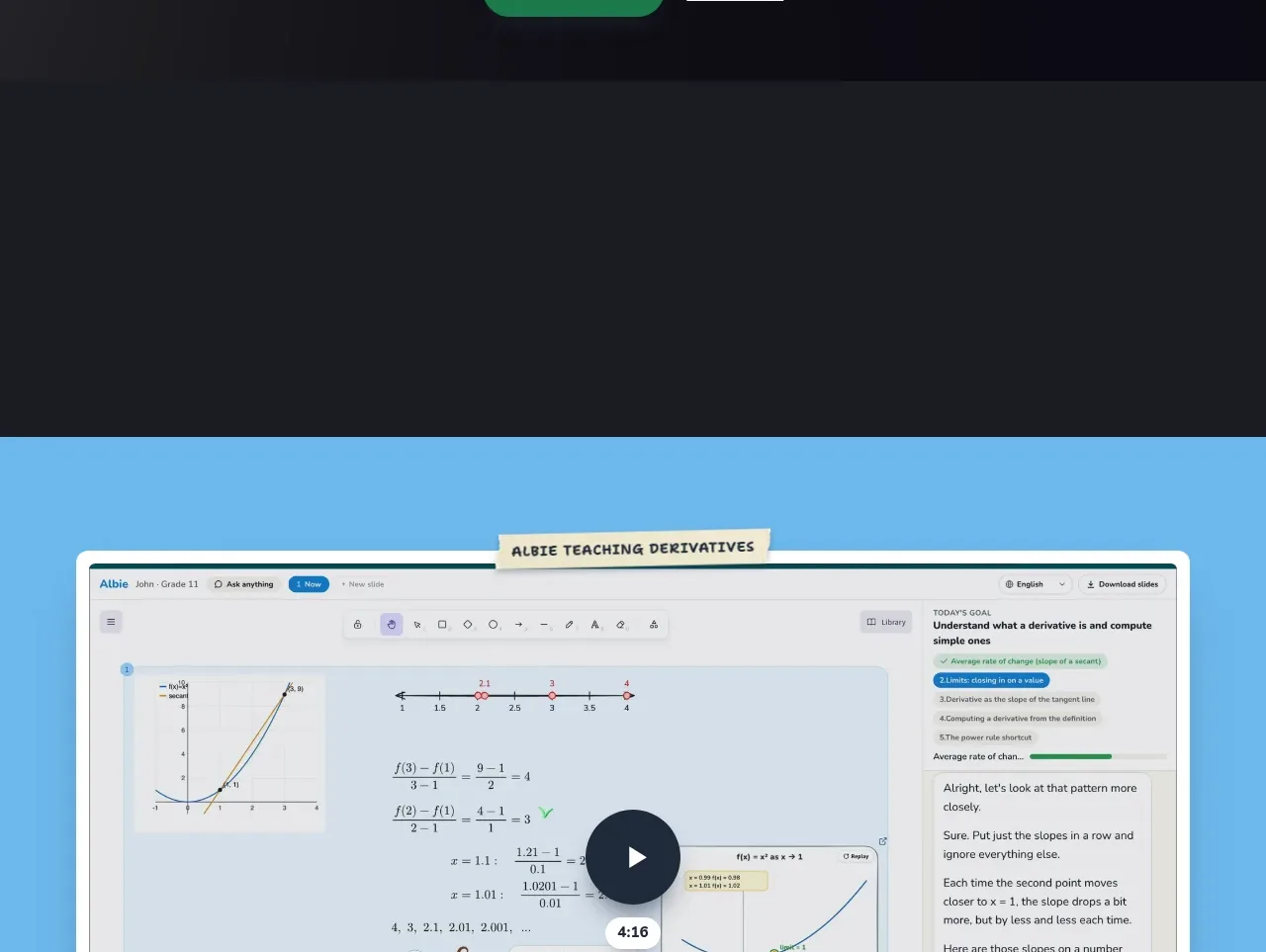
Design analysis
A dark, cinematic CTA gathers the previously introduced capabilities into one memorable promise and gives visitors a clear next step with a secondary plans link.
Prompt preview
## Reference images

Study these alongside the description below: hierarchy, rhythm, spacing, colour. Build for the product you are asked about, using this design language.

- Component: https://kage-design-assets.t3.tigrisfiles.io/components/albie/924ea594-904d-48ee-866c-6d109761f321-1791439551-7.webp
- Full page it was cut from: https://kage-design-assets.t3.tigrisfiles.io/screenshots/albie/924ea594-904d-48ee-866c-6d109761f321-1791439457023-full.webp
- Component on Kage: https://kage.design/component/albie-cta

## Before you start
Ask what the user's final conversion action is and what accumulated product promise should be restated here. Ask for the brand's strongest visual motif and use an original version of it.

Build a high-contrast closing CTA on a near-black background around #17181F. Use an optional wide product montage or abstract stage-like visual in the upper portion, followed by a centered headline, one-sentence summary, primary green pill button around #169B68, and a secondary underlined link. The headline should be large, white or warm cream, and tightly composed. Keep the content centered with generous spacing and a clear focal point; avoid adding competing navigation or too many claims. Use subtle shadows and 999px button radii, with visible hover and focus states.

Never: copy logos, product names, copy, illustrations, or imagery from the reference.
More components
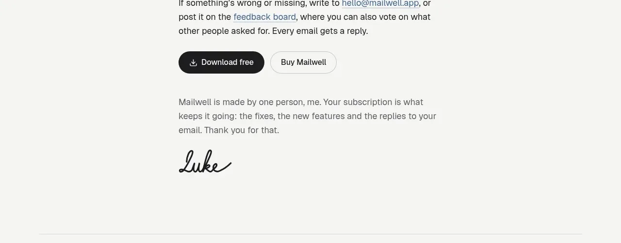
 Trial and purchase call to action
Mailwell · Call to action
Trial and purchase call to action
Mailwell · Call to action
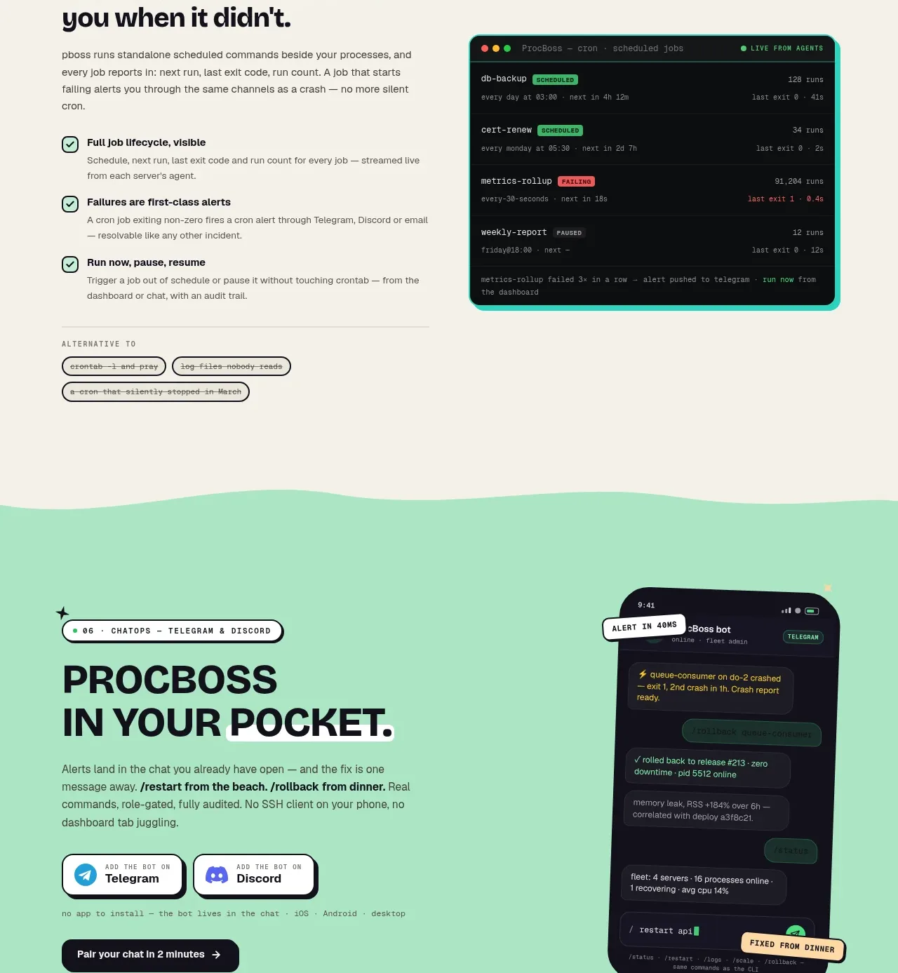
 Pocket alerts call to action
ProcBoss · Call to action
Pocket alerts call to action
ProcBoss · Call to action
 Dark final conversion band
ProcBoss · Call to action
Dark final conversion band
ProcBoss · Call to action
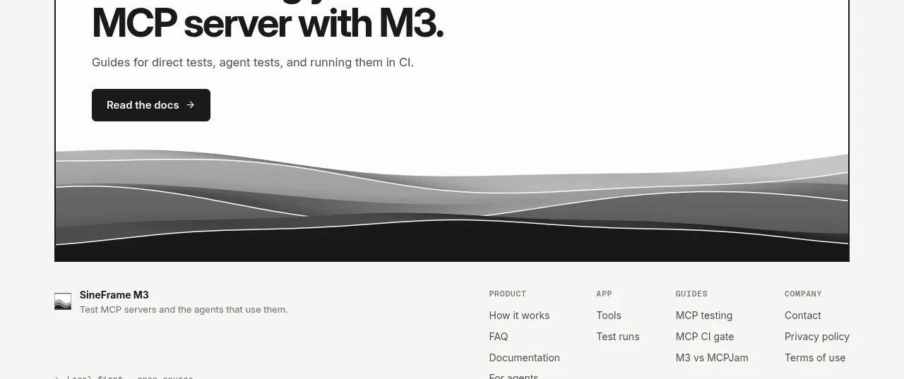
 Documentation call to action
SineFrame M3 · Call to action
Documentation call to action
SineFrame M3 · Call to action
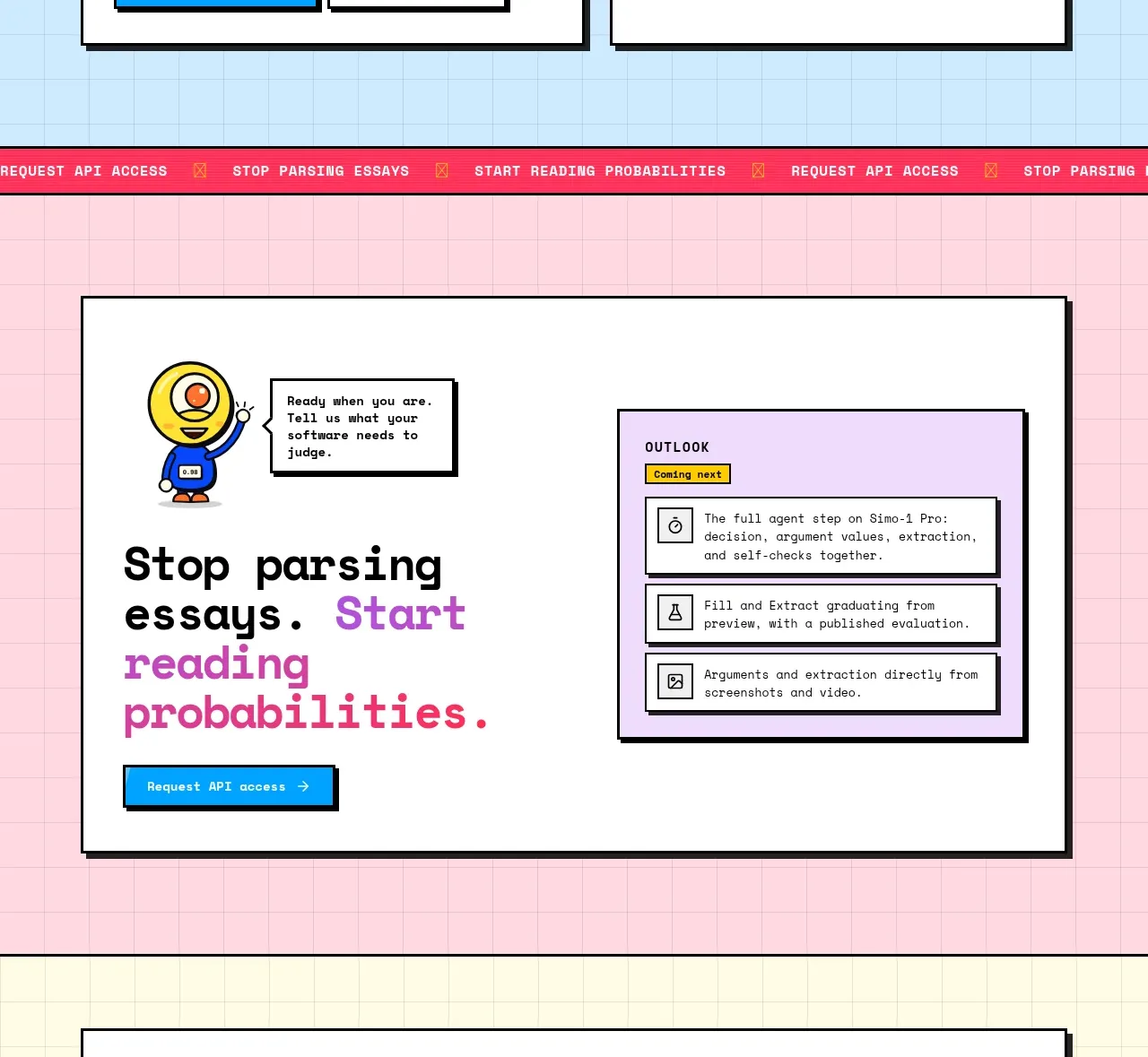
 Conversion call to action
Simo · Call to action
Conversion call to action
Simo · Call to action
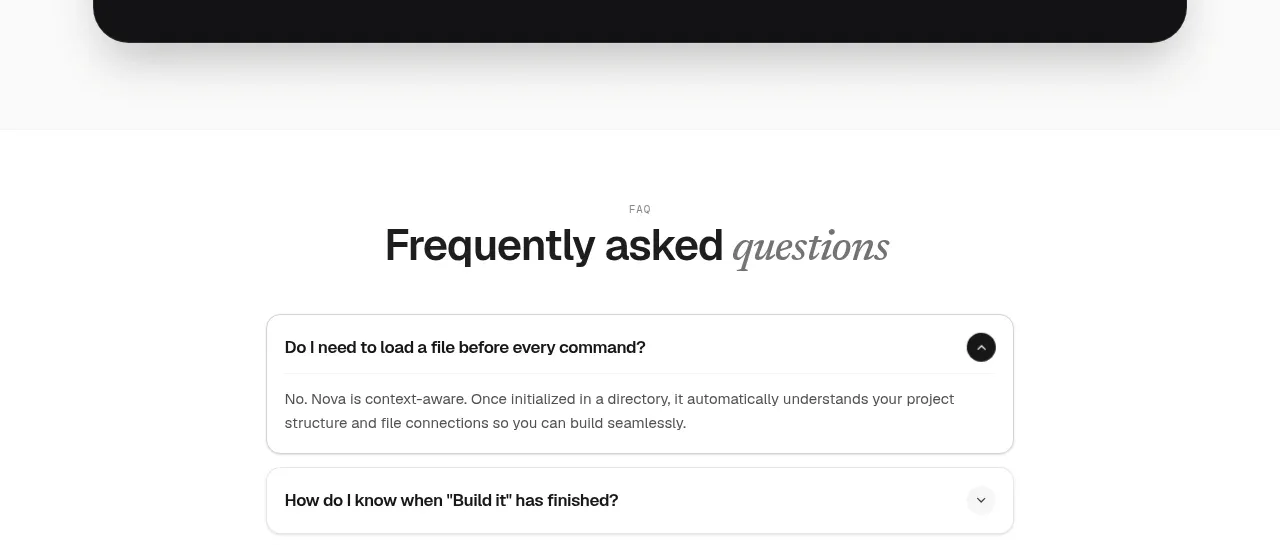
 Install command CTA
NOVA CLI v1.0 · Call to action
Install command CTA
NOVA CLI v1.0 · Call to action