kage
kage
albie.school

Design analysis
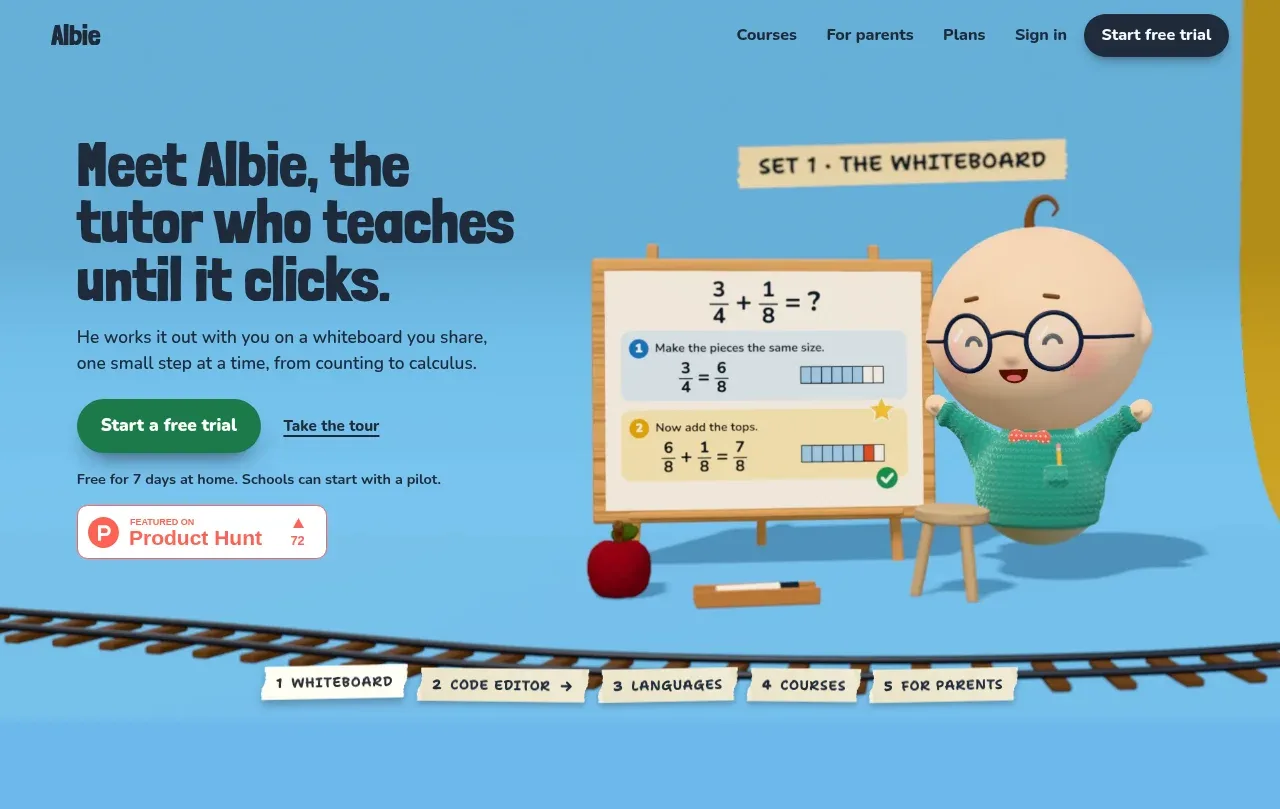
A long-form education landing page uses a deliberately handmade visual system: dark condensed display headlines, smaller rounded body text, taped paper labels, illustrated 3D classroom scenes, and a railway track that repeatedly separates sections. The page moves through large blue, yellow, coral, green, and purple feature bands before tightening into a dark studio CTA, product video, pricing comparison, safety information, and a compact footer; the changing rhythm keeps a very tall page legible while preserving one cohesive classroom-world motif.
Prompt preview
## Reference images

Study these alongside the description below: hierarchy, rhythm, spacing, colour. Build for the product you are asked about, using this design language.

- Full page: https://kage-design-assets.t3.tigrisfiles.io/screenshots/albie/924ea594-904d-48ee-866c-6d109761f321-1791439457023-full.webp
- Above the fold: https://kage-design-assets.t3.tigrisfiles.io/screenshots/albie/924ea594-904d-48ee-866c-6d109761f321-1791439452401.webp
- Design on Kage: https://kage.design/designs/albie-landing-page

## Before you start
Ask the user what they are building, who it is for, and what brand assets they already have (name, colours, type choices, logo, and imagery). Wait for their answers before designing. Apply everything below to their product, not to the reference product.

## Page structure
1. **Top navigation and hero** — Use a compact header over a bright full-bleed opening panel, with a small wordmark area, simple navigation links, a dark pill CTA, a large left-aligned headline and supporting copy, paired with a large character/product scene on the right. Include a primary CTA, a secondary text link, trial/supporting text, and a small credibility badge.
2. **Feature route tabs** — Place a short row of taped paper-like labels over a hand-drawn railway track, acting as anchors for the major feature sections.
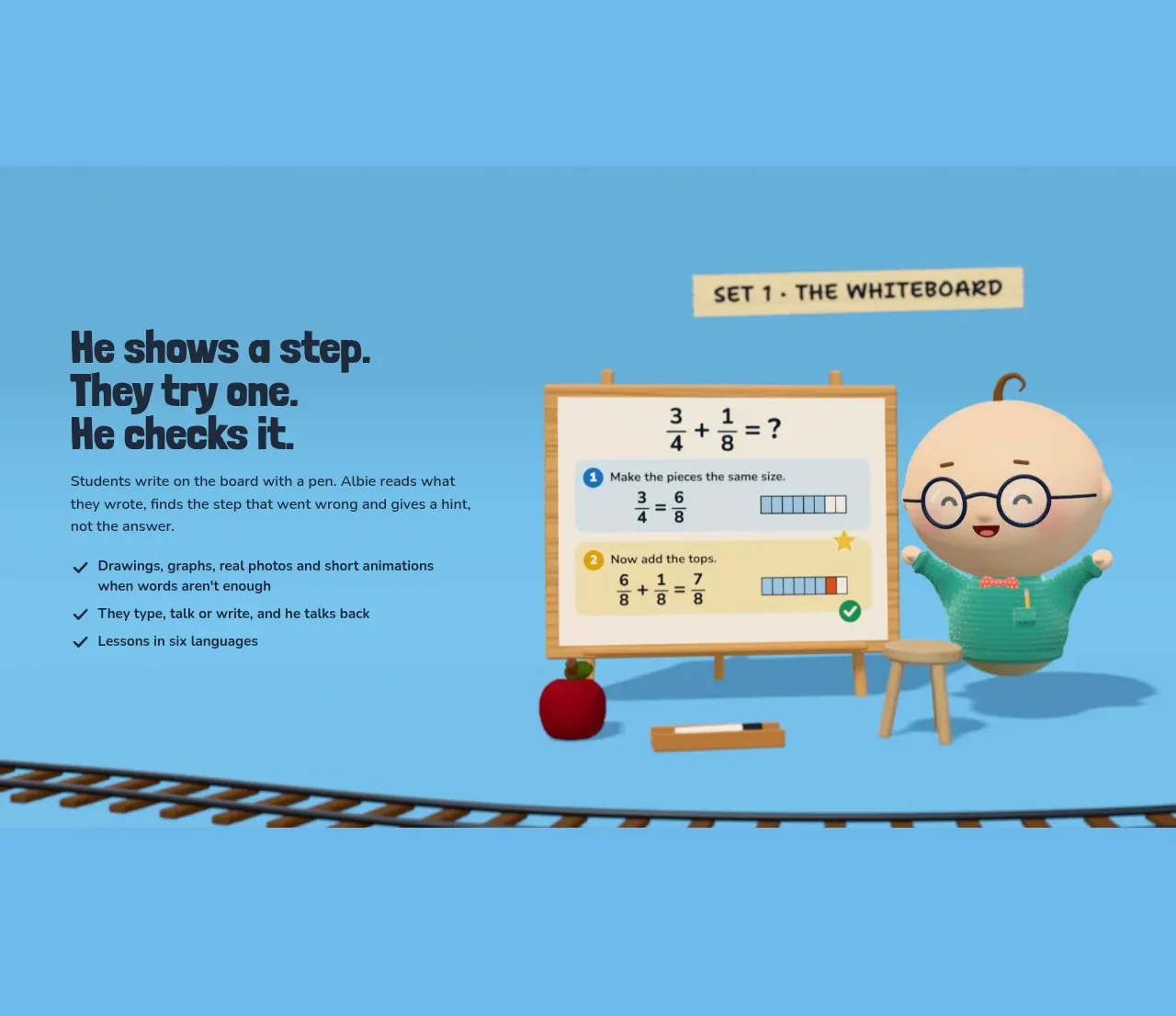
3. **Whiteboard feature** — Continue the blue background with a two-column feature panel: explanatory headline, paragraph, and checkmarked benefits on the left; a repeated teaching/demo scene on the right. Add a small taped set label above the visual and use the track as a bottom divider.
4. **Code editor feature** — Switch to a warm yellow/orange band. Reverse the composition so the illustrated laptop/workspace occupies the left and the feature headline and explanation sit on the right, again grounded by the railway track.
5. **Languages feature** — Use a coral band with text on the left and a visual language-learning scene on the right. Make speech bubbles and hanging paper elements the focal details, with the track below.
6. **Courses feature** — Use a green band with a shelf/course-board illustration on the left and a larger explanatory text block on the right. Keep the set label and railway divider to connect it to the preceding scenes.
7. **Parents feature** — Use a purple band with the explanatory copy on the left and a calmer parent-facing mail/dashboard scene on the right. Reduce visual busyness while retaining the track motif.
8. **Studio summary CTA** — Move into a dark near-black section. Show a wide miniature panorama of all the colourful feature sets at the top, like a photographed studio set, then center a concise headline, supporting sentence, primary green CTA, and secondary link below it.
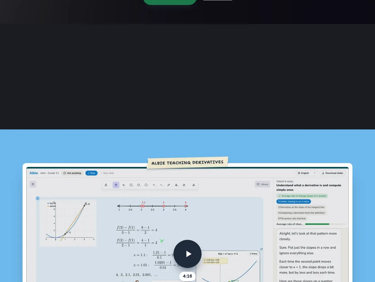
9. **Product demonstration** — Introduce a bright blue section containing a large framed product/video preview. Give the preview a pale border and rounded corners, add a taped label above it, and place a prominent circular play control in the middle.
10. **Pricing heading and comparison** — Transition to an off-white/light neutral background. Add a strong left-aligned heading, then two side-by-side pricing cards: a yellow family plan and a blue organization plan. Use taped tabs at the top, bold plan headings, pricing rows or quote treatment, checkmarked benefits, full-width dark buttons, and a small usage disclaimer below.
11. **Safety and privacy** — Use a green section with a two-column layout: a large safety headline on the left and a vertically stacked checklist of age, ads, filtering, memory, and safeguarding rules on the right. Finish with an underlined privacy-notice link spanning the lower part of the section.
12. **Footer** — End with a dark navy footer containing the compact brand area, a horizontal set of utility/legal links, and a small copyright note aligned to the opposite side.

## Design language
- Build hierarchy through contrast between chunky, condensed, almost hand-lettered display headings and compact rounded body text; use large headlines around 48–72px on desktop, body copy around 15–18px, and small labels around 11–13px.
- Keep each feature band intentionally spacious, with one clear message and one hero object per section. Let the page rhythm alternate between dense illustrated content and generous bands of breathing room rather than using many small cards.
- Use a sequence of saturated, mostly flat backgrounds—sky blue around #69B7DF, warm yellow around #F8C843, coral around #F27F63, green around #54B97A, purple around #A889D8—then reset to near-black #171820, off-white #F7F7F4, and navy #1E2C3E for utility sections.
- Treat dark navy/charcoal as the primary text and button colour, approximately #15253A or #18202B. Reserve green for primary action emphasis and use colour changes between bands as the main navigation device.
- Pair clean responsive grids with playful handmade artifacts: taped cream paper labels, slightly irregular edges, small shadows, props, speech bubbles, and a recurring toy railway track as a visual rule.
- Keep cards and media panels lightly rounded, with soft shadows rather than sharp borders. Buttons are dark or green, pill-shaped, high contrast, and large enough to feel tactile; pricing cards can use stronger drop shadows against the pale background.
- Use illustrations or product scenes as compositional anchors, not decorative wallpaper. Repeat characters, boards, laptops, shelves, mailboxes, and classroom props to make the page feel like one physical set.
- Maintain generous vertical padding in the colourful feature sections and use the track to create a consistent baseline/divider. Tighten the layout in pricing, safety, and footer sections where users need to compare or scan details.
- Make interaction simple and legible: navigation anchors should scroll to sections, primary CTAs should remain visually obvious, links should be underlined or clearly differentiated, and the product preview should expose a centered play affordance. Add only restrained hover lift, button darkening, or gentle illustration movement; do not overpower the editorial scene.
- On smaller screens, stack the two-column scenes, keep labels attached to their section, preserve readable headline scale, and let the railway divider crop or simplify rather than forcing horizontal overflow.

## Never
- Do not copy the reference product’s logo, wordmark, name, tagline, exact copy, character, illustrations, classroom props, railway artwork, screenshots, pricing, or icon set.
- Do not reproduce the reference page as an Albie clone or present the result as Albie.
- Create original content, brand assets, imagery, and product-specific examples for the user’s product while reusing only the general principles of colourful editorial sectioning, tactile labels, illustrated scenes, and changing page rhythm.
Components from this page
All components
 Top navigation
Albie · Navigation
Top navigation
Albie · Navigation
 Primary teaching hero
Albie · Hero
Primary teaching hero
Albie · Hero
 Whiteboard learning feature
Albie · Feature grid
Whiteboard learning feature
Albie · Feature grid
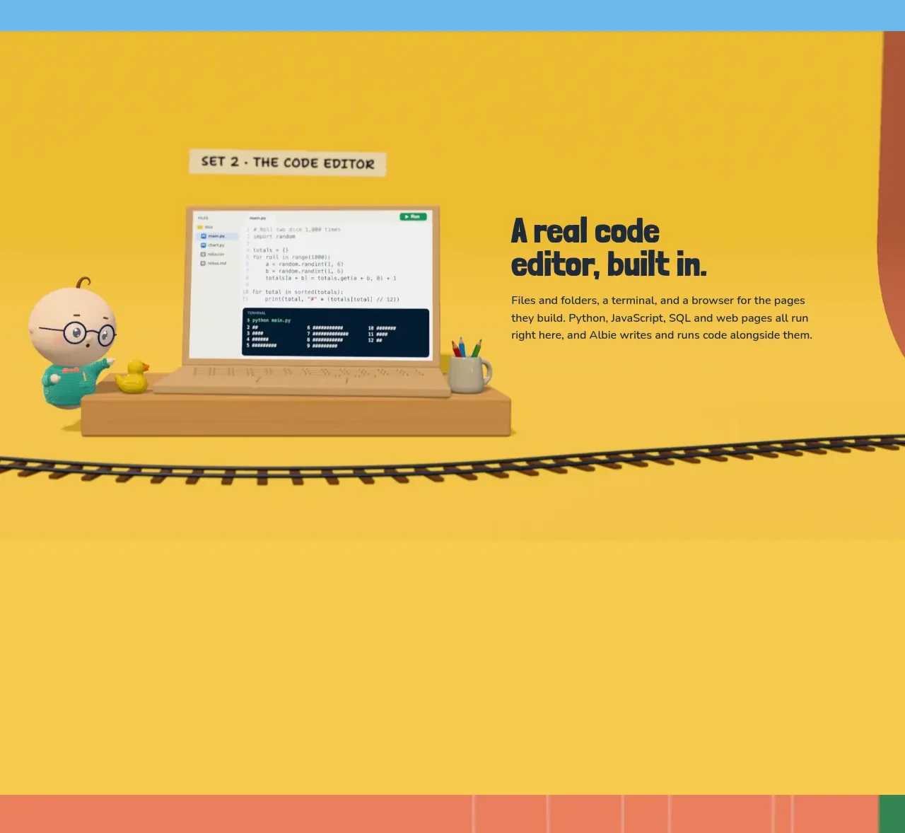 Embedded code editor
Albie · Feature grid
Embedded code editor
Albie · Feature grid
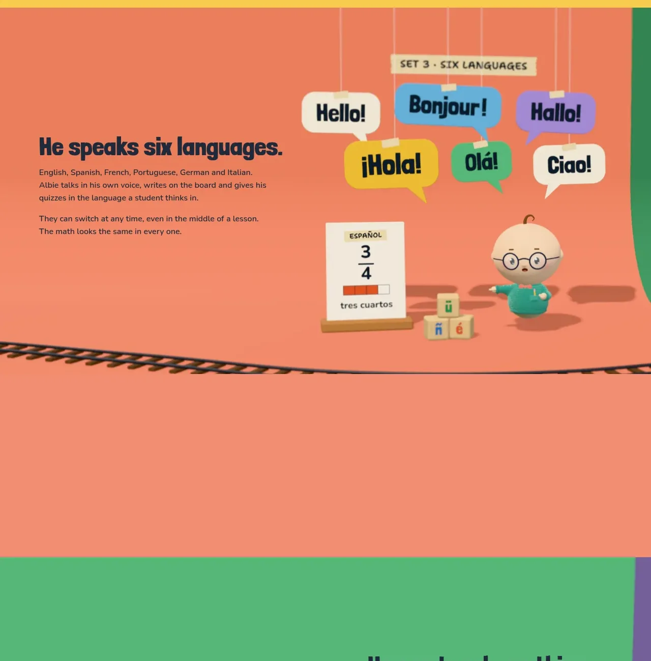 Multilingual capability
Albie · Feature grid
Multilingual capability
Albie · Feature grid
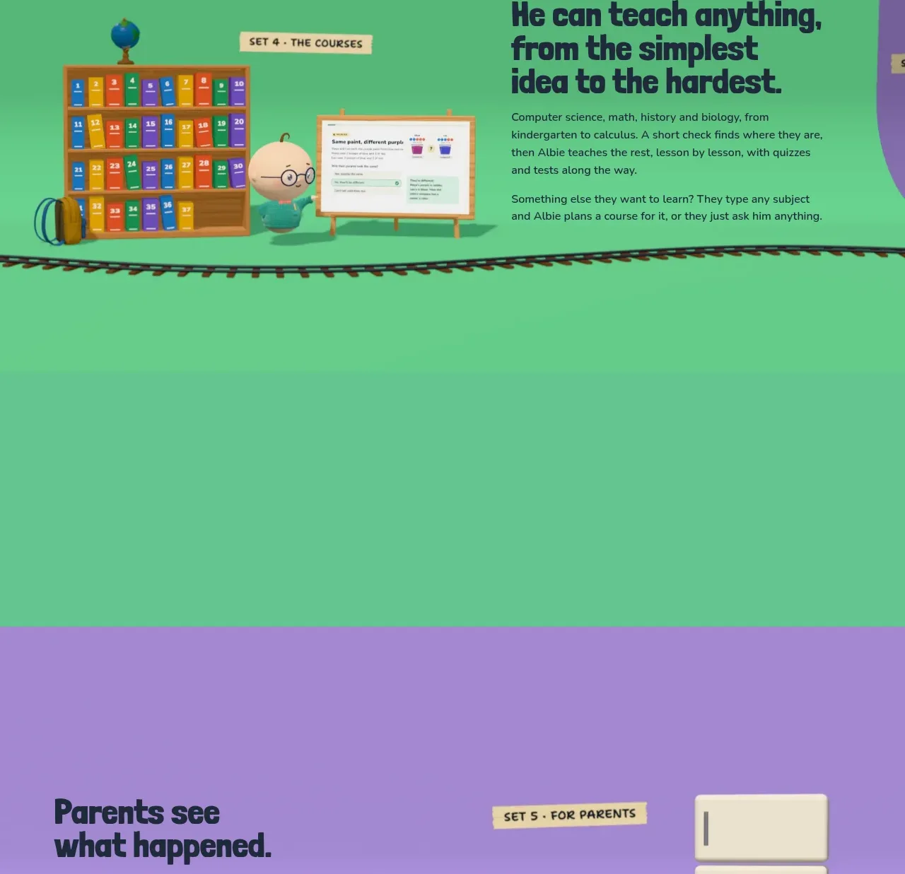 Course breadth feature
Albie · Feature grid
Course breadth feature
Albie · Feature grid
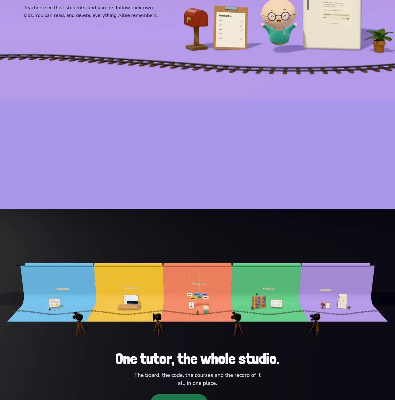 Parent visibility feature
Albie · Feature grid
Parent visibility feature
Albie · Feature grid
 Studio-wide conversion CTA
Albie · Call to action
Studio-wide conversion CTA
Albie · Call to action
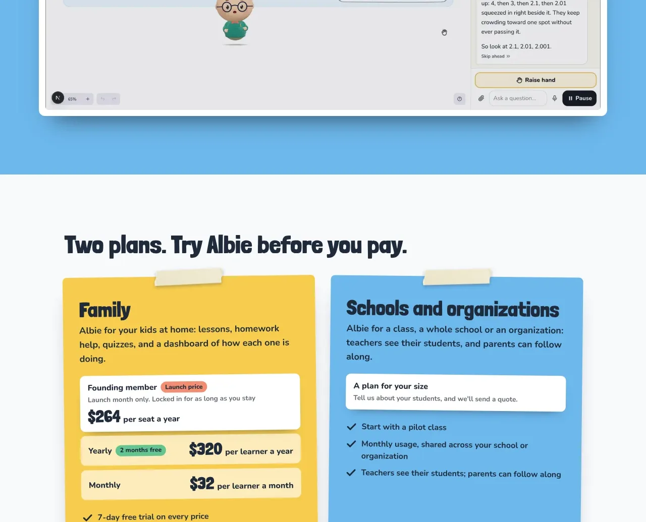 Product walkthrough video
Albie · Gallery
Product walkthrough video
Albie · Gallery
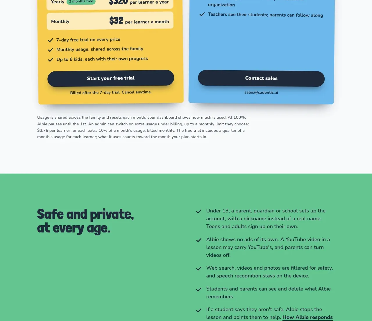 Two-plan pricing
Albie · Pricing table
Two-plan pricing
Albie · Pricing table
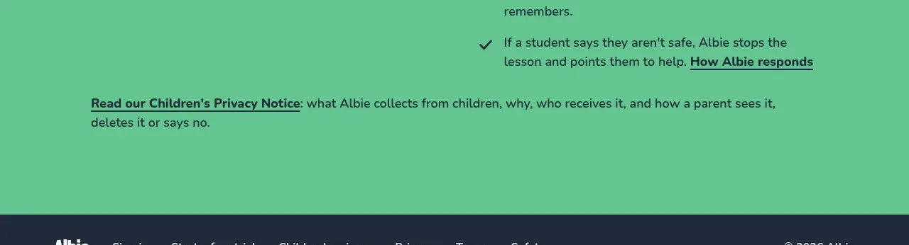 Safety and privacy assurance
Albie · Feature grid
Safety and privacy assurance
Albie · Feature grid
 Site footer
Albie · Footer
Site footer
Albie · Footer