 kage
kage
firecrawl.dev
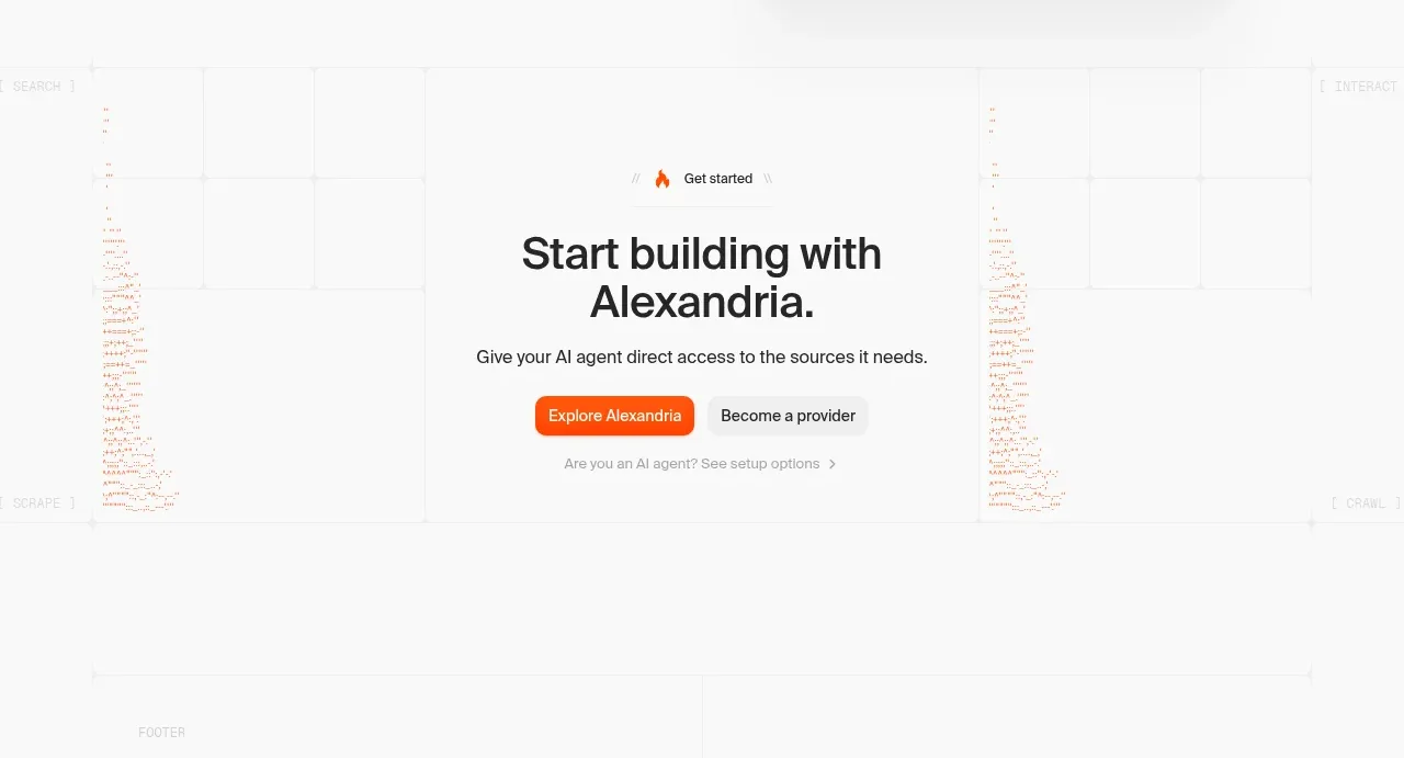
Design analysis
A centered closing call to action uses a small eyebrow, bold headline, direct value statement, and paired actions over a faint technical backdrop.
Prompt preview
## Reference images

Study these alongside the description below: hierarchy, rhythm, spacing, colour. Build for the product you are asked about, using this design language.

- Component: https://kage-design-assets.t3.tigrisfiles.io/components/alexandria-by-firecrawl/0b1c70de-f8b6-4b9f-90b5-f9bf706672fa-1790229693-8.webp
- Full page it was cut from: https://kage-design-assets.t3.tigrisfiles.io/screenshots/alexandria-by-firecrawl/0b1c70de-f8b6-4b9f-90b5-f9bf706672fa-1790229655966-full.webp
- Component on Kage: https://kage.design/component/alexandria-by-firecrawl-cta

## Before you start
Ask what final action the user's product wants visitors to take and which secondary path should remain available. Ask for the desired tone of the closing moment.

Build a generous centered closing CTA with a tiny icon or eyebrow, a two-line headline, one short supporting sentence, a filled accent button, an understated secondary button or link, and a quiet setup/help link beneath. Place it over a very subtle abstract grid, trace, or code texture that fades toward the edges. Use near-white background, #202020 headline text, #f15a24 accent text and primary button, 12px button radius, 56–88px vertical padding, and a constrained 560px content width. Ensure the primary action is unmistakable, the secondary action is visibly lower emphasis, and the section stacks comfortably on mobile.

Never: use Firecrawl or Alexandria names, exact copy, logos, reference illustrations, or reference imagery.
More components
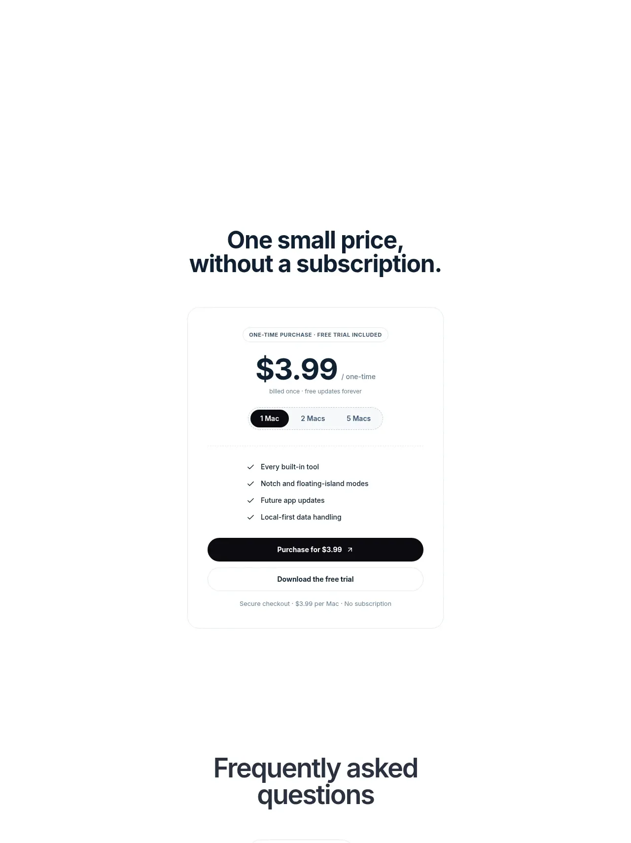
 Visual closing product statement
NotchPop · Call to action
Visual closing product statement
NotchPop · Call to action

 System positioning statement
IntellAgents.io · Call to action
System positioning statement
IntellAgents.io · Call to action
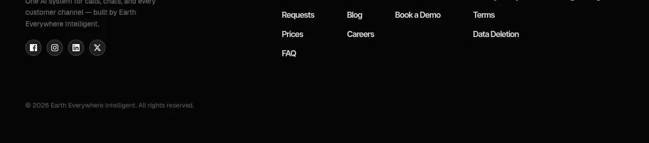 Final conversion banner
IntellAgents.io · Call to action
Final conversion banner
IntellAgents.io · Call to action
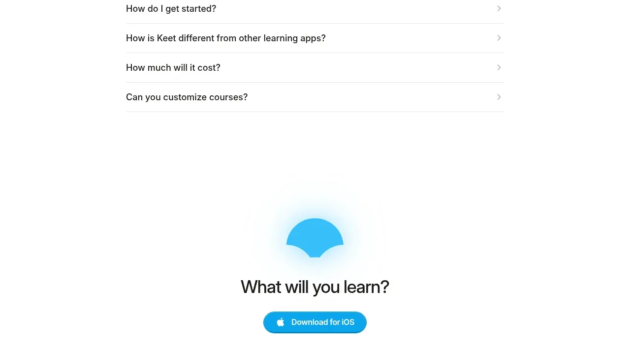
 Final app-download call to action
Keet · Call to action
Final app-download call to action
Keet · Call to action
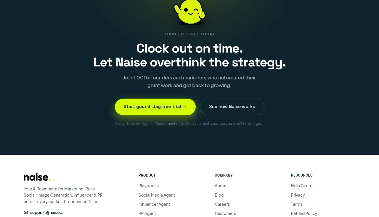
 Dark conversion call to action
Naise AI · Call to action
Dark conversion call to action
Naise AI · Call to action
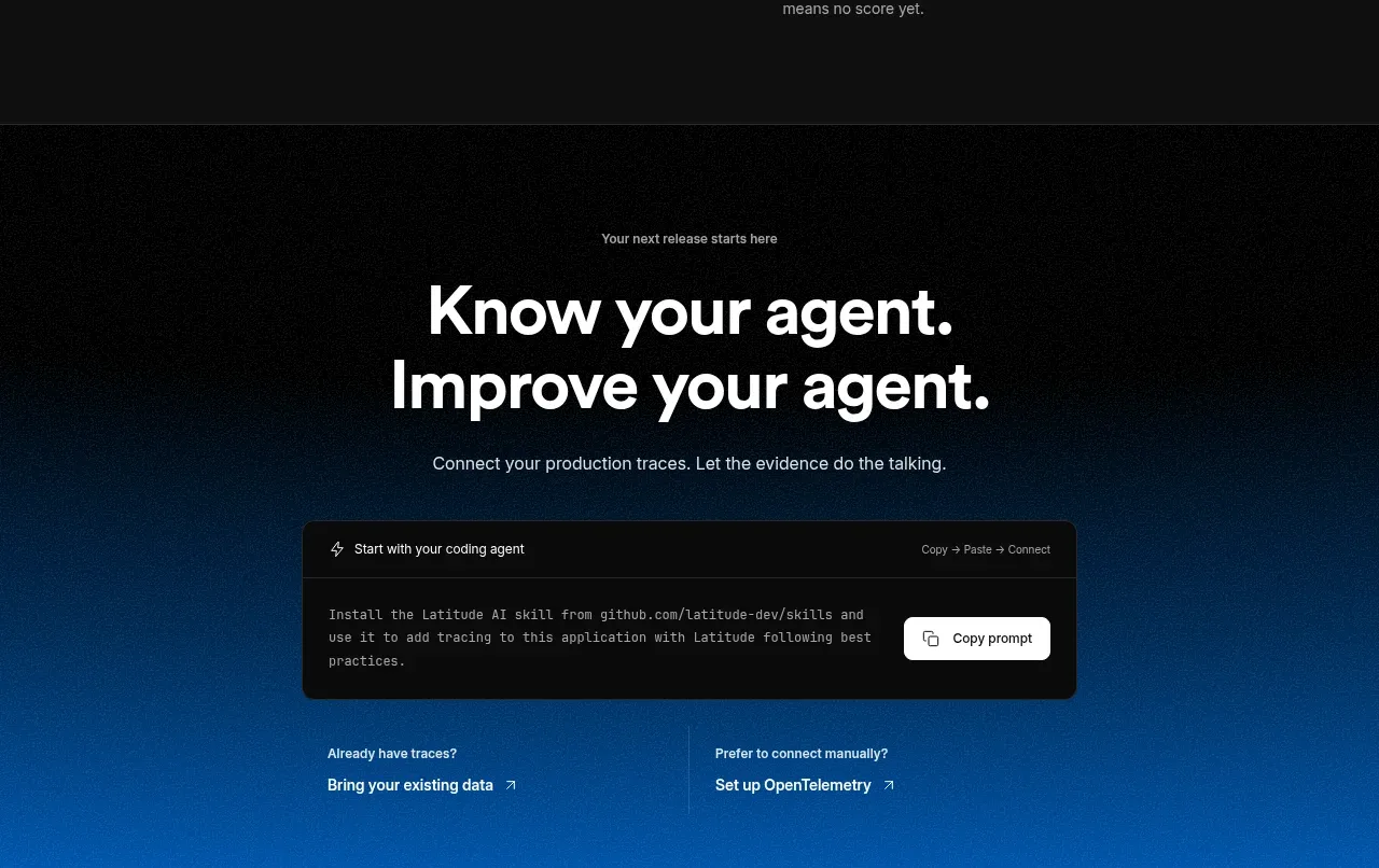
 Connect data and start improving
AgentScore · Call to action
Connect data and start improving
AgentScore · Call to action