kage
kage
firecrawl.dev

Design analysis
A long-form AI product landing page pairs an intense orange ASCII-art hero with a mostly white, highly structured editorial body. Thin gray rules, small monospace section labels, restrained typography, and repeated centered headlines create a measured rhythm; below the hero, the page moves from benefits to a provider network and metrics, then a categorized library grid, integration code panels, a provider waitlist form, CTA, and an extensive multi-column footer.
Prompt preview
## Reference images

Study these alongside the description below: hierarchy, rhythm, spacing, colour. Build for the product you are asked about, using this design language.

- Full page: https://kage-design-assets.t3.tigrisfiles.io/screenshots/alexandria-by-firecrawl/0b1c70de-f8b6-4b9f-90b5-f9bf706672fa-1790229655966-full.webp
- Above the fold: https://kage-design-assets.t3.tigrisfiles.io/screenshots/alexandria-by-firecrawl/0b1c70de-f8b6-4b9f-90b5-f9bf706672fa-1790229640227.webp
- Design on Kage: https://kage.design/designs/alexandria-by-firecrawl-landing-page

## Before you start
Ask the user what they are building, who it is for, and what brand assets they already have, including the product name, colours, type choices, logo, and any existing visual constraints. Wait for their answers before designing. Apply the reference's structural and visual principles to their product, not to Alexandria or Firecrawl.

## Page structure
1. **Navigation and hero:** Begin with a compact top navigation over a full-bleed vivid colour field. Place a small brand mark at left, a restrained text navigation in the middle, and a utility metric plus light sign-up button at right. Center a small eyebrow, a large two-line headline, supporting copy, primary and secondary actions, and a subtle provider link over a dense, animated-looking ASCII or data texture.
2. **Section index divider:** Transition to white with generous vertical space and a thin horizontal rule. Add a small monospace-style section index at the left, using an accent mark and muted metadata to establish the page's editorial chapter system.
3. **Connection/value section:** Center a two-line headline with the second line in the accent colour, followed by a short explanation. Under it, show a wide, pale product workflow panel with source/provider marks, a compact result/code fragment, connection state, and numbered steps. Finish with four evenly spaced benefit columns with short headings and descriptions.
4. **Data universe section:** Add another indexed divider, then a centered headline and subtitle. Present a large, airy network visualization: a dotted globe or abstract data mass surrounded by fine orbit lines and small provider nodes. Follow it with a small metadata caption and a four-column statistic strip showing large accent numerals, labels, and muted descriptions.
5. **Library/provider section:** Introduce the next chapter with its index, centered headline, subtitle, and a horizontal row of category filters. Below, create a restrained multi-column provider card grid; each card has a small provider icon, name, source type, and compact description. End with a centered accent button and a small secondary provider-count/provider CTA.
6. **Build-anywhere section:** Use another index divider and a centered headline/subtitle over a very faint technical background texture. Below, split a bordered two-column panel: the left column explains connecting an agent through a prompt/MCP/CLI interface and shows a code or command block; the right explains embedding the product in an app and shows SDK code. Give each column a small tab row, copy control, code area, and documentation link.
7. **Provider onboarding section:** Mark the chapter with an index and a short label. Use a two-column layout with a large left-aligned headline and explanatory copy, and a raised white multi-step form card on the right. Include a progress indicator, name/organization field, orange continue button, keyboard hint, and privacy note.
8. **Final CTA:** Place a compact centered call to action inside a wide, lightly framed panel with faint data/ASCII fragments at the sides. Include a small eyebrow, strong headline, short supporting sentence, primary orange button, secondary button, and a subtle setup link.
9. **Footer introduction:** Add a spacious footer preamble with a small “footer” label, thin rule, brand/mission block on the left, backing and compliance details toward the middle/right, and a two-column set of social/community links.
10. **Footer navigation:** Finish with a large bordered four-column link matrix for Products, Use Cases, Resources, and Company. Below it, add a slim legal/status row with copyright, terms, privacy, abuse reporting, and a small system-status indicator.

## Design language
- Build hierarchy with a restrained sans-serif scale: large centered section headlines around 48–64px, compact 14–16px supporting text, and tiny uppercase/monospace labels for chapter navigation and metadata.
- Use a chapter-based rhythm. Separate major sections with large white gaps and hairline rules; move from dense hero texture, to airy explanatory content, to data visualization, to denser grids and code panels, then return to a compact CTA and information-rich footer.
- Treat orange as a focused action and emphasis colour, approximately `#ff4f00` or `#ff5a00`, with near-black text around `#202020`, white backgrounds, and cool pale gray surfaces around `#f7f7f5`.
- Use orange selectively: hero background, highlighted headline lines, key numbers, primary buttons, active progress, and tiny index accents. Keep most of the body monochrome so the orange moments carry navigational weight.
- Use a full-bleed ASCII/data texture in the hero and very faint technical textures in selected transitions, but keep content legible with strong contrast and generous empty space.
- Prefer thin 1px gray borders, horizontal rules, and lightly divided grid cells. Use small radii, approximately 6–12px, on buttons and cards; reserve soft shadow for the elevated onboarding form rather than applying shadows globally.
- Keep provider cards, stats, code samples, and footer links aligned to a consistent centered max-width grid. Let borders define structure instead of heavy filled cards.
- Pair a clean modern sans-serif for headlines and body copy with a monospace or letter-spaced technical treatment for section indices, metrics captions, code, and small labels.
- Buttons should be compact and direct: solid orange for the primary action, white or transparent with a border for secondary actions, and arrow indicators on links. Use subtle hover colour or border changes and small upward/side motion rather than conspicuous animation.
- If adding motion, make the hero data texture gently animate, let provider/network nodes drift minimally, and use calm transitions for tabs, filters, copy controls, and form steps. Preserve the static editorial layout and accessibility.

## Never
- Do not copy Firecrawl or Alexandria logos, wordmarks, product names, exact copy, illustrations, provider marks, social icons, or proprietary ASCII artwork.
- Do not reproduce the reference's brand identity or present the result as Firecrawl/Alexandria.
- Do not use the reference's provider names, statistics, code examples, navigation labels, or footer content; replace them with content relevant to the user's product.
- Do not turn every section into a card, add heavy gradients, or replace the sparse white editorial rhythm with a generic SaaS dashboard.
Components from this page
All components
 Primary navigation
Alexandria by Firecrawl · Navigation
Primary navigation
Alexandria by Firecrawl · Navigation
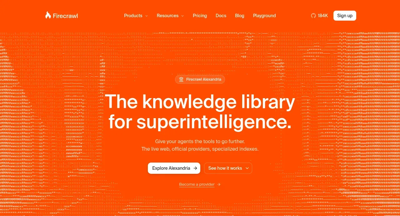 Orange knowledge-library hero
Alexandria by Firecrawl · Hero
Orange knowledge-library hero
Alexandria by Firecrawl · Hero
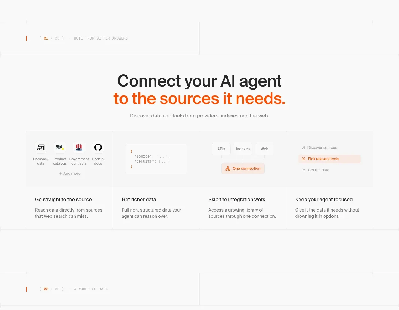 Agent-to-source workflow
Alexandria by Firecrawl · Feature grid
Agent-to-source workflow
Alexandria by Firecrawl · Feature grid
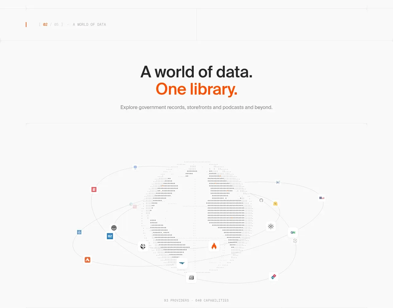 Data universe and library map
Alexandria by Firecrawl · Feature grid
Data universe and library map
Alexandria by Firecrawl · Feature grid
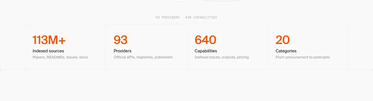 Library scale statistics
Alexandria by Firecrawl · Stats
Library scale statistics
Alexandria by Firecrawl · Stats
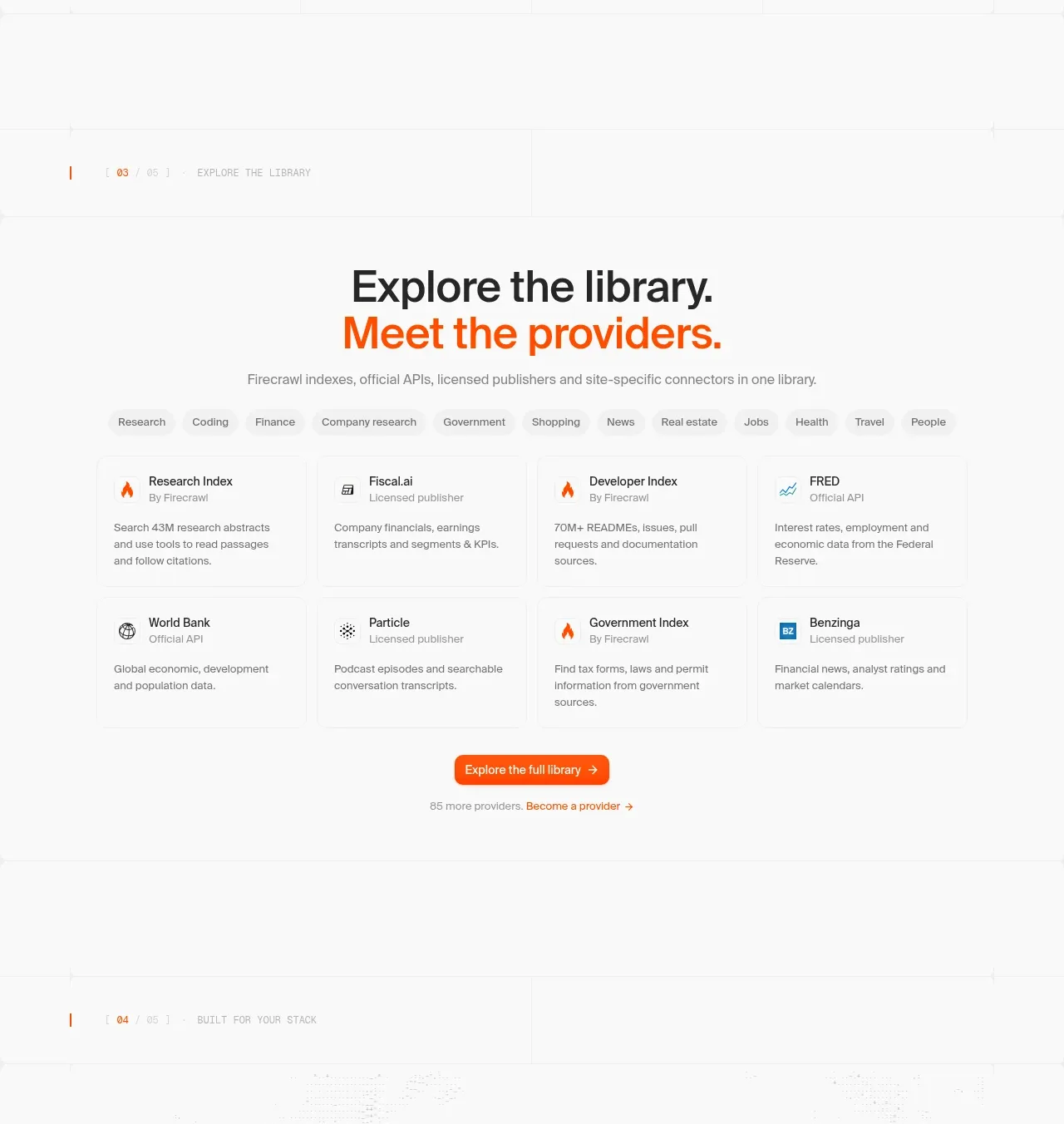 Provider library browser
Alexandria by Firecrawl · Feature grid
Provider library browser
Alexandria by Firecrawl · Feature grid
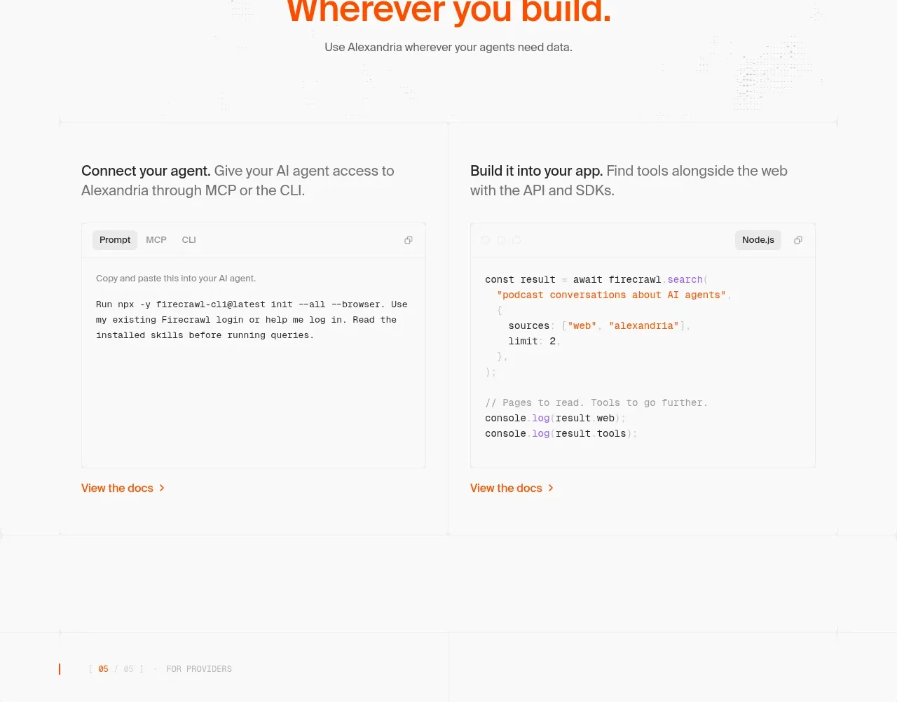 Build and integration options
Alexandria by Firecrawl · Tabs & steps
Build and integration options
Alexandria by Firecrawl · Tabs & steps
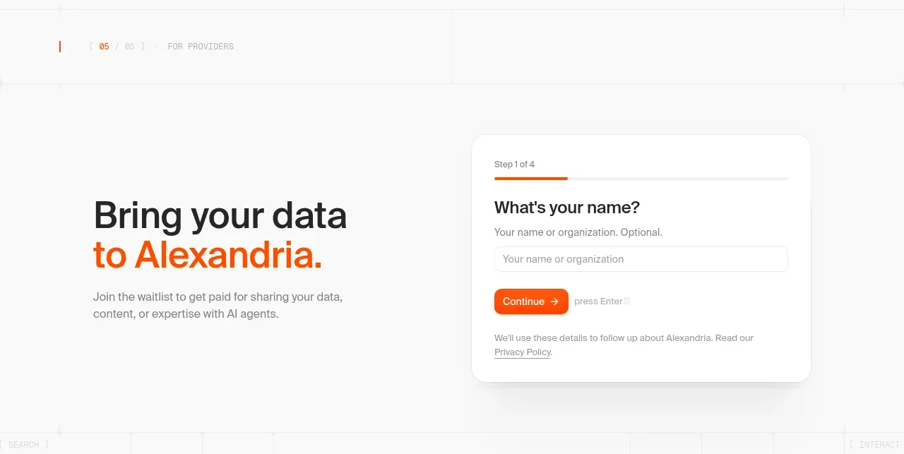 Provider waitlist form
Alexandria by Firecrawl · Form
Provider waitlist form
Alexandria by Firecrawl · Form
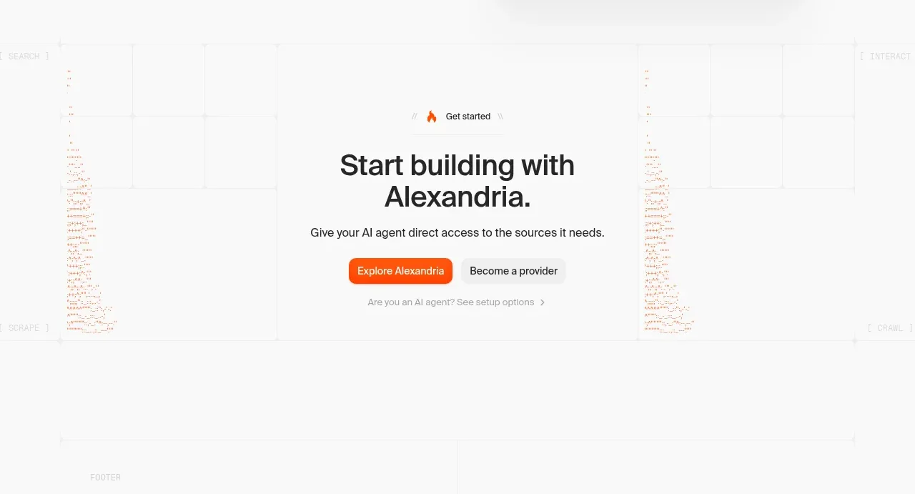 Final build CTA
Alexandria by Firecrawl · Call to action
Final build CTA
Alexandria by Firecrawl · Call to action
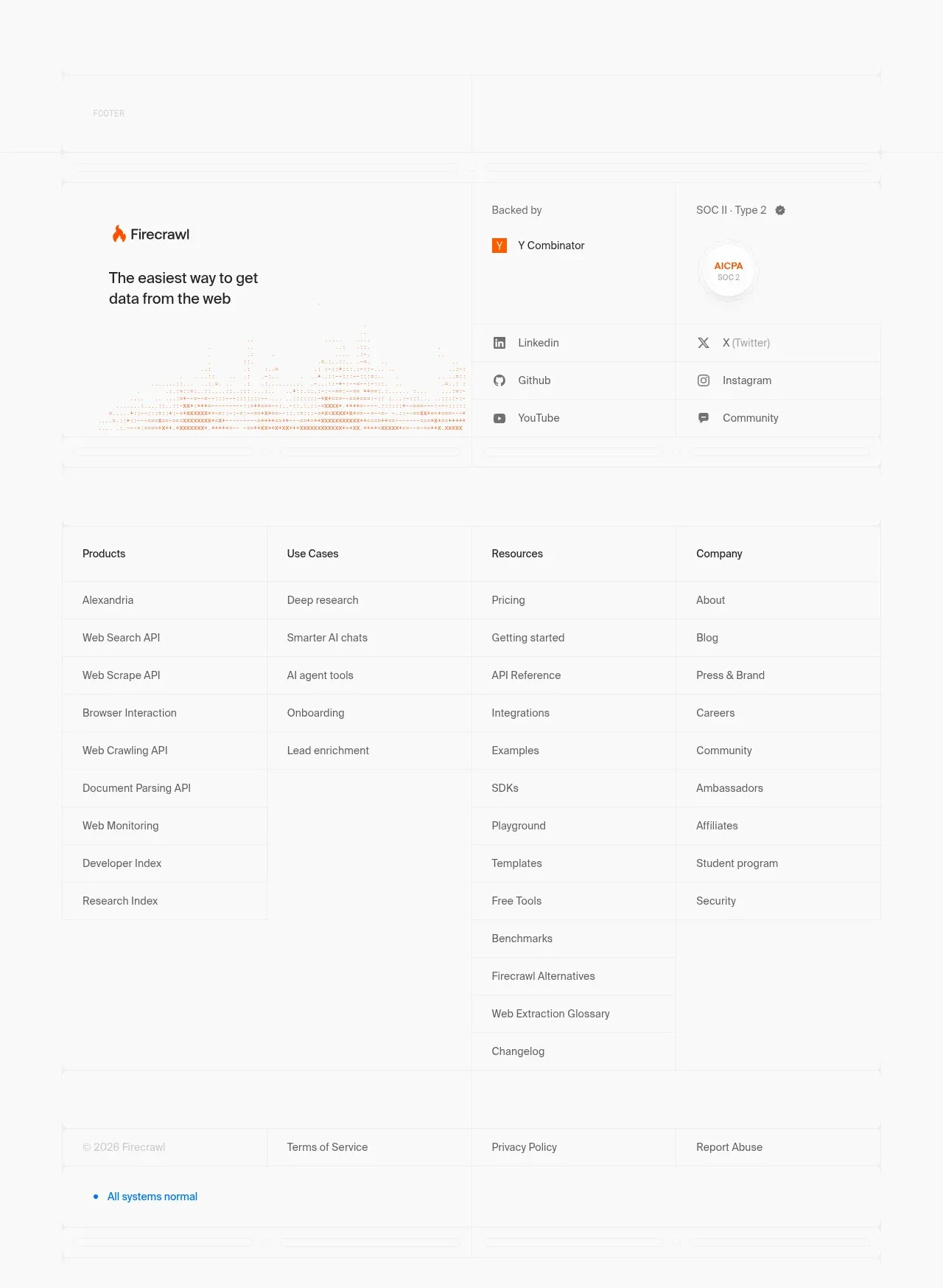 Multi-column site footer
Alexandria by Firecrawl · Footer
Multi-column site footer
Alexandria by Firecrawl · Footer