kage
kage
firecrawl.dev
Design analysis
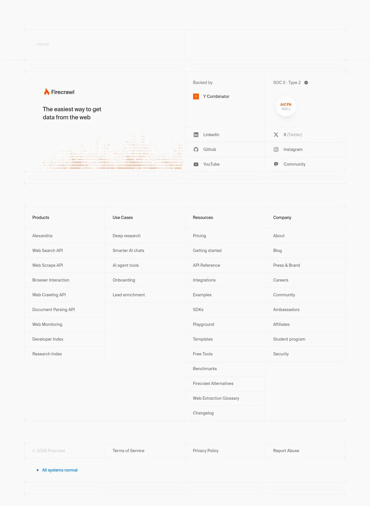
The footer starts with trust and social proof, continues into a dense multi-column link directory, and ends with legal links plus system status.
Prompt preview
## Reference images

Study these alongside the description below: hierarchy, rhythm, spacing, colour. Build for the product you are asked about, using this design language.

- Component: https://kage-design-assets.t3.tigrisfiles.io/components/alexandria-by-firecrawl/0b1c70de-f8b6-4b9f-90b5-f9bf706672fa-1790229693-9.webp
- Full page it was cut from: https://kage-design-assets.t3.tigrisfiles.io/screenshots/alexandria-by-firecrawl/0b1c70de-f8b6-4b9f-90b5-f9bf706672fa-1790229655966-full.webp
- Component on Kage: https://kage.design/component/alexandria-by-firecrawl-footer

## Before you start
Ask what navigation groups, trust signals, social channels, legal links, and support status the user's product needs. Ask for the brand's footer color and accessibility preferences.

Create a large footer with three layers. First, include a top trust row with the brand mark rendered as a generic placeholder, a short positioning statement, and a compact backed-by/compliance area plus social links. Second, add a spacious four-column link directory with clear group headings and evenly aligned rows; use generous row height and subtle horizontal separators only where useful. Third, finish with a thin legal bar containing copyright, terms, privacy, abuse/reporting, and a small colored system-status indicator. Use a white or very pale gray background, #202020 headings, #666666 links, #f15a24 for small accents, #ededed dividers, 12–14px link text, 13–16px headings, and a max-width container around 780px. Collapse link columns into accordions on mobile and preserve strong focus states.

Never: use Firecrawl or Alexandria logos, product names, exact link labels, illustrations, imagery, or reference copy.