 kage
vibeide.dev

Design analysis
The footer combines a brand/legal block, grouped navigation columns, and a final low-contrast legal strip with policy links and company details.
Prompt preview
## Reference images

Study these alongside the description below: hierarchy, rhythm, spacing, colour. Build for the product you are asked about, using this design language.

- Component: https://kage-design-assets.t3.tigrisfiles.io/components/vibeide/07b340e8-2f64-4d74-b3e0-eba165a9aca9-1793080891-8.webp
- Full page it was cut from: https://kage-design-assets.t3.tigrisfiles.io/screenshots/vibeide/07b340e8-2f64-4d74-b3e0-eba165a9aca9-1793080830929-full.webp
- Component on Kage: https://kage.design/component/vibeide-footer

## Before you start
Ask what the user's product and brand are, then apply the principles below to that product rather than reproducing this reference.

Build a dark footer with a top area containing a brand/about block on the left and 3–4 grouped link columns on the right. Beneath a subtle divider, add a compact legal row with company details, policy links, copyright, and an optional language selector. Use #080909, #f1f1ed for the brand, #858783 for body copy, #60635f for legal text, and #252827 for dividers. Keep the grid aligned to a shared max-width, use 12–14px text with 1.5 line height, and provide visible hover/focus states. Collapse link groups into stacked sections or accordions on mobile.

Never use the reference logo, product name, company details, copy, links, or exact legal text.
More components

 Multi-column site footer
Basedash View-only members · Footer
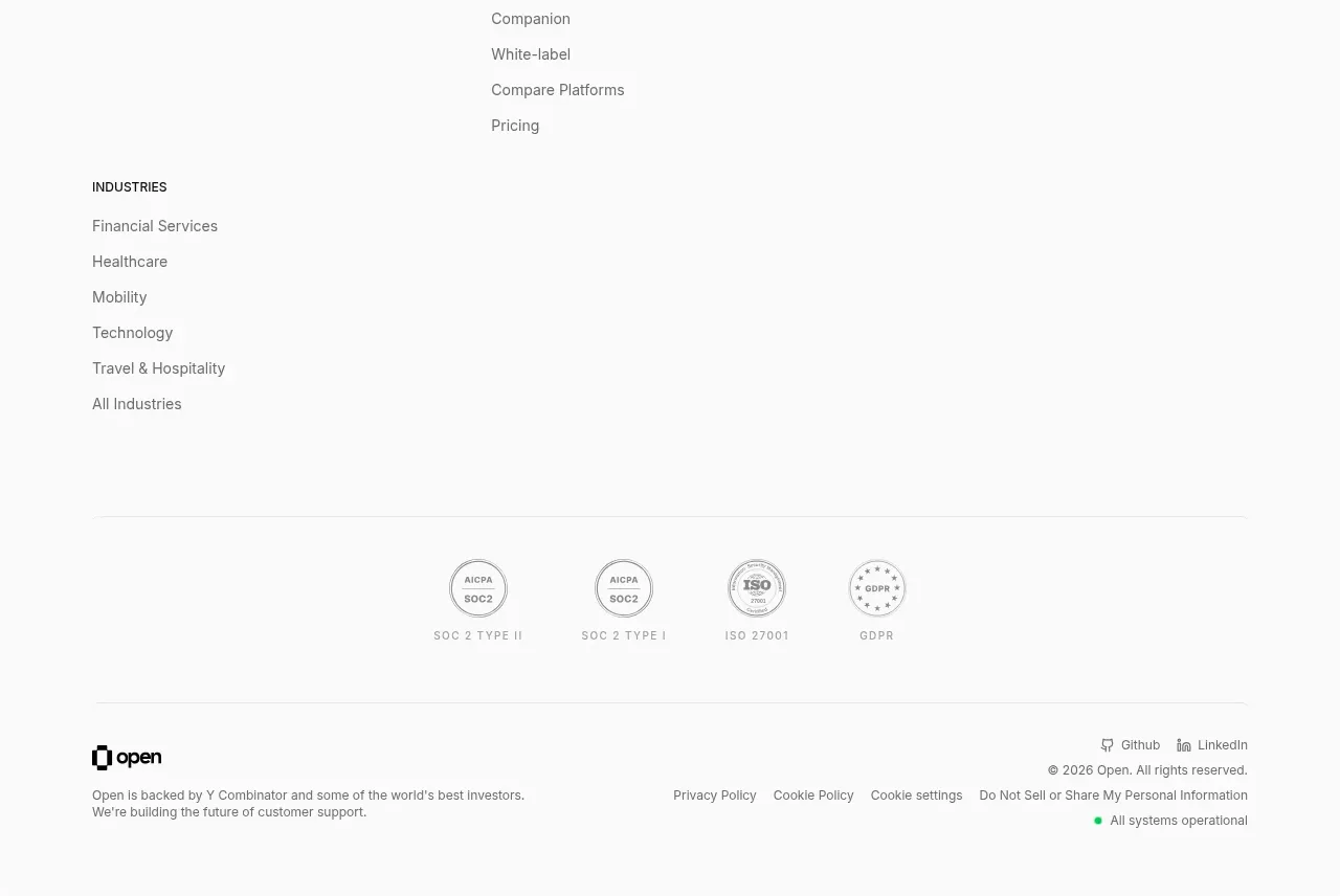
 Site navigation and trust footer
Open For sales · Footer
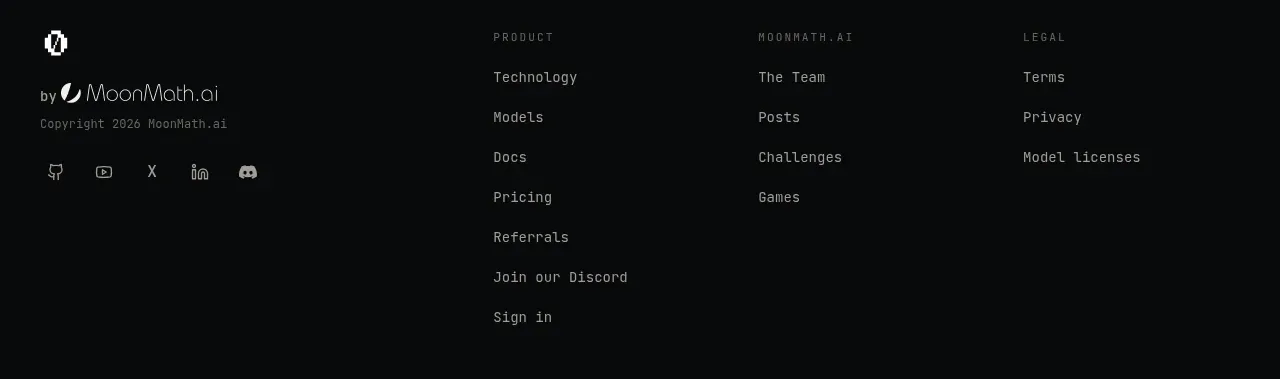
 Multi-column site footer
Zro: Uncensored Security Models · Footer
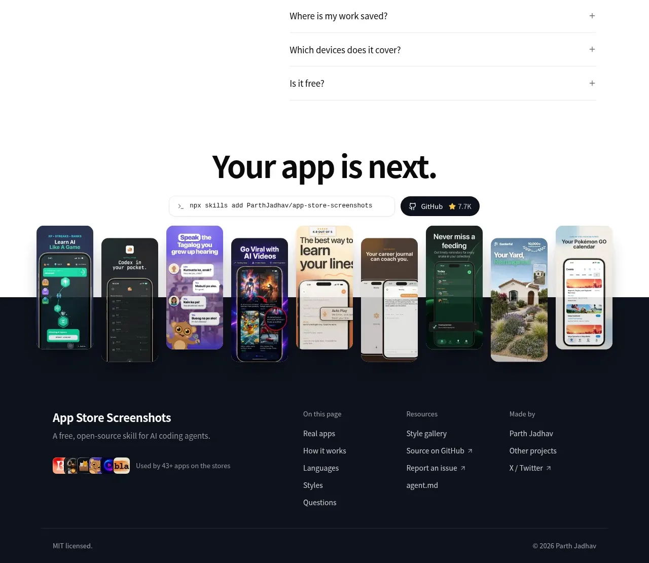
 Multi-column dark footer
App Store Screenshots · Footer

 Quiet utility footer
Dotverse · Footer

 Utility footer
AI Bridge · Footer