 kage
kage
applyseed.com

Design analysis
A short, high-contrast closing message and one primary action create a clean conversion moment before the footer.
Prompt preview
## Reference images

Study these alongside the description below: hierarchy, rhythm, spacing, colour. Build for the product you are asked about, using this design language.

- Component: https://kage-design-assets.t3.tigrisfiles.io/components/applyseed/bf723559-d370-4cf7-bc95-35bbaececd41-1789797758-10.webp
- Full page it was cut from: https://kage-design-assets.t3.tigrisfiles.io/screenshots/applyseed/bf723559-d370-4cf7-bc95-35bbaececd41-1789797723399-full.webp
- Component on Kage: https://kage.design/component/applyseed-cta

## Before you start
Ask what the user's product is, who it serves, and what brand personality and colors they want. Apply these principles to that product rather than reproducing the reference.

Build a centered closing CTA with generous vertical whitespace. Use a short headline with one or two words highlighted in the product's accent colors, a single dark rounded button beneath it, and a tiny reassurance line under the button. Keep the background white or near-white, center everything within a readable max-width, and avoid extra links or imagery. Use 36–48px headline type, 14–16px muted supporting text, a #111315 button with white text, 10–12px button radius, and 72–112px vertical padding. Add a subtle hover lift and visible keyboard focus ring.

Never: use logos, product names, copy, illustrations, or imagery from the reference.
More components
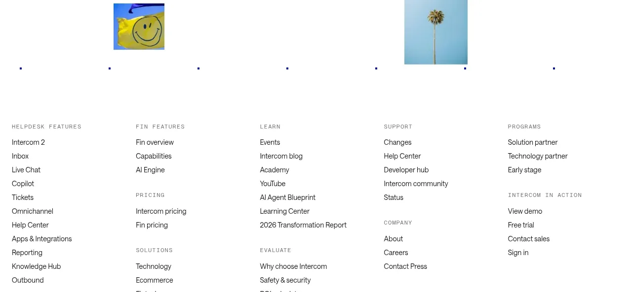
 Final customer experience call to action
intercom.com · Call to action
Final customer experience call to action
intercom.com · Call to action
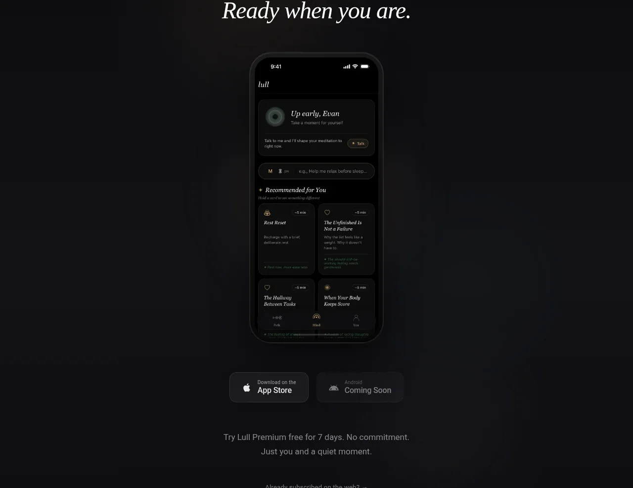
 App download conversion
Lull · Call to action
App download conversion
Lull · Call to action
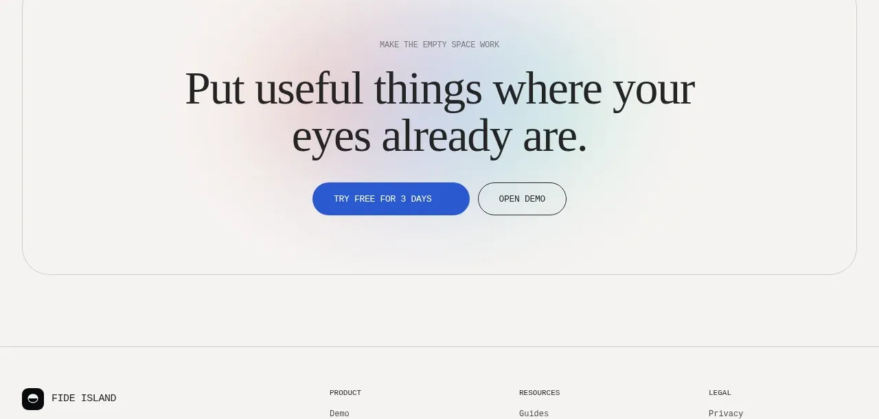
F
Final conversion call to action
Fide Island · Call to action

 Inline conversion banner
QAgent · Call to action
Inline conversion banner
QAgent · Call to action
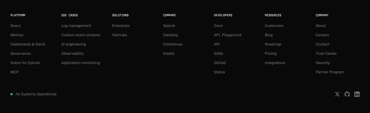
A
Final signup call to action
Axiom · Call to action
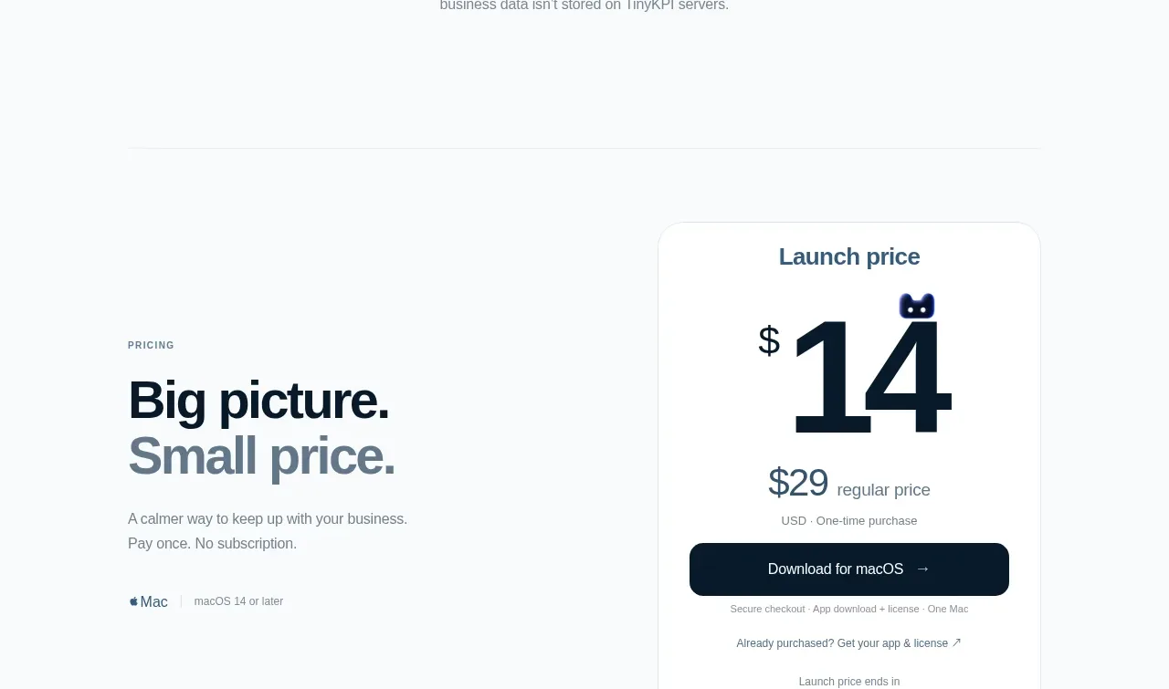
 Privacy promise
TinyKPI · Call to action
Privacy promise
TinyKPI · Call to action