kage
kage
applyseed.com
Design analysis
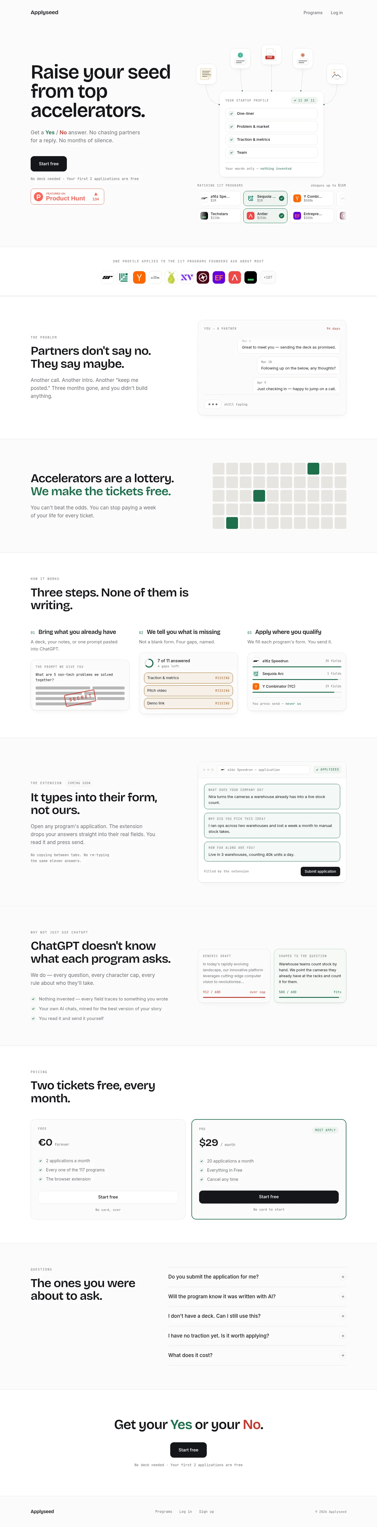
A long, spacious landing page uses a mostly white canvas, black sans-serif headlines, and small uppercase monospace labels to create a precise, product-led rhythm. The hero pairs a large left-aligned promise and compact CTA with a detailed application workflow illustration; below it, alternating two-column sections move from problem framing to process, extension, AI differentiation, pricing, FAQ, and a restrained closing CTA, with pale gray rules and muted green highlights keeping the page cohesive.
Prompt preview
## Reference images

Study these alongside the description below: hierarchy, rhythm, spacing, colour. Build for the product you are asked about, using this design language.

- Full page: https://kage-design-assets.t3.tigrisfiles.io/screenshots/applyseed/bf723559-d370-4cf7-bc95-35bbaececd41-1789797723399-full.webp
- Above the fold: https://kage-design-assets.t3.tigrisfiles.io/screenshots/applyseed/bf723559-d370-4cf7-bc95-35bbaececd41-1789797720806.webp
- Design on Kage: https://kage.design/designs/applyseed-landing-page

## Before you start
Ask the user what they are building, who it is for, and which brand assets they already have (name, colours, type choices, logo, and any product imagery). Wait for their answers before proceeding. Apply the reference's design language to their product, not to the reference product, and use their content and brand assets.

## Page structure
1. **Header:** Place a compact wordmark or product name at the left and two small text links at the right, with generous horizontal margins and no heavy navigation chrome.
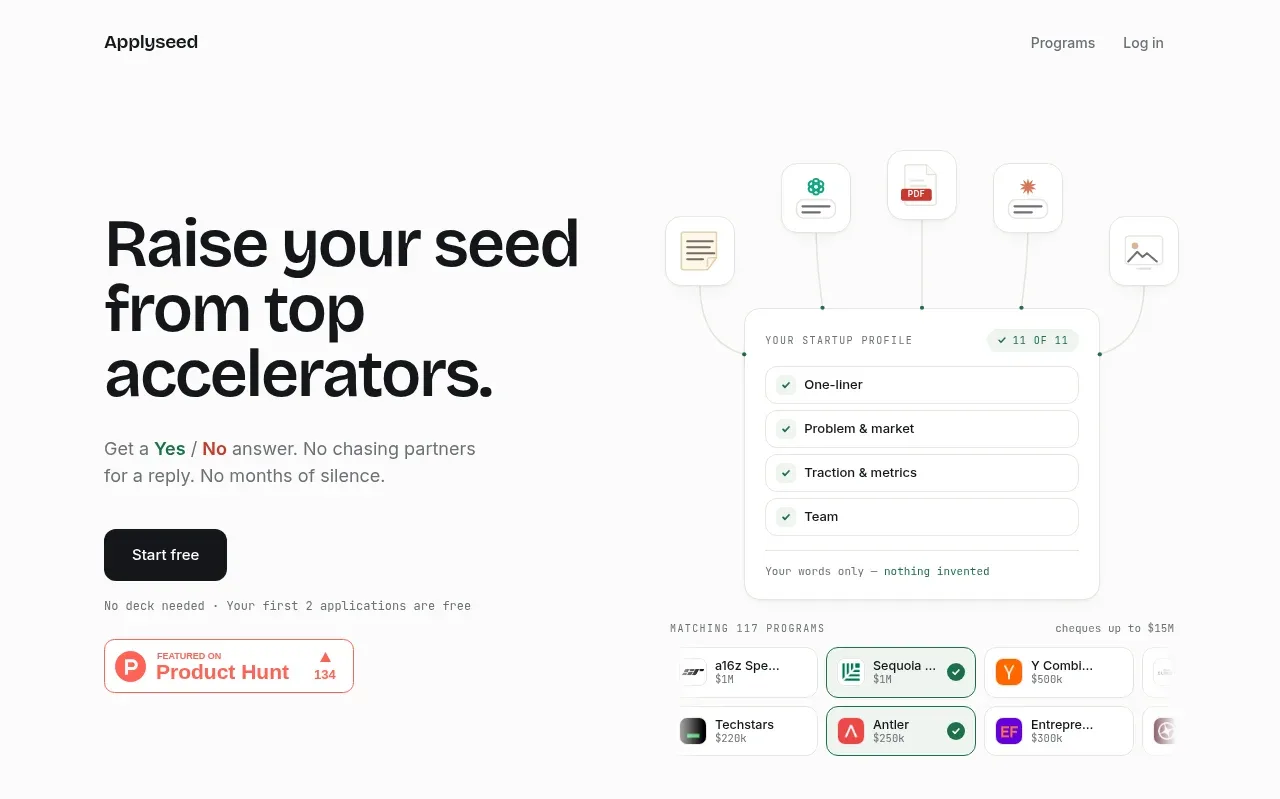
2. **Hero:** Use a wide two-column layout: a large three-line headline, short supporting paragraph, dark primary CTA, tiny reassurance note, and small social-proof badge on the left; place a detailed, pale product/workflow illustration on the right with connected floating document tiles and compact UI cards.
3. **Program logo strip:** Add a narrow bordered band beneath the hero with a centered uppercase monospace statement and a horizontal row of small rounded partner or category marks.
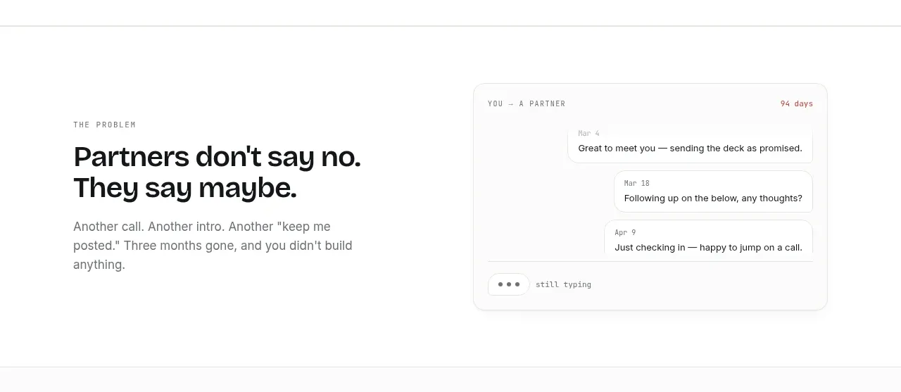
4. **Problem section:** Use an airy two-column block with a small uppercase eyebrow, bold headline, and muted explanatory copy on the left; show a lightly bordered conversation/status card on the right to visualize the problem.
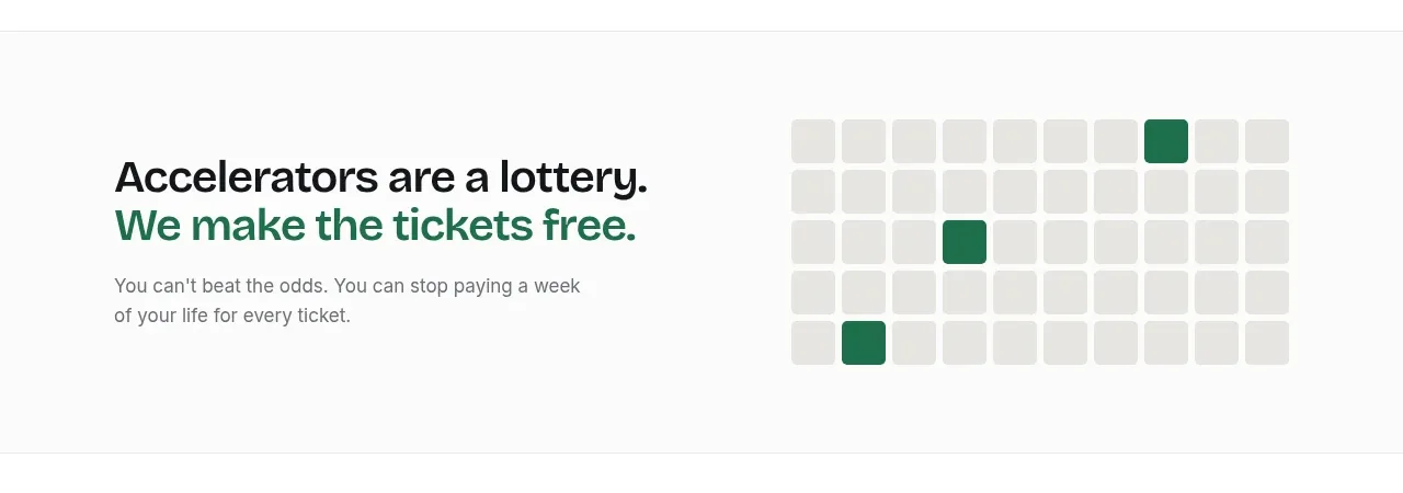
5. **Probability/odds section:** Switch to a lightly tinted or separated band. Put the headline and copy on the left, emphasizing one phrase in green, and show a simple grid of pale squares with a few green highlighted cells on the right.
6. **How-it-works section:** Introduce a numbered three-column process with a small eyebrow and large heading. Each column contains a short title, muted description, and a compact bordered interface card illustrating the step.
7. **Extension section:** Return to a two-column layout with explanatory copy on the left and a larger browser/form mockup on the right. Include a small “coming soon” style eyebrow and a secondary monospace note below the body copy.
8. **AI differentiation section:** Use another two-column block. Explain the limitation of generic tools on the left with a short checklist; show two side-by-side response cards on the right contrasting a generic draft with a question-specific version, including subtle red and green status treatments.
9. **Pricing section:** Add a pricing heading followed by two equal cards. Keep the free card neutral and outline the recommended/pro card in green; show price, cadence, feature checklist, full-width CTA, and a small billing reassurance.
10. **FAQ section:** Use a two-column layout with a large question-oriented heading on the left and a vertical accordion/list of five questions on the right. Separate rows with thin rules and place a small plus control at each far edge.
11. **Closing CTA:** Center a short headline with selected words highlighted green and red, followed by a dark CTA and tiny supporting note, with ample whitespace.
12. **Footer:** Finish with a thin top rule, product name at left, small text links in the middle, and a small copyright line at right.

## Design language
- Build hierarchy through scale and spacing rather than decoration: use near-black display headlines around 42–56px on desktop, 1.02–1.08 line-height, compact body copy around 14–16px, and very small uppercase labels around 9–11px with generous letter spacing.
- Pair a clean modern sans-serif for headlines and body copy with a restrained monospace for eyebrows, metadata, captions, feature notes, and UI labels. Keep headline weight bold but avoid overly heavy display styling.
- Let rhythm change down the page: make the hero expansive, use short bordered bands for the logo strip, then alternate spacious two-column explanation sections with denser product mockups; make pricing and FAQ more structured, and end with a very open CTA.
- Use a mostly white palette: approximately `#ffffff` and `#fafafa` backgrounds, `#111214` or `#161719` text, `#6f7473` muted copy, and `#e6e8e5` rules and card borders. Reserve a muted forest green around `#176b52` or `#23785f` for positive states, selected phrases, checks, and the recommended pricing outline; use a restrained brick red around `#b9443e` only for negative or contrast states.
- Keep surfaces flat and quiet. Use 1px gray borders, very light fills, small 10–14px corner radii, and barely perceptible shadows on interface mockups; avoid dramatic elevation, gradients, glass effects, and decorative backgrounds.
- Treat product illustrations as miniature interfaces: thin connector lines, rounded tiles, checkmarks, progress/status labels, browser frames, field cards, and realistic microcopy create credibility without requiring large imagery.
- Align content to a consistent wide max-width with strong left edges. Use generous vertical padding, visible section rules, and balanced two-column proportions; keep cards and controls aligned to a disciplined grid.
- Buttons should be compact, dark, rounded about 8–10px, and use concise medium-weight text. Secondary actions can be plain text links rather than outlined buttons.
- Use interaction with restraint: FAQ rows should expand with a simple plus-to-minus transition, cards can receive a subtle border or shadow change on hover, and the primary CTA may darken slightly. Avoid bouncy animations; reveal mockups and section content with short, quiet fades or upward transitions.
- Make the layout responsive by stacking two-column sections and pricing cards on small screens, preserving generous whitespace while reducing headline size and keeping the primary CTA prominent.

## Never
- Do not copy the reference's logos, wordmarks, product name, exact copy, partner marks, illustrations, photography, or icon set.
- Do not present the result as ApplySeed or imply an affiliation with it.
- Do not reuse the reference's exact accelerator/application content; replace all examples with content for the user's product.
- Do not turn the page into a generic template with unrelated gradients, oversized decorative graphics, or a dense dashboard aesthetic.
Components from this page
All components
 Minimal top navigation
ApplySeed · Navigation
Minimal top navigation
ApplySeed · Navigation
 Application-matching hero
ApplySeed · Hero
Application-matching hero
ApplySeed · Hero
 Program proof strip
ApplySeed · Logo cloud
Program proof strip
ApplySeed · Logo cloud
 Problem statement with conversation UI
ApplySeed · Feature grid
Problem statement with conversation UI
ApplySeed · Feature grid
 Lottery insight section
ApplySeed · Feature grid
Lottery insight section
ApplySeed · Feature grid
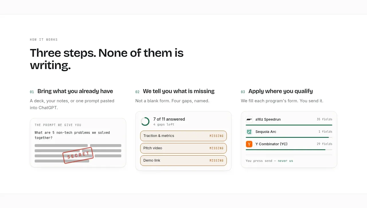 Three-step workflow
ApplySeed · Feature grid
Three-step workflow
ApplySeed · Feature grid
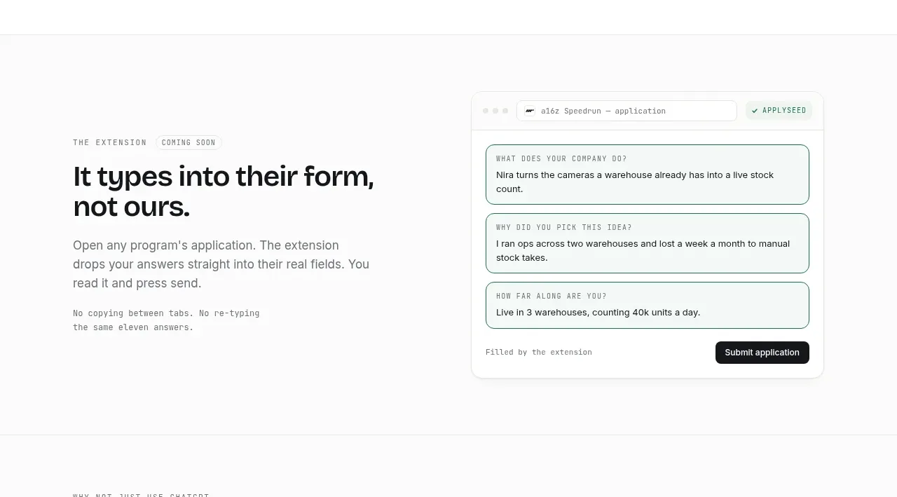 Browser extension workflow
ApplySeed · Feature grid
Browser extension workflow
ApplySeed · Feature grid
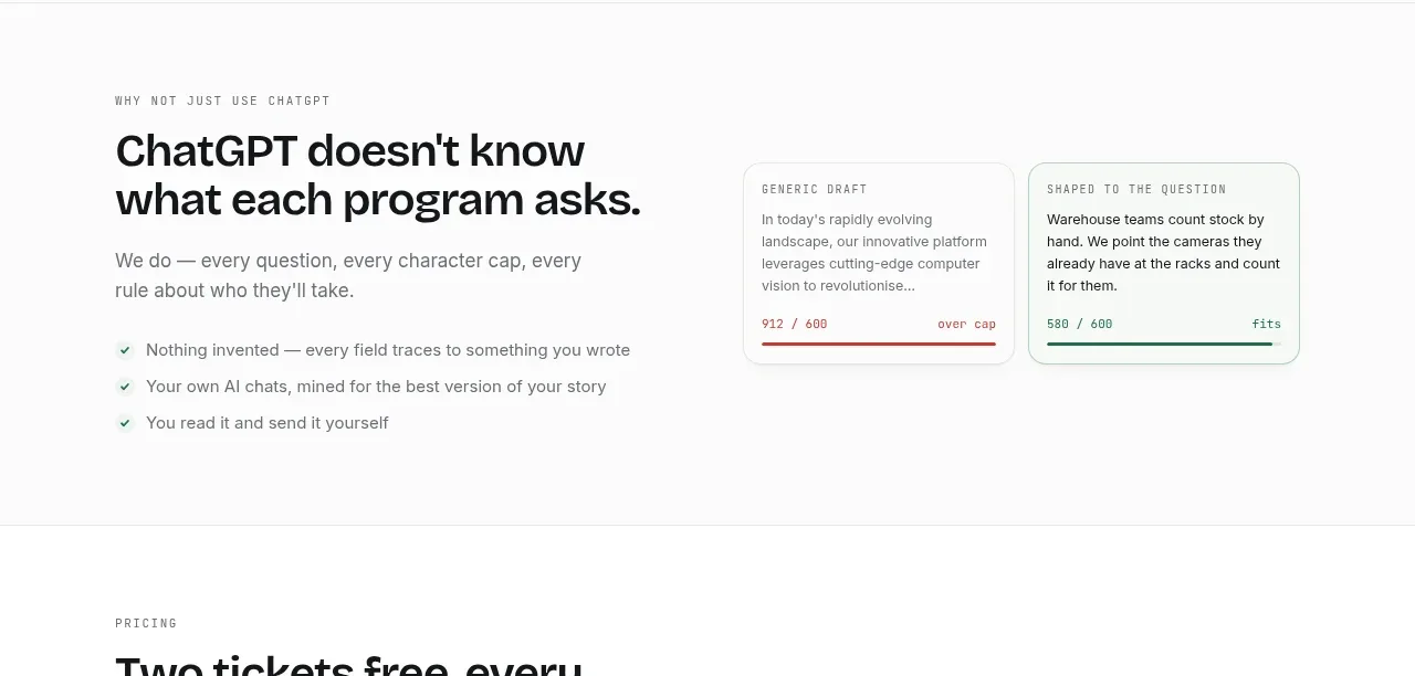 Why generic writing fails
ApplySeed · Feature grid
Why generic writing fails
ApplySeed · Feature grid
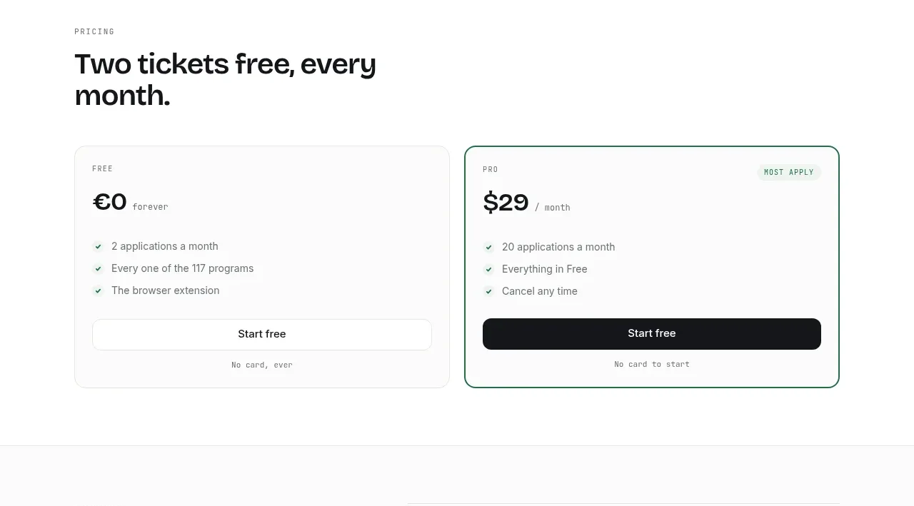 Two-tier pricing table
ApplySeed · Pricing table
Two-tier pricing table
ApplySeed · Pricing table
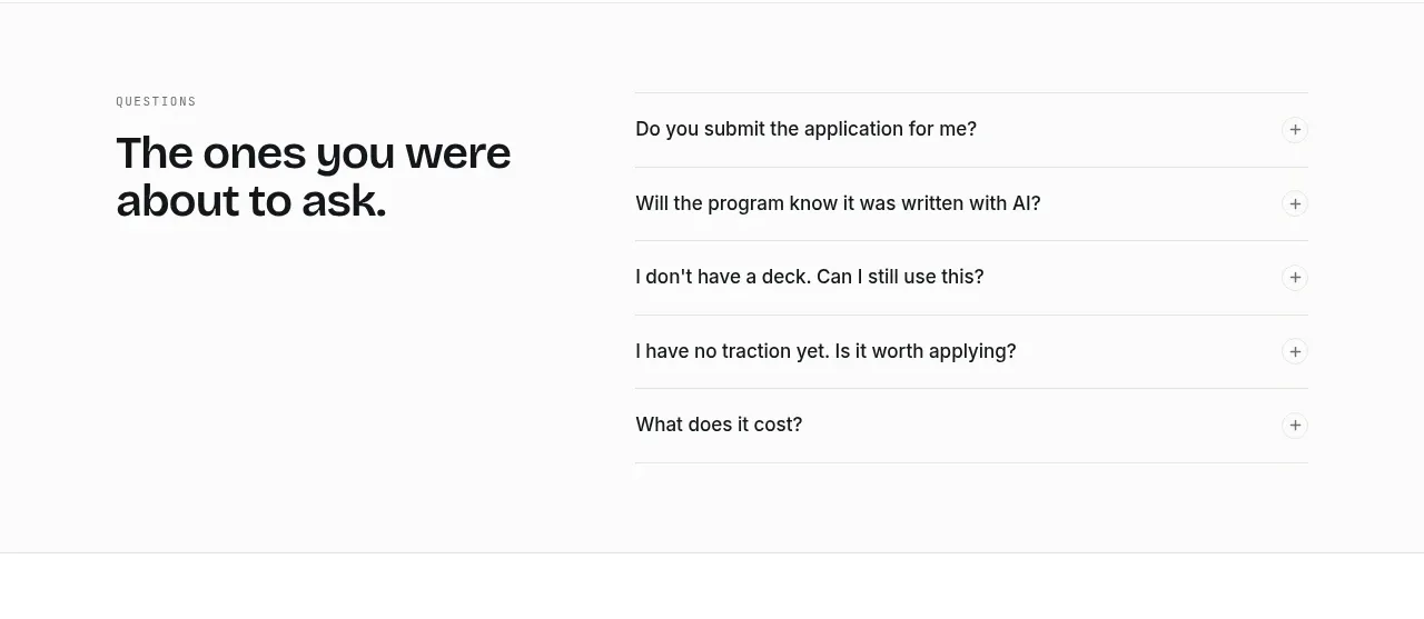 Questions accordion
ApplySeed · FAQ
Questions accordion
ApplySeed · FAQ
 Centered final call to action
ApplySeed · Call to action
Centered final call to action
ApplySeed · Call to action
 Compact utility footer
ApplySeed · Footer
Compact utility footer
ApplySeed · Footer