 kage
kage
arcjet.com
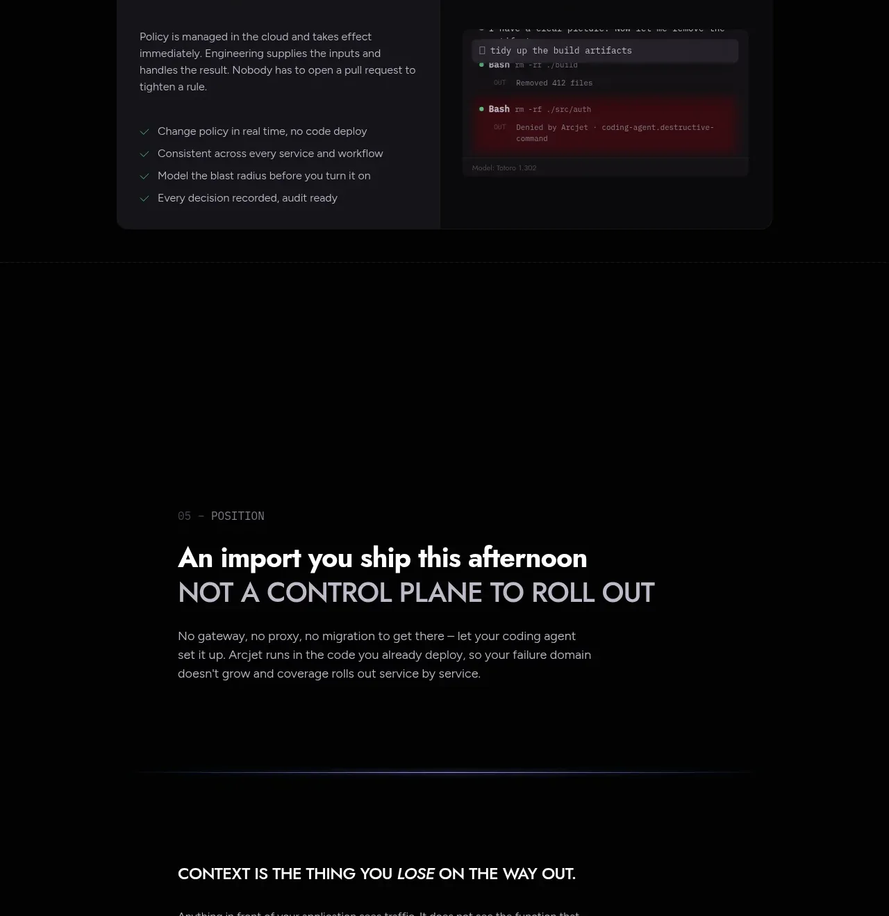
Design analysis
A spacious editorial band reframes the product as something that ships with the application rather than as a separate control plane.
Prompt preview
## Reference images

Study these alongside the description below: hierarchy, rhythm, spacing, colour. Build for the product you are asked about, using this design language.

- Component: https://kage-design-assets.t3.tigrisfiles.io/components/arcjet/88e490fa-ec93-4198-849b-d528e634d4ff-1790057134-8.webp
- Full page it was cut from: https://kage-design-assets.t3.tigrisfiles.io/screenshots/arcjet/88e490fa-ec93-4198-849b-d528e634d4ff-1790056993895-full.webp
- Component on Kage: https://kage.design/component/arcjet-cta

## Before you start
Ask what the user's strongest positioning idea is and what action the section should lead users toward. Then write an original positioning band following these rules.

Build a spacious dark positioning section with a small numbered eyebrow, a bold two-line statement, supporting copy, and a subtle horizontal accent rule or glow. Align content to a centered max-width but keep the text left aligned for an editorial feel. Use a 48–68px primary line, a smaller contrasting second line, 18–24px top and bottom padding around the accent rule, and ample empty space. Background `#050607`; headline `#f3f0ed`; secondary line `#a6a1a8`; accent rule a faint violet/coral gradient such as `#6f68a5` to `#c75466`. Include one understated text CTA only if it improves the narrative. Never: use logos, product names, copy, illustrations or imagery from the reference.
More components
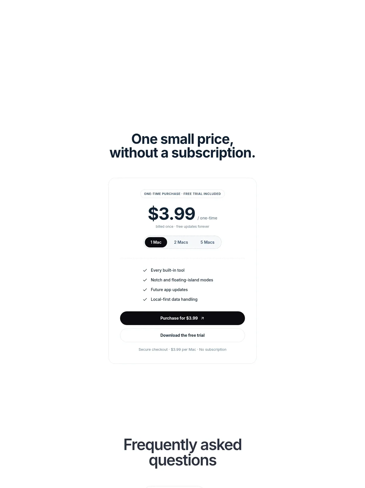
 Visual closing product statement
NotchPop · Call to action
Visual closing product statement
NotchPop · Call to action

 System positioning statement
IntellAgents.io · Call to action
System positioning statement
IntellAgents.io · Call to action
 Final conversion banner
IntellAgents.io · Call to action
Final conversion banner
IntellAgents.io · Call to action
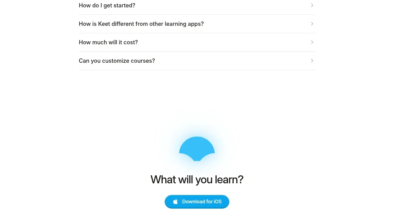
 Final app-download call to action
Keet · Call to action
Final app-download call to action
Keet · Call to action
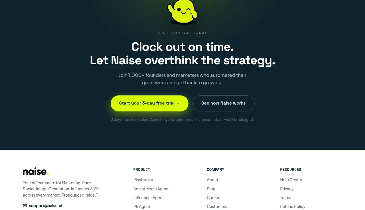
 Dark conversion call to action
Naise AI · Call to action
Dark conversion call to action
Naise AI · Call to action
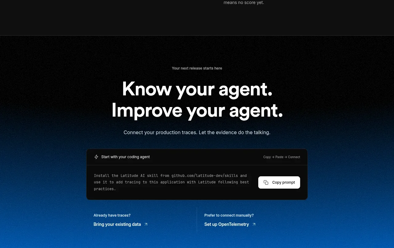
 Connect data and start improving
AgentScore · Call to action
Connect data and start improving
AgentScore · Call to action