kage
kage
arcjet.com

Design analysis
A very dark, vertically paced security landing page uses a centered editorial grid, compact uppercase section labels, and high-contrast white headlines with occasional italic or purple emphasis. The page moves from an atmospheric hero and customer proof into progressively denser explanatory modules: workflow diagrams, four threat cards, stacked code examples, policy comparisons, proof metrics, and FAQ rows, with thin rules and restrained violet, red, green, and amber accents creating hierarchy without bright surfaces.
Prompt preview
## Reference images

Study these alongside the description below: hierarchy, rhythm, spacing, colour. Build for the product you are asked about, using this design language.

- Full page: https://kage-design-assets.t3.tigrisfiles.io/screenshots/arcjet/88e490fa-ec93-4198-849b-d528e634d4ff-1790056993895-full.webp
- Above the fold: https://kage-design-assets.t3.tigrisfiles.io/screenshots/arcjet/88e490fa-ec93-4198-849b-d528e634d4ff-1790056987322.webp
- Design on Kage: https://kage.design/designs/arcjet-landing-page

## Before you start
Ask the user what they are building, who it is for, and which brand assets they already have (name, colours, type, logo, and any imagery). Wait for their answers before proceeding. Apply the system below to that product, not to the reference product.

## Page structure
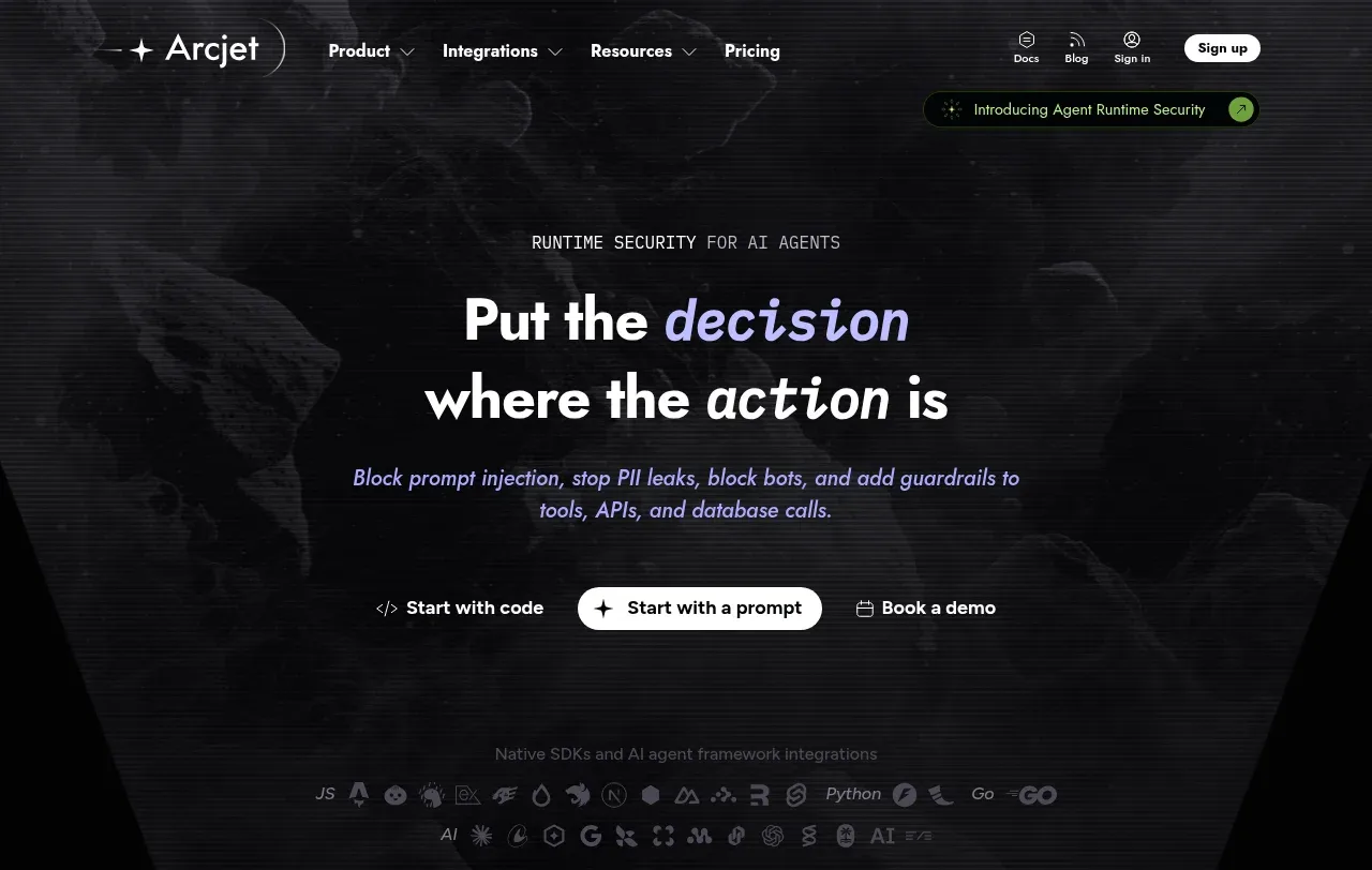
1. **Utility navigation and hero** — Build a slim transparent top bar over a black atmospheric background, with a small brand mark at left, compact navigation links, utility links, and a pill-shaped sign-up action at right. Center a small uppercase eyebrow, a two-line oversized headline with one italic/emphasized phrase, concise supporting copy, and three low-key actions with one white filled pill as the primary CTA.
2. **Runtime/tooling credibility strip** — Place a subdued line about SDKs and frameworks beneath the hero, followed by a faint row of technology marks or text labels. Keep this as low-contrast evidence rather than a prominent logo wall.
3. **Customer proof** — Center a small uppercase label and a horizontal row of three muted customer names/logos, followed by a short compatibility statement and a thin violet rule.
4. **Problem introduction** — Start a numbered section label such as “01 — The problem,” then use a left-aligned heading and short explanatory paragraph. Below it, show a horizontal sequence of dark action cards connected as a workflow, ending in a red-outlined result card; include tiny allow/deny states under the cards.
5. **Risk amplification divider** — Use generous black space, a thin rule, and one centered sentence to transition from the single workflow problem to broader risks.
6. **Missed-controls overview** — On a subtly star-speckled or textured black background, center a heading and three-line explanatory intro. Stack four wide dark horizontal cards: Unauthorized tool calls, Data exfiltration, Cost explosion, and Sequence drift. Each card pairs copy on the left with a small abstract glowing diagram on the right; vary accent colours between white, red, and warm tones.
7. **Observe / enforce / audit explainer** — Introduce a numbered “How it works” label, a colourful two-word heading, and a short paragraph. Use a sparse two-column composition with the explanatory text at left and a vertical control stack at right; the selected item is expanded in a dark rounded panel while the other two remain compact, dim rows.
8. **Controls introduction** — Center a numbered label, bold heading, and concise three-line description explaining the product’s control surface.
9. **Capability/code cards** — Stack five large dark rectangular feature cards with generous vertical gaps. Each card has a small circular or geometric glowing icon in a narrow left area, a feature title and paragraph in the upper content area, and a dark code sample panel below or overlapping it. Cover prompt-injection detection, agent tool controls, sensitive information/data-loss prevention, token and spend budgets, and bots/classic web-surface protection. Use a distinct restrained accent for each icon, but keep the card surfaces nearly black.
10. **Policy comparison** — Add a numbered policy section with a left-aligned title, paragraph, and two side-by-side cards. One card explains rules in code with a checklist and code example; the other explains remote policies with a checklist and a policy/audit interface mockup. Keep both cards equal in width and joined by the same grid.
11. **Position statement** — Create a spacious numbered section with a large two-line heading contrasting a fast import with the absence of a control plane, plus a short paragraph. Follow with a thin violet divider.
12. **Context explanation** — Use a left-aligned heading and paragraph, then three compact icon-led points explaining that the system sees arguments, works everywhere, and requires no new infrastructure. Place a wide, lightly bordered abstract orbit/enforcement diagram beneath or beside the list.
13. **Proof and compatibility** — Add a numbered proof section with a two-line heading and short setup paragraph. Present four equal metric cells in one bordered row, such as compliance, latency, SDK count, and bot coverage. Follow with a green-tinted compliance/trust strip containing circular certification badges and a small evidence note.
14. **FAQ** — Introduce a numbered FAQ heading, then stack several wide nearly-black accordion rows with subtle borders, compact question text, and plus controls aligned at the far right.
15. **Closing CTA** — Transition into a horizontally textured black panel with a glowing circular emblem above a centered two-line CTA heading, short paragraph, and the same three-action treatment used in the hero.
16. **Footer** — End with a low-contrast footer containing a small brand mark, tiny social or utility icons, and several sparse navigation columns with short link groups.

## Design language
- Use a near-black base around `#030405` or `#050506`; keep most surfaces between `#0a0b0e` and `#121216` so cards separate subtly without looking like bright dashboards.
- Build hierarchy through scale and spacing: small monospaced or uppercase section labels, 14–18px body copy, 28–42px section headings, and an approximately 56–72px hero heading on desktop. Use a clean sans serif for body and headings, with occasional italic emphasis or a restrained monospace treatment for technical labels.
- Keep the main content in a narrow editorial column, generally 720–980px wide, while allowing feature cards and proof rows to expand toward the page margins. Alternate centered introductions with left-aligned explanatory sections to change rhythm as the page progresses.
- Start with an atmospheric hero using faint smoky/abstract background texture and horizontal scanline-like noise; later use sparse star texture, code surfaces, and diagrams as supporting depth rather than decoration.
- Use white and cool gray for primary hierarchy, muted gray for secondary copy, and violet/lilac around `#8d72ff` or `#a875ff` for emphasis and rules. Reserve red/coral around `#e34b55` for denied or dangerous states, green around `#4fae72` for approvals and compliance, and amber around `#d99a4a` for warnings.
- Treat borders as hairlines with low-opacity gray or violet; use small radii, typically 4–10px, and almost no broad drop shadows. Prefer inner glow, faint gradients, and illuminated diagram elements over glossy elevation.
- Make technical UI feel credible: code blocks should be near-black with a fine border, tiny monospace text, line numbers or syntax colour, and occasional red/green diff states. Keep text dense inside examples but preserve large empty margins around major sections.
- Change density deliberately: the hero and transition statements are airy; workflow and threat sections become diagrammatic; capability and policy areas are denser and more rectangular; proof and FAQ simplify into clear rows before the final CTA opens back up.
- Keep interactions understated: primary buttons are white pills with dark text, secondary actions are text links, accordions use simple plus icons, and cards should reveal state through border/accent changes rather than large animations. If adding motion, use slow ambient background movement, gentle glow pulses, and short opacity/translate transitions.
- Make the page responsive by collapsing horizontal workflow, metric, comparison, and footer layouts into vertical stacks while preserving the same order, spacing, dark surfaces, and accent semantics.

## Never
- Do not copy the reference product’s logos, wordmarks, product name, tagline, copy, illustrations, photography, diagrams, code samples, customer names, certification marks, or icon set.
- Do not present the result as Arcjet or imply affiliation with Arcjet.
- Create new content, brand assets, examples, diagrams, and terminology for the user’s product while preserving only the general dark technical landing-page design language.
Components from this page
All components
 Minimal dark site navigation
Arcjet · Navigation
Minimal dark site navigation
Arcjet · Navigation
 Agent runtime security hero
Arcjet · Hero
Agent runtime security hero
Arcjet · Hero
 Customer and ecosystem proof
Arcjet · Logo cloud
Customer and ecosystem proof
Arcjet · Logo cloud
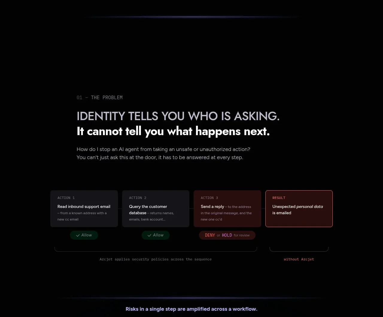 Problem: identity and workflow risk
Arcjet · Feature grid
Problem: identity and workflow risk
Arcjet · Feature grid
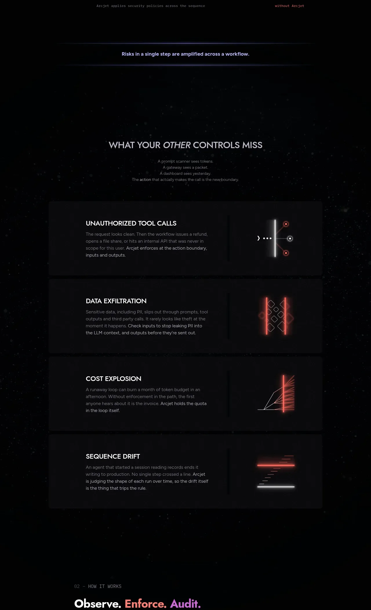 What other controls miss
Arcjet · Feature grid
What other controls miss
Arcjet · Feature grid
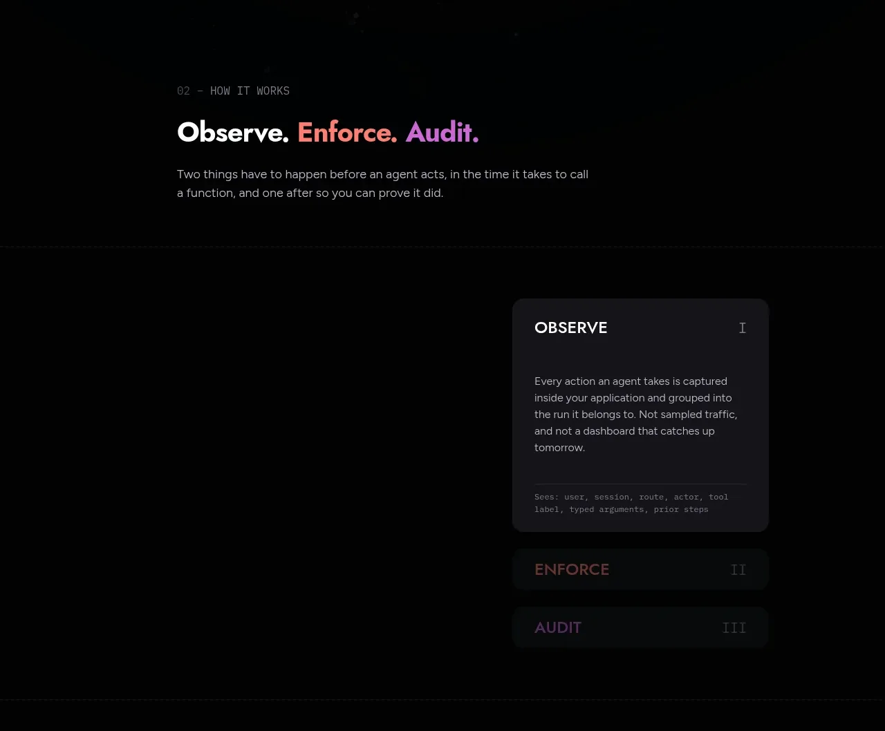 Observe, enforce, audit workflow
Arcjet · Tabs & steps
Observe, enforce, audit workflow
Arcjet · Tabs & steps
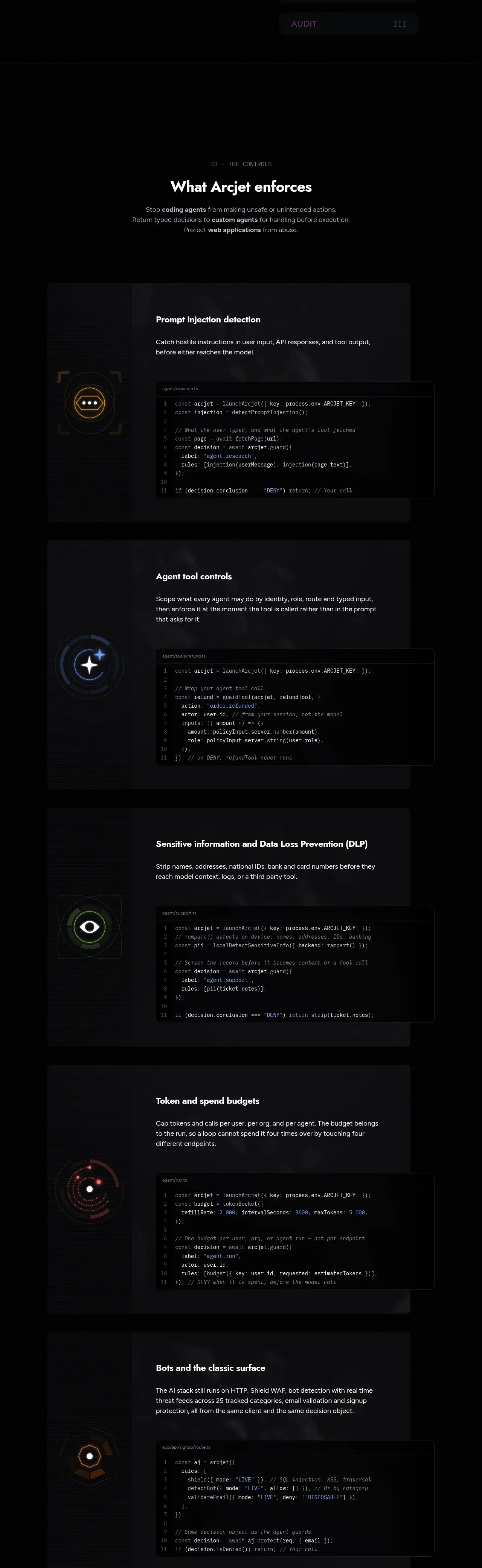 What the product enforces
Arcjet · Feature grid
What the product enforces
Arcjet · Feature grid
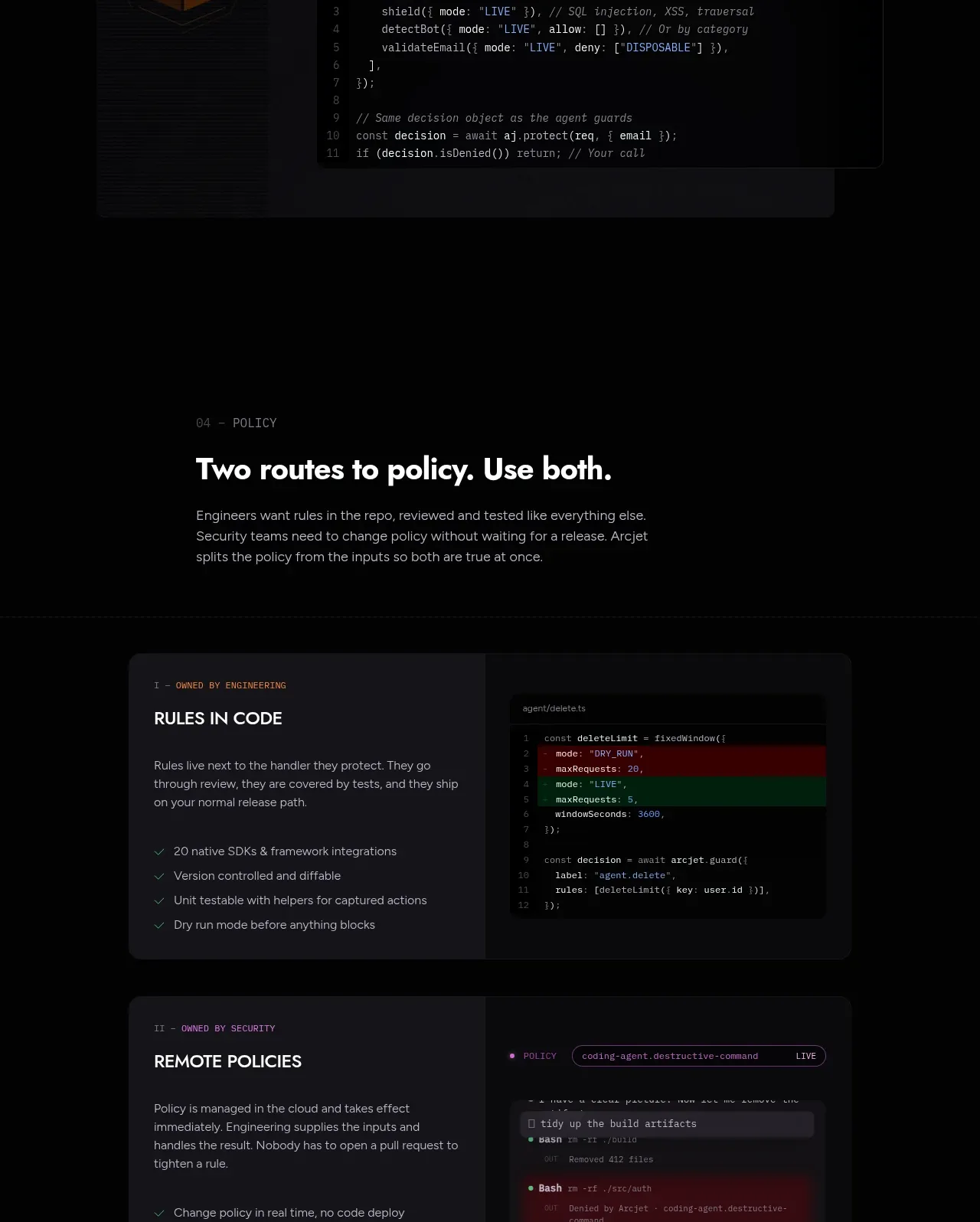 Two routes to policy
Arcjet · Feature grid
Two routes to policy
Arcjet · Feature grid
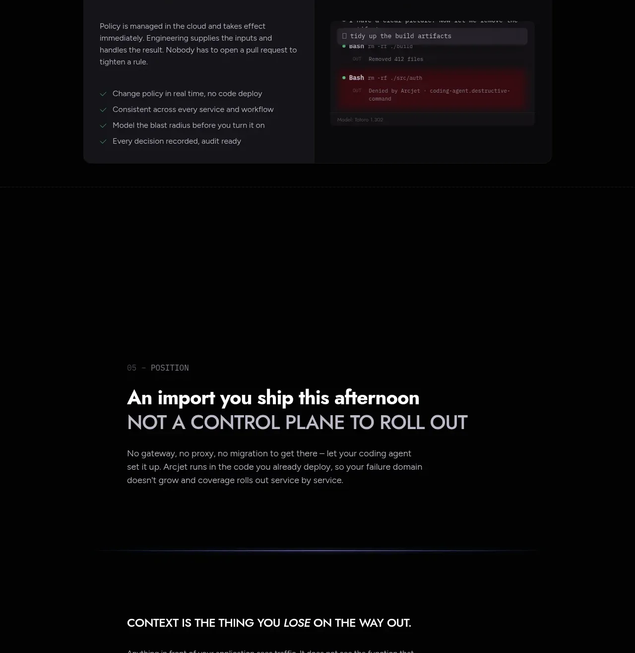 Positioning statement
Arcjet · Call to action
Positioning statement
Arcjet · Call to action
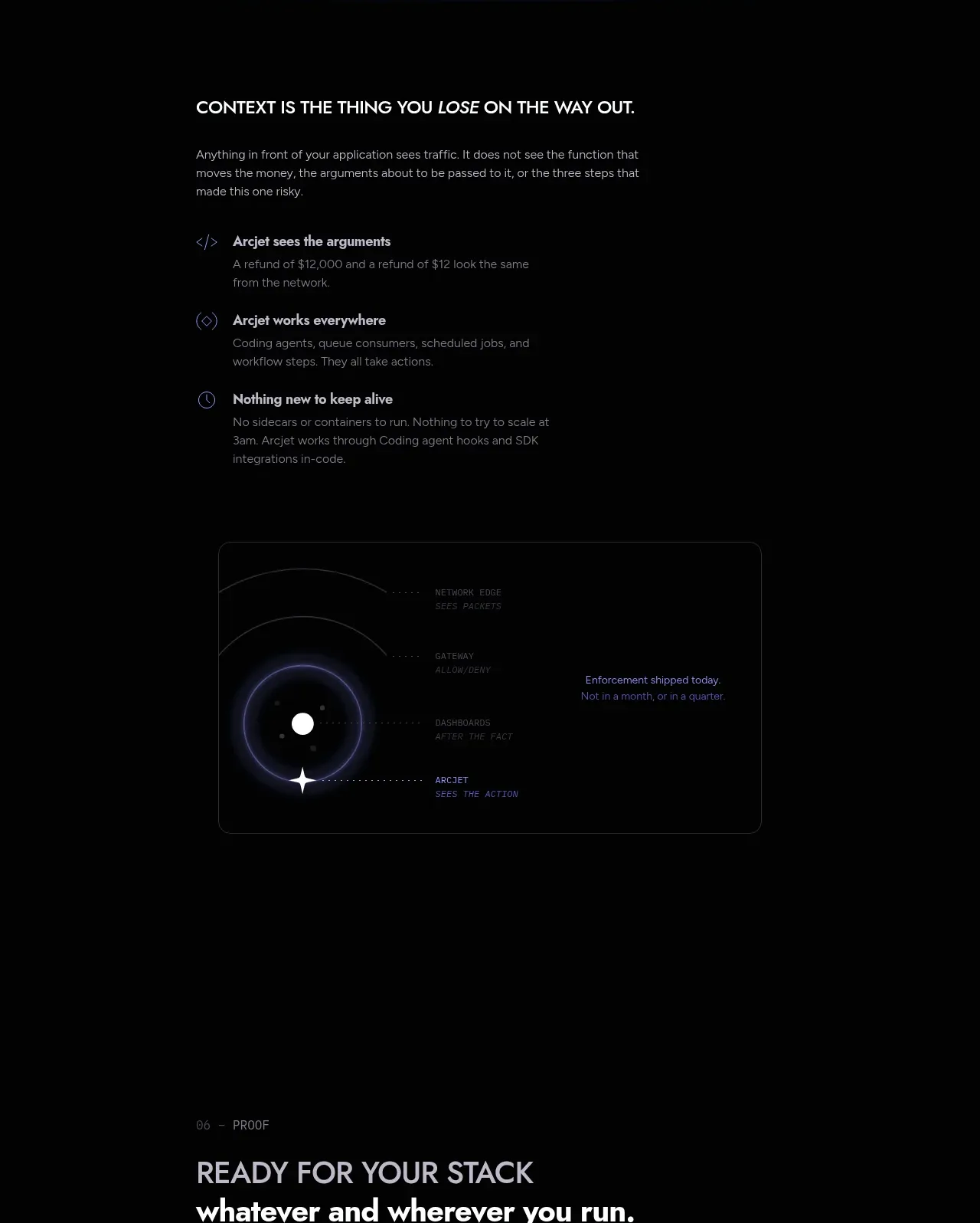 Context is the thing you lose
Arcjet · Feature grid
Context is the thing you lose
Arcjet · Feature grid
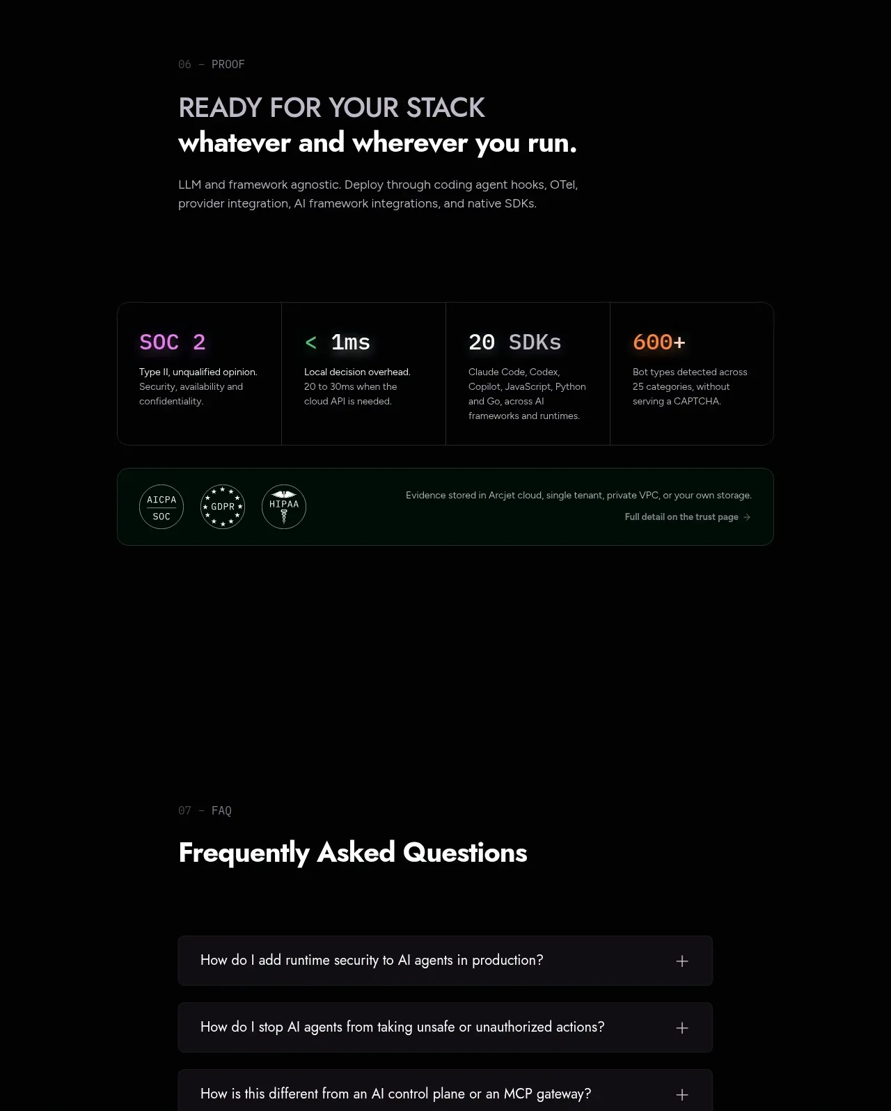 Stack readiness and trust metrics
Arcjet · Stats
Stack readiness and trust metrics
Arcjet · Stats
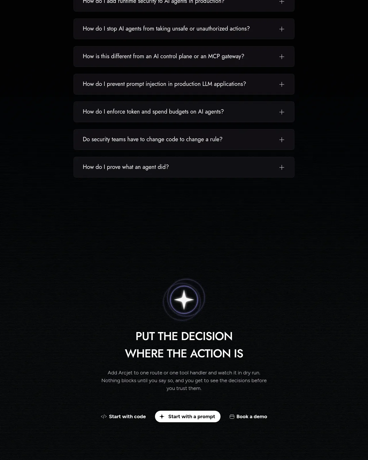 Frequently asked questions
Arcjet · FAQ
Frequently asked questions
Arcjet · FAQ