 kage
kage
arsaze.com
Design analysis
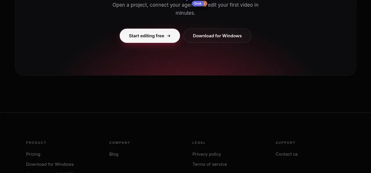
A large rounded panel closes the narrative with an oversized two-line invitation, supporting sentence, and paired actions. A restrained red-purple glow gives the otherwise black page a final focal point.
Prompt preview
## Reference images

Study these alongside the description below: hierarchy, rhythm, spacing, colour. Build for the product you are asked about, using this design language.

- Component: https://kage-design-assets.t3.tigrisfiles.io/components/arsaze/e4f15c51-7821-4e39-ba4c-e316208d7c18-1790748087-10.webp
- Full page it was cut from: https://kage-design-assets.t3.tigrisfiles.io/screenshots/arsaze/e4f15c51-7821-4e39-ba4c-e316208d7c18-1790748036683-full.webp
- Component on Kage: https://kage.design/component/arsaze-cta

## Before you start
Ask what the user's primary conversion goal is, what the lowest-friction secondary action should be, and what promise should close the page. Then write original content for that product.

Create a centered CTA panel with 32px side margins, a 1px #29292d border, 16px radius, and a subtle radial red-to-purple glow near the bottom edge. Use an oversized editorial serif heading with an italic second line, a short muted supporting sentence, and two pill buttons: a white primary action and dark outlined secondary action. Keep the panel vertically generous, around 250–320px tall, with a clear hierarchy and ample whitespace. Add hover lift, focus rings, and ensure the buttons stack on narrow screens.

Never: use logos, product names, copy, illustrations, or imagery from the reference.
More components

 Network growth CTA
godaylight.com · Call to action
Network growth CTA
godaylight.com · Call to action
 Split closing CTA
godaylight.com · Call to action
Split closing CTA
godaylight.com · Call to action

 Closing conversion banner
FastRouter.ai · Call to action
Closing conversion banner
FastRouter.ai · Call to action

 Final download call to action
Blenny · Call to action
Final download call to action
Blenny · Call to action

 Visual download call to action
Art4 · Call to action
Visual download call to action
Art4 · Call to action

 Sponsor call to action
opensend.cc · Call to action
Sponsor call to action
opensend.cc · Call to action