kage
kage
arsaze.com

Design analysis
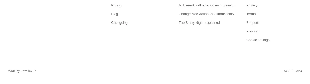
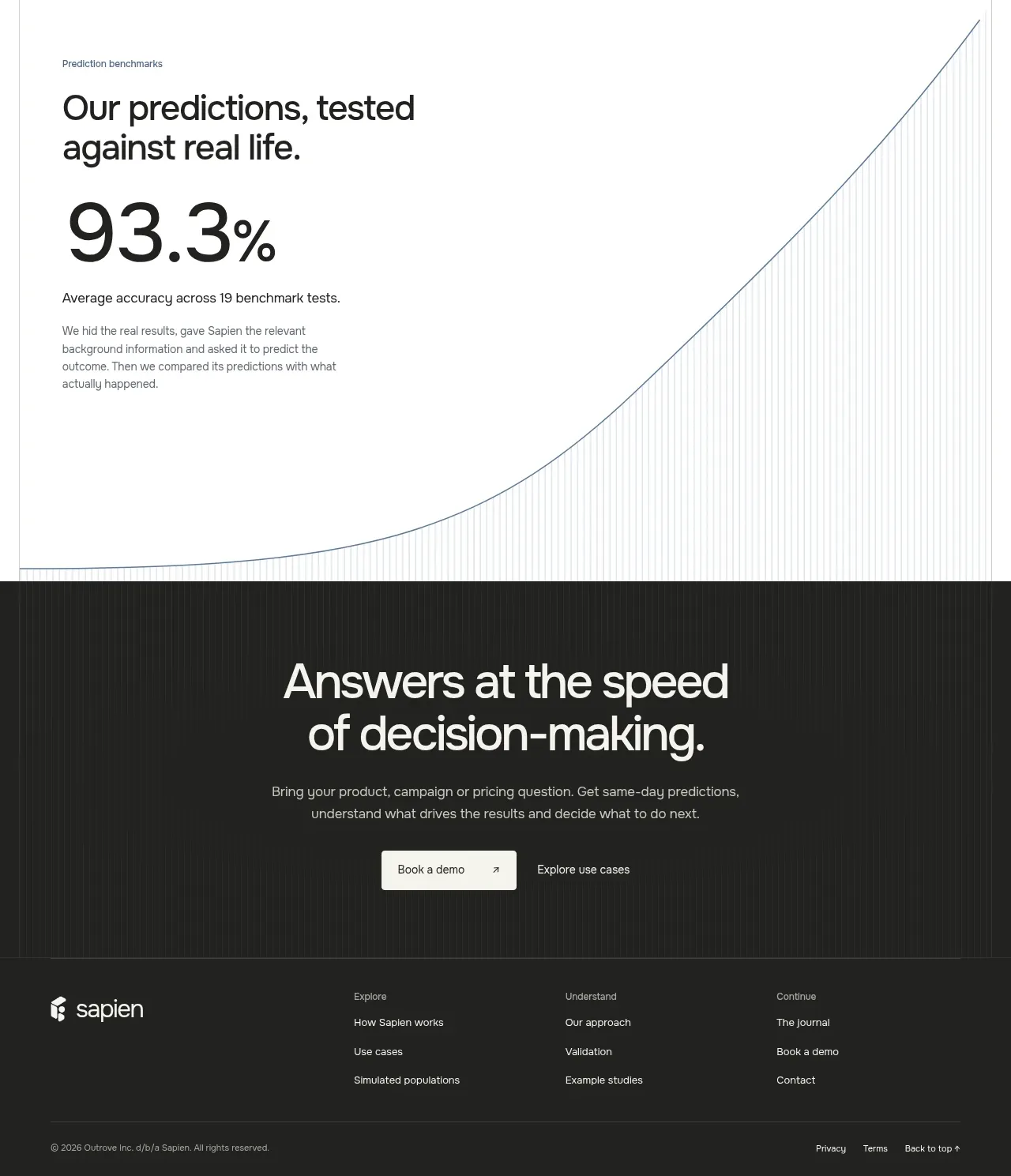
A sparse footer uses four small link columns and a separated bottom row for the brand mark, copyright, and sign-in utility, maintaining the page's quiet dark finish.
Prompt preview
## Reference images

Study these alongside the description below: hierarchy, rhythm, spacing, colour. Build for the product you are asked about, using this design language.

- Component: https://kage-design-assets.t3.tigrisfiles.io/components/arsaze/e4f15c51-7821-4e39-ba4c-e316208d7c18-1790748087-11.webp
- Full page it was cut from: https://kage-design-assets.t3.tigrisfiles.io/screenshots/arsaze/e4f15c51-7821-4e39-ba4c-e316208d7c18-1790748036683-full.webp
- Component on Kage: https://kage.design/component/arsaze-footer

## Before you start
Ask which product, company, legal, support, and account links the user's brand actually needs. Use those categories to create an original footer.

Build a low-contrast footer on #050505 with a thin top border. Use a max-width container and four compact link groups across the top, each with a tiny letter-spaced uppercase heading and vertically spaced 12px gray links. Add a horizontal divider, then a bottom row with a small neutral brand treatment and copyright at left and an account link at right. Keep text #77737a, headings #aaa5aa, and hover links off-white with a pink accent. Collapse into two columns on tablet and one column on mobile, preserving adequate vertical padding and legal accessibility.

Never: use logos, product names, copy, illustrations, or imagery from the reference.