 kage
kage
art4.app

Design analysis
A wide, rounded artwork-backed CTA closes the persuasion loop with a short two-line message and one centered action, while a small attribution detail adds editorial credibility.
Prompt preview
## Reference images

Study these alongside the description below: hierarchy, rhythm, spacing, colour. Build for the product you are asked about, using this design language.

- Component: https://kage-design-assets.t3.tigrisfiles.io/components/art4/7829dcfa-a9d2-43f5-a84e-0a12e7aa84a2-1791180360-6.webp
- Full page it was cut from: https://kage-design-assets.t3.tigrisfiles.io/screenshots/art4/7829dcfa-a9d2-43f5-a84e-0a12e7aa84a2-1791180184357-full.webp
- Component on Kage: https://kage.design/component/art4-cta

## Before you start
Ask what final action the user's product needs visitors to take and what visual mood should reinforce it. Apply the principles below to that product.

Build a full-width closing CTA inside a rounded container with roughly 12–16px corner radius and substantial inset margins. Use a calm, low-contrast visual background with a light overlay for legibility. Center a two-line headline around 30–38px, a short supporting sentence, and one dark pill-shaped primary button. Keep the text area compact and vertically centered, with 64–96px padding. Add any attribution or metadata as tiny, low-contrast text in a corner only if it supports the product story. Ensure the CTA remains readable on small screens by adjusting the overlay and stacking content.

Never use logos, product names, copy, illustrations, or imagery from the reference.
More components

 Network growth CTA
godaylight.com · Call to action
Network growth CTA
godaylight.com · Call to action
 Split closing CTA
godaylight.com · Call to action
Split closing CTA
godaylight.com · Call to action

 Closing conversion banner
FastRouter.ai · Call to action
Closing conversion banner
FastRouter.ai · Call to action

 Final download call to action
Blenny · Call to action
Final download call to action
Blenny · Call to action

 Sponsor call to action
opensend.cc · Call to action
Sponsor call to action
opensend.cc · Call to action
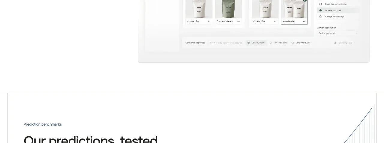
 Final conversion call to action
Sapien · Call to action
Final conversion call to action
Sapien · Call to action