kage
kage
art4.app
Design analysis
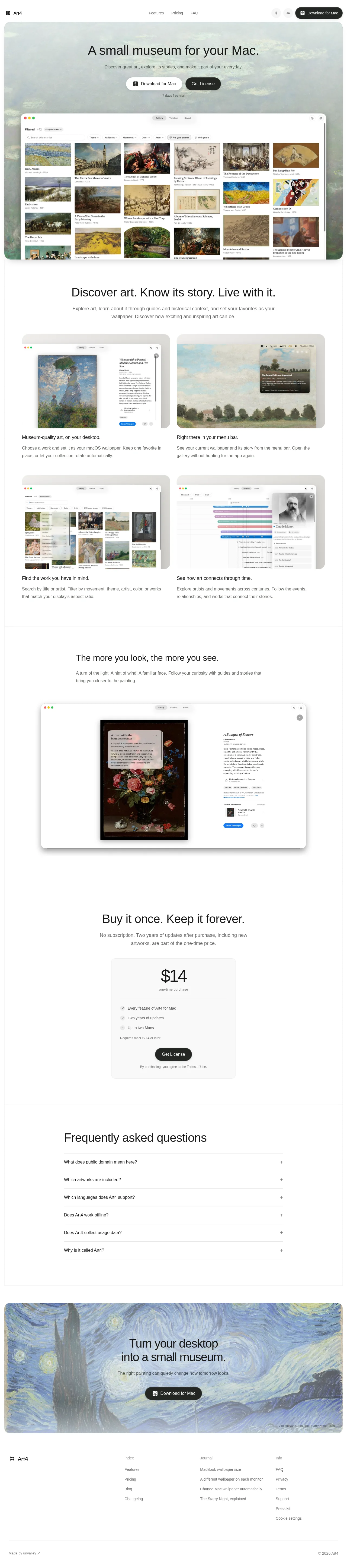
A museum-quiet landing page that lets public-domain paintings carry the colour while the UI stays neutral: a full-bleed Monet hero card with a washed overlay for legible centred type, then white sections where rounded macOS-window mockups do the selling in a 2x2 captioned grid. Rhythm alternates image-backed cards with airy centred text blocks, a single narrow price card, a hairline-ruled accordion FAQ, and a Starry Night closer carrying a tiny attribution credit. One neutral grotesque, generous whitespace, pill buttons and hairline borders keep the interface from competing with the art.
Prompt preview
## Reference images

Study these alongside the description below: hierarchy, rhythm, spacing, colour. Build for the product you are asked about, using this design language.

- Full page: https://kage-design-assets.t3.tigrisfiles.io/screenshots/art4/7829dcfa-a9d2-43f5-a84e-0a12e7aa84a2-1791180184357-full.webp
- Above the fold: https://kage-design-assets.t3.tigrisfiles.io/screenshots/art4/7829dcfa-a9d2-43f5-a84e-0a12e7aa84a2-1791180179894.webp
- Design on Kage: https://kage.design/designs/art4-landing-page

## Before you start
Ask the user what they are building, who it is for, and what brand assets they already have (name, colours, type). Also ask what imagery they can legitimately use — their own product screenshots and artwork or photos they have rights to — and wait for the answers. Everything below is applied to their product, not to the reference.

## Page structure
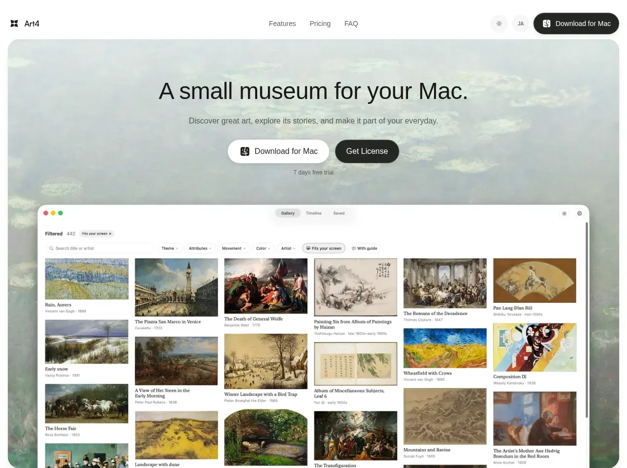
1. **Top nav** — flat bar on the page background: wordmark left; three plain text links centred (Features, Pricing, FAQ pattern); right cluster with a theme toggle, a language switch, and a black pill CTA with icon. No heavy border; at most a hairline.
2. **Hero card** — an inset, large-radius (20–24px) container nearly full-width, backed by one rich artwork/photo washed light at the top. Centred 44–56px headline, one-line grey subhead, two pill CTAs (white primary with icon, dark secondary), and a small trial note. Below, a rounded macOS app-window mockup (traffic lights, real filter bar and grid UI) rises from the card's bottom edge — the app itself is the hero image.
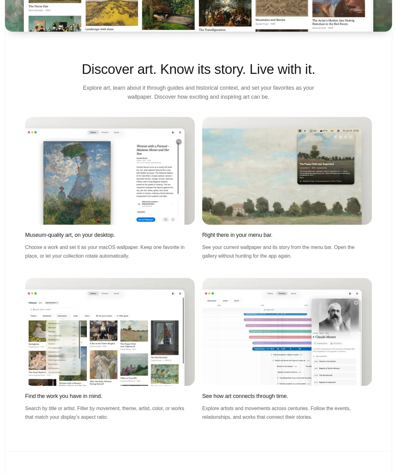
3. **Value statement + feature bento** — centred 36–44px statement plus a two-line paragraph, then a 2x2 grid of cards on soft-grey surfaces. Each card holds a rounded app screenshot and, beneath it, a 16px semibold caption and a two-line grey description. Four cards = four distinct capabilities (core output, ambient surface, findability, connections).
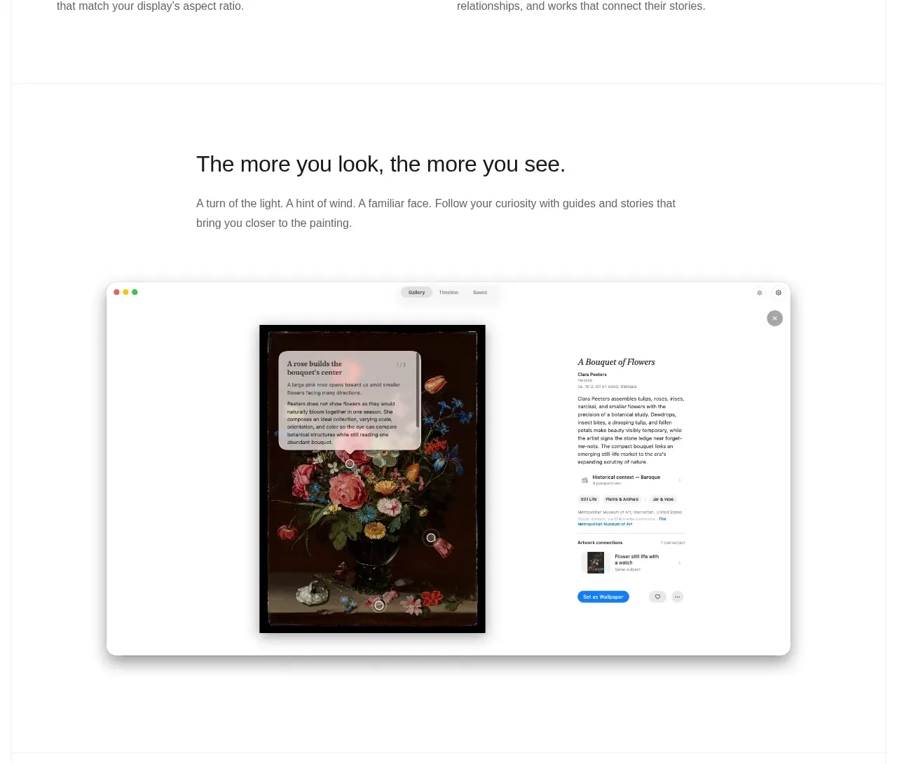
4. **Deep-dive section** — centred headline plus one paragraph, then a single large centred screenshot of the most detailed screen, resting on a light card. One feature, one big proof.
5. **Pricing** — centred headline carrying the buy-once positioning, one reassurance line, then one narrow centred card: oversized price figure, "one-time purchase" label, hairline separators, three check-marked bullet lines, a system-requirement footnote, a black pill CTA, and a tiny legal line. No plan table.
6. **FAQ** — a large left-anchored headline, then full-width accordion rows separated by 1px hairlines: 15–16px questions, plus icons on the right, generous row padding.
7. **Closing CTA** — a full-width rounded card over a dramatic artwork background: centred white two-line headline, one supporting line, a white pill button, and a tiny muted artwork credit pinned bottom-right.
8. **Footer** — light surface: wordmark left; three link columns (product index, editorial/journal links, info/legal links); a bottom hairline row with a maker credit on the left and copyright on the right.

## Design language
- **Palette:** page background #FAFAF9 or #FFFFFF; ink #111111; secondary text #6F6F6F; hairlines #E7E5E4; primary buttons #1A1A1A with white text; secondary buttons #FFFFFF with a 1px #E5E5E5 border. Keep the UI strictly neutral and let one rich artwork per major section supply all the colour.
- **Type:** one neutral grotesque (Inter-like). Headlines 44–56px at weight 500–600 with about -0.02em tracking; section statements 32–40px; body 15–16px in grey; captions and labels 13–14px. Never use heavy black display weights — the voice is calm and curatorial.
- **Rhythm:** alternate image-backed rounded cards with plain white sections so the page breathes between proofs. 100–140px vertical padding between sections; centred text max-width ~640–720px, grids ~1080px. Each section makes one point with one visual.
- **Depth & shape:** flat surfaces with hairline borders; 16–24px card radii; fully rounded pill buttons. Reserve soft, low-opacity shadows only for floating app mockups so windows read as objects on a wall.
- **Imagery:** prove every claim with believable product mockups (traffic lights, filter chips, metadata panels, plausible empty states). Behind centred text on artwork, apply a light wash or scrim for contrast. Always credit artworks in 11–12px muted type.
- **Interaction & motion:** quiet. Subtle hover shading on pills, accordion rows that expand with a rotating plus icon, no marquees, parallax, or gradient glow. If motion exists at all it is a 150–200ms ease on colour and shadow.
- **Density:** sparse by design — single column, lots of air. The densest surface on the page is the product screenshot itself, which makes the surrounding whitespace feel intentional.

## Never
- No Art4 name, wordmark, logo, or copy from the page (e.g. "A small museum for your Mac", "Buy it once. Keep it forever.", the FAQ questions, the footer links).
- No reuse of the specific artworks shown (the Monet water-lily hero, the Van Gogh Starry Night closer) — use the user's own artwork, screenshots, or assets they have rights to.
- Never present the result as Art4 or imply any affiliation with it.
Components from this page
All components
 Minimal product navigation
Art4 · Navigation
Minimal product navigation
Art4 · Navigation
 Atmospheric product hero
Art4 · Hero
Atmospheric product hero
Art4 · Hero
 Four-part product capabilities
Art4 · Feature grid
Four-part product capabilities
Art4 · Feature grid
 Immersive detail showcase
Art4 · Gallery
Immersive detail showcase
Art4 · Gallery
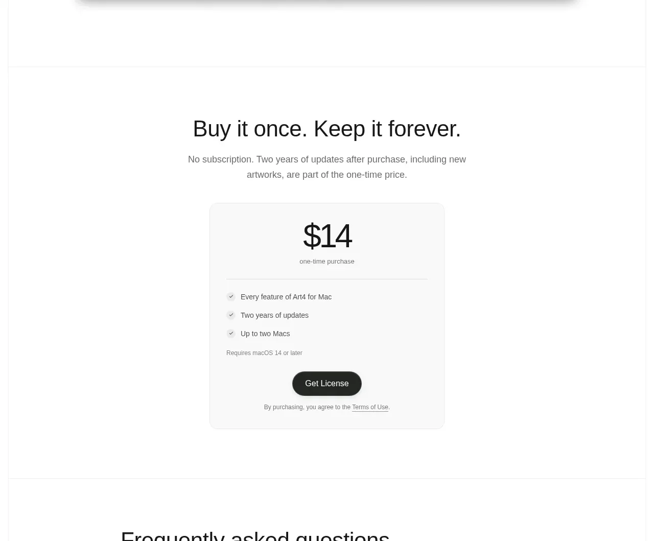 Single purchase pricing card
Art4 · Pricing table
Single purchase pricing card
Art4 · Pricing table
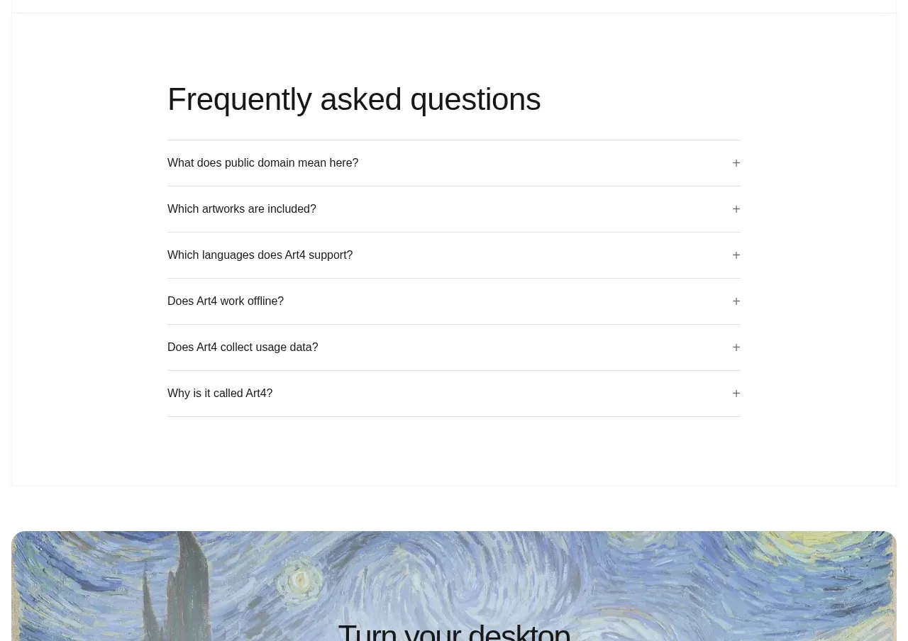 Frequently asked questions
Art4 · FAQ
Frequently asked questions
Art4 · FAQ
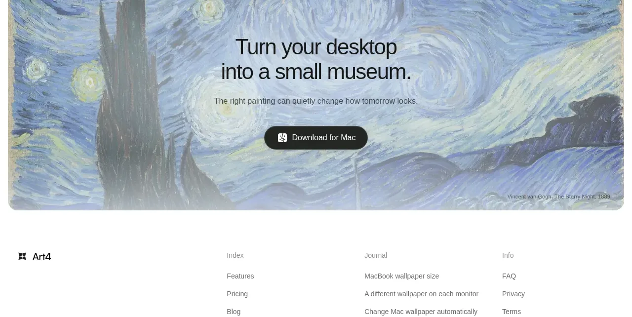 Visual download call to action
Art4 · Call to action
Visual download call to action
Art4 · Call to action
 Multi-column utility footer
Art4 · Footer
Multi-column utility footer
Art4 · Footer