kage
kage
art4.app
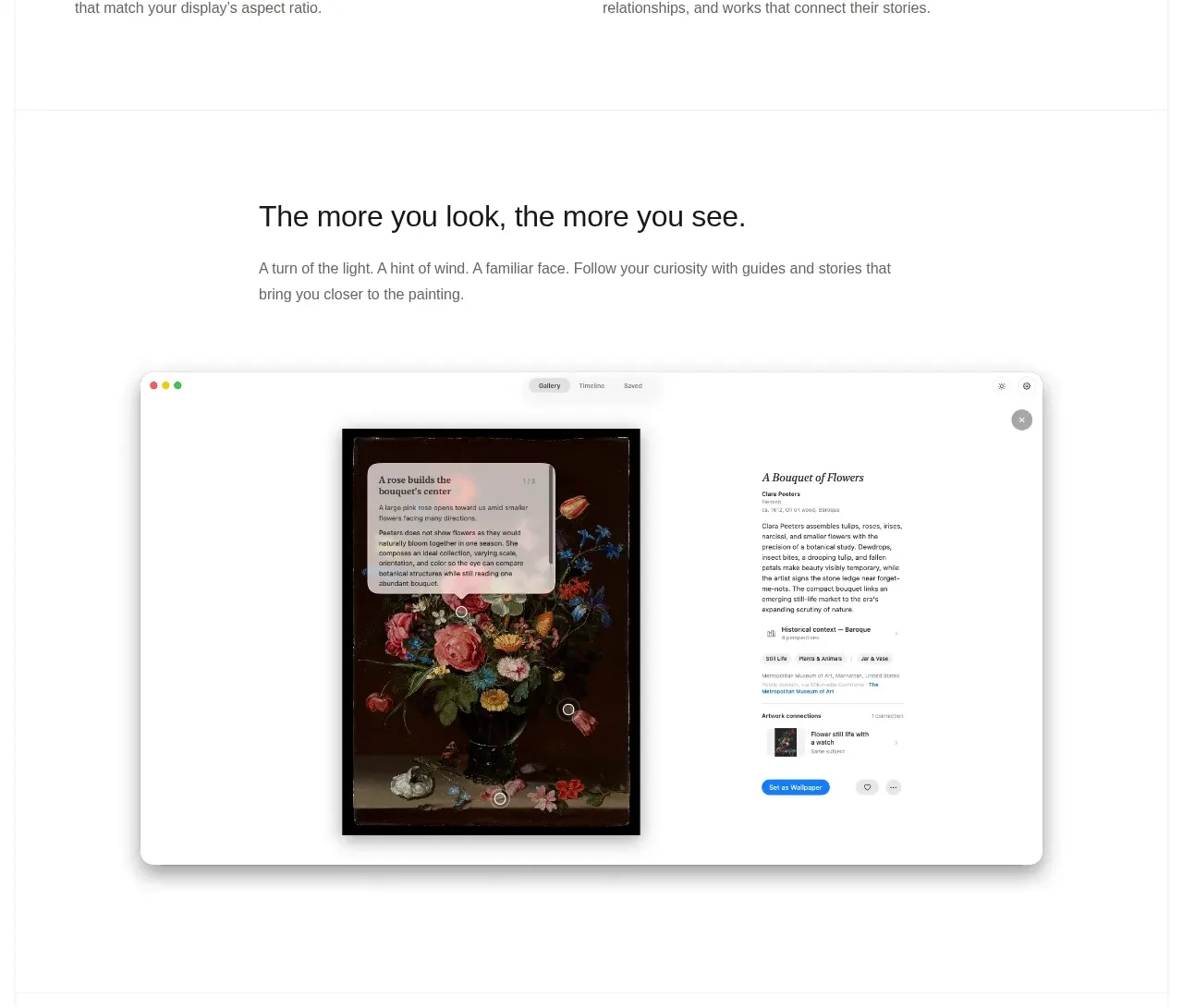
Design analysis
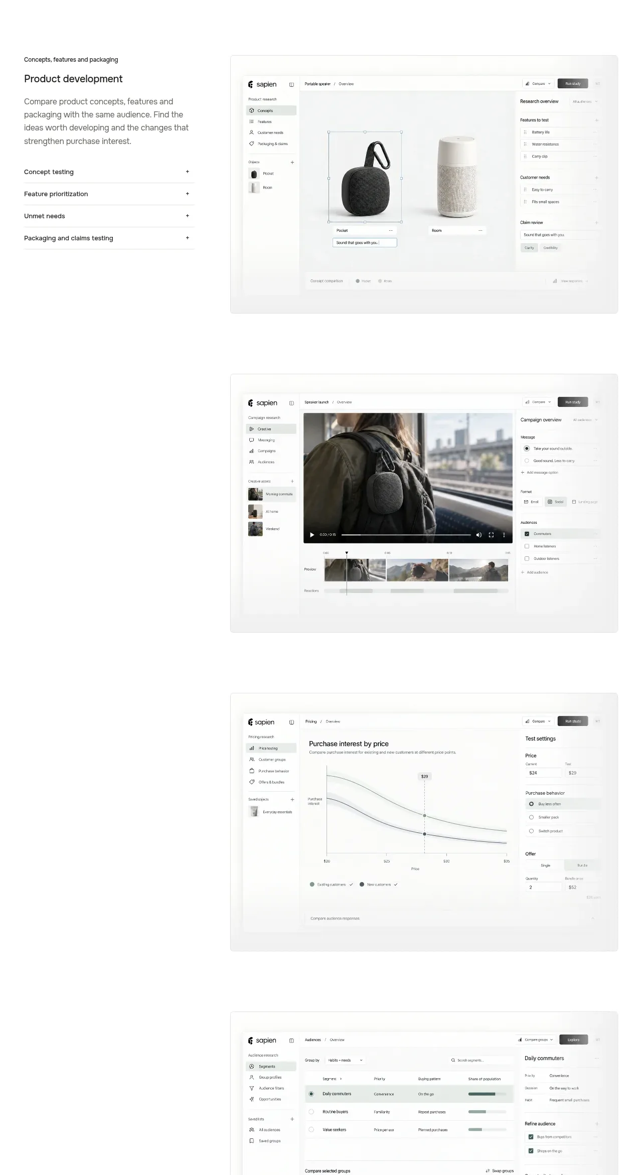
An editorial transition introduces a deeper look, then presents one dominant, centered interface image so the product's richest interaction receives focus rather than competing with a grid.
Prompt preview
## Reference images

Study these alongside the description below: hierarchy, rhythm, spacing, colour. Build for the product you are asked about, using this design language.

- Component: https://kage-design-assets.t3.tigrisfiles.io/components/art4/7829dcfa-a9d2-43f5-a84e-0a12e7aa84a2-1791180359-3.webp
- Full page it was cut from: https://kage-design-assets.t3.tigrisfiles.io/screenshots/art4/7829dcfa-a9d2-43f5-a84e-0a12e7aa84a2-1791180184357-full.webp
- Component on Kage: https://kage.design/component/art4-gallery

## Before you start
Ask what single workflow or interaction in the user's product deserves the most attention. Apply the principles below to that product.

Create an editorial showcase section with a centered heading, a restrained explanatory paragraph, and one large centered product visual beneath it. Use a white or very light #fbfbfa background, a narrow text measure of about 520px, and generous top and bottom whitespace. The visual should be wide but not edge-to-edge, framed in a pale neutral shell with 16–20px radius and a subtle shadow; the content inside can be richer and darker to demonstrate depth. Maintain a quiet hierarchy: heading 26–32px, body 14–15px in #737775, and no competing secondary cards. If interactive, allow the visual to open into a larger detail view or respond to hover without changing the overall layout.

Never use logos, product names, copy, illustrations, or imagery from the reference.