kage
kage
articos.com
Design analysis
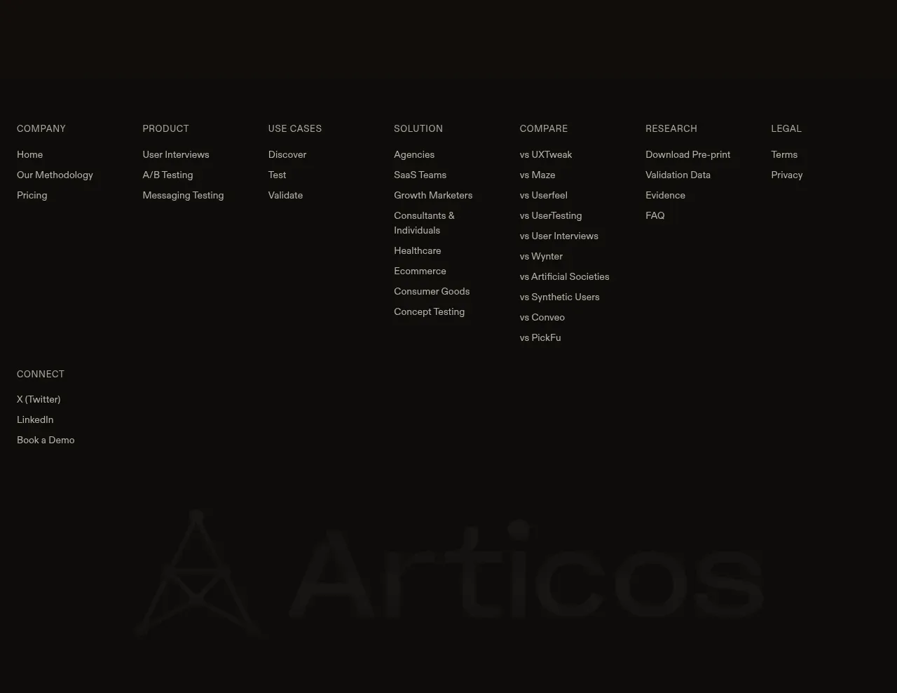
The footer is a quiet, information-dense sitemap with several link columns, social links, and a large low-contrast brand wordmark treatment.
Prompt preview
## Reference images

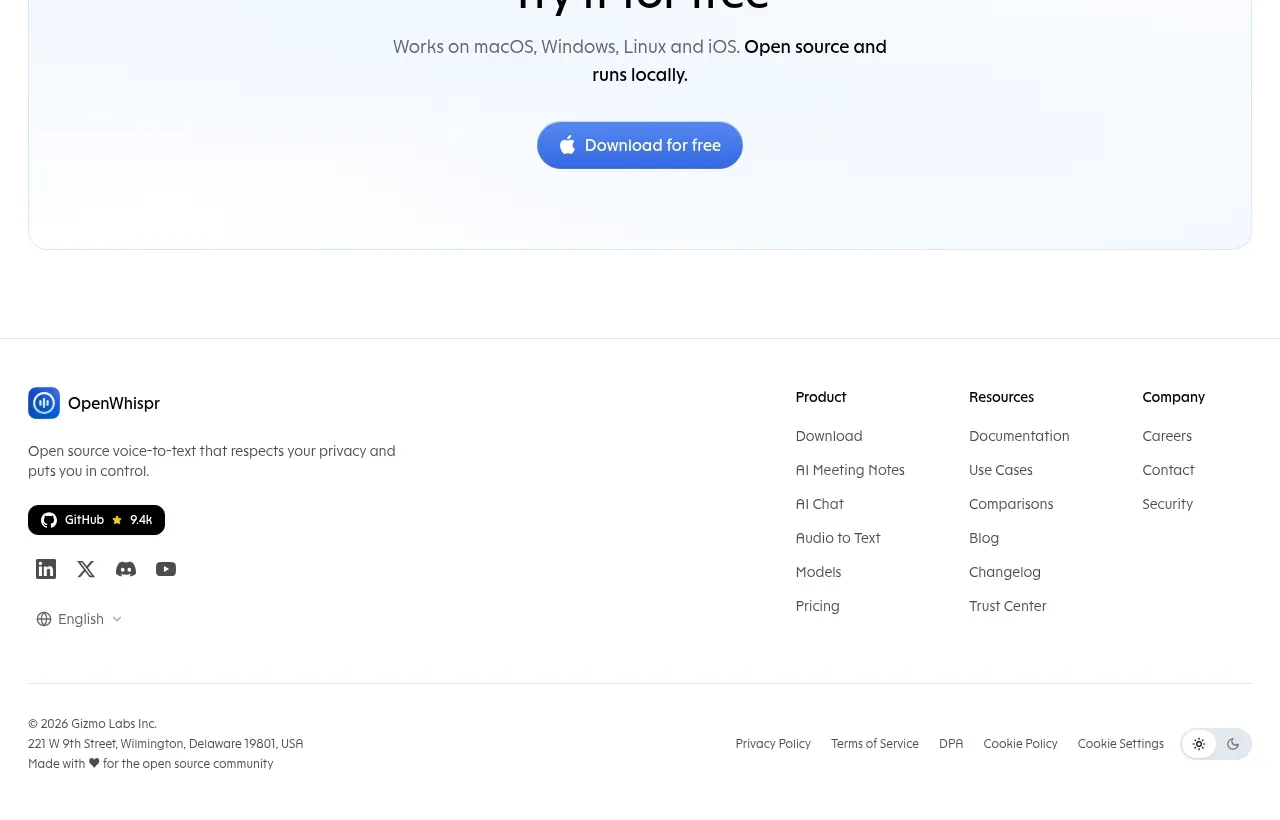
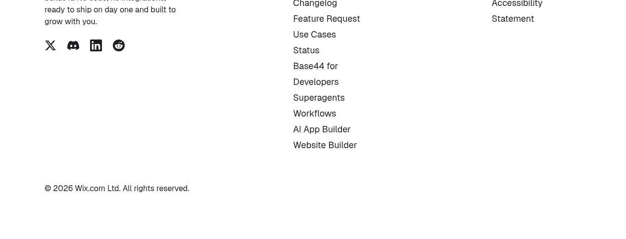
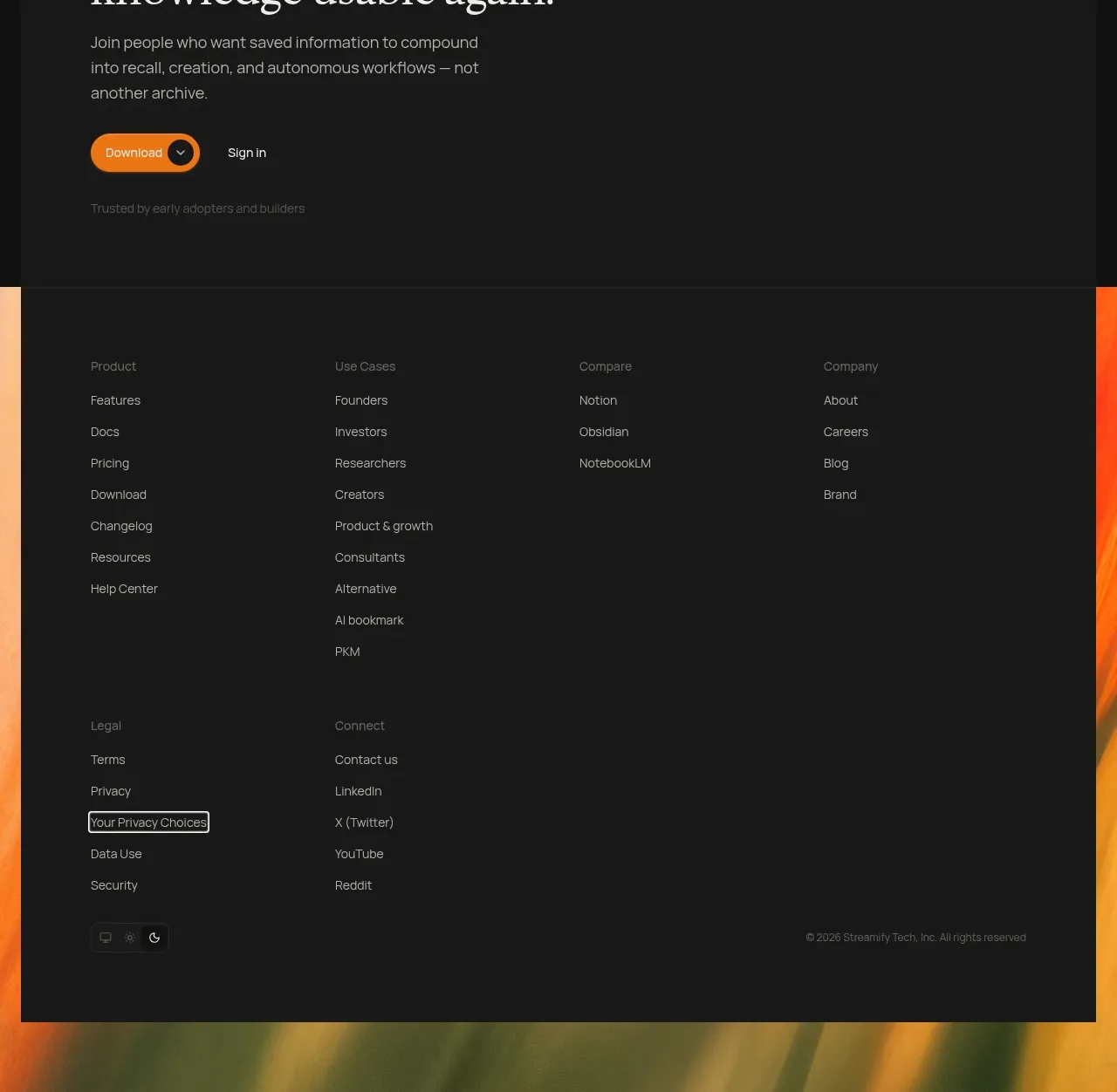
Study these alongside the description below: hierarchy, rhythm, spacing, colour. Build for the product you are asked about, using this design language.

- Component: https://kage-design-assets.t3.tigrisfiles.io/components/articos-mcp/b74b5a52-121a-40b3-9410-436e13736de5-1791957712-6.webp
- Full page it was cut from: https://kage-design-assets.t3.tigrisfiles.io/screenshots/articos-mcp/b74b5a52-121a-40b3-9410-436e13736de5-1791957659853-full.webp
- Component on Kage: https://kage.design/component/articos-mcp-footer

## Before you start
Ask what pages, resources, social channels, legal links, and brand expression the user's product needs. Build a useful footer for that information architecture.

Create a large dark footer on `#0d0d0b` with a thin top divider around `#29271f` and a low-contrast editorial finish.

- Use a max-width container with 5–7 link columns, each headed by a small uppercase label in muted gold or warm gray.
- Keep links compact at 11–13px with 10–14px vertical spacing, using `#aaa69b` normally and ivory on hover.
- Group links by meaningful categories such as product, use cases, resources, company, and legal; add a separate social block only if needed.
- Leave substantial breathing room above the sitemap and reserve the bottom for a large, subdued wordmark or abstract brand treatment at roughly 8–15% opacity.
- Use responsive grid collapse: 2 columns on tablet and 1–2 on mobile, with clear focus styles and adequate touch targets.
- Avoid excessive borders; use spacing and hierarchy to organize the footer.

Never use logos, product names, copy, illustrations, or imagery from the reference.