kage
kage
opencode.ai

Design analysis
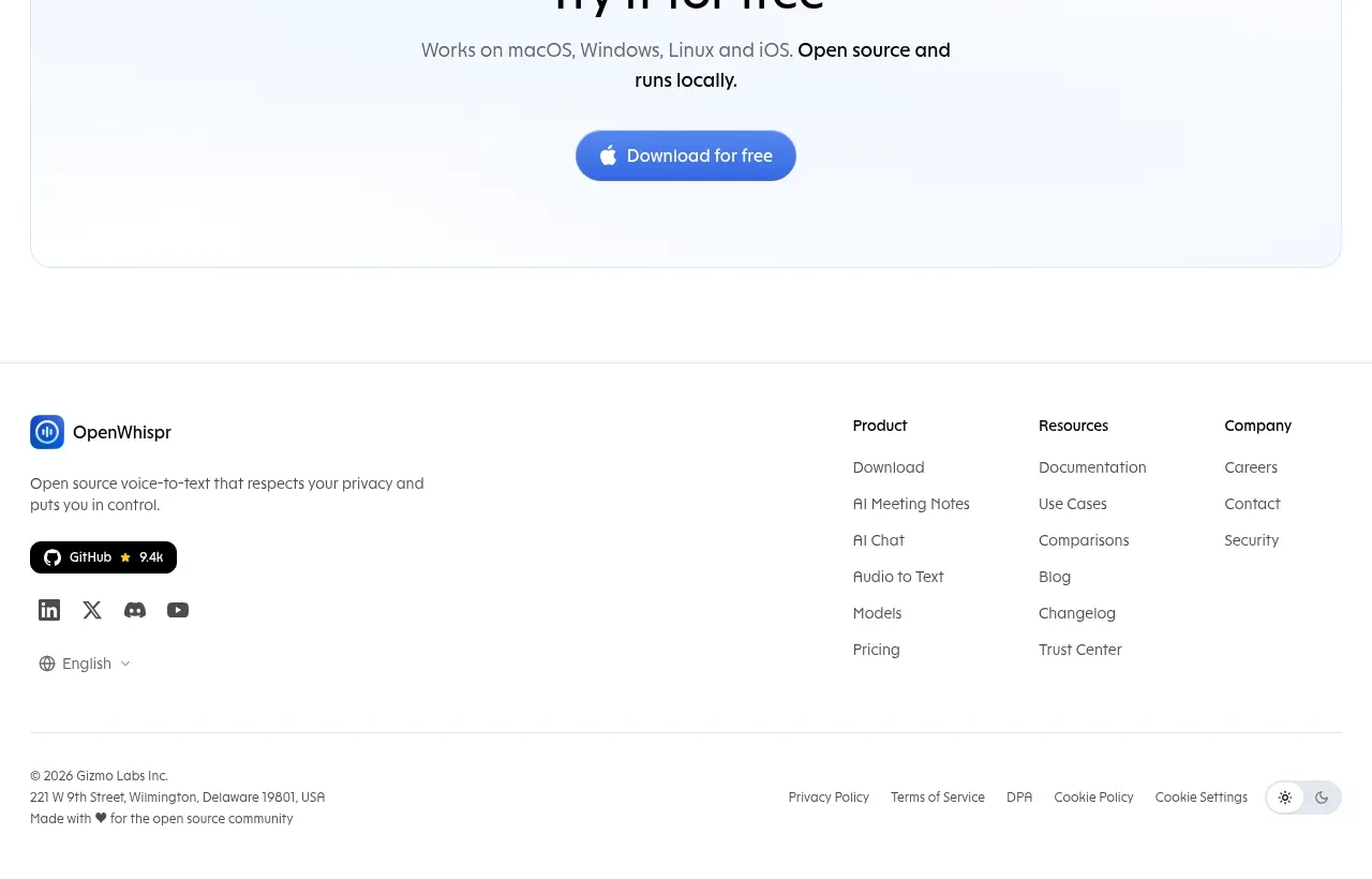
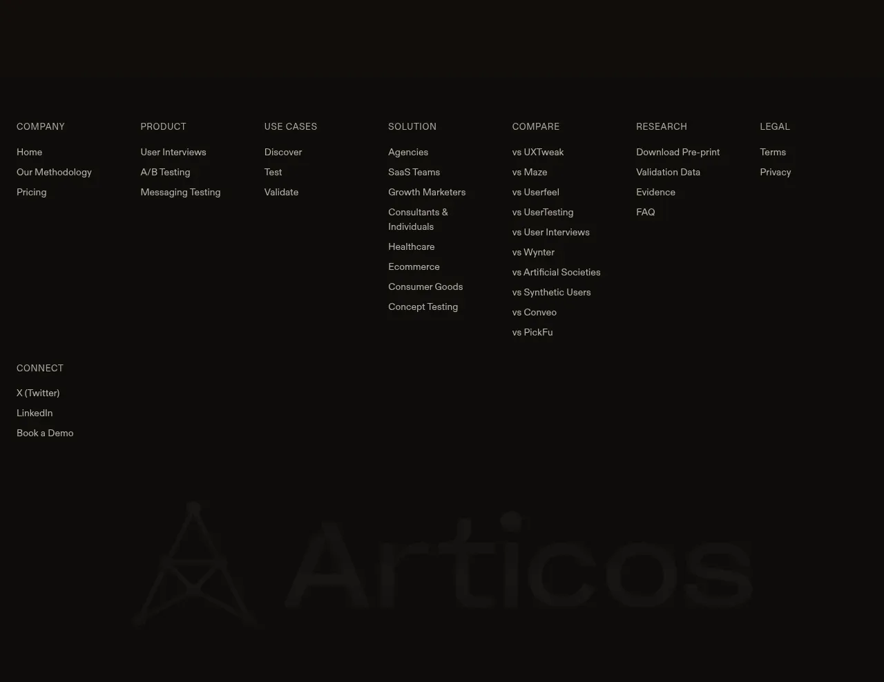
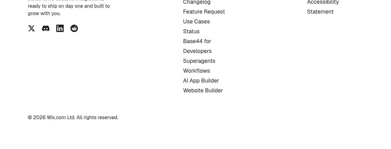
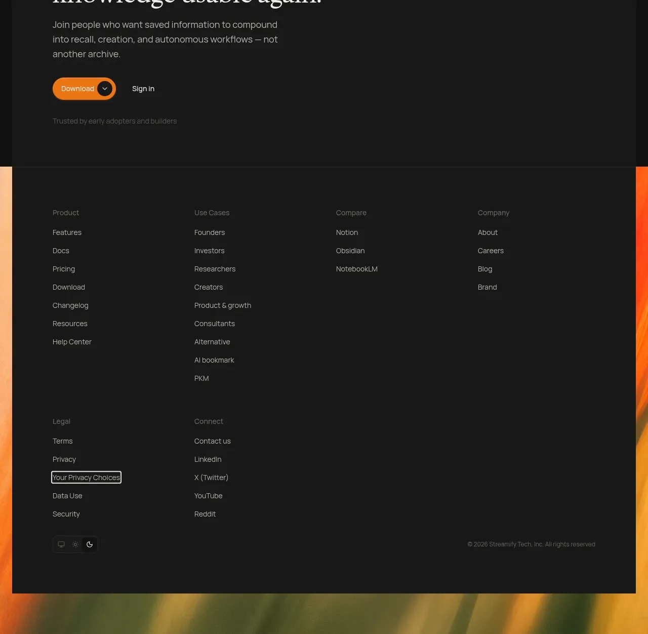
The footer closes with a bordered utility-link row and a sparse legal/language line, preserving the site's technical restraint.
Prompt preview
## Reference images

Study these alongside the description below: hierarchy, rhythm, spacing, colour. Build for the product you are asked about, using this design language.

- Component: https://kage-design-assets.t3.tigrisfiles.io/components/opencode-2-0/565a21f1-5840-46fe-9e23-a71210513fd4-1791957897-8.webp
- Full page it was cut from: https://kage-design-assets.t3.tigrisfiles.io/screenshots/opencode-2-0/565a21f1-5840-46fe-9e23-a71210513fd4-1791957827568-full.webp
- Component on Kage: https://kage.design/component/opencode-2-0-footer

## Before you start
Ask which destinations, legal links, social channels, and language controls the user's product needs. Adapt this footer to those requirements.

Build a restrained two-level footer. The upper level is a row of evenly divided utility links with subtle vertical separators; the lower level is centered, smaller legal text with copyright, company, privacy, terms, and language controls. Use a white/off-white background, 1px #dedede borders, 12–14px monospace or technical typography, #333 primary links, and #999 secondary metadata. Add hover and focus states without adding heavy color. Make the link grid wrap cleanly or become a two-column stack on mobile, and keep legal content easy to scan.

Never: use the reference logo, product name, copy, illustrations, or imagery.