kage
kage
agibot.sh

Design analysis
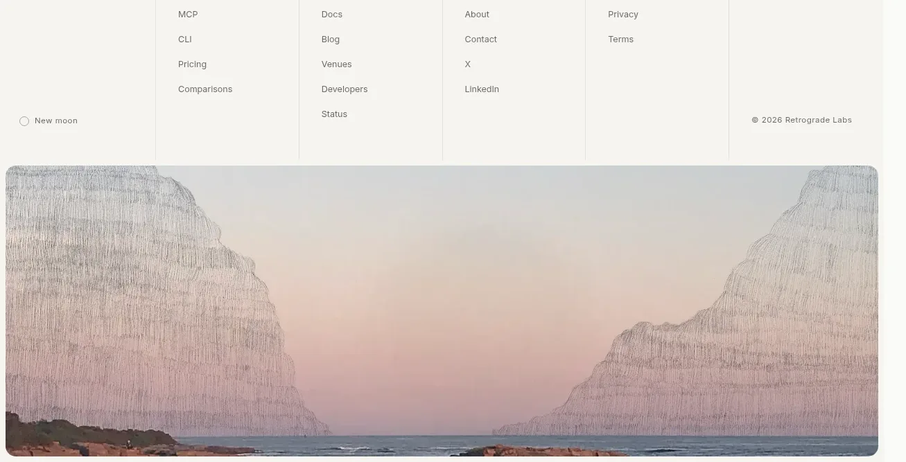
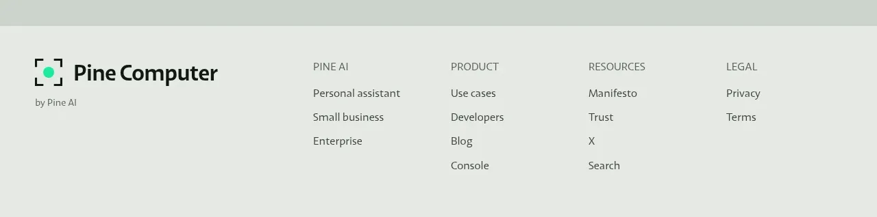
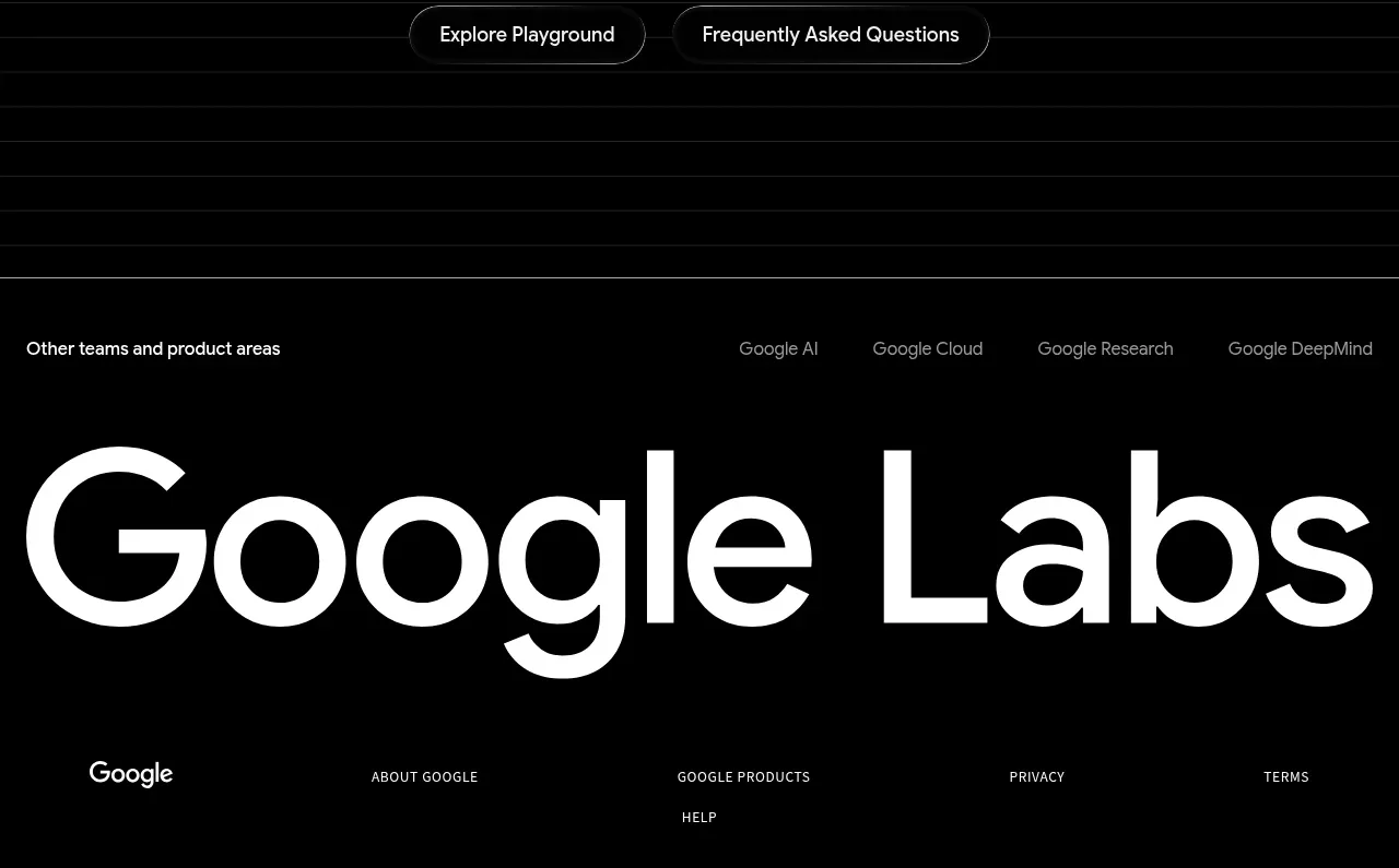
A compact footer combines a small brand block, short description, utility links, a divider, and a copyright/settings row before the next visual section.
Prompt preview
## Reference images

Study these alongside the description below: hierarchy, rhythm, spacing, colour. Build for the product you are asked about, using this design language.

- Component: https://kage-design-assets.t3.tigrisfiles.io/components/agibot/caf89d58-757f-4493-9c2d-6456be940e33-1791784915-3.webp
- Full page it was cut from: https://kage-design-assets.t3.tigrisfiles.io/screenshots/agibot/caf89d58-757f-4493-9c2d-6456be940e33-1791784894236-full.webp
- Component on Kage: https://kage.design/component/agibot-footer

## Before you start
Ask what the user's product and brand are, then apply the following principles to that context rather than copying the reference.

Build a compact footer on a subtly lighter near-black/navy-black background around #070710. Use a centered max-width container with a small brand block and two-line description on the left, and a horizontal group of utility links on the right. Add generous top and bottom padding, a very faint divider #171722, then a lower metadata row with copyright text on the left and a secondary settings/privacy link on the right. Use muted gray #9996a4 for supporting text, white #ebe9f1 for links, 12–14px typography, and restrained spacing. Preserve the desktop two-column alignment and stack the brand and links on mobile; add clear hover contrast.

Never: use logos, product names, copy, illustrations, or imagery from the reference.